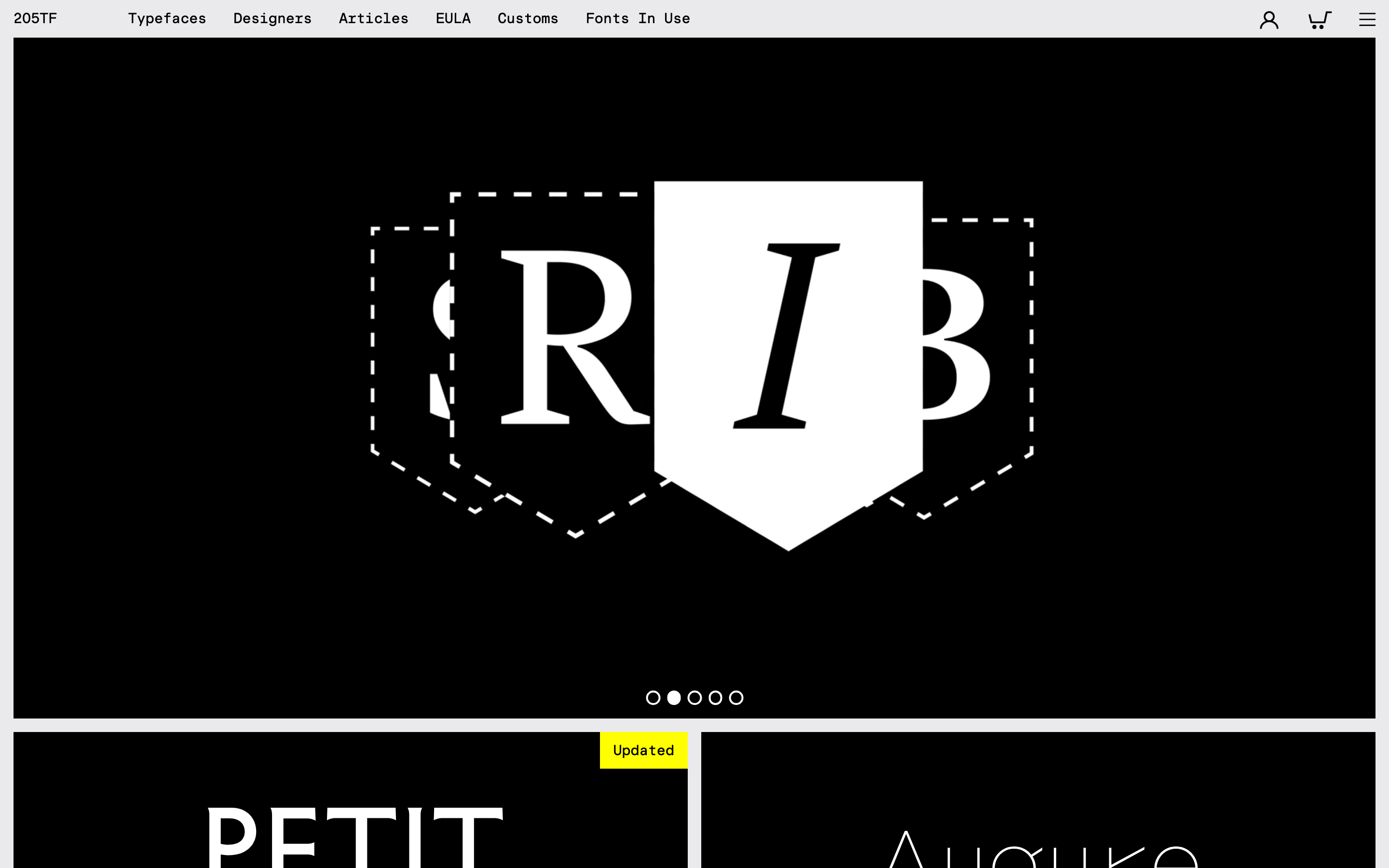
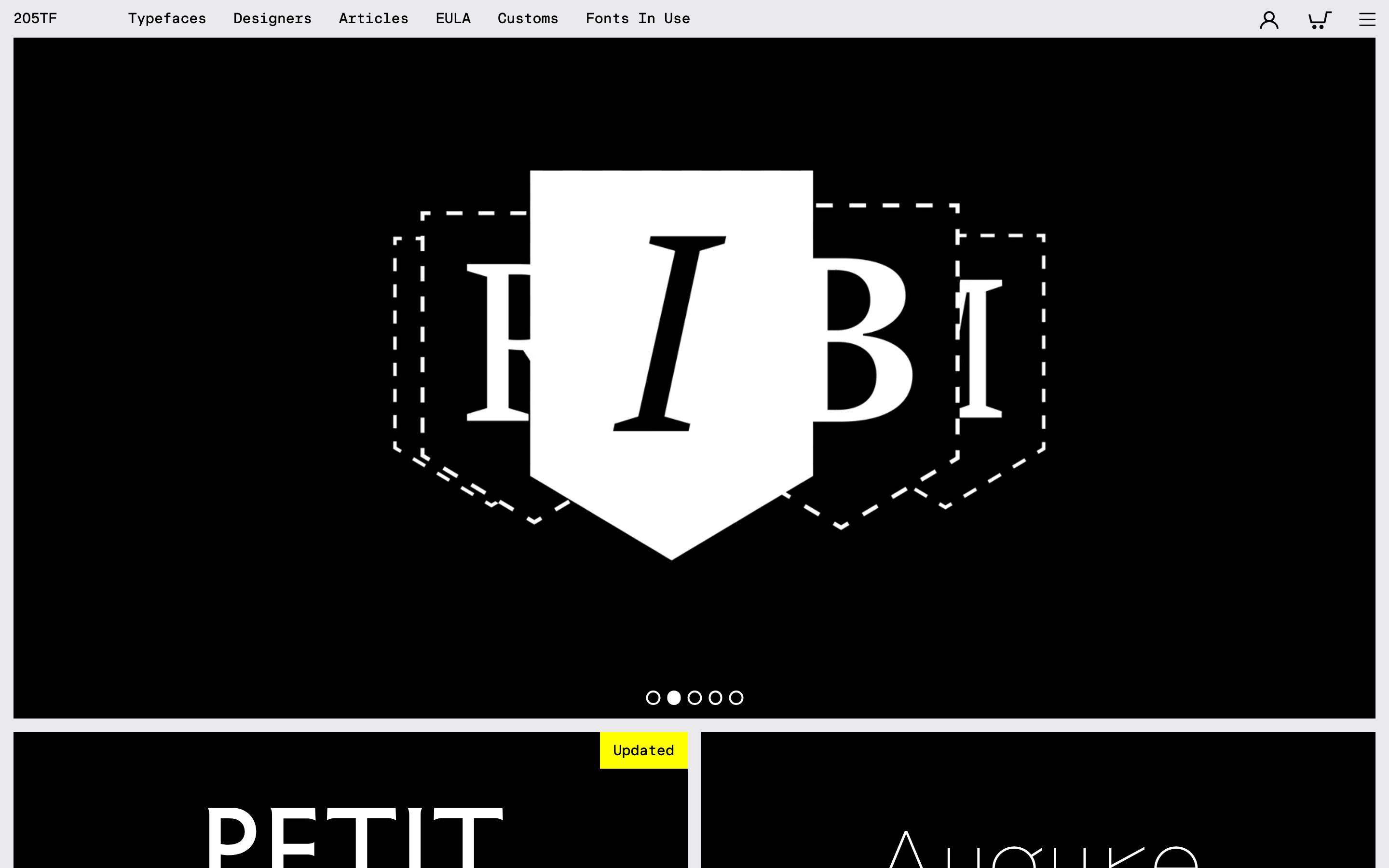
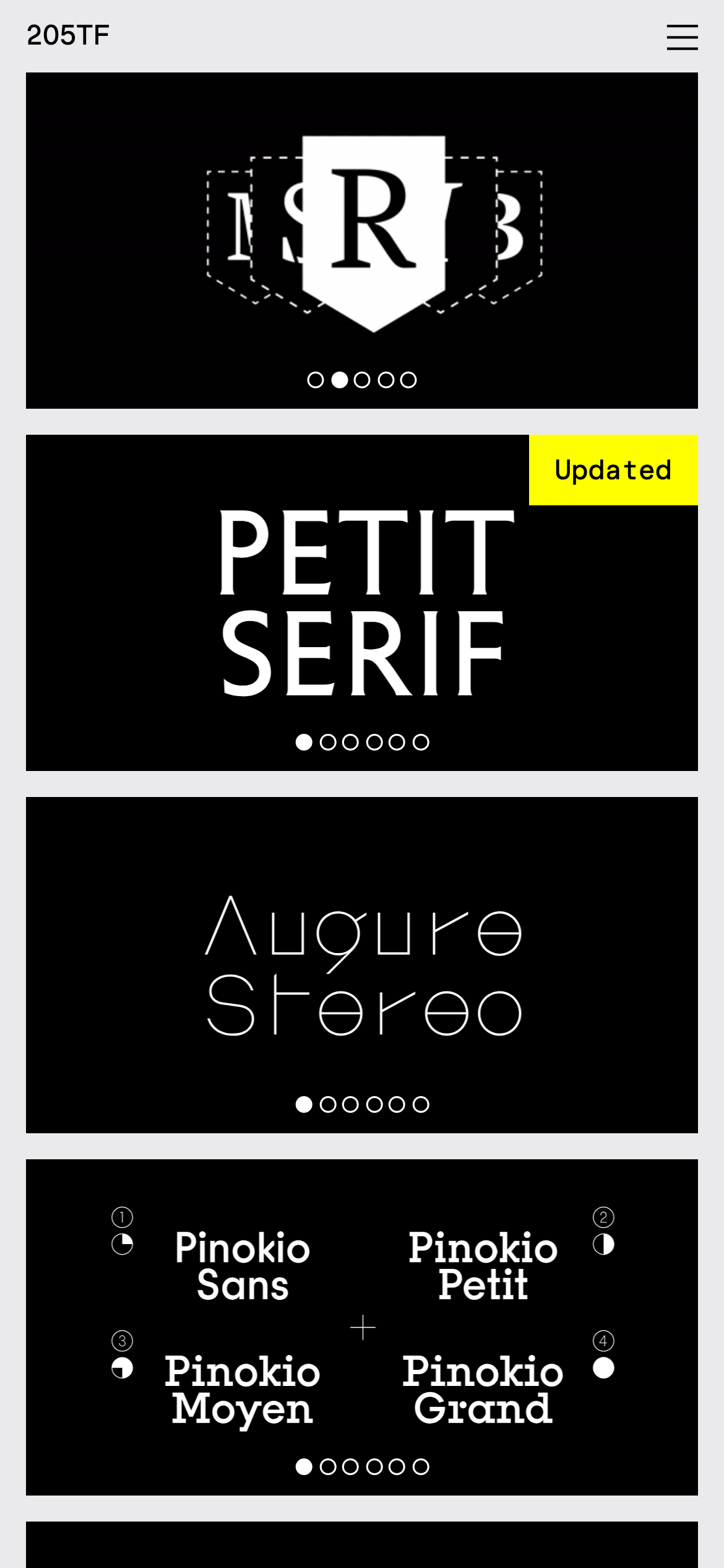
A curated black-box gallery where type specimens are presented as monolithic artifacts.
02
Color
#FFFF00Accent
#FFFFFFInk
#808080Ink soft
#000000BG
#EAEAE9BG quiet
#CCCCCCMuted
rgba(255,255,255,1.0)Line
Absolute stark contrast to elevate the inherent character and craftsmanship of the typefaces being presented.
03
Typography
didone-serif · transitional-serif
display100px · 400
heading56px · 400
body14px · 400
Maintain high contrast by strictly using white text on black backgrounds for all specimens. · Utilize extreme tracking (negative letter-spacing) on large-scale display typography to tighten visual density. · Reserve bold weights strictly for specific specimen showcases, keeping the UI strictly at a 400 weight.
04
Spacing
7px
14px
28px
56px
Strict 7-point base unit applied to all padding, gaps, and margins, creating a highly constrained spatial grid.
05
Surfaces
sm · 0px
md · 0px
lg · 24px
pill · 999px
Flat, clean edges or dashed outlines (used in the hero graphic), with occasional 1px or 2px solid strokes for interactive grid states.
06
Layout
1280container
12columns
28pxgutter
768 / 1024breakpoints
A strict two-column asymmetric grid on desktop that completely collapses into a single continuous vertical stack on mobile.
07
Motion & Interaction
220msmicro
400mssmall
600msmedium
cubic-bezier(0.52, 0.07, 0.2, 0.99)easing
Smooth cubic-bezier easing applied to all structural transforms and container slides. · Strict 0.45s to 0.6s transition durations for primary carousel and grid state changes. · Instantaneous cursor updates to custom SVG arrows when hovering over interactive specimen zones.
Custom SVG cursors (left and right arrows) replace the default pointer to indicate interactive carousel or grid navigation. · Directs to specimen detail pages or advances the image carousel, maintaining a seamless state change.
08
Components
buttonMinimal text-only links or custom pointer cursors (left/right arrows) that hide traditional UI in favor of direct interaction.
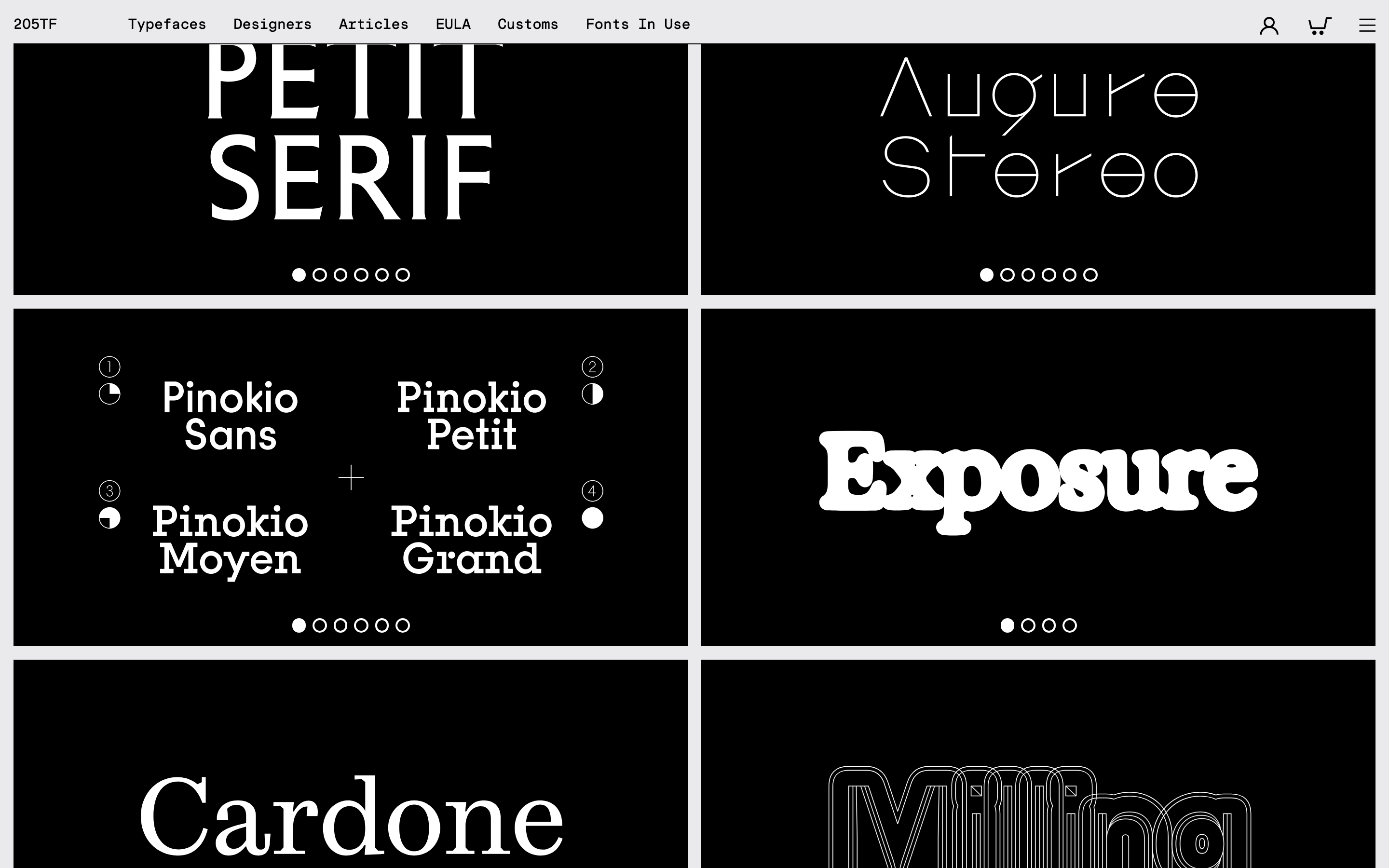
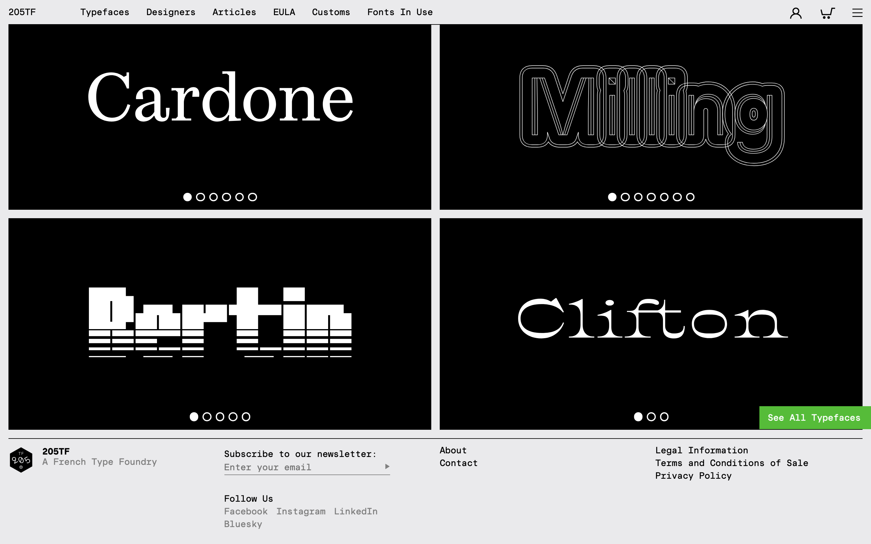
cardFull-bleed black blocks acting as specimen containers, framed by a white background grid with distinct 24px corner radii.
chipA high-contrast rectangular badge featuring a vibrant yellow background (#FFFF00) and black text for statuses like 'Updated'.
inputNot visible in the provided screenshot.
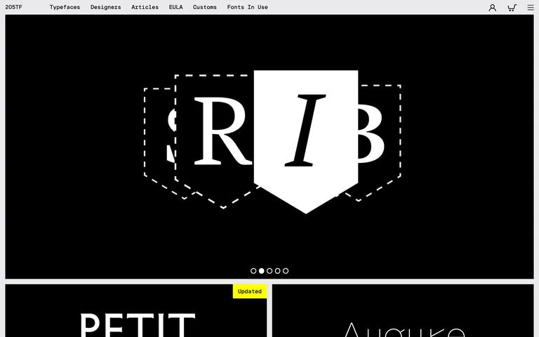
heroA massive, dominating black container featuring an oversized serif specimen graphic and custom dashed outlines.
09
Voice & Don'ts
ToneExpert, minimalist, and supremely confident.
HeadlinesUnapologetically large, highly tracked-out specimen names that function more as visual anchors than mere headings.
CTAsSubtle, non-intrusive text links that deliberately avoid standard button aesthetics to keep the focus on the type.
Don't introduce secondary colors — screenshot shows a strictly achromatic black and white palette, save for a single functional yellow badge.
Don't use bold or heavy UI weights — screenshot shows all navigation and UI elements rendered in a consistent 400 weight.
Don't apply drop shadows or 3D effects — screenshot shows completely flat, graphic surfaces with no depth cues.
Don't use rounded corners on cards — screenshot shows the black specimen containers fitting perfectly square within a 24px radius outer frame.
Don't create dense text paragraphs — screenshot shows the UI relies almost entirely on massive display typography and sparse navigation links.
Don't use default browser cursors on interactive zones — screenshot clearly demonstrates custom arrow cursor images for left/right navigation.
Avoid: Avoid using standard HTML buttons or brightly colored UI elements that would distract from the specimens.
Avoid: Avoid multi-column text blocks; keep text strictly to single lines or very short, high-impact bursts.
Avoid: Avoid introducing any decorative elements or illustrations that are not actual type specimens.
Captured from the live site · real computed styles
11
System prompt
205TF is a premium digital type foundry website that utilizes a stark, minimalist black-and-white aesthetic to let its font specimens speak for themselves. The UI relies on a strict 7-point spacing grid and a 12-column layout, ensuring a highly structured yet dramatic presentation. Key colors are limited to pure black (#000000) and white (#FFFFFF), with a solitary high-contrast yellow (#FFFF00) used sparingly for status badges like 'Updated'. The typography categories are predominantly transitional-serif and didone-serif, though the UI navigation is set in a mono-like geometric sans. Critical constraints include: never introduce secondary or decorative colors, maintain a strict 400 font weight across all standard UI elements, and avoid traditional button components in favor of custom SVG cursors and text links to preserve the gallery-like purity of the layout.
Bring this taste to your agent
Hand your AI agent a machine-readable spec of this design — tokens, type, motion, the whole DNA.