CURATED · OPEN · FREE
Worth including as a prime example of modern, high-scale corporate branding using expansive gradients and generous whitespace to convey a future-oriented vision.
 Open in OpenDesign
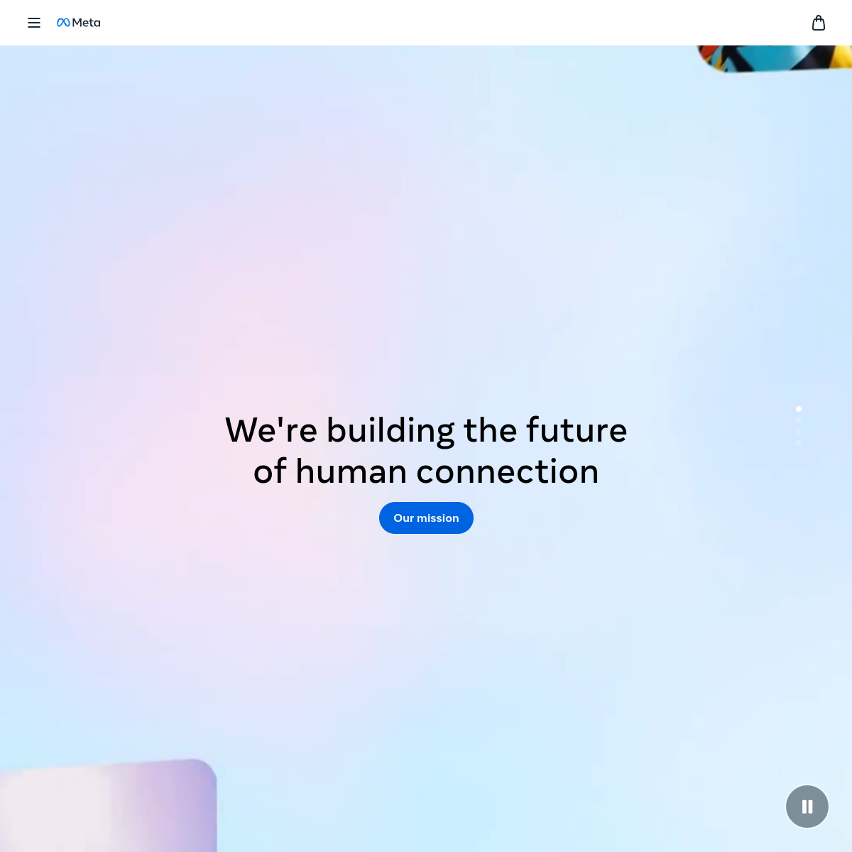
A soft, expansive pastel gradient background dominated by light blue with subtle hints of pink and green, contrasted by dark text and a single vibrant blue accent.
Full-viewport, immersive hero layout with central content and generous whitespace, featuring floating elements at the edges.
Clean, focused interactions on a minimal set of elements, with standard hover and click feedback.
Subtle background animations and smooth transitions for a modern, fluid feel.