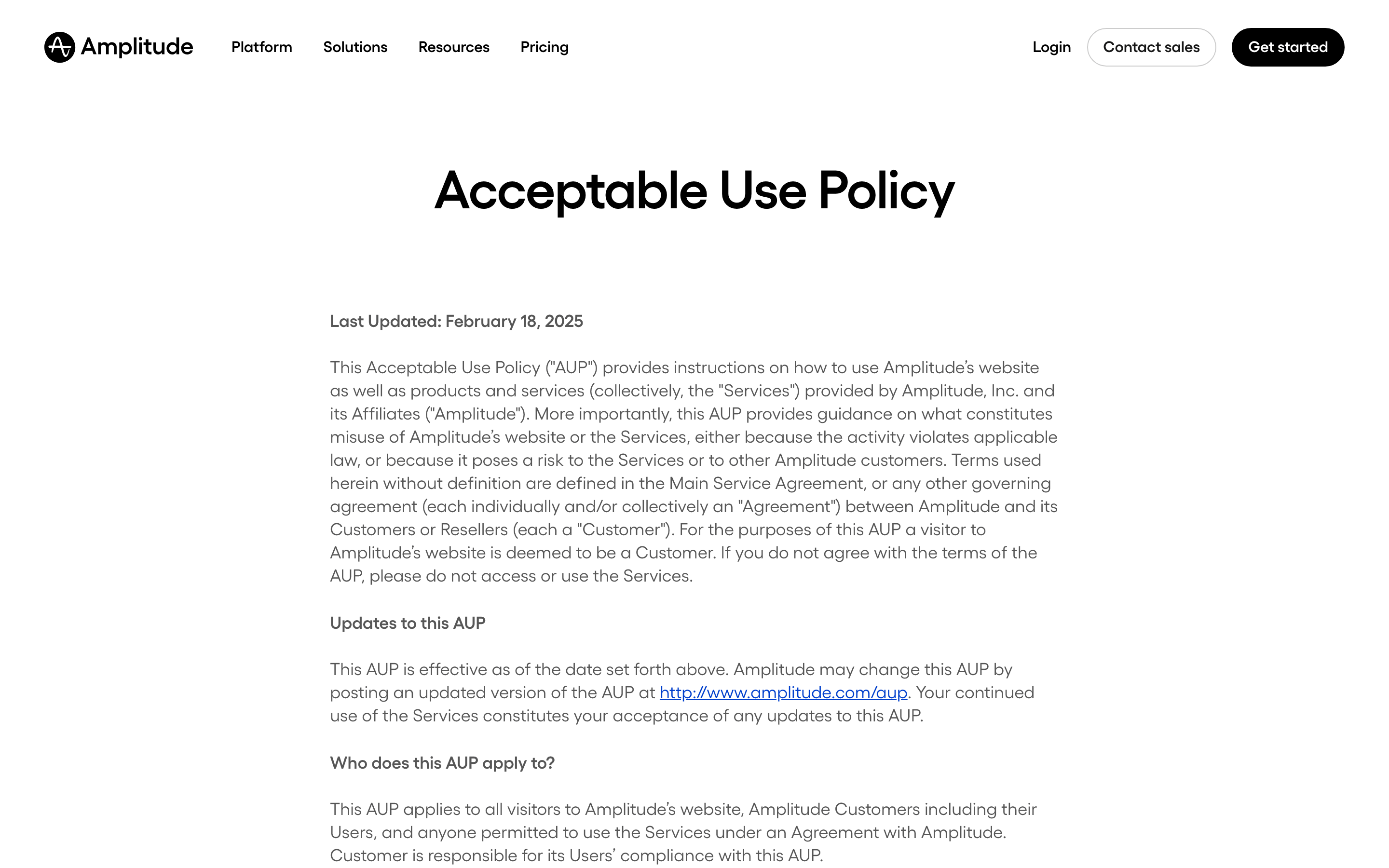
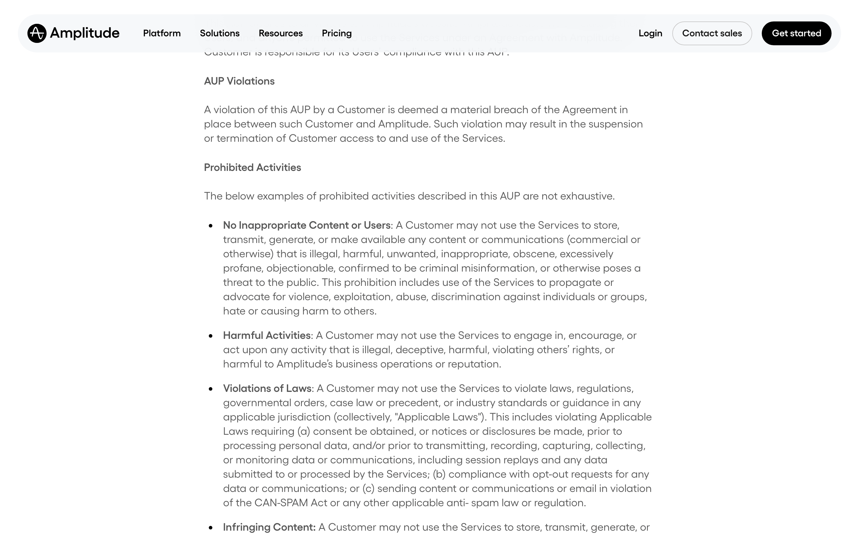
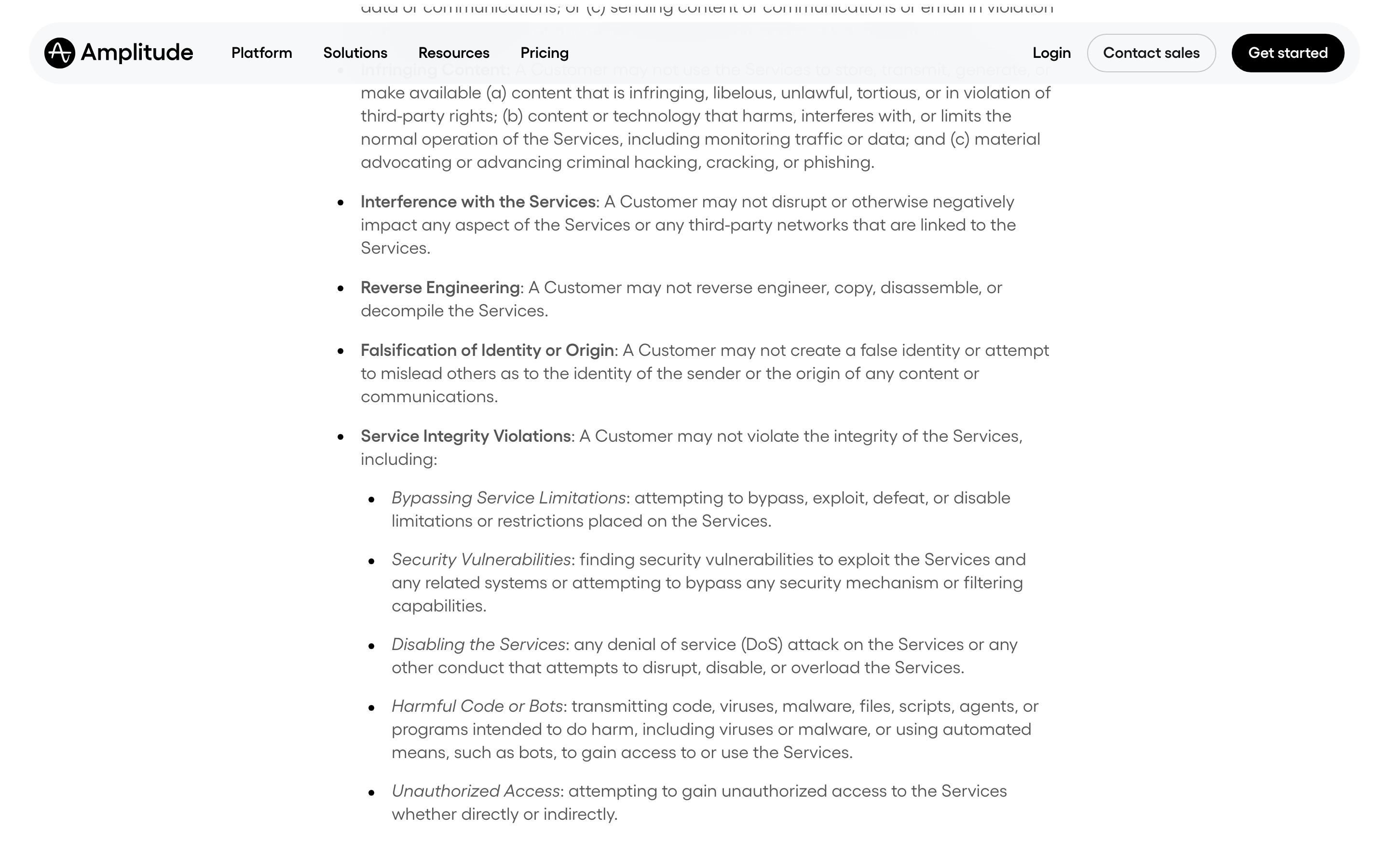
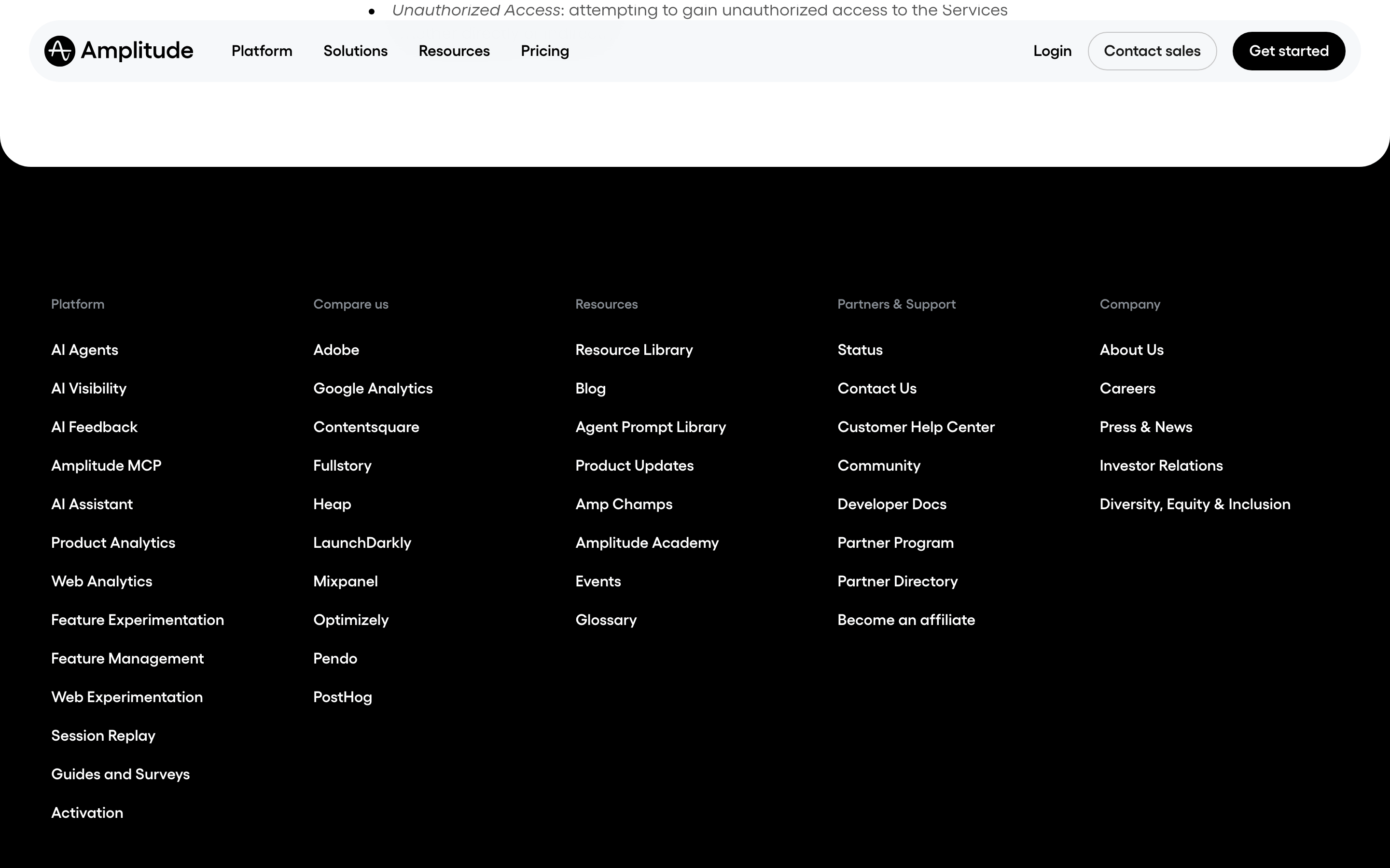
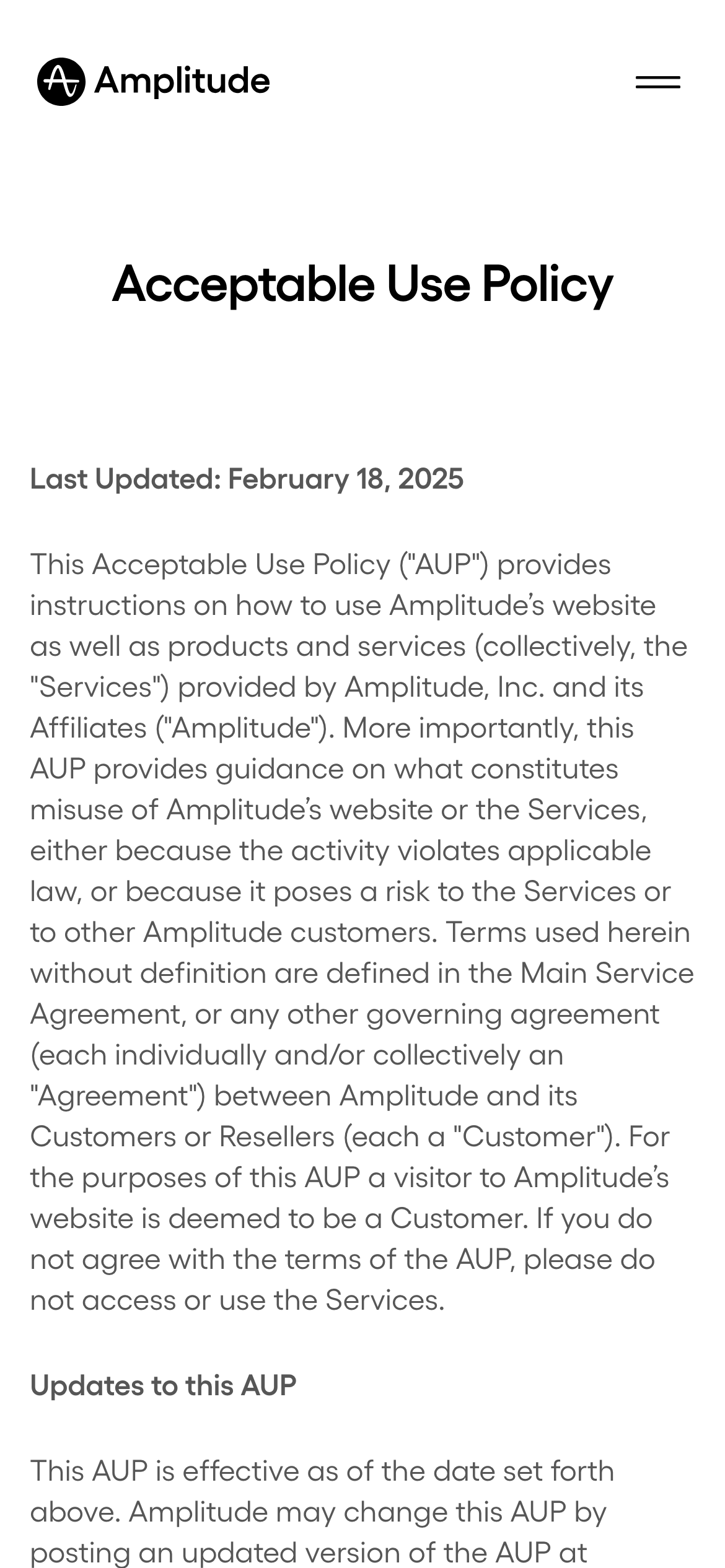
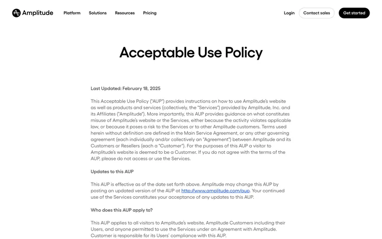
A professional enterprise software dashboard layout adapted for legal documentation.
02
Color
#000000Accent
#171717Ink
#373D42Ink soft
#FFFFFFBG
#565656Muted
rgba(0,0,0,0.1)Line
High-contrast monochrome for maximum readability and professional clarity.
03
Typography
geometric-sans · humanist-sans · monospace
display56px · 600
heading24px · 600
body18px · 400
small14px · 400
Body text uses a highly legible humanist sans-serif. · Headings use a slightly more structured sans-serif. · Tight letter-spacing is applied to display sizes for a modern, premium feel.
04
Spacing
4px
8px
12px
16px
24px
32px
48px
64px
Consistent 4px base grid with generous vertical padding for distinct content sections.
05
Surfaces
sm · 4px
md · 6px
lg · 12px
pill · 9999px
Minimal use of 1px solid borders, mostly relying on spacing and typography for separation.
06
Layout
1280container
12columns
24pxgutter
768 / 1024breakpoints
Standard top navigation with a centered, narrow column for legal text.
07
Motion & Interaction
200msmicro
300mssmall
500msmedium
cubic-bezier(0.4, 0, 0.2, 1)easing
Subtle background-color transitions on hover. · Opacity changes for interactive states.
Background color shift for buttons and subtle opacity changes for text links. · Immediate visual response via background color changes.
08
Components
buttonSolid black primary button with pill radius; secondary text buttons.
cardNo cards used on this text-heavy legal page.
chipN/A
inputN/A
heroText-only hero with large typography and a clear metadata line.
09
Voice & Don'ts
ToneProfessional, clear, authoritative, and legal.
HeadlinesDirect and descriptive.
CTAsAction-oriented and high-contrast.
Don't use decorative background images — screenshot shows a clean, solid white background.
Don't use a multi-color palette — screenshot shows a strict monochrome black-and-white scheme.
Don't use centered body text — screenshot shows left-aligned text for better readability.
Don't use decorative borders — screenshot shows layout separation primarily through spacing.
Don't use wide text columns — screenshot shows a narrow, optimized column for reading.
Don't use casual typography — screenshot shows a highly legible, professional sans-serif font.
Captured from the live site · real computed styles
11
System prompt
This design represents a professional B2B software's legal documentation page, prioritizing absolute clarity and authority over visual expression. The core palette is a strict monochrome, with a white background (#FFFFFF) and deep charcoal ink (#171717), utilizing black (#000000) for primary call-to-action buttons. Typography relies on highly legible humanist and geometric sans-serif categories (IBM Plex Sans) with a tight letter-spacing on display headings to maintain a modern, premium feel. Critical design constraints include: maintaining the narrow, centered content column for optimal reading lines, avoiding any decorative background imagery or patterns, and ensuring a complete absence of colorful accents. The layout is a classic single-column editorial structure with generous vertical spacing to separate logical content blocks.
Bring this taste to your agent
Hand your AI agent a machine-readable spec of this design — tokens, type, motion, the whole DNA.