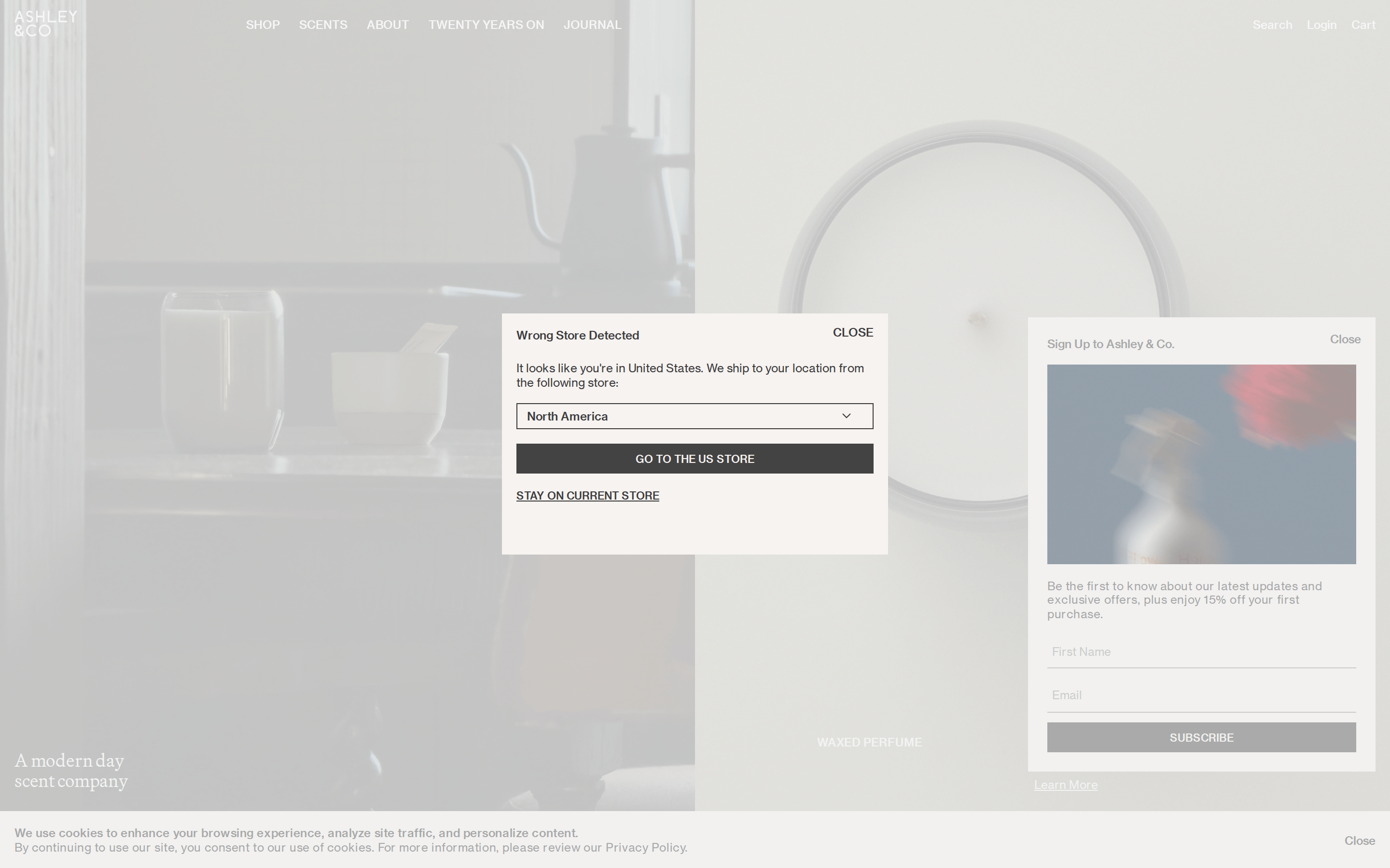
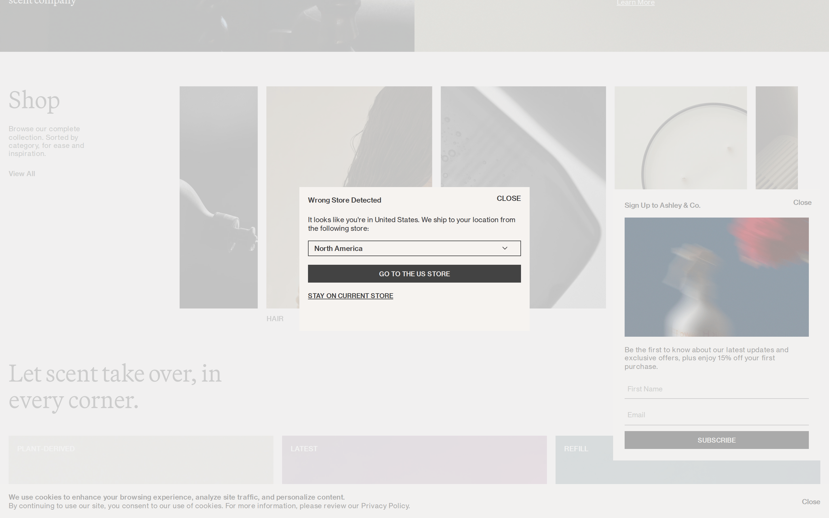
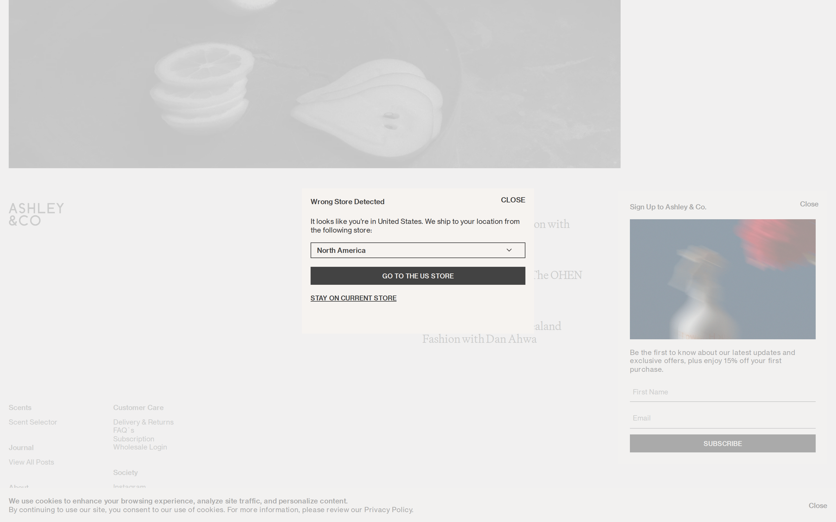
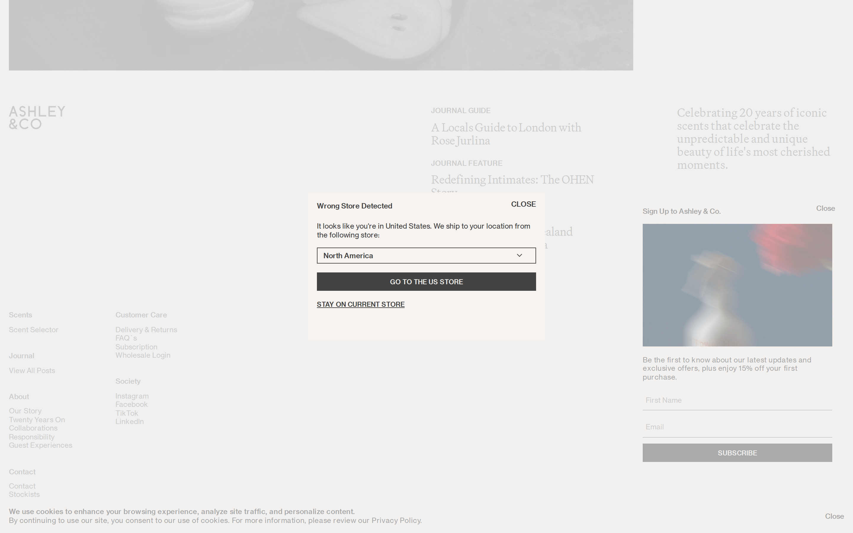
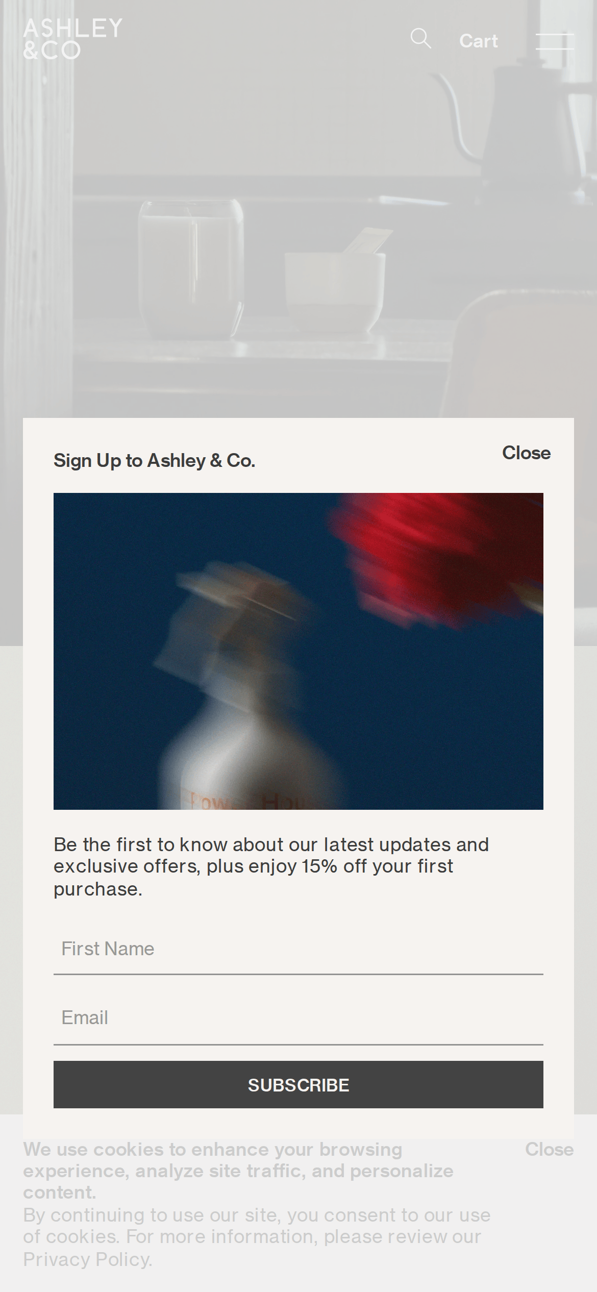
A high-end minimalist boutique that relies on atmospheric photography and quiet typography.
02
Color
#3C3C3CInk
#F6F3F0BG
#939393Muted
rgba(3C3C3C, 0.1)Line
Warm, desaturated neutrals that recede to let lifestyle photography dominate.
03
Typography
transitional-serif · grotesque-sans
display42px · 400
body12px · 400
Display uses a serif for elegant contrast against the clean sans-serif body text. · Navigation and secondary text are heavily tracked uppercase to maintain a clean, rhythmic baseline. · Body text remains small and unobtrusive to maximize the negative space.
04
Spacing
4px
8px
16px
24px
32px
48px
64px
96px
Generous padding within containers to maintain a premium, uncluttered feel.
05
Surfaces
sm · 4px
md · 8px
lg · 10px
pill · 999px
Minimal, often defined by a simple 1px line in dark ink or muted gray.
06
Layout
1280container
12columns
24pxgutter
768 / 1024breakpoints
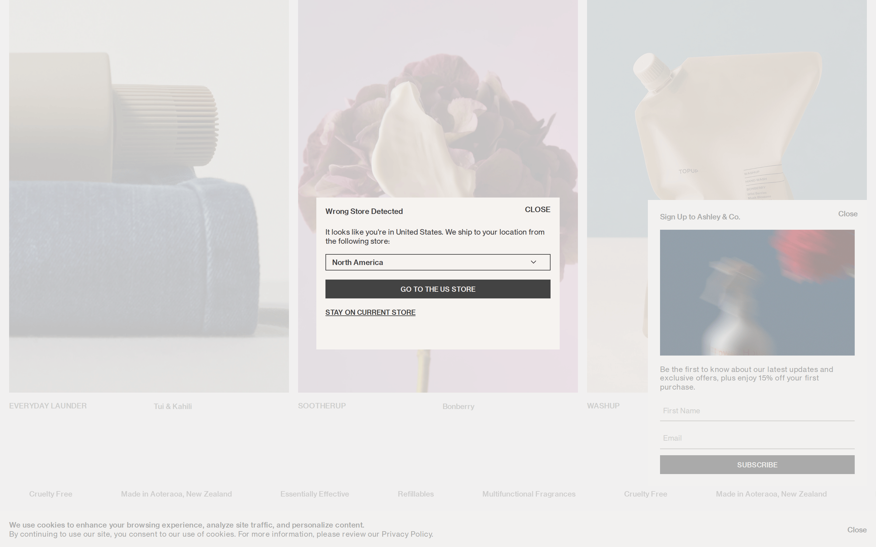
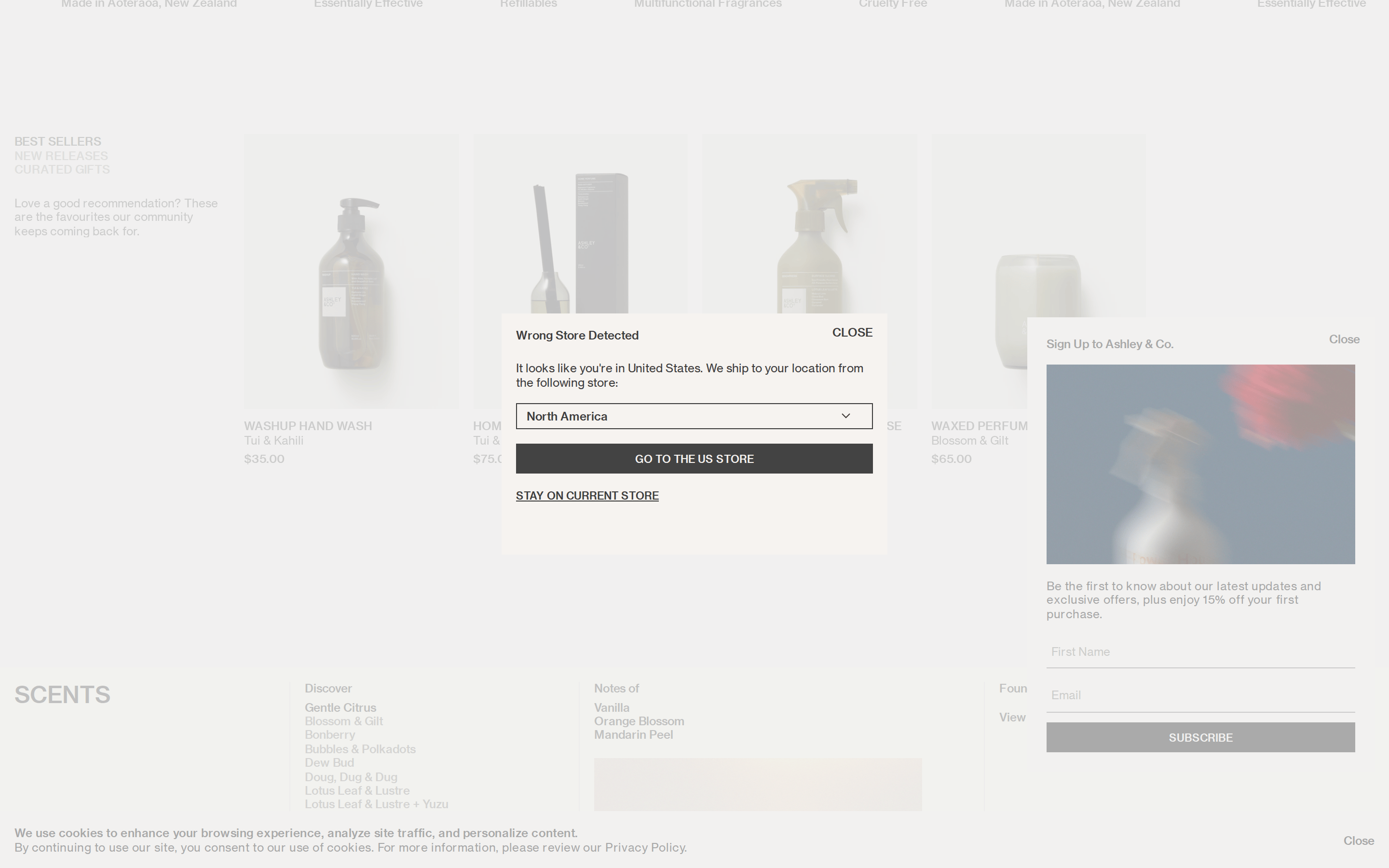
Asymmetrical split layouts and full-width atmospheric photography.
07
Motion & Interaction
220msmicro
400mssmall
800msmedium
cubic-bezier(0.4, 0, 0.2, 1)easing
Smooth fade-ins and gentle easing for a calm browsing experience.
Subtle opacity shifts or color transitions. · Immediate visual feedback through state changes.
08
Components
buttonHigh-contrast solid rectangles with uppercase text and sharp corners.
cardImage-forward cards with minimal borders and clean typography.
chipSimple pill-shaped or rectangular tags.
inputMinimalist underline-only inputs.
heroFull-viewport or large photographic backgrounds with overlaid serif headlines.
09
Voice & Don'ts
ToneRefined, calm, and evocative.
HeadlinesShort, evocative phrases using transitional serif.
CTAsDirect, uppercase, and functional.
Don't use vibrant or high-chroma colors — the screenshot shows a strictly warm, desaturated neutral palette.
Don't use decorative or heavy fonts — the screenshot shows clean grotesque-sans for body and a refined transitional-serif for display.
Don't add drop shadows or heavy borders — the screenshot shows flat, borderless surfaces that rely on negative space.
Don't use rounded buttons or cards — the screenshot shows sharp, rectangular corners (even 10px radius is used sparingly).
Don't use small, crowded layouts — the screenshot shows generous padding and wide gaps between elements.
Don't use an aggressive or promotional tone — the screenshot shows calm, refined language focused on lifestyle.
Captured from the live site · real computed styles
11
System prompt
This design DNA is for a premium scent company with a calm, minimalist, and photographic approach. It uses a warm neutral palette (#F6F3F0, #3C3C3C, #939393) and a clean typographic hierarchy pairing a transitional-serif display font with a grotesque-sans body font. The layout relies on generous negative space and high-quality lifestyle imagery. Critical donts: avoid vibrant colors, avoid heavy shadows or borders, avoid decorative fonts, avoid rounded UI elements, avoid dense text, and avoid aggressive or promotional language. This style is suitable for premium consumer brands, editorial sites, or high-end product showcases where atmosphere is paramount.
Bring this taste to your agent
Hand your AI agent a machine-readable spec of this design — tokens, type, motion, the whole DNA.