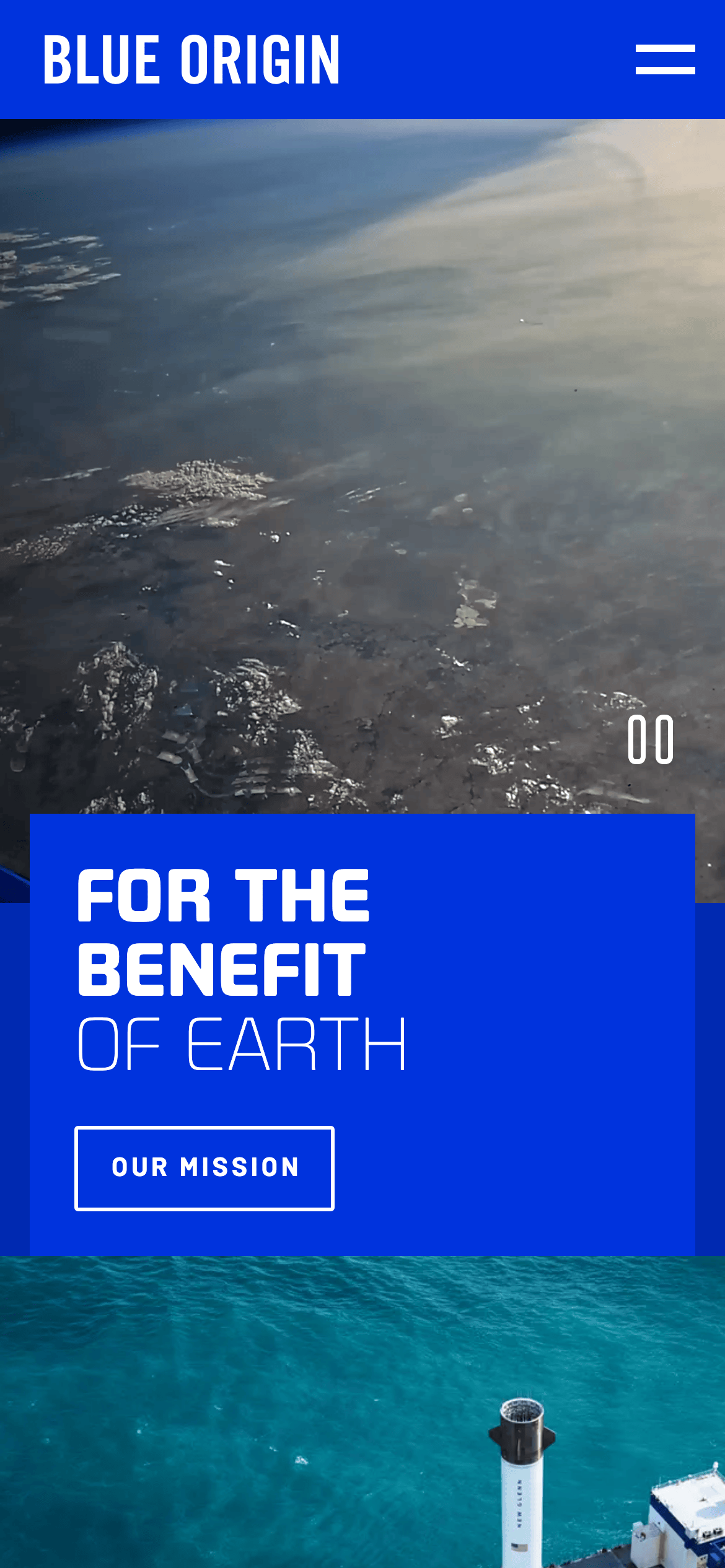
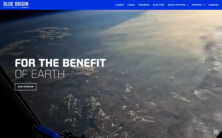
High-contrast cinematic design using deep blacks and vibrant brand blue to evoke the scale of space.
03
Typography
geometric-sans · humanist-sans
display72px · 800
h156px · 700
h240px · 700
body16px · 400
All primary display text is uppercase with wide tracking for a technical, monumental feel · Navigation uses a slightly wider spacing for readability in uppercase · Body text maintains a neutral weight and standard spacing for legibility against dark backgrounds
04
Spacing
4px
8px
12px
16px
24px
32px
48px
64px
96px
Consistent use of 4px and 8px increments creates a technical, grid-aligned spacing system.
05
Surfaces
sm · 2px
md · 4px
lg · 4px
pill · 999px
Thin 1-2px white or light gray borders used for buttons and subtle dividers.
Full-bleed photographic sections with content overlaid directly on imagery.
07
Motion & Interaction
220msmicro
400mssmall
800msmedium
cubic-bezier(0.4, 0, 0.2, 1)easing
Smooth fade-ins and slide-ups for content sections as they enter the viewport. · Hover effects on buttons and links primarily involving color and border transitions.
Subtle transitions on border color or text color for interactive elements. · Immediate visual feedback via active states or page transitions.
08
Components
buttonOutline or ghost buttons with 2px white borders, uppercase text, and wide letter-spacing.
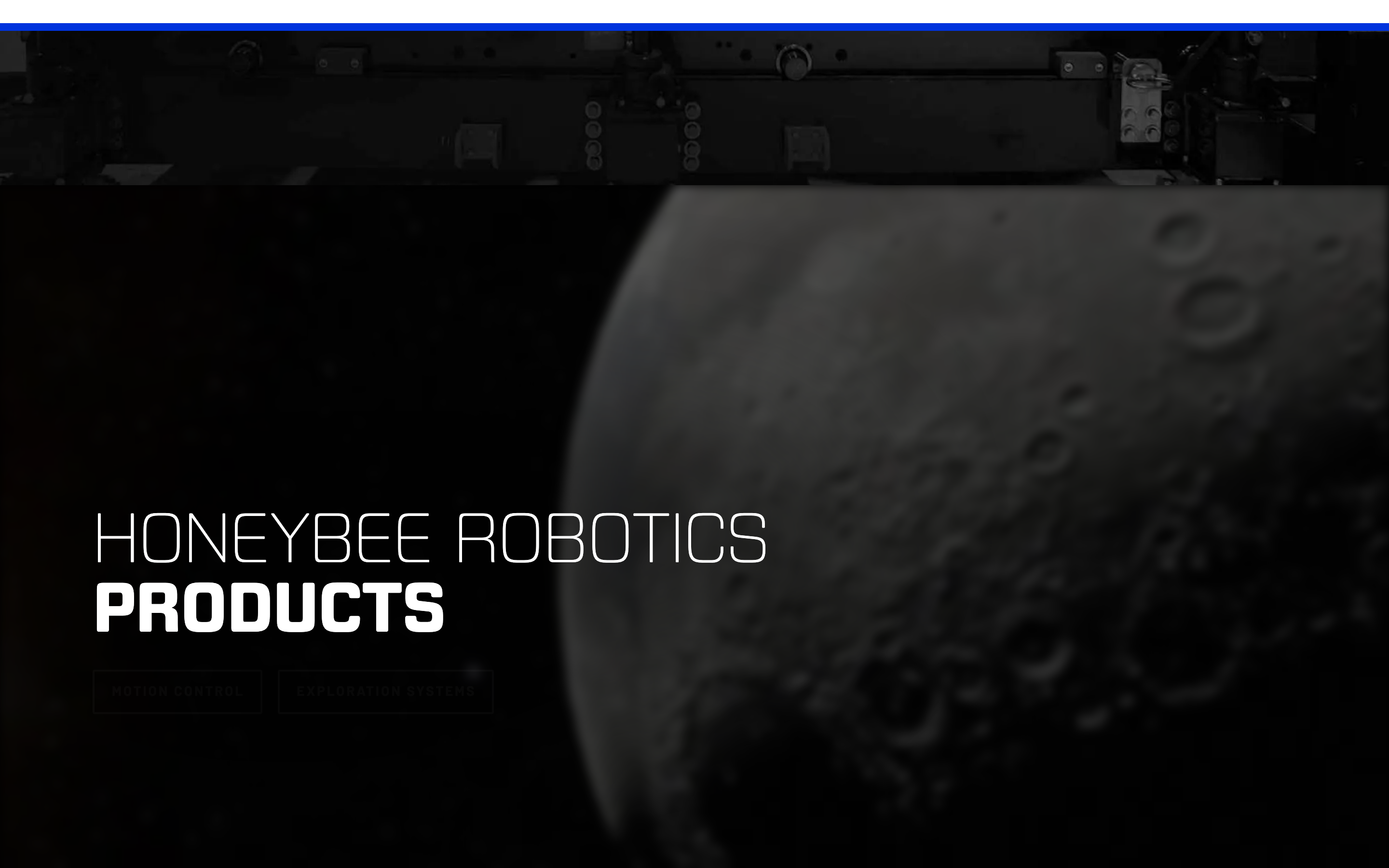
cardFull-width photographic sections with text overlays, acting as large interactive cards.
chipNone visible.
inputMinimalist search or form inputs with subtle borders.
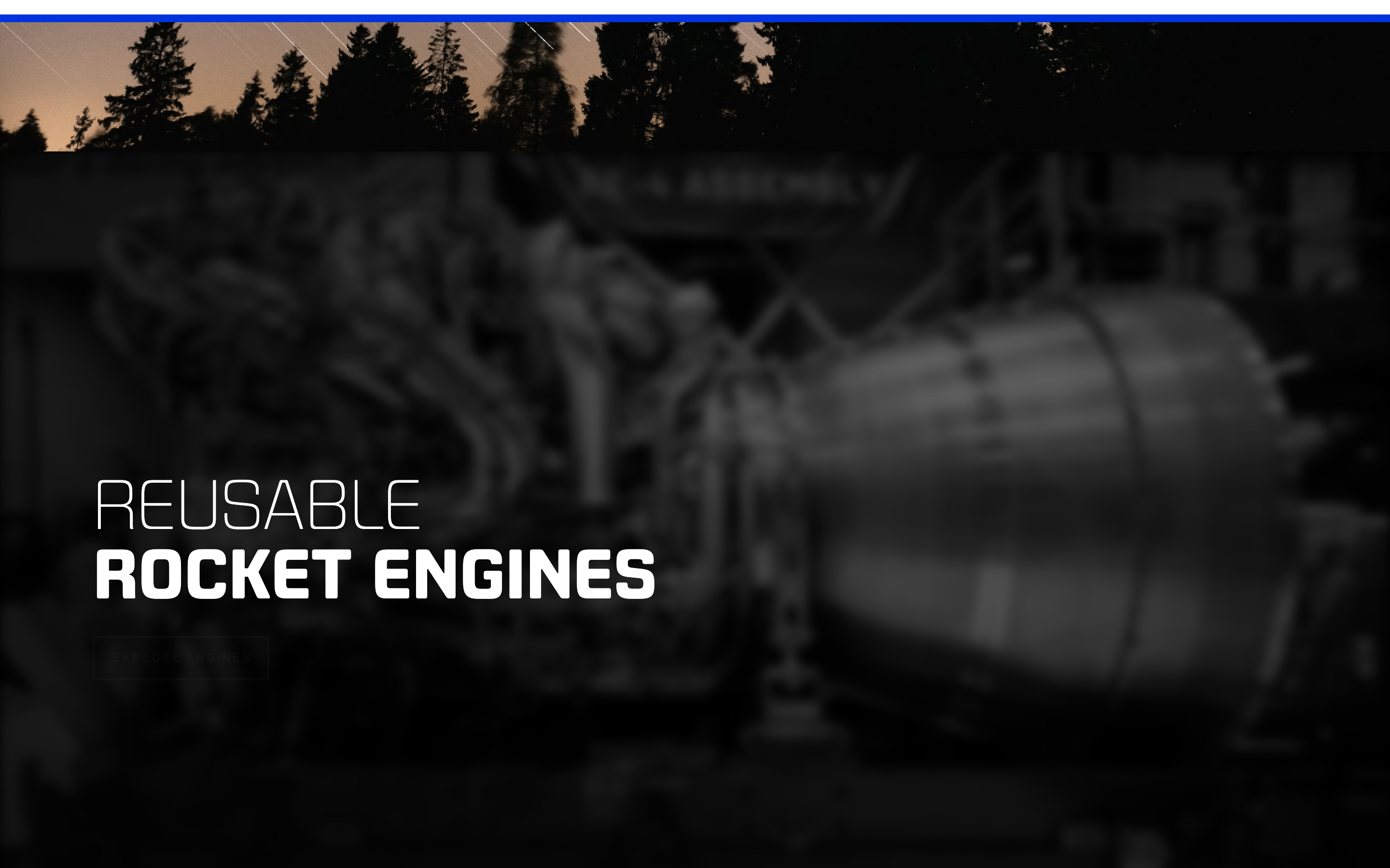
heroFull-viewport photographic or video background with large-scale typography and a single CTA.
09
Voice & Don'ts
ToneInspirational, authoritative, and forward-looking.
HeadlinesMonumental, uppercase, and direct, emphasizing core missions and technical capabilities.
CTAsAction-oriented and concise, such as 'OUR MISSION' or 'EXPLORE ENGINES'.
Don't use centered text layouts for primary mission statements — the screenshot shows them left-aligned to maintain a strong architectural base.
Don't use a white background for primary sections — the screenshot shows black or deep dark backgrounds to enhance the space theme.
Don't use thin, decorative fonts for headlines — the screenshot shows bold, geometric sans-serif typefaces.
Don't use rounded UI elements for primary buttons — the screenshot shows sharp or slightly rounded (2-4px) rectangular buttons.
Don't use a variety of accent colors — the screenshot shows a strict black-white-blue palette.
Don't use small, cramped typography — the screenshot shows large, well-spaced display fonts for maximum impact.
Avoid: Avoid casual or conversational language.
Avoid: Avoid cluttered layouts that distract from the primary imagery.
Avoid: Avoid low-contrast text that compromises the cinematic feel.
Avoid: Avoid decorative elements that do not serve a functional or atmospheric purpose.
Avoid: Avoid using multiple font families within a single view.
Avoid: Avoid using rounded, playful UI elements that clash with the technical theme.
Captured from the live site · real computed styles
11
System prompt
This is a high-end, cinematic website for an aerospace company. The design DNA is built around dramatic, full-bleed photographic sections and monumental, uppercase typography. The color palette is strictly limited to deep black (#000000), a vibrant corporate blue (#0033DD), and pure white (#FFFFFF) for high contrast. Typography uses a bold geometric sans-serif for display and a clean humanist sans-serif for body text. Critical rules: never use a white background for primary sections, always use wide letter-spacing for uppercase headlines, and never use multiple font families or decorative flourishes. The layout is expansive, prioritizing atmospheric imagery over dense text. Interaction is refined, with smooth transitions and ghost-style buttons.
Bring this taste to your agent
Hand your AI agent a machine-readable spec of this design — tokens, type, motion, the whole DNA.