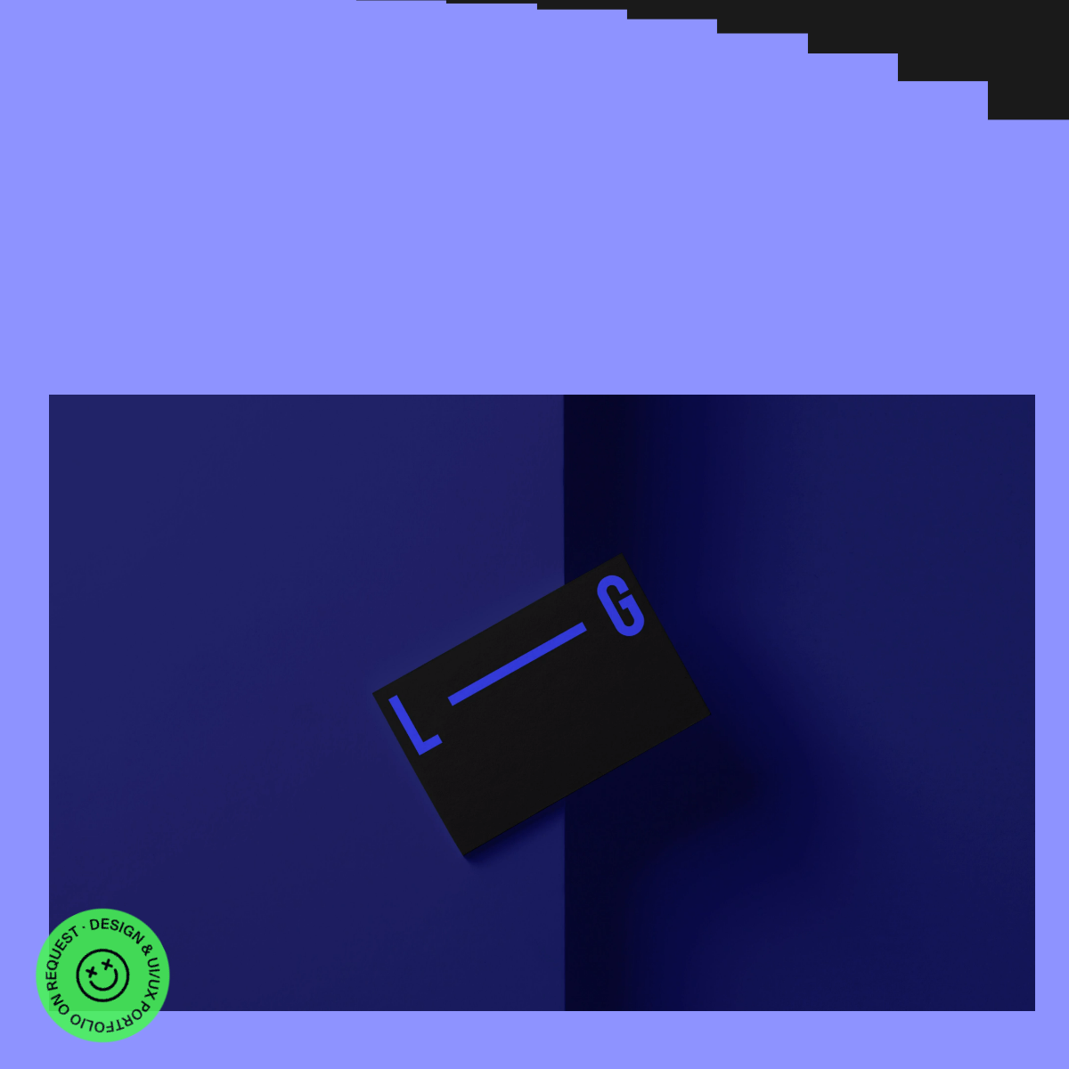
Don't use serif typography — screenshot shows geometric sans-serif instead.
Don't use busy patterns — screenshot shows solid color blocks instead.
Don't use centered text alignment — screenshot shows left-aligned logo mark instead.
Don't use subtle background gradients — screenshot shows flat, high-contrast color fields instead.
Avoid: Traditional grid layouts
Avoid: Standard navigation menus
Avoid: Overly explanatory text
11
System prompt
This is an experimental design portfolio website with a bold, artistic identity. The design uses a striking palette of vibrant lavender (#7B7BFF) against deep midnight blues (#0D0D1A, #1A1A3D). Typography is minimal and geometric, serving the 3D composition. Key critical donts: avoid soft shadows, rounded corners, and traditional grid layouts. The site prioritizes visual impact over conventional usability, using dramatic 3D compositions and bold color blocking. Interactive elements are playful, like the circular green badge. The overall approach is experimental and challenges typical web design conventions.
Bring this taste to your agent
Hand your AI agent a machine-readable spec of this design — tokens, type, motion, the whole DNA.