CURATED · OPEN · FREE
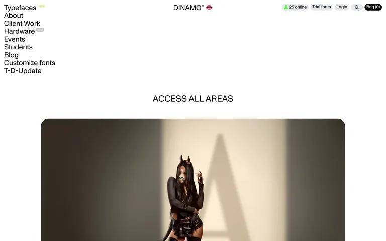
An excellent reference for balancing heavy typographic presence with generous whitespace and editorial photography.
 Open in OpenDesign
A minimalist, high-contrast palette dominated by stark white and deep black, with a single vibrant yellow accent.
An asymmetric, split layout featuring a persistent left-aligned navigation sidebar and a central content area for large editorial imagery.
Smooth, unified transitions using custom cubic-bezier curves for page loads and micro-interactions.
Subtle fades and background shifts that emphasize content without distracting from the typography.