CURATED · OPEN · FREE
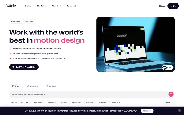
The site is a prime example of a gallery-style SaaS platform that uses a neutral UI to highlight its primary content: visual design.
 Open in OpenDesign
A clean, light-mode palette centered on white (#FFFFFF) and soft grays (#FAF9FB) with a deep ink (#0D0C22) for text and a signature pink accent (#E94B84).
A 12-column responsive grid with a 1280px container, featuring generous whitespace and a split hero layout on desktop.
Subtle hover effects on cards and smooth transitions for buttons and inputs, emphasizing a polished and responsive feel.
Fast, micro-interactions for UI feedback and a smooth 0.5s transition for larger state changes.