A prestigious global architecture studio presenting a visual portfolio.
02
Color
#FFFFFFInk
#1A1A1ABG
#333333BG soft
#F5F5F5BG quiet
rgba(255, 255, 255, 0.15)Line
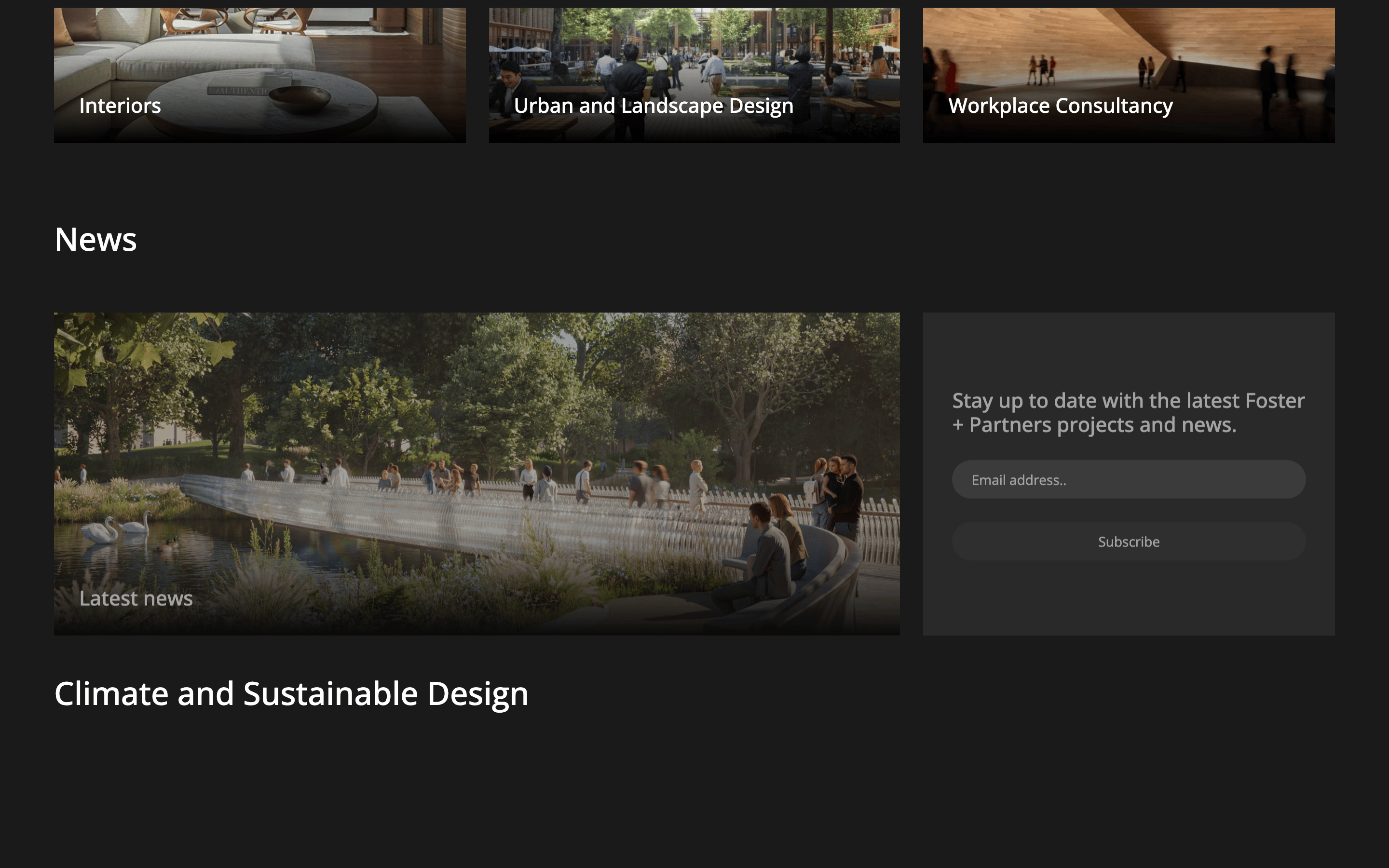
Monochromatic dark UI with high-contrast white typography that recedes to let architectural photography dominate.
03
Typography
humanist-sans
display48px · 500
heading33px · 500
body16px · 400
Headlines use sentence case to maintain a quiet, elegant tone. · Text is predominantly white to ensure readability over dark backgrounds. · Minimal variation in font weight keeps the interface uncluttered.
04
Spacing
4px
8px
16px
24px
32px
48px
64px
96px
Generous whitespace creates a calm, museum-like browsing experience.
05
Surfaces
sm · 2px
md · 4px
lg · 8px
pill · 25px
Thin, semi-transparent white borders are used for subtle separation.
rgb(128, 128, 128) 0px 0px 5px 0px
06
Layout
1280container
12columns
24pxgutter
768 / 1024breakpoints
Asymmetric grid layout that prioritizes large, immersive imagery.
07
Motion & Interaction
150msmicro
400mssmall
500msmedium
cubic-bezier(0.25, 0.25, 0.75, 0.75)easing
Smooth crossfades for hero image transitions. · Opacity and transform changes on interactive elements.
Subtle changes in text color or background opacity. · Immediate navigation or state change.
08
Components
buttonMinimalist pill-shaped buttons with subtle background transparency.
cardImage-heavy grid items with text overlays, often using gradient fades for legibility.
chipSmall, rounded labels for categories.
inputMinimal, borderless search field integrated into the header.
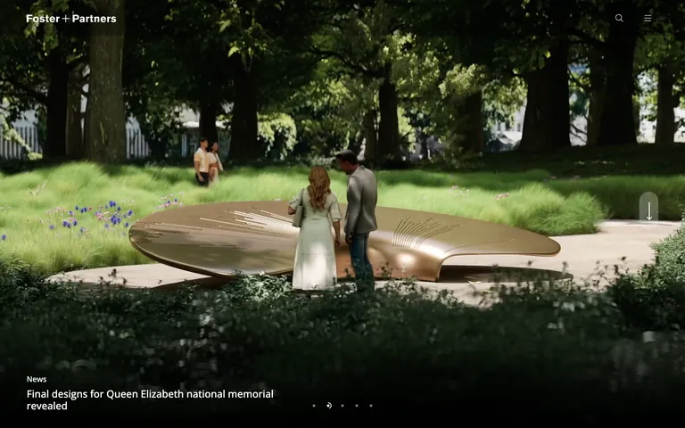
heroFull-viewport photographic slideshow with text anchored at the bottom.
09
Voice & Don'ts
ToneAuthoritative, elegant, and understated.
HeadlinesDirect, factual, and sentence-case.
CTAsClean and functional, often integrated as icons or small pill buttons.
Don't use bright or neon accent colors — screenshot shows a strict monochromatic palette.
Don't use decorative serif fonts — screenshot uses a clean humanist-sans-serif throughout.
Don't overcrowd the UI with UI chrome — screenshot lets the architecture photography dominate.
Don't use hard box shadows or 3D effects — screenshot relies on flat surfaces and subtle transparency.
Don't use all-caps headlines — screenshot predominantly uses sentence case for a refined tone.
Don't use a rigid, uniform grid — screenshot shows an asymmetric layout emphasizing visual hierarchy.
Captured from the live site · real computed styles
11
System prompt
This is a high-end architectural studio portfolio. The design DNA is defined by a minimalist, photography-driven approach with a strict monochromatic dark palette (#1A1A1A bg, #FFFFFF ink, #333333 muted). Typography relies on a clean humanist-sans-serif (Open Sans) to provide a neutral, elegant voice. Layout is asymmetric, prioritizing full-bleed imagery and generous whitespace to evoke a gallery-like experience. Interactions are subtle, using soft opacity and color transitions. Key donts: never introduce high-chroma accent colors, avoid decorative serifs, do not overcrowd the UI with interface elements, avoid heavy shadows, use sentence case for headlines, and maintain an asymmetric layout. The system should feel like a prestigious, calm, and visually-led architectural archive.
Bring this taste to your agent
Hand your AI agent a machine-readable spec of this design — tokens, type, motion, the whole DNA.