CURATED · OPEN · FREE
Glean
Enterprise AI search and assistant platform.
ai search
01
Identity DNA
enterprise AI search productivity connectors
A polished, high-trust enterprise AI platform that feels professional yet modern.
02
Color
#343CEDAccent
#333333Ink
#FFFFFFBG
#FDFEFEBG soft
#D2D4FBBG quiet
rgba(52,60,237,0.2)Line
Clean white base with high-chroma electric blue accents and soft pastel gradients.
03
Typography
geometric-sans · humanist-sans · monospace
display 48px · 400h1 48px · 700body 18px · 400body 16px · 400Use neutral sans-serif for all primary text. · Use slim geometric sans for occasional display emphasis. · Use monospace only for technical labels.
04
Spacing
4px
8px
16px
24px
32px
48px
64px
96px
4px base grid.
05
Surfaces
sm · 6px
md · 8px
lg · 20px
pill · 64px
1px solid #333333
rgba(52, 60, 237, 0.2) 0px 0px 17px 0px · rgba(0, 0, 0, 0.03) 0px 8px 10px 0px
06
Layout
1280 container
12 columns
24px gutter
768 / 1024 breakpoints
12-column grid.
07
Motion & Interaction
220ms micro
300ms small
400ms medium
cubic-bezier(0.25, 0.1, 0.25, 1.0) easing
Opacity fade for UI state changes. · Ease-in-out transitions for interactive elements.
Subtle scale or color shift on buttons. · Immediate feedback via transition.
08
Components
button Primary uses filled blue with pill border-radius; secondary uses outline or text. card White cards with subtle borders and rounded corners. chip Small badges with rounded corners and subtle background colors. input Clean white inputs with subtle borders. hero Split layout with large typography on the left and 3D/illustrative elements on the right.
09
Voice & Don'ts
Tone Professional, helpful, and confident. Headlines Short, punchy, and descriptive. CTAs Direct and action-oriented (e.g., 'Get a demo'). don't use pure black for text — screenshot shows #333333 instead don't use sharp corners — screenshot shows border-radius of 20px instead don't use static flat backgrounds — screenshot shows soft pastel gradients instead don't use small tight typography — screenshot shows large 48px display sizes instead don't use neon or highly saturated secondary colors — screenshot shows muted #D2D4FB instead don't use ornate or serif fonts — screenshot shows clean geometric/humanist sans-serif instead Avoid: Slang Avoid: Jargon Avoid: Aggressive sales language
10
Inside the pack — real screenshots
桌面首屏(hero) 桌面滚动分段(90% viewport 步进,作为视觉证据) 桌面滚动分段(90% viewport 步进,作为视觉证据) 桌面滚动分段(90% viewport 步进,作为视觉证据) 桌面滚动分段(90% viewport 步进,作为视觉证据) 桌面滚动分段(90% viewport 步进,作为视觉证据) 桌面滚动分段(90% viewport 步进,作为视觉证据) 桌面滚动分段(90% viewport 步进,作为视觉证据) 桌面滚动分段(90% viewport 步进,作为视觉证据) 桌面滚动分段(90% viewport 步进,作为视觉证据) 桌面滚动分段(90% viewport 步进,作为视觉证据) 桌面滚动分段(90% viewport 步进,作为视觉证据) 桌面滚动分段(90% viewport 步进,作为视觉证据) 移动首屏 Captured from the live site · real computed styles
11
System prompt
Glean is an enterprise AI search and assistant platform with a polished, high-trust design. The visual system relies on a clean white base (#FFFFFF) contrasted with a high-chroma electric blue accent (#343CED) and soft pastel gradients. Typography utilizes clean, professional sans-serif categories (geometric and humanist) with large display sizes up to 48px to convey authority and clarity. The layout is structured, spacious, and uses a 12-column grid with 20px border-radius on major components. Critical constraints: Do not use pure black (#000000) for text, use #333333 instead. Do not use sharp corners, maintain the rounded, friendly aesthetic. Do not use heavy or decorative serif fonts.
en · zh-CN · zh-TW · ja · ko
OpenDesign · curated web aesthetics for AI-readable design DNA · opendesign.cc
Why we curated this: 
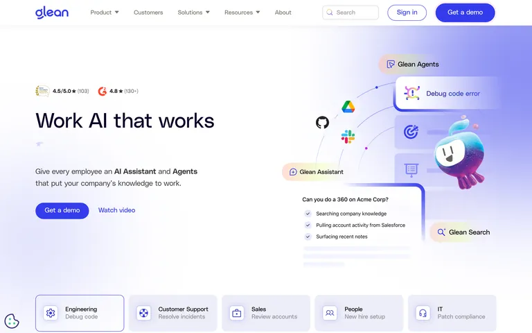
The site exemplifies a modern, premium SaaS aesthetic, balancing technical authority with an approachable, friendly UI through rounded corners and soft gradients.