CURATED · OPEN · FREE
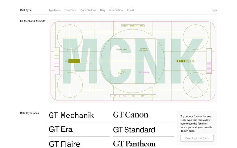
The site serves as a masterclass in restraint, using a minimalist framework to let the typography products themselves be the primary visual focus.
 Open in OpenDesign
A strict monochrome palette consisting of white (#FFFFFF), black (#000000), and neutral gray (#8C8C8C), with vibrant colors appearing only in featured project imagery.
A highly structured, left-aligned grid system with clear separation between labels and content, reminiscent of Swiss editorial design.
Minimal and subtle interactions, primarily relying on a uniform 0.1s ease-out transition for pointer-based hover states.
Very fast, utilitarian micro-interactions designed to feel responsive without drawing attention to the animation itself.