CURATED · OPEN · FREE
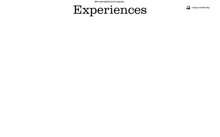
This site is an excellent example of how a restrictive color palette combined with strong typography can create a highly memorable and premium brand identity for a creative studio.
 Open in OpenDesign
A stark, high-contrast monochrome palette centered on black and white, utilizing a warm off-white for subtle background variation and a single playful pink accent for specific highlights.
The layout is expansive and grid-based, characterized by massive typography, generous vertical white space, and clear, thin horizontal dividers.
Interactions are refined and subtle, primarily involving smooth opacity transitions and simple text underlines on hover, maintaining the site's calm and professional demeanor.
Motion is used sparingly and elegantly, primarily for smooth fade-in reveals of content blocks and subtle state changes.