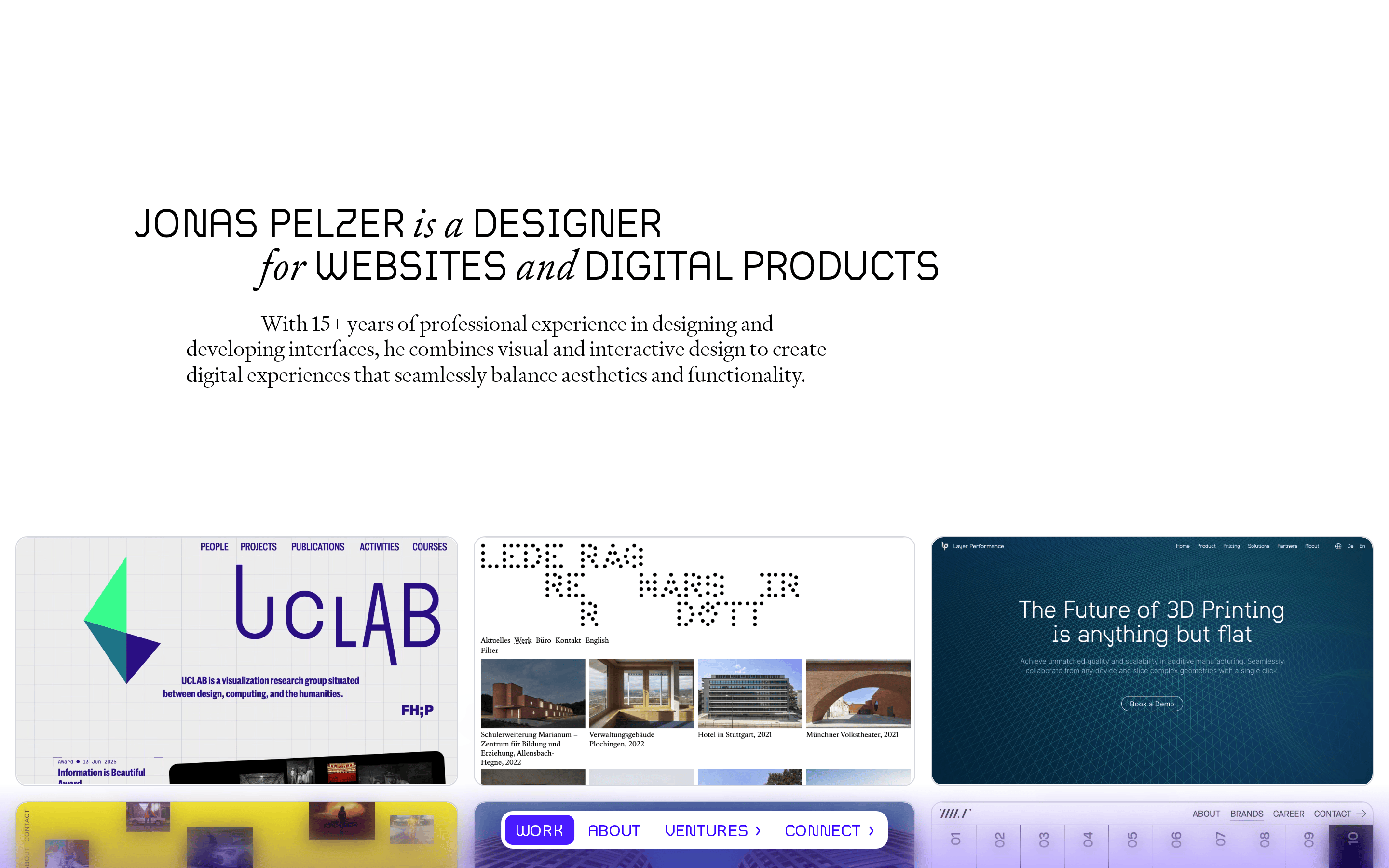
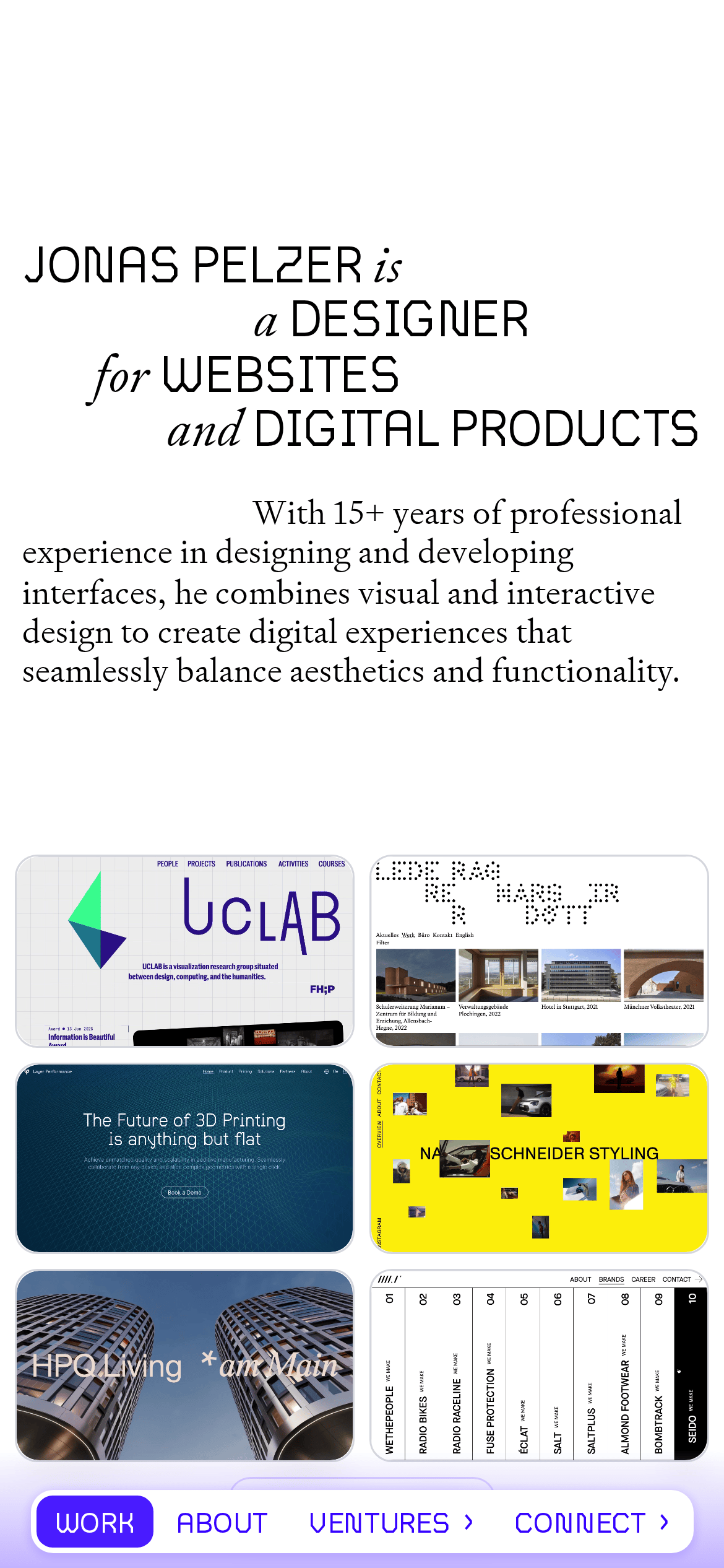
DesignerDigital ProductsWebsitesJonas Pelzer15+ years
A refined digital portfolio acting as a living case study catalog.
02
Color
#3502FFAccent
#000000Ink
#FFFFFFBG
rgba(0, 0, 0, 0.1)Line
High-contrast black and white foundation with a singular, high-chroma purple accent.
03
Typography
geometric-sans · transitional-serif
display56px · 400
Mix geometric sans and transitional serif within the same headline block for rhythmic contrast. · Use generous line-height and tracking for elegant readability. · Favor all-caps for primary navigation and category labels.
04
Spacing
4px
8px
16px
24px
32px
48px
64px
96px
Generous vertical padding and white space to let the typography and projects breathe.
05
Surfaces
sm · 4px
md · 8px
lg · 12px
pill · 999px
1px solid #000000 for sharp boundaries; 1px solid rgb(212, 214, 221) for subtle divisions.
0px 1px 4px 2px rgba(53, 2, 255, 0.1)
06
Layout
1280container
12columns
24pxgutter
768 / 1024breakpoints
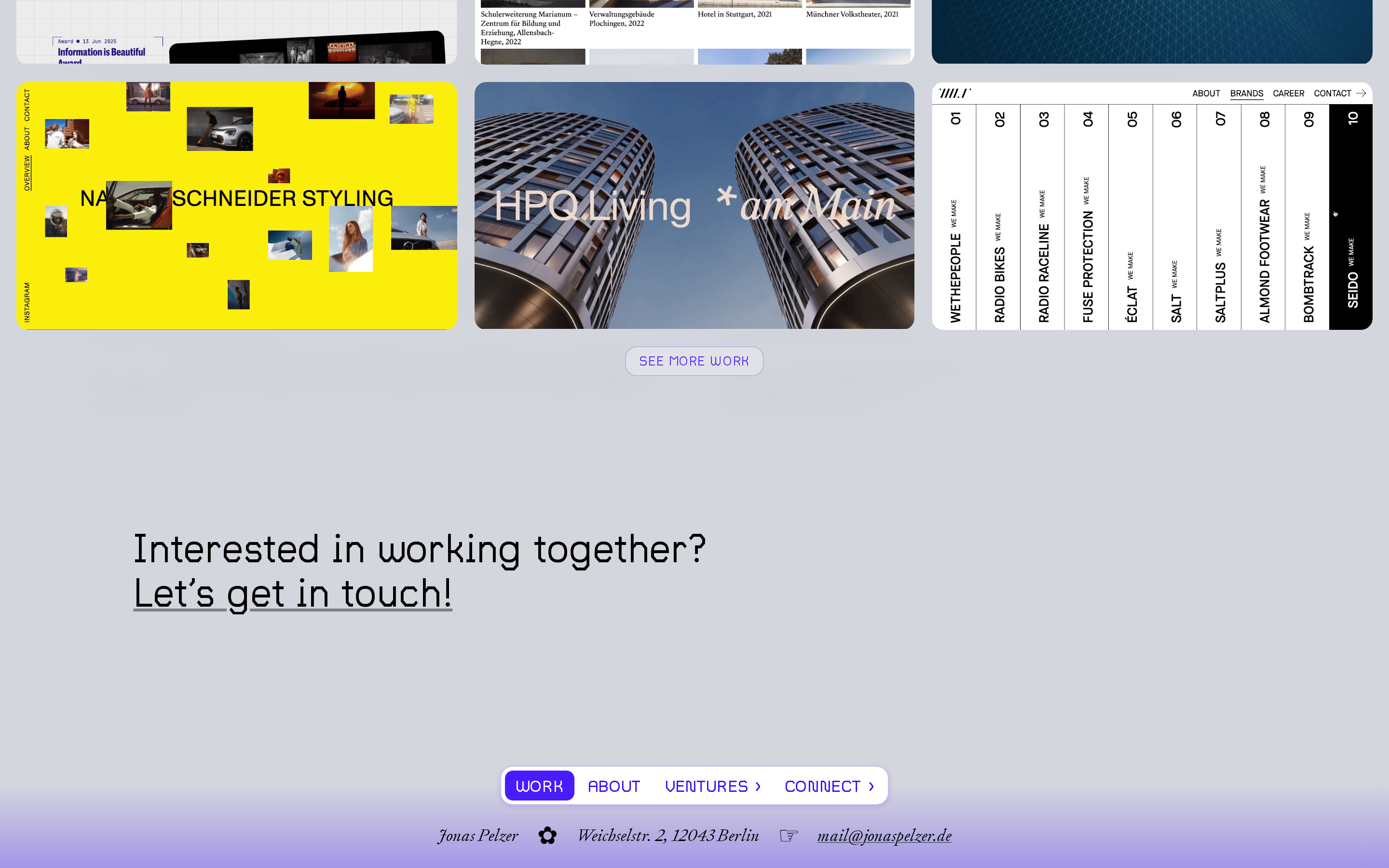
Centered hero section followed by a 3-column grid of project cards.
07
Motion & Interaction
220msmicro
400mssmall
800msmedium
cubic-bezier(0.22, 1, 0.36, 1)easing
Smooth page transitions and hover states on project cards. · Subtle scaling or translation on project thumbnails.
Subtle scale or shadow change on project cards and navigation items. · Immediate visual feedback on interactive elements.
08
Components
buttonPill-shaped navigation bar with solid purple background for active state.
cardProject thumbnails with rounded corners (12px) and subtle shadow or border.
heroLarge typographic lockup mixing sans and serif with generous white space above.
09
Voice & Don'ts
ToneProfessional, confident, and experienced.
HeadlinesDirect, declarative, and typographically expressive.
CTAsClear, action-oriented, often presented in all-caps within the navigation.
Don't use a serif font for primary navigation — screenshot shows uppercase sans-serif labels.
Don't use a bright or multi-color palette — screenshot shows a strict black, white, and purple scheme.
Don't center all content — screenshot shows left-aligned hero text and a structured grid.
Don't use heavy drop shadows — screenshot shows only one instance of a subtle purple box-shadow.
Don't use complex or decorative UI components — screenshot shows a minimal, text-driven interface.
Don't use a dark mode interface — screenshot shows a bright, light-background design.
Avoid: Avoid overly casual or playful language.
Avoid: Avoid dense blocks of text without clear hierarchy.
Captured from the live site · real computed styles
11
System prompt
This is a refined, typography-driven design portfolio for a senior digital designer. The palette is a high-contrast foundation of black (#000000) and white (#FFFFFF) with a single, vibrant purple accent (#3502FF). Typography is a sophisticated mix of geometric sans and transitional serif categories. Layout is centered and spacious with generous white space. Key donts: avoid colorful gradients, avoid using serif for navigation, and avoid cluttered layouts. The voice is professional and experienced, using direct, declarative headlines.
Bring this taste to your agent
Hand your AI agent a machine-readable spec of this design — tokens, type, motion, the whole DNA.