← OpenDesign CURATED · OPEN · FREE
Kevin Tw
A playful, hand-drawn personal portfolio site that mimics a physical notebook.
Playful Portfolio Expressive Mobile UI
01
Identity DNA
hand-drawn notebook sketchy personal playful
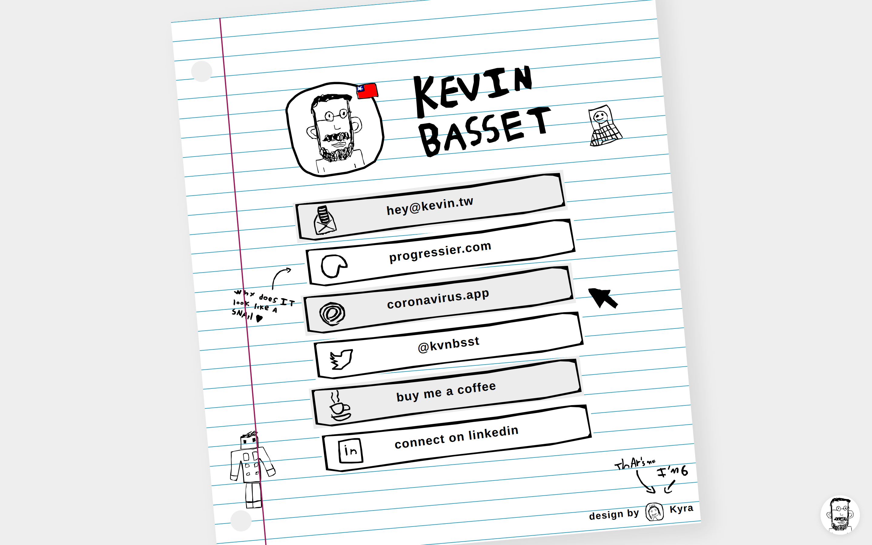
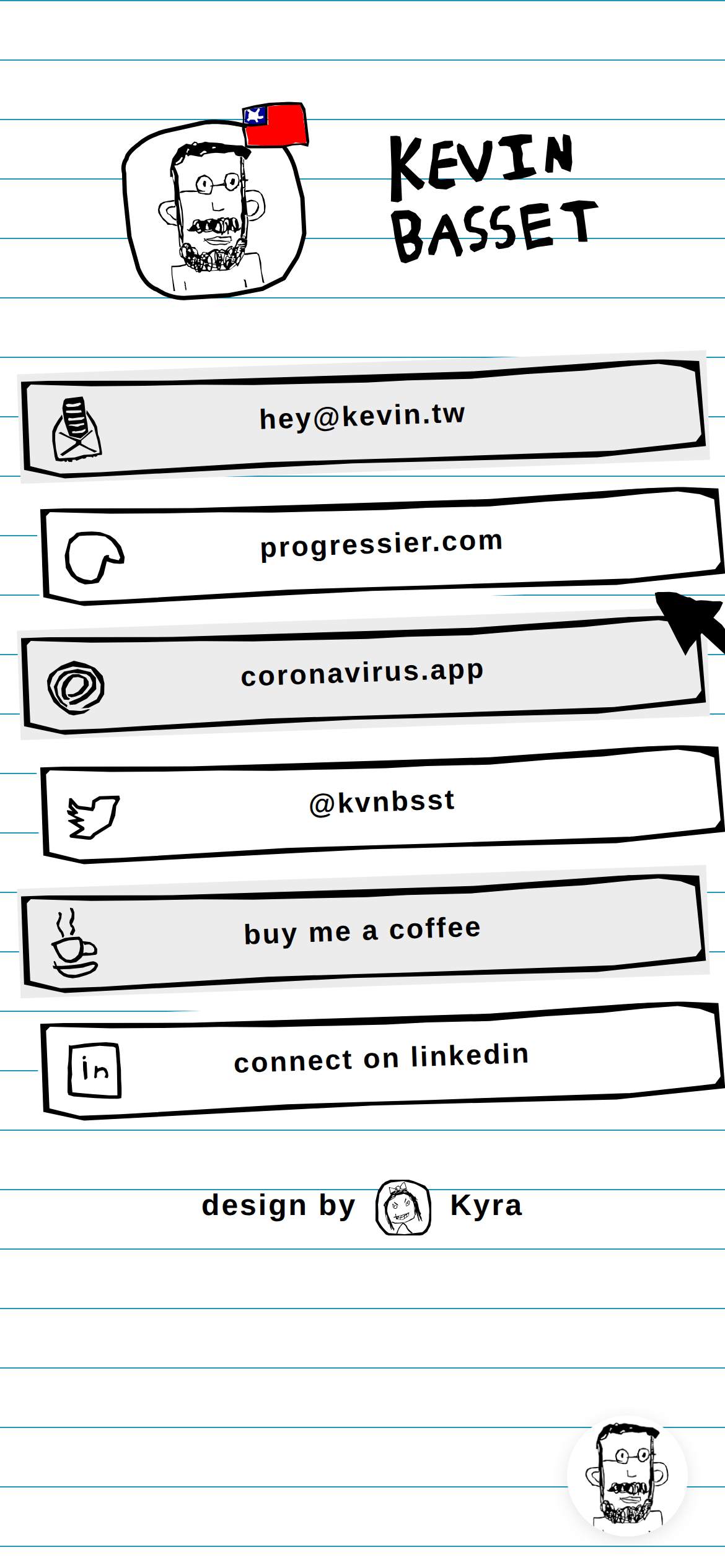
A hand-drawn, interactive paper notebook used as a personal link-in-bio page.
02
Color
#D93025Accent
#000000Ink
#FFFFFFBG
#ECECECBG soft
rgba(0,0,0,1.0)Line
High-contrast, monochrome sketch style with minimal, deliberate color accents.
03
Typography
humanist-sans
display 50px · 700body 20px · 600Text uses standard system fonts but styled with heavy tracking and weights to mimic bold marker strokes.
04
Spacing
4px
8px
16px
24px
32px
48px
64px
96px
100px
Layout is constrained by a rigid vertical stack of link elements, spaced evenly.
05
Surfaces
sm · 4px
md · 8px
lg · 12px
pill · 50px
2px solid black with slightly irregular, hand-drawn styling.
0px 2px 9px 0px rgba(82, 79, 79, 0.15) · 15px 15px 33px 0px rgba(27, 27, 27, 0.1)
06
Layout
1280 container
1 columns
24px gutter
768 / 1024 breakpoints
A single centered vertical column of interactive elements, offset on a background that resembles a sheet of lined paper.
07
Motion & Interaction
220ms micro
400ms small
800ms medium
cubic-bezier(0.25, 0.1, 0.25, 1) easing
Smooth transitions on hover for the interactive link buttons.
Subtle visual feedback on the hand-drawn link buttons, likely a slight color change or translation. · Standard link navigation behavior.
08
Components
button Hand-drawn rectangular outlines with thick black borders and white/light gray fills, featuring a left-aligned sketchy icon and centered text. card The entire notebook page acts as a large card with a subtle paper shadow effect. chip None visible. input None visible. hero A simple layout containing a circular hand-drawn avatar and a large, bold, hand-written name. 09
Voice & Don'ts
Tone Playful, personal, and approachable. Headlines Bold, hand-written, and expressive. CTAs Casual and conversational, presented as simple links. Don't use perfectly straight, geometric lines — the screenshot shows slightly wobbly, hand-drawn borders. Don't use corporate, polished typography — the screenshot shows bold, hand-written style headers. Don't use a complex color palette — the screenshot is primarily monochrome with minimal red/blue accents. Don't use heavy, realistic drop shadows — the screenshot shows a subtle paper lift effect. Don't use standard, uniform icons — the screenshot features custom, sketchy, hand-drawn icons. Don't use standard rounded UI components — the screenshot shows irregular, sketched rectangles. Avoid: Formal corporate language Avoid: Overly complex UI patterns Avoid: Strict grid layouts 10
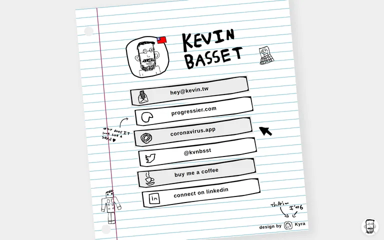
Inside the pack — real screenshots
桌面首屏(hero) 桌面滚动分段(90% viewport 步进,作为视觉证据) 桌面滚动分段(90% viewport 步进,作为视觉证据) 移动首屏 Captured from the live site · real computed styles
11
System prompt
This is a playful personal portfolio site that uses a hand-drawn notebook aesthetic. The design relies on a strict monochrome palette with a bright white background (#FFFFFF) and deep black ink (#000000), accented by a single touch of red (#D93025) for the flag icon. Typography is bold and humanist-sans, using heavy weights and wide letter-spacing to mimic a thick marker. The layout is a simple, centered vertical column of sketchy link buttons. Key constraints: Avoid straight geometric lines in favor of slightly wobbly, hand-drawn borders; avoid polished, corporate UI elements; avoid complex color gradients; avoid realistic 3D effects in favor of subtle paper shadows; avoid perfectly uniform icons; avoid formal, rigid grid layouts.
More from the library en · zh-CN · zh-TW · ja · ko
OpenDesign · curated web aesthetics for AI-readable design DNA · opendesign.cc
Why we curated this: This site is worth including as a prime example of a skeuomorphic, hand-drawn UI that uses deliberate imperfection to create a highly personal and memorable brand identity.