CURATED · OPEN · FREE
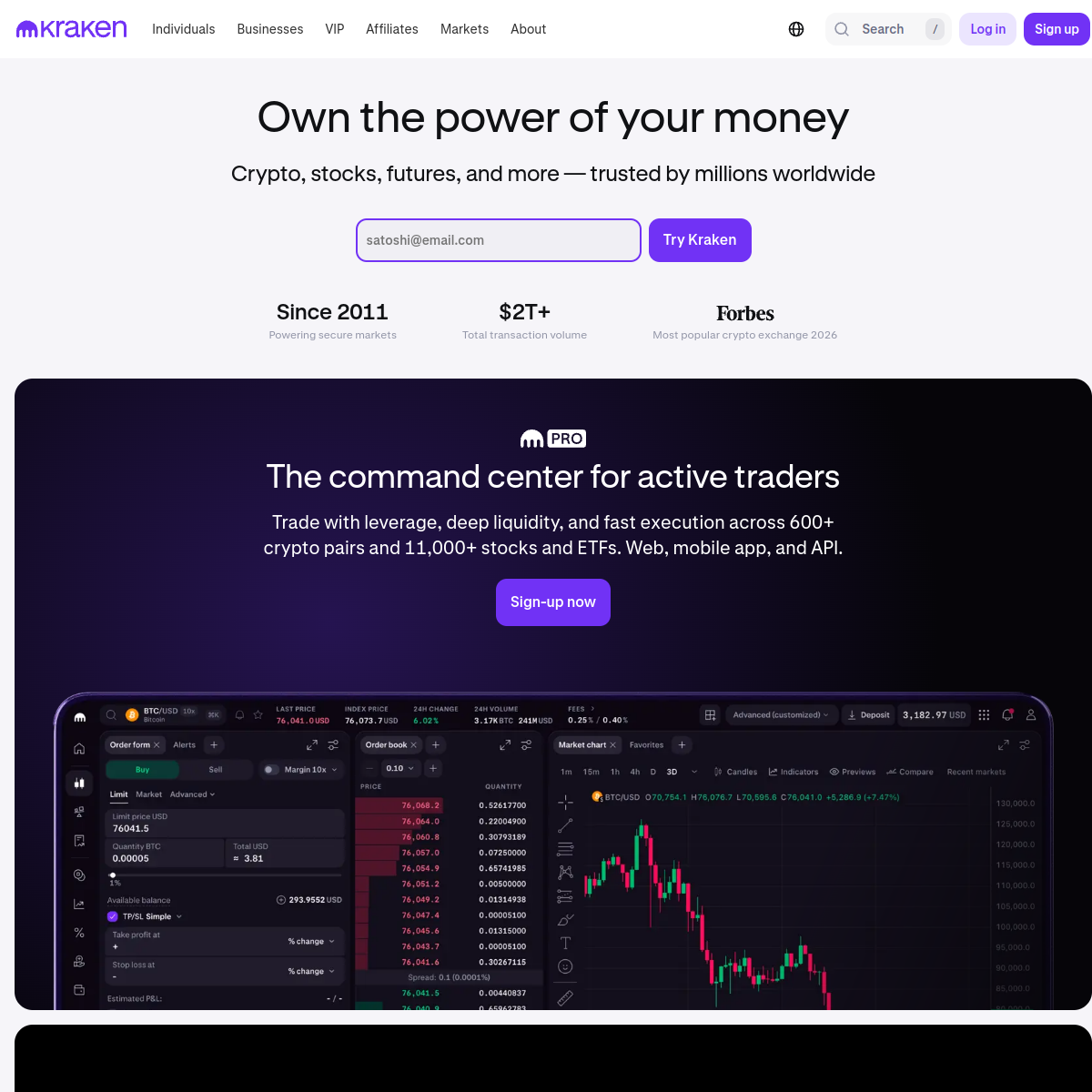
This site is a prime example of modern fintech design, balancing professional credibility with a strong, memorable brand identity.
 Open in OpenDesign
A high-contrast palette of white, black, and dark gray, accented with a vibrant purple for key interactive elements.
A clean, single-column layout with generous spacing that transitions into a dark, full-width section to highlight the advanced trading platform.
Subtle hover effects and transitions on buttons and links provide feedback without being distracting.
Minimal and purposeful animations are used to guide the user's attention and add polish.