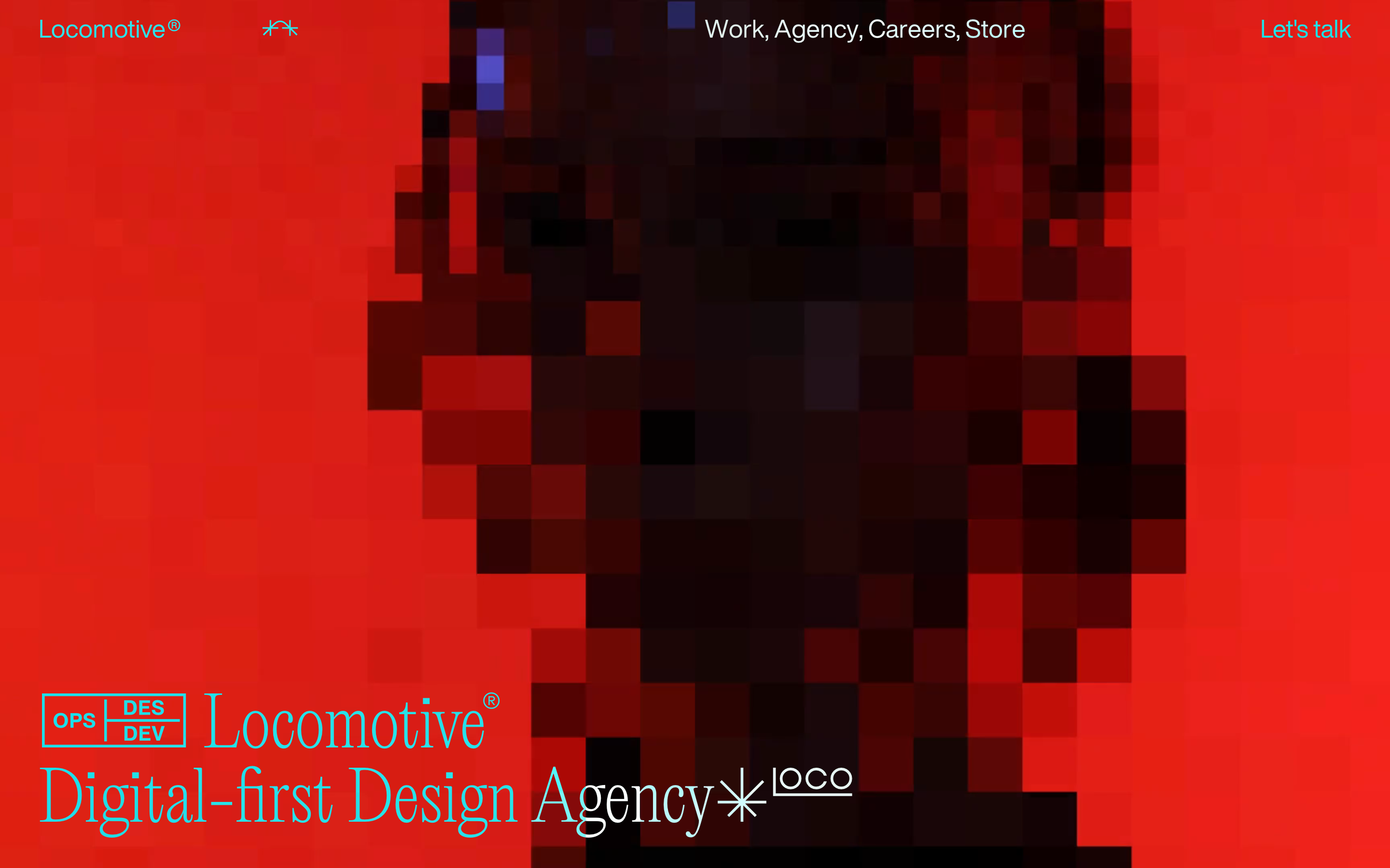
A premium design studio balancing editorial elegance with bold technical precision.
02
Color
#E05F15Accent
#000000Ink
#FFFFFFBG
rgba(0,0,0,1.0)Line
High-contrast palette using stark black and white, punctuated by a single high-chroma orange accent.
03
Typography
didone-serif · grotesque-sans
display110px · 400
headline70px · 400
body26px · 400
caption15px · 400
04
Spacing
4px
8px
16px
24px
32px
48px
64px
96px
Open and spacious layout with generous padding (40px vertical) and consistent gaps (20px) between elements.
05
Surfaces
sm · 0px
md · 0px
lg · 0px
pill · 0px
Minimal but precise 2px solid borders used for separators and structured labels.
06
Layout
1920container
12columns
24pxgutter
768 / 1024breakpoints
Asymmetric grid layout with a strong emphasis on large hero imagery and text overlapping visual elements.
07
Motion & Interaction
150msmicro
200mssmall
300msmedium
cubic-bezier(0.215, 0.61, 0.355, 1)easing
Smooth transitions for opacity and background-color changes on hover. · Precise, fast transforms for interactive UI elements. · Immersive, likely complex canvas or WebGL effects for background imagery.
Subtle opacity or background-color changes with precise easing curves. · Immediate feedback via transform or opacity shifts.
08
Components
buttonText-based navigation links with subtle directional arrows or custom typography, no traditional button styling.
cardMinimal or non-existent in the hero; relies on large, immersive imagery instead of contained cards.
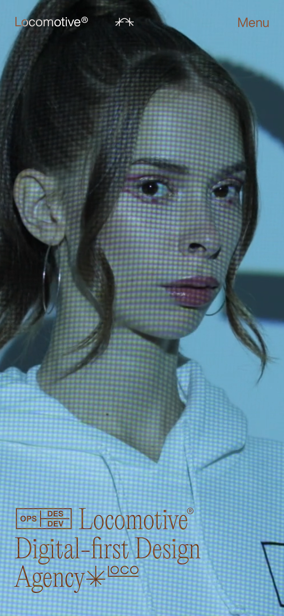
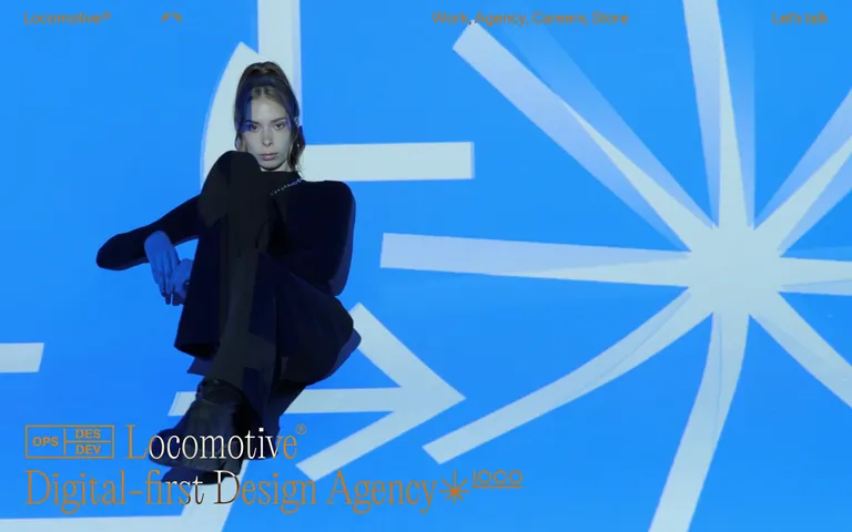
heroFull-bleed or dominant photographic/video background with overlapping large-scale serif typography.
09
Voice & Don'ts
ToneProfessional, innovative, and confident, with a touch of playfulness.
HeadlinesBold, large-scale serif typography that feels editorial and premium.
CTAsSubtle, text-focused calls to action integrated naturally into the navigation or layout.
Don't use rounded corners on any elements — the screenshot shows sharp, 0px radius boxes and cards.
Don't use drop shadows or complex depth effects — the screenshot relies on pure typography and color contrast.
Don't use a multi-color palette — the screenshot is strictly black, white, and one orange accent.
Don't use small, condensed typography for headlines — the screenshot features massive, 110px scale display text.
Don't use standard, heavy button components — the screenshot uses text links and subtle borders for interactions.
Don't use busy backgrounds behind text — the screenshot uses high-contrast solid backgrounds or clean imagery.
Avoid: Avoid casual or overly friendly language.
Avoid: Avoid complex gradients or drop shadows.
Avoid: Avoid cluttered layouts or excessive UI components.
Captured from the live site · real computed styles
11
System prompt
Locomotive is a premium digital-first design agency whose visual identity is defined by massive didone-serif display typography, a high-contrast monochrome palette (black #000000 and white #FFFFFF), and a single vibrant orange accent (#E05F15). The layout relies on bold typography (up to 110px) and generous whitespace. Interactions are subtle, using opacity and background-color transitions with precise cubic-bezier easing. Key constraints: avoid rounded corners (keep radius at 0px), avoid drop shadows, and never use heavy, traditional button components. The system emphasizes a clean, editorial, and highly expressive aesthetic that prioritizes large-scale imagery and typography over complex UI widgets.
Bring this taste to your agent
Hand your AI agent a machine-readable spec of this design — tokens, type, motion, the whole DNA.