CURATED · OPEN · FREE
Worth including as a prime example of balancing bold branding with high-functionality e-commerce design.
 Open in OpenDesign
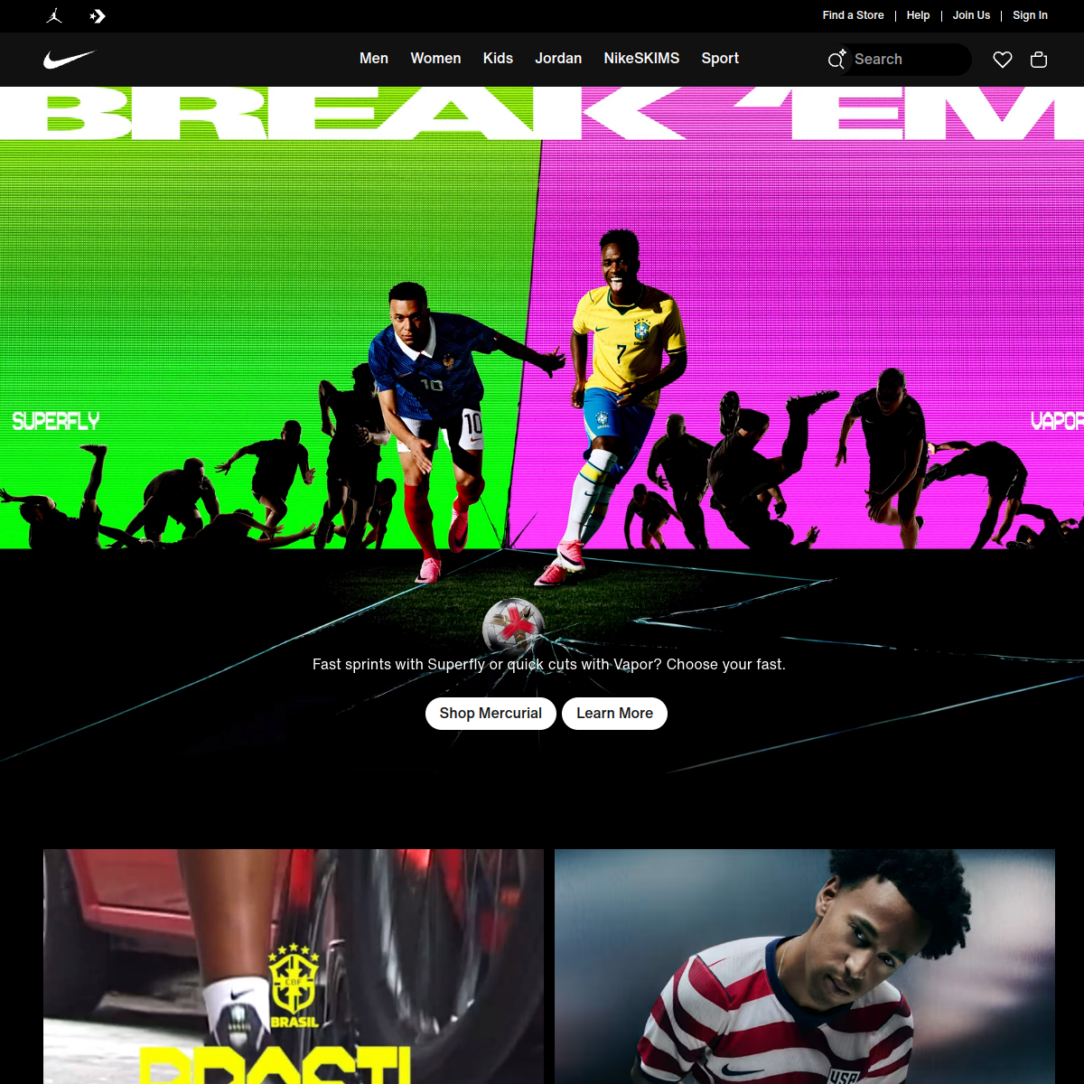
A high-contrast palette dominated by black and white, allowing vibrant product photography to dictate the color story.
Full-bleed imagery and spacious, grid-based sections create a powerful, editorial feel.
Focuses on clear, immediate visual feedback through subtle color shifts and smooth transitions.
Utilizes smooth, functional transitions to guide the user experience without distraction.