CURATED · OPEN · FREE
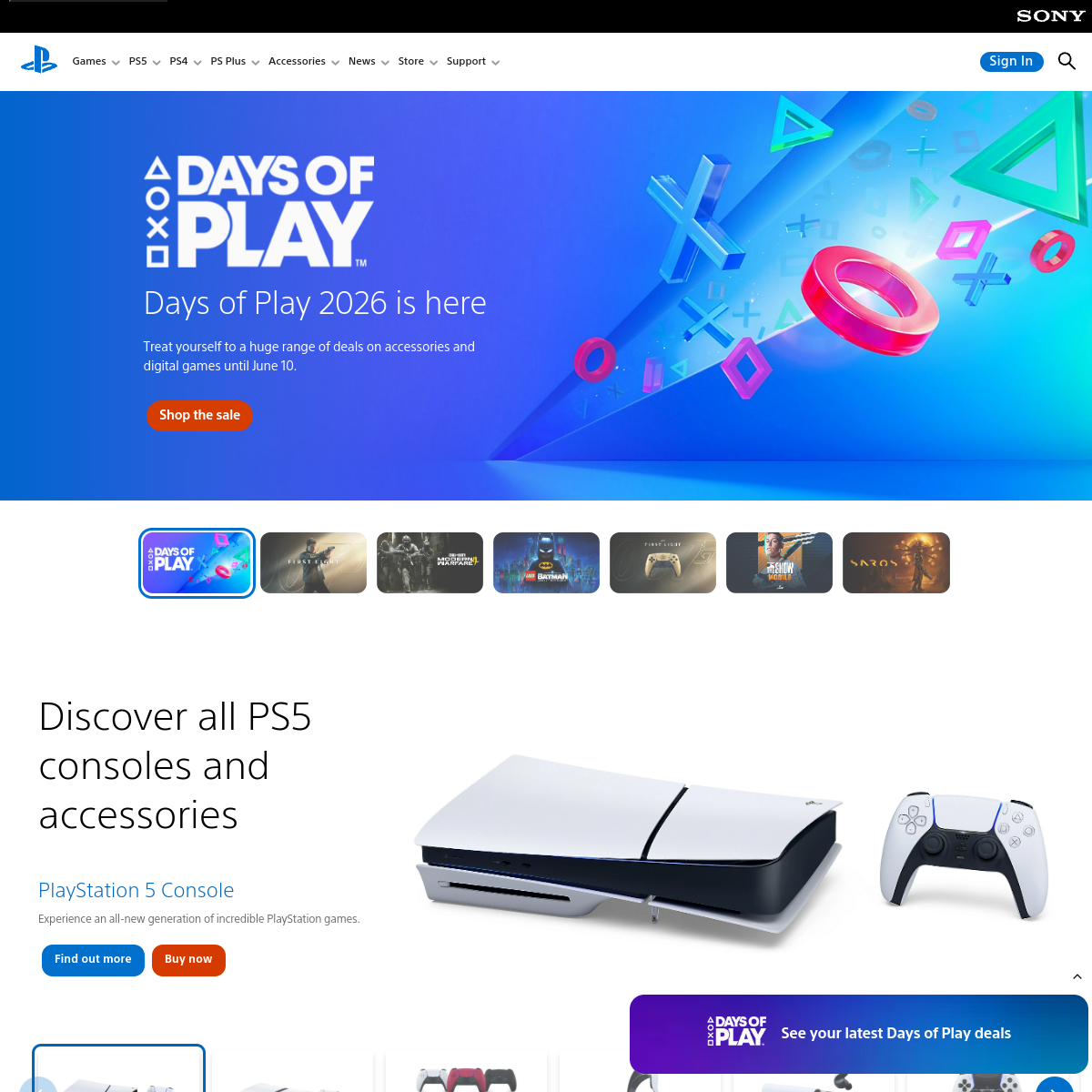
A prime example of high-energy consumer branding with a strong emphasis on vibrant visual graphics.
 Open in OpenDesign
High-contrast blacks and whites punctuated by a vibrant orange accent and colorful 3D promotional graphics.
Full-width, sectioned layout designed for immersive, large-scale visual content.
Clean, high-contrast buttons with straightforward hover states.
Implied subtle animations in the floating 3D elements of the hero section.