Full-width dark background with a centered, constrained content area.
07
Motion & Interaction
220msmicro
400mssmall
800msmedium
cubic-bezier(0.72, 0, 0.12, 1)easing
Smooth opacity and transform transitions on hover states. · Staggered entrance animations for text elements. · Subtle parallax or floating effects for UI components.
Subtle background color shifts or slight upward translations for buttons and interactive elements. · Immediate visual feedback with color or opacity changes, often followed by a navigation transition.
08
Components
buttonPill-shaped buttons with a solid white/light background for primary actions (Start for free) and transparent bordered backgrounds for secondary actions (Book a demo).
cardClean, slightly rounded containers with subtle borders or background differentiation to showcase product interfaces.
chipSmall, rounded tags or labels with minimal padding, often containing monospaced text for technical concepts.
inputRounded input fields with clean borders and light backgrounds for search or command inputs.
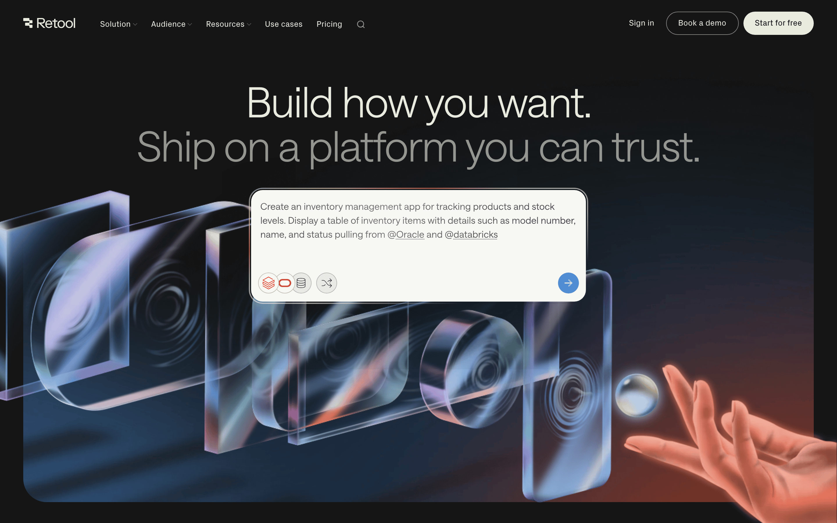
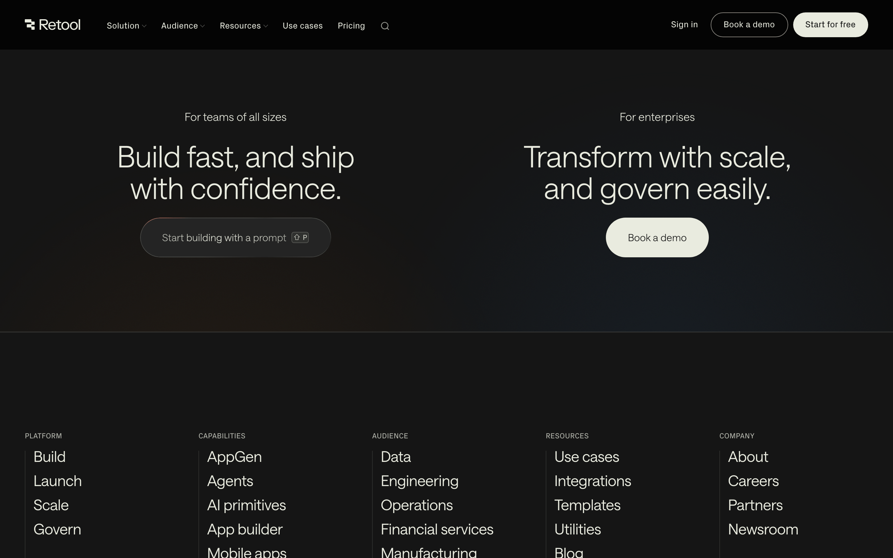
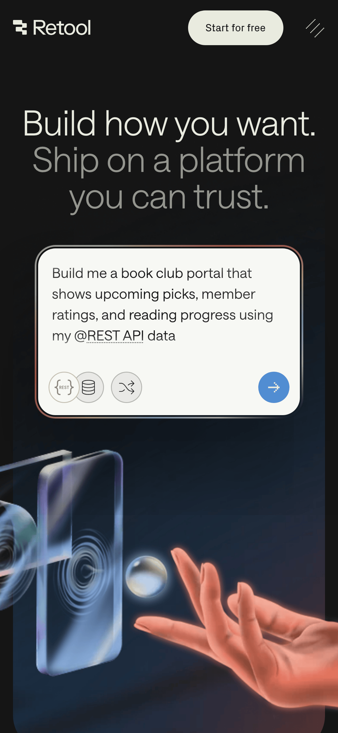
heroA massive, centered headline pair followed by a floating product UI demonstration over a subtle gradient background.
09
Voice & Don'ts
ToneDirect, technical, and confident.
HeadlinesShort, punchy, and action-oriented (e.g., 'Build how you want. Ship on a platform you can trust.').
CTAsClear and benefit-driven, emphasizing ease of entry or expert consultation.
Don't use high-saturation neon colors — screenshot shows a palette of warm grays, dark backgrounds, and a single cool blue accent.
Don't use decorative serif fonts for headlines — screenshot shows a clean, functional grotesque-sans for large display text.
Don't use sharp 90-degree corners for main containers — screenshot shows a preference for soft, large-radius rounding (pill shapes or 20px+ curves).
Don't use busy, textured backgrounds — screenshot shows smooth gradients and clean, solid dark surfaces.
Don't use tiny, cramped layouts — screenshot shows generous spacing and large typography for a clear hierarchy.
Don't use multiple competing accent colors — screenshot shows a restrained use of blue and warm orange/red only in specific graphic contexts.
Captured from the live site · real computed styles
11
System prompt
A developer-focused SaaS platform for building internal tools. The design uses a dark mode palette with warm, muted grays (#151515, #E9EBDF) and a cool blue accent (#518DD2). Typography features a clean grotesque-sans for display and a humanist-sans for body text, with a heavy emphasis on large, thin-weight headlines. The layout is centered and spacious, with generous padding. Critical don'ts: never use high-saturation neon colors, avoid decorative serifs for headlines, and don't use sharp 90-degree corners for main UI containers. The tone is direct, technical, and confident.
Bring this taste to your agent
Hand your AI agent a machine-readable spec of this design — tokens, type, motion, the whole DNA.