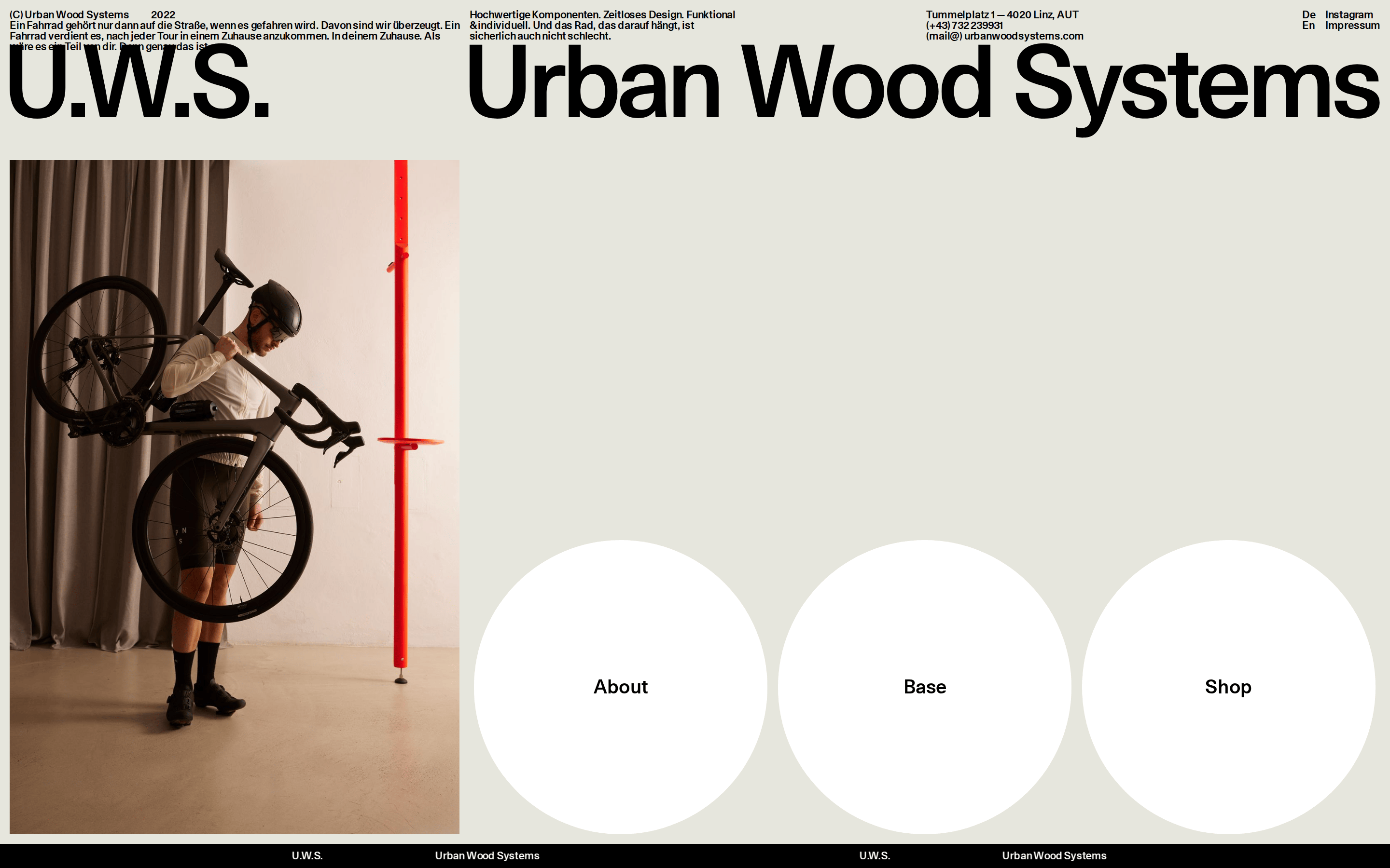
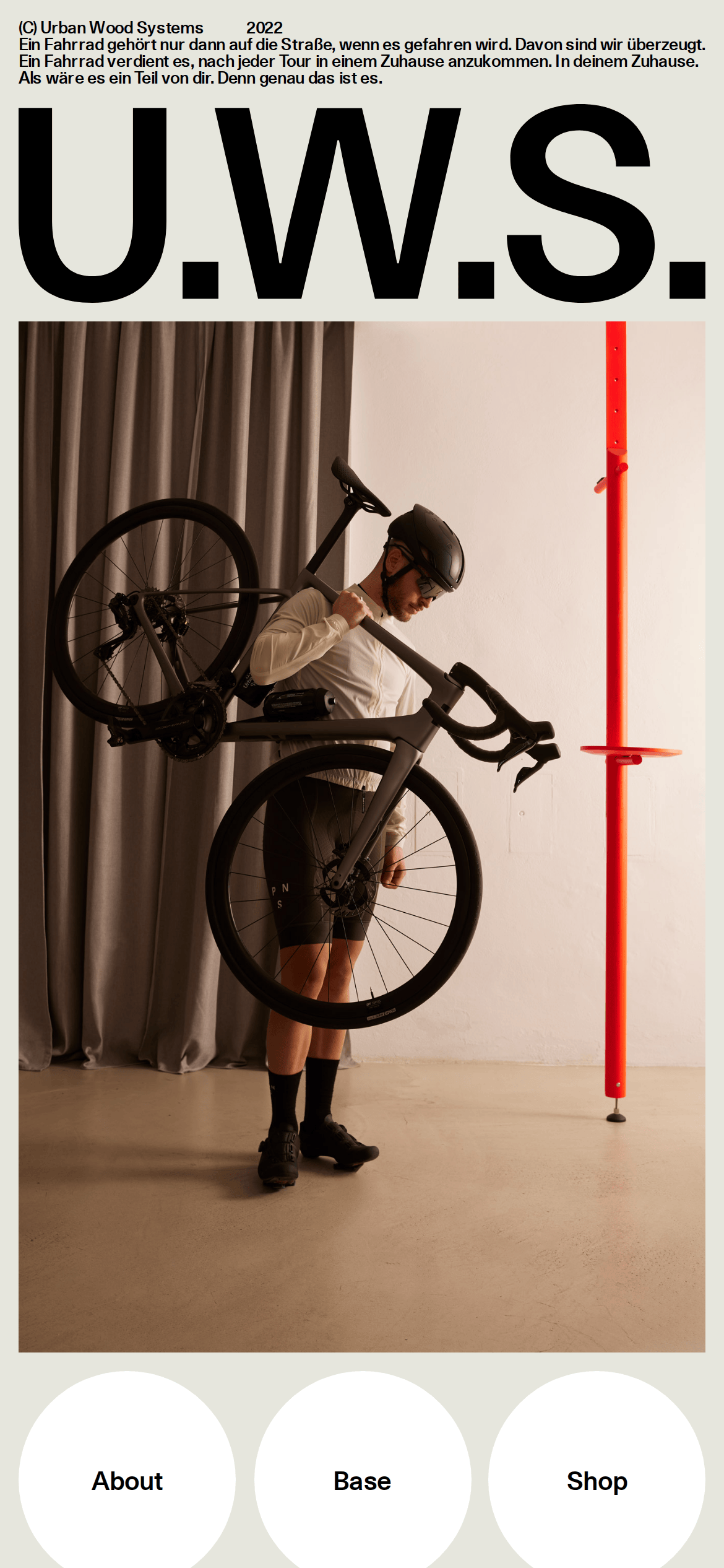
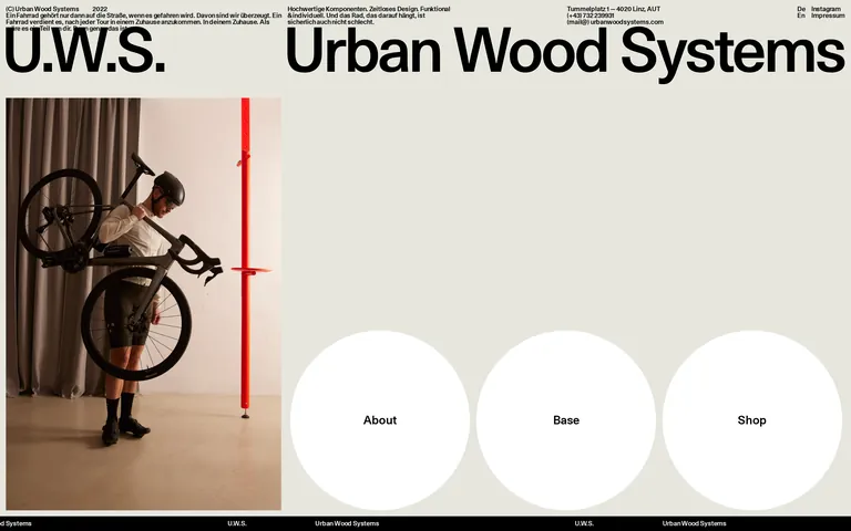
A minimalist Swiss design magazine meets a high-end hardware catalog.
02
Color
#000000Ink
#E6E6DDBG
rgba(0,0,0,0.1)Line
High-contrast monochromatic palette with a warm neutral background.
03
Typography
grotesque-sans
display140px · 500
body11px · 500
All text is strictly set to medium weight (500). · Tight letter spacing (-0.1px to -2px) across all elements. · No font weight variation; hierarchy is established solely through massive scale differences.
04
Spacing
4px
8px
16px
24px
32px
48px
64px
96px
Strict 4px grid with minimal padding around interactive elements.
05
Surfaces
sm · 0px
md · 0px
lg · 0px
pill · 999px
No visible borders except standard 1px system defaults; relies entirely on layout and spacing.
06
Layout
1440container
12columns
24pxgutter
768 / 1024breakpoints
Asymmetric 2-column grid on desktop, stacking to single column on mobile.
07
Motion & Interaction
0msmicro
200mssmall
0msmedium
lineareasing
Color transitions on interactive elements (0.2s). · No complex entrance animations or motion patterns visible.
Standard pointer cursor on clickable elements. · None.
08
Components
buttonLarge white circular containers acting as primary navigation hubs.
cardNone; navigation is handled via large geometric shapes.
chipNone.
inputNone.
heroAsymmetric split layout with a large product photograph on one side and a massive typographic block on the other.
09
Voice & Don'ts
ToneConfident, understated, and functional.
HeadlinesMassive, bold, and tightly spaced.
CTAsSubtle, integrated into large geometric navigation hubs.
Don't use lightweight or thin font weights — screenshot shows all text at weight 500.
Don't add drop shadows or depth to surfaces — screenshot shows perfectly flat elements.
Don't use a pure white background — screenshot shows a warm neutral (#E6E6DD).
Don't use complex border radii on buttons — screenshot shows large pill/circular shapes (300px radius).
Don't use bright or multi-colored accent palettes — screenshot is strictly monochromatic with black ink.
Don't use wide or relaxed letter spacing — screenshot shows tight, compressed typography.
Avoid: Excessive adjectives or marketing fluff.
Avoid: Complex or multi-step navigation menus.
Avoid: Vibrant or neon color schemes.
Avoid: Decorative elements or unnecessary UI flourishes.
Captured from the live site · real computed styles
11
System prompt
This is a minimalist, premium product site for high-end bicycle hardware. It uses a bold, industrial aesthetic with a warm neutral background (#E6E6DD) and deep black ink (#000000). Typography is handled exclusively with a medium-weight (500) grotesque sans-serif font (Unica77), utilizing massive display sizes for headlines (up to 140px) and very small sizes (11px) for body text, creating a stark hierarchical contrast. Critical constraints include: never use font weights other than 500, maintain a strictly monochromatic palette without vibrant accents, and keep surfaces completely flat without shadows. Navigation is achieved through large, white circular hubs rather than traditional menus.
Bring this taste to your agent
Hand your AI agent a machine-readable spec of this design — tokens, type, motion, the whole DNA.