A confident, professional shield for modern SaaS companies.
02
Color
#5E05C4Accent
#181822Ink
#6D6E87Ink soft
#FFFFFFBG
#F7F8FABG soft
#EDE9F6BG quiet
#484960Muted
rgba(24, 24, 34, 0.1)Line
A restrained, professional palette anchored by deep navy-black and a singular, high-chroma purple accent.
03
Typography
transitional-serif · geometric-sans · monospace
display72px · 400
headline40px · 400
body16px · 400
label14px · 500
Use Reckless for all display and headline text to add warmth and editorial authority. · Use Inter for all body, UI, and label text to maintain clarity and a modern tech feel. · Limit text weight variations to 400 and 500 to keep the interface clean.
04
Spacing
4px
8px
12px
16px
24px
32px
48px
64px
96px
Generous vertical and horizontal padding emphasizes clarity and reduces visual clutter.
05
Surfaces
sm · 4px
md · 8px
lg · 16px
pill · 999px
Subtle 1px borders in rgba(24, 24, 34, 0.1) are used sparingly to define structure.
0px 0px 2px 2px rgba(204, 204, 204, 1)
06
Layout
1280container
12columns
24pxgutter
768 / 1024breakpoints
A structured 12-column grid with wide gutters supports a clean, modular layout.
07
Motion & Interaction
200msmicro
350mssmall
645msmedium
cubic-bezier(0.455, 0.03, 0.515, 0.955)easing
Smooth 0.2s color transitions on text and UI elements. · Slightly longer 0.3s to 0.35s cubic-bezier transitions for structural animations.
Text color transitions smoothly, buttons may have subtle background shifts or scale. · Immediate visual feedback via standard active states.
08
Components
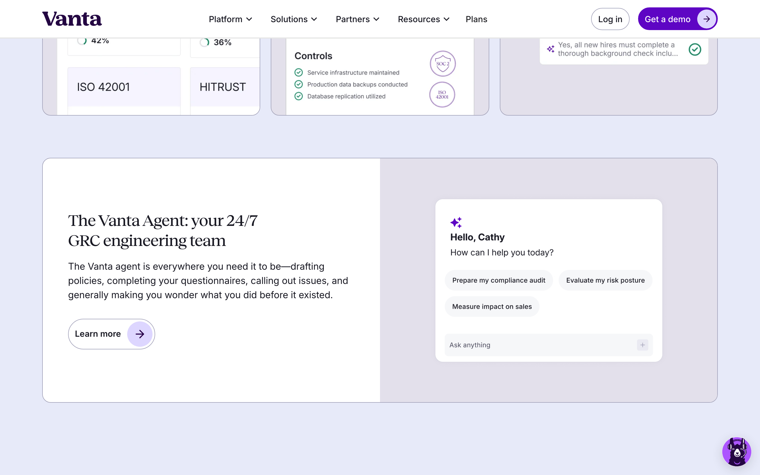
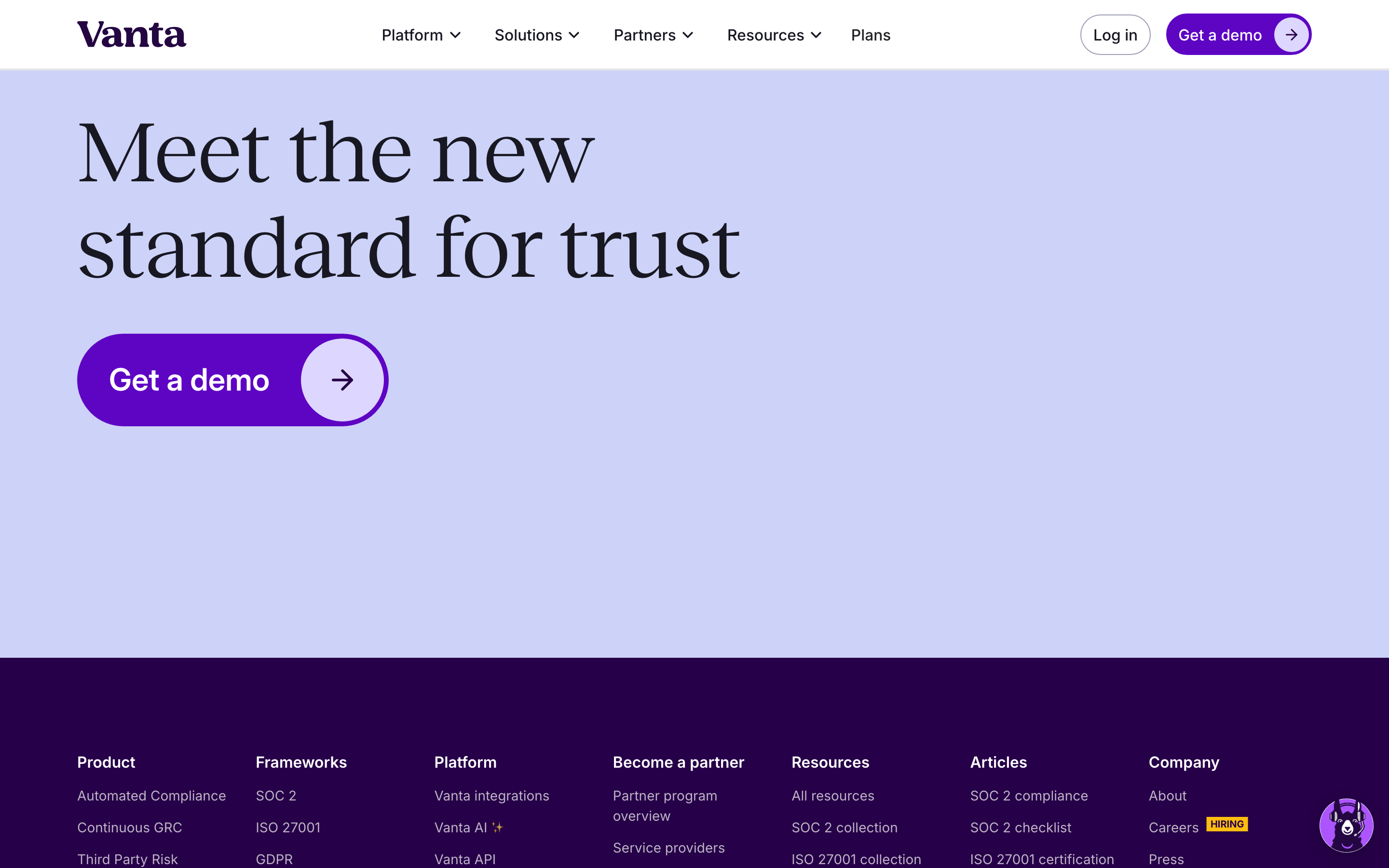
buttonPrimary buttons are pill-shaped with a vibrant purple background; secondary buttons are outlined or ghost with pill-shaped or slightly rounded corners.
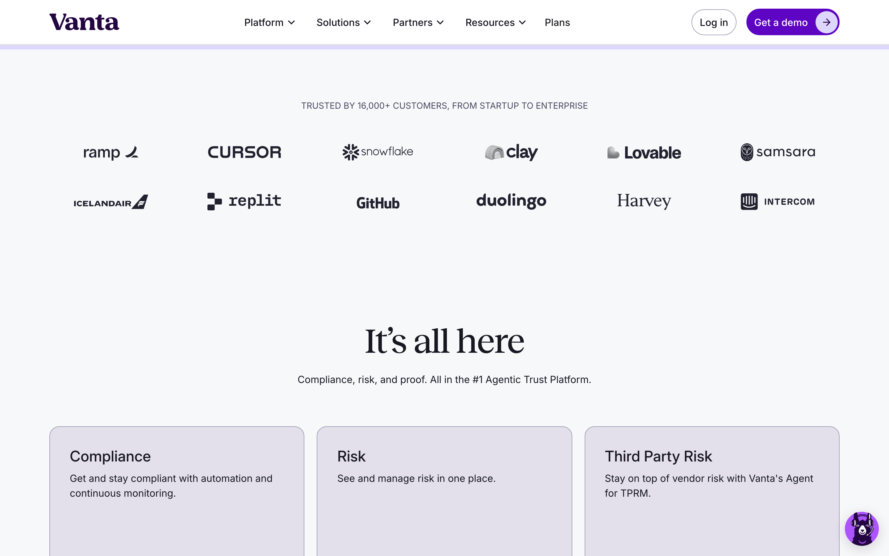
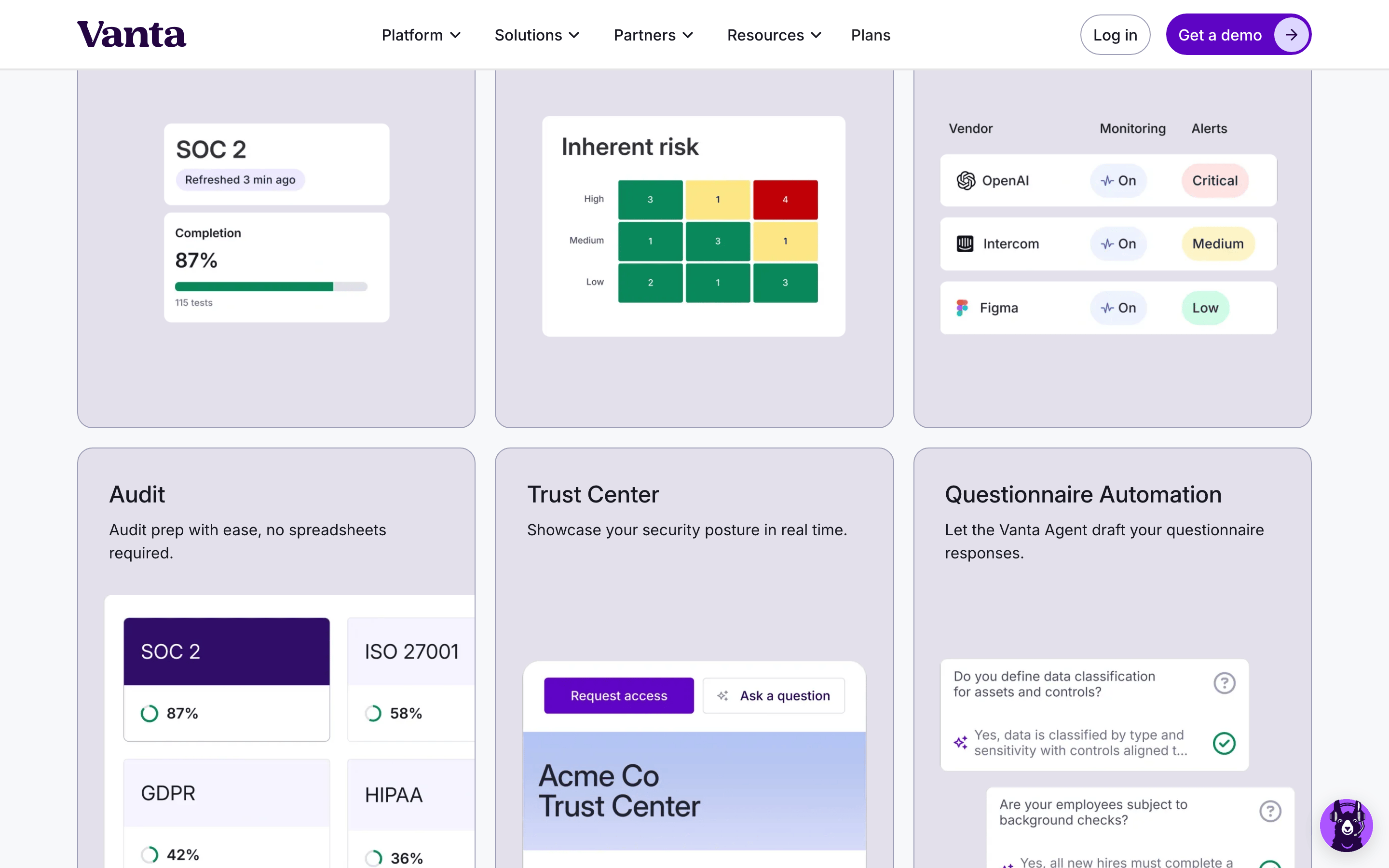
cardMinimalist cards with soft grey backgrounds, no shadows, and subtle padding.
chipNot prominently featured; relies on clean typography and icons instead.
inputRounded, pill-shaped input fields with light grey borders and generous internal padding.
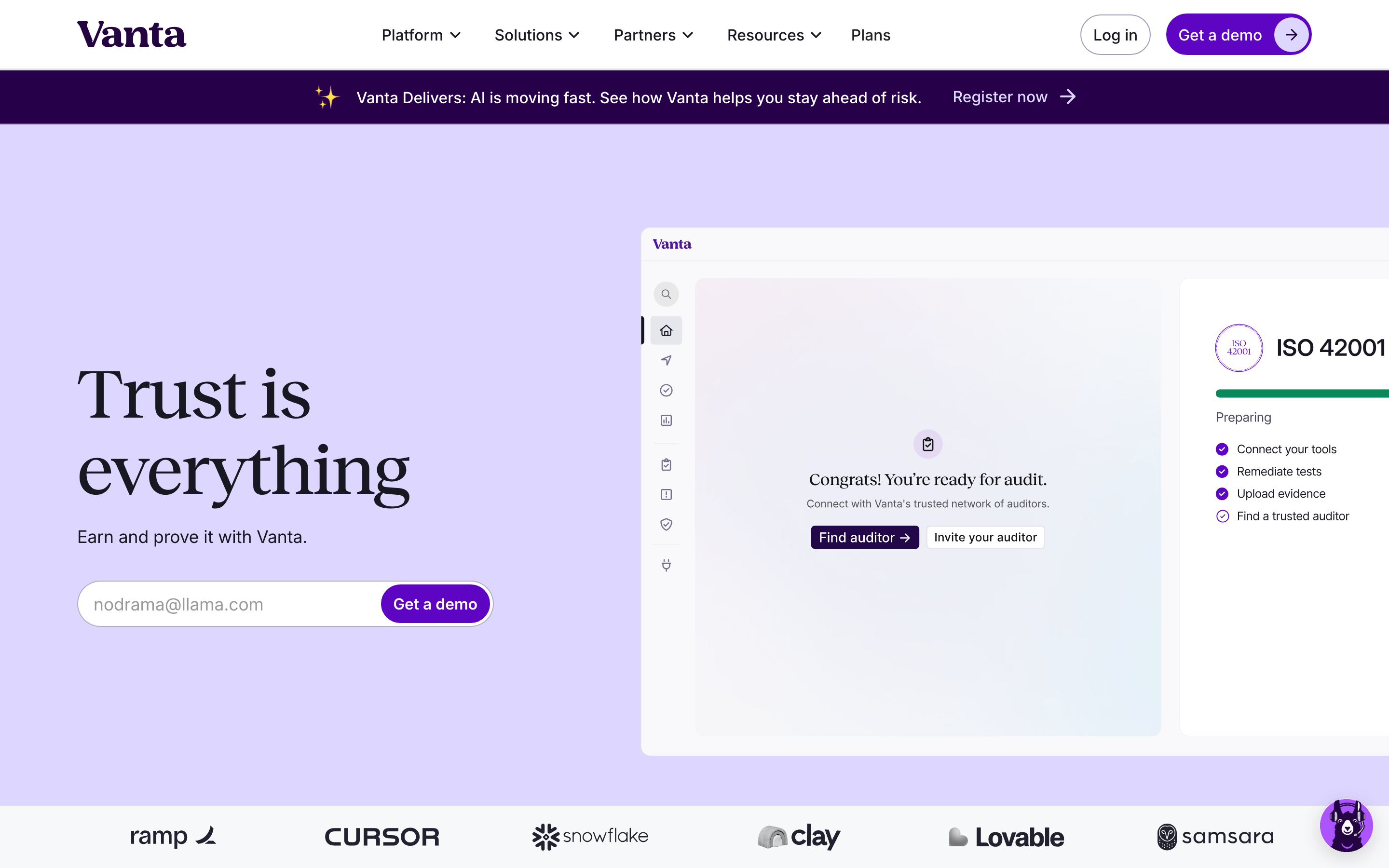
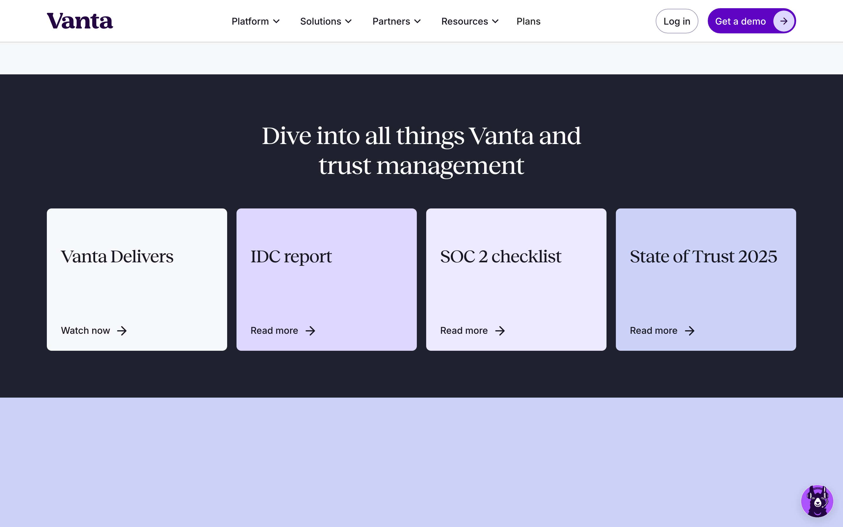
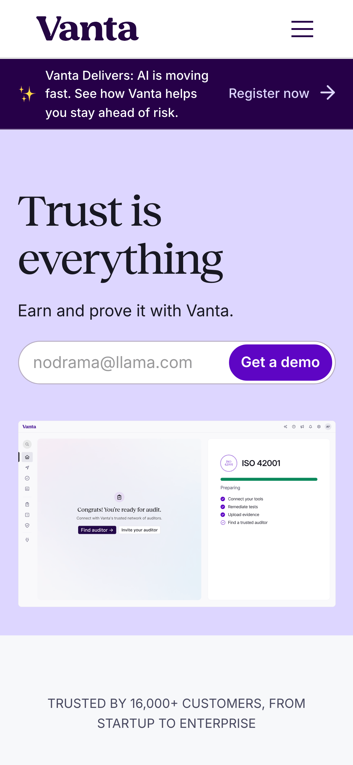
heroA split layout with a large serif headline on the left and a detailed product UI mockup on the right.
09
Voice & Don'ts
ToneProfessional, reassuring, and authoritative yet approachable.
HeadlinesDirect and declarative statements using a transitional serif typeface for impact.
CTAsAction-oriented and concise, often enclosed in pill-shaped buttons.
Don't use harsh, saturated colors for backgrounds — screenshot shows soft lavender and grey.
Captured from the live site · real computed styles
11
System prompt
Design system for Vanta, a compliance and security SaaS platform. The visual language balances high-end editorial warmth with modern tech precision, positioning the brand as a trustworthy partner for complex enterprise needs. Key colors include a crisp white (#FFFFFF) and soft grey (#F7F8FA) backgrounds, a deep ink-black (#181822) for text, and a vibrant purple (#5E05C4) for primary accents and CTAs. Typography features a transitional-serif (Reckless) for bold display headlines, paired with a geometric sans (Inter) for highly legible body and UI text. Critical donts: never use harsh or overly saturated background colors; avoid blocky, sharp-cornered UI elements like rectangular buttons; maintain generous whitespace and avoid visual clutter; and do not use heavy, distracting drop shadows or overly complex gradients.
Bring this taste to your agent
Hand your AI agent a machine-readable spec of this design — tokens, type, motion, the whole DNA.