A premium, trustworthy tech company operating at the intersection of automotive and software.
02
Color
#006feeAccent
#23233cInk
#ffffffBG
#f2f2f2BG soft
#808080Muted
rgba(35, 35, 60, 1.0)Line
High-contrast and professional, using a deep navy as the primary text color and a vibrant blue for interactive accents.
03
Typography
humanist-sans · monospace
display40px · 500
h224px · 500
body16px · 400
All typography uses tight, negative letter-spacing. · Headlines are bold and large, while body text remains highly legible. · Text colors are strictly limited to the deep navy ink or white for dark backgrounds.
04
Spacing
4px
8px
16px
24px
32px
48px
64px
96px
Standard 4px grid with clear visual grouping through generous whitespace.
05
Surfaces
sm · 3px
md · 8px
lg · 12px
pill · 999px
Solid 2px borders for buttons, providing a clear interactive affordance.
06
Layout
1280container
12columns
24pxgutter
768 / 1024breakpoints
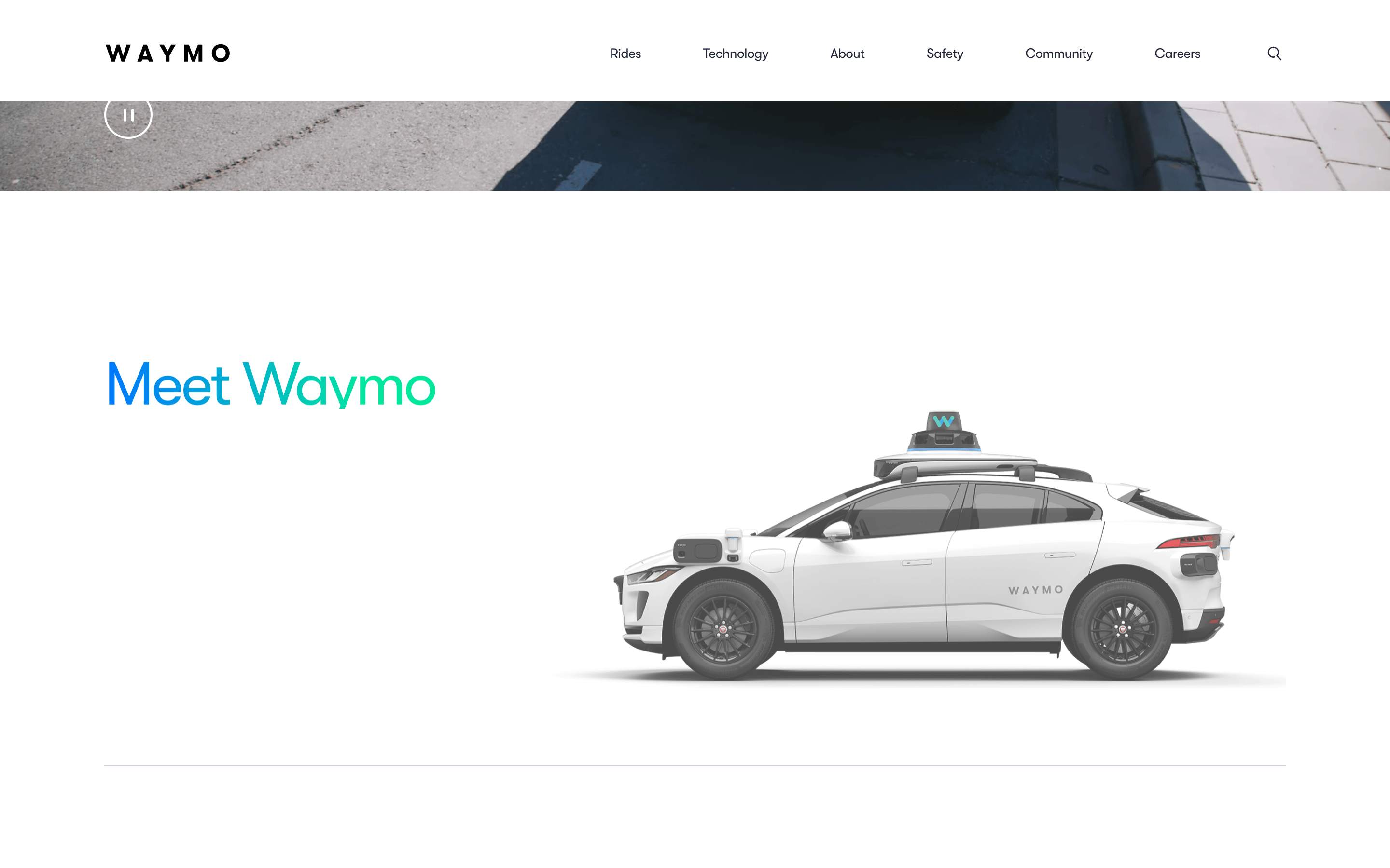
Centered container with a standard top navigation, split hero sections, and stacked full-width content blocks.
07
Motion & Interaction
150msmicro
400mssmall
500msmedium
cubic-bezier(0.4, 0, 0.2, 1)easing
Smooth fades and translates for UI element reveals. · Subtle hover transitions on interactive elements. · Staggered entrance animations for grouped elements.
Subtle opacity changes or background shifts for buttons and links. · Instant response with subtle state transitions.
08
Components
buttonSolid or outlined buttons with generous padding and sharp corners or slightly rounded borders.
cardNot prominently featured, relying more on split-text and full-width imagery.
chipNot featured.
inputNot featured.
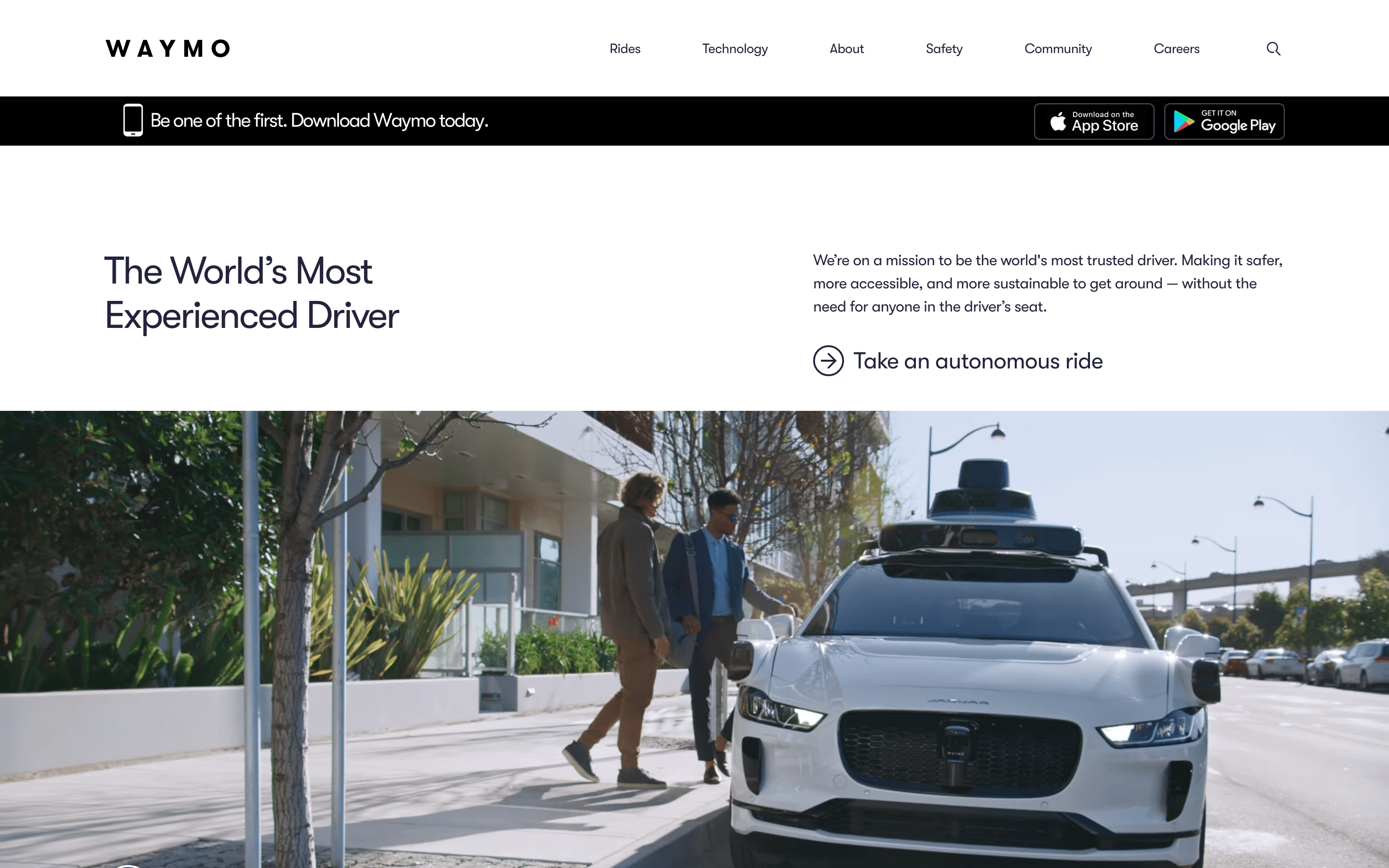
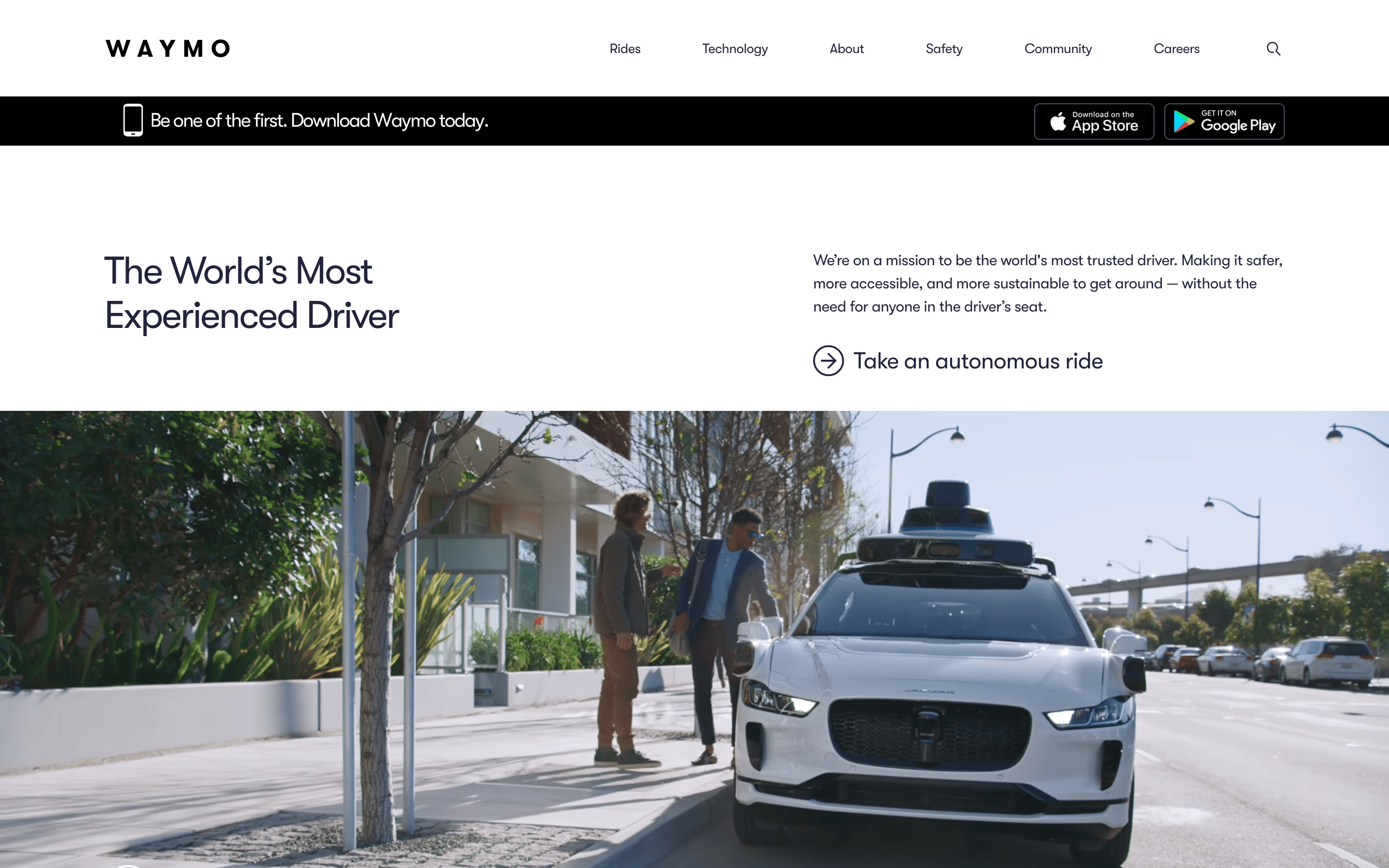
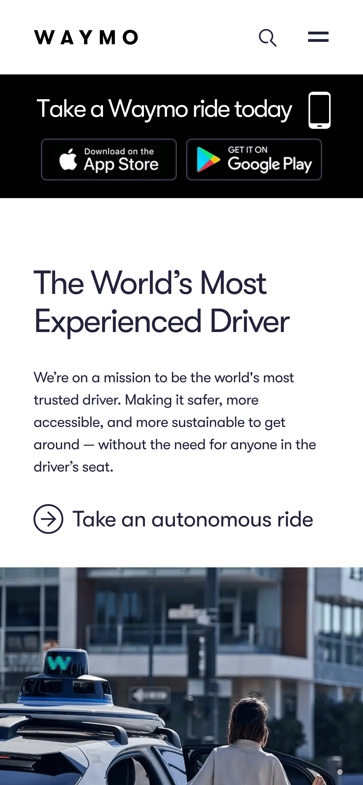
heroSplit layout with a large headline on one side and descriptive text with a CTA on the other, supported by a prominent hero image.
09
Voice & Don'ts
ToneConfident, professional, and mission-driven.
HeadlinesBold, direct statements emphasizing safety and experience.
CTAsClear, action-oriented, and framed as an invitation.
Don't use drop shadows on UI elements — screenshot shows completely flat, clean design.
Don't use rounded corners on primary buttons — screenshot shows sharp or slightly rounded edges.
Don't use multiple competing accent colors — screenshot shows a strict navy, white, and single blue accent palette.
Don't clutter the interface with dense information blocks — screenshot shows generous whitespace and clear visual hierarchy.
Don't use all-caps for body text — screenshot shows standard sentence case for readability.
Don't rely on dark mode as the primary interface — screenshot shows a predominantly light-mode design.
Captured from the live site · real computed styles
11
System prompt
Waymo's website design is a clean, professional, and trust-forward layout for a consumer-facing autonomous vehicle platform. The color palette is dominated by a deep navy ink (#23233c) and crisp white backgrounds (#ffffff), with a vibrant blue accent (#006fee) for primary actions. The typography is a humanist-sans-serif family characterized by tight, negative letter-spacing, creating a modern and confident feel. Critical design constraints include maintaining a flat UI with no drop shadows, using generous whitespace to establish a clear visual hierarchy, and avoiding cluttered interfaces. The design language is restrained and premium, focusing on large photography and bold headlines to convey a sense of safety and technological leadership.
Bring this taste to your agent
Hand your AI agent a machine-readable spec of this design — tokens, type, motion, the whole DNA.