CURATED · OPEN · FREE
This site is a prime example of bold, confident fintech design that uses strong typography and a vibrant color to build trust and convey speed.
 Open in OpenDesign
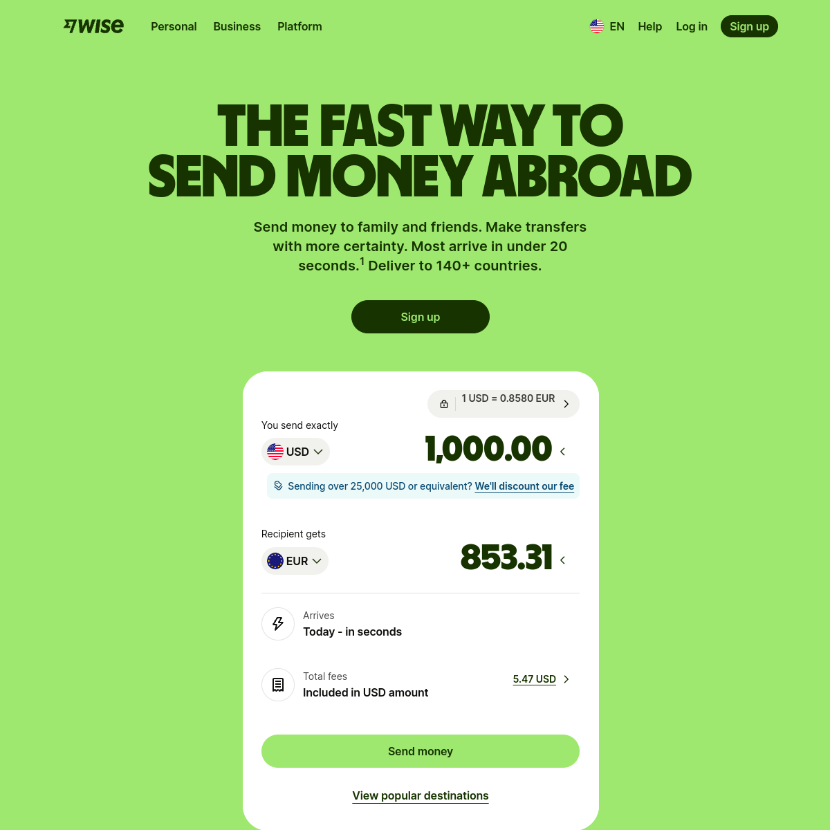
A high-energy, two-tone palette of vibrant lime green and deep dark green-black creates immediate contrast and a bold, modern financial brand identity.
A focused, single-column layout centers the user's attention on the core value proposition and the functional money transfer calculator.
Interaction is straightforward and functional, with clear, high-contrast buttons and intuitive dropdowns for selecting currencies and destinations.
Motion is likely subtle and functional, emphasizing smooth transitions for UI state changes without distracting from the core task.