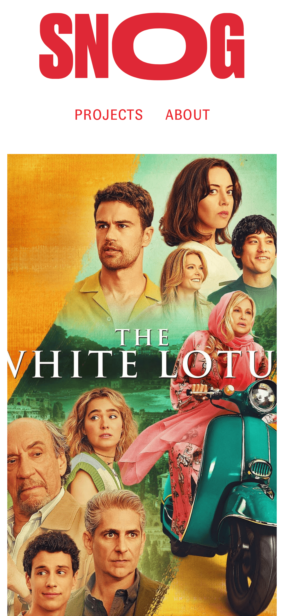
Stark white background acts as a neutral canvas for a single high-chroma red accent and dense, colorful imagery.
03
タイポグラフィ
condensed-grotesque · grotesque-sans
display172px · 700
body14px · 700
Navigation text is consistently uppercase and bold · Display logotype dominates the top of the layout · Minimal type hierarchy, mostly just logotype and links
04
余白
4px
8px
16px
24px
32px
48px
64px
96px
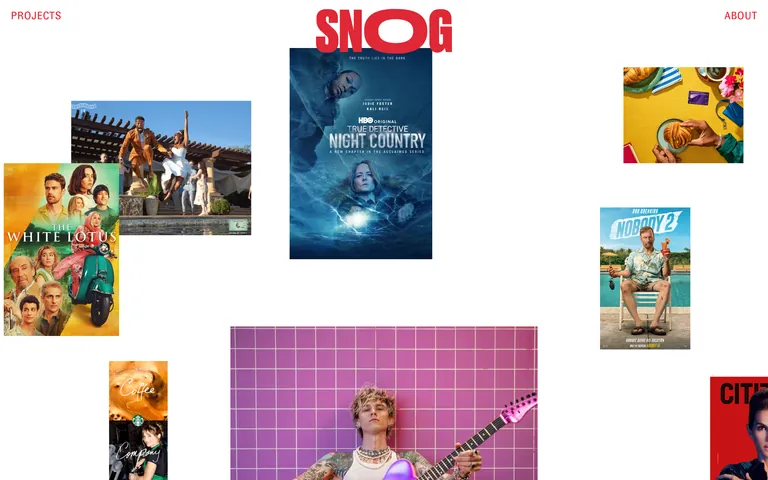
Irregular gallery layout relies on large, absolute whitespace rather than a strict grid.
05
サーフェス (角丸 / 影 / 罫線)
sm · 0px
md · 0px
lg · 0px
pill · 200px
No structural borders, only image contents and a single 1px border-width rule noted in the facts.
06
レイアウト
12columns
24pxgutter
768 / 1024breakpoints
Asymmetrical scattered gallery, images of varying sizes overlap and float over a white background.
07
モーションとインタラクション
50msmicro
50mssmall
50msmedium
lineareasing
Minimal, near-instant transitions of 0.05s on elements
Cursor changes to pointer on interactive elements · Standard link navigation
08
コンポーネント
buttonPlain uppercase text links with cursor pointer
cardEdge-to-edge project imagery without padding or borders
heroMassive red typography overlapping a vertically stacked gallery of project posters.
09
文体と禁止事項
トーンConfident, bold, direct
見出しMassive, condensed, uppercase logotype
CTASimple, uppercase text links
don't use a muted or pastel palette — screenshot shows a stark white background with a single bold red accent
don't center-align all content symmetrically — screenshot shows an asymmetrical, scattered gallery layout
don't use thin, delicate typography — screenshot shows a massive, ultra-bold condensed logotype
don't add padding or borders to image cards — screenshot shows imagery edge-to-edge or floating freely
This site is a creative production studio portfolio defined by extreme visual confidence. It uses a stark white background (#FFFFFF) as a canvas for a massive, ultra-bold red condensed logotype (#EE242F) and a scattered gallery of high-impact project imagery. The typography is dominated by the display font (Druk) at 172.8px, with navigation in a secondary grotesque sans (GT Zirkon) at 14px uppercase. Key colors are strictly red (#EE242F) and black (#000000) on white. Critical donts: 1) Don't use subtle UI components like shadows or borders on images, as the layout relies on raw, floating photography. 2) Don't symmetricaly align content, as the scattered gallery is intentionally asymmetrical. 3) Don't use long, smooth animations, as the interaction model relies on near-instant 0.05s transitions.
このセンスを AI エージェントへ
この設計の機械可読な仕様——カラー・タイポ・モーションまで——をそのまま AI エージェントに渡せます。