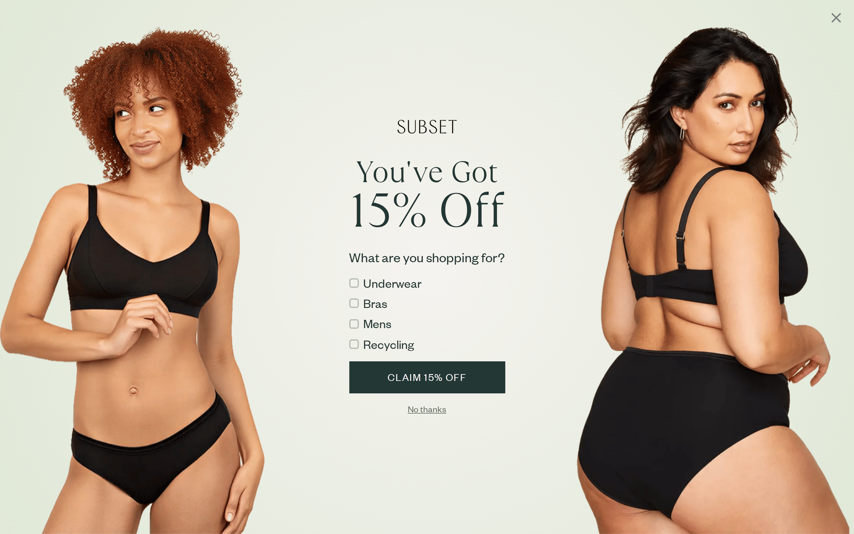
This is a refined e-commerce interface for a sustainable underwear brand, characterized by a calm, earthy palette. Key colors include a creamy off-white background (#f5f4ee), dark ink text (#241f20), muted green accents (#8bba78), and a deep teal for primary buttons (#233735). Typography pairs a sharp didone-serif for large display text with a humanist-sans for all body and UI elements. The layout is spacious, often using a split composition with full-bleed photography flanking centered text. Key donts: Do not use bright, neon colors; avoid heavy borders or drop shadows; do not use playful, rounded fonts; avoid busy backgrounds; do not center-align long blocks of text; and avoid aggressive, urgent marketing language.