CURATED · OPEN · FREE
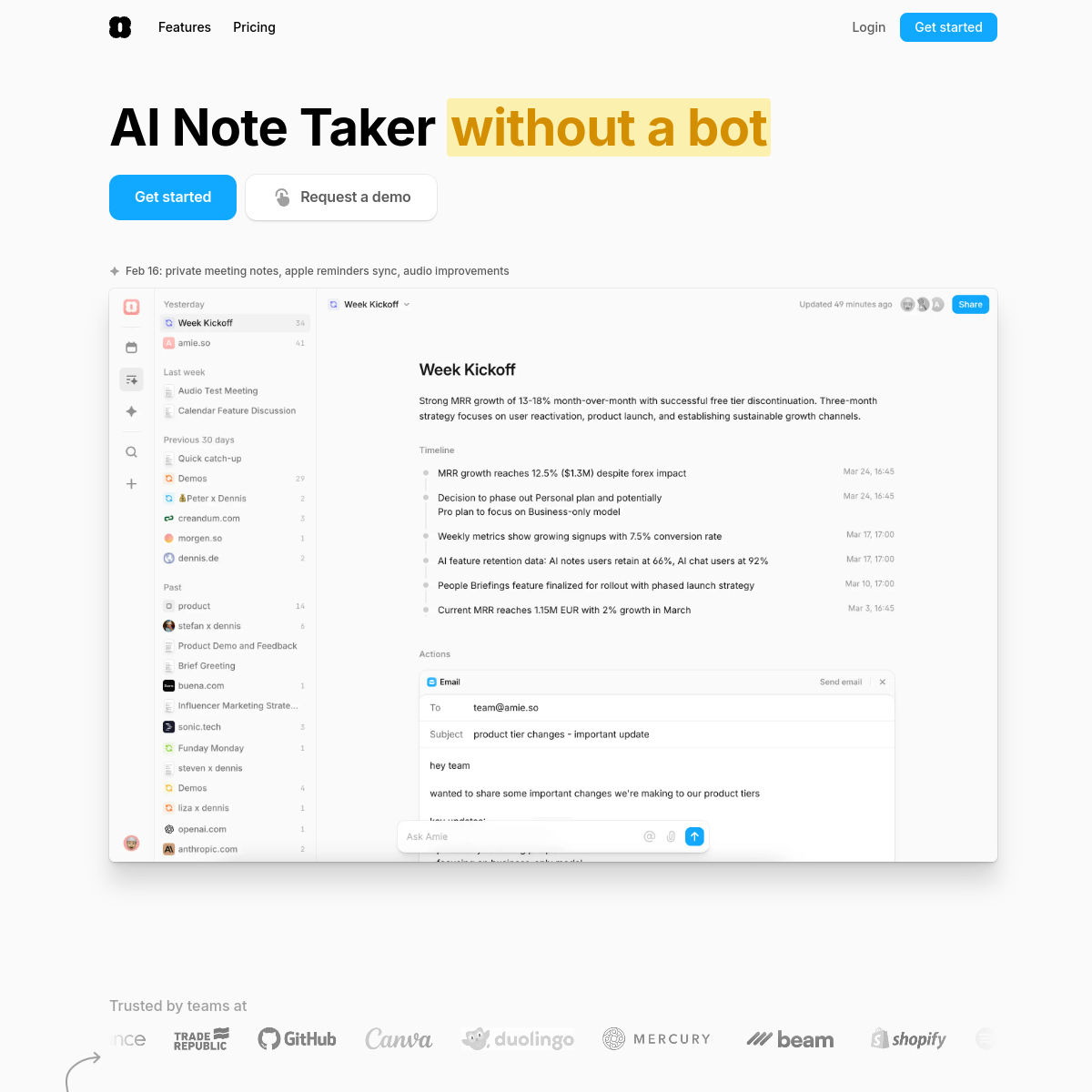
Amie
A friendly, AI-powered productivity app that keeps your schedule and notes effortlessly organized.
Calendar Consumer Friendly
01
Identity DNA
productive integrated clean intelligent friendly
A clean, modern workspace that feels like a helpful friend rather than a complex tool.
02
Color
#11A8FFAccent
#000000Ink
#5C5C5CInk soft
#FFFFFFBG
#A0A0A0Muted
rgba(205, 205, 205, 1)Line
A clean, high-contrast palette with a single vibrant blue accent, ensuring readability and a professional yet approachable feel.
03
Typography
humanist-sans
display 40px · 700heading 20px · 600body 16px · 400small 14px · 400
04
Spacing
4px
8px
12px
16px
20px
24px
28px
32px
48px
64px
96px
A base-4 system that uses generous padding (12px, 20px, 28px) to create an airy, uncluttered feel.
05
Surfaces
sm · 4px
md · 8px
lg · 12px
pill · 9999px
Subtle 1px solid borders using rgba(205, 205, 205, 1) for soft delineation.
rgba(0, 0, 0, 0.06) 0px 0px 0px 1px · rgba(0, 0, 0, 0.06) 0px 1px 1px -0.5px · rgba(0, 0, 0, 0.06) 0px 3px 3px -1.5px
06
Layout
1280 container
12 columns
24px gutter
768 / 1024 breakpoints
A centered, wide container with a narrow, readable text column and a sidebar-heavy product UI layout.
07
Motion & Interaction
150ms micro
300ms small
600ms medium
cubic-bezier(0.4, 0, 0.2, 1) easing
Smooth transitions for color, background-color, and border-color on interactive elements.
Subtle changes in background color or text color, often with a pointer cursor. · Standard button press behavior.
08
Components
button Pill-shaped primary buttons with a vibrant blue background and white text; secondary buttons are white with a subtle border. card Clean, white surfaces with subtle shadows and rounded corners, often used for showcasing product interfaces. chip Not prominently visible in this view. input Not prominently visible in this view. hero A bold, oversized headline paired with a highlighted accent phrase, two primary actions, and a large product screenshot.
09
Voice & Don'ts
Tone Friendly, confident, and straightforward, avoiding overly technical jargon. Headlines Bold and direct, often using a highlighted accent phrase to draw attention. CTAs Action-oriented and inviting, using clear phrases like 'Get started'. Don't use dark, moody backgrounds — the screenshot shows a predominantly white and airy background. Don't use heavy, decorative serif fonts for headlines — the screenshot shows a clean, humanist sans-serif. Don't use multiple competing vibrant accent colors — the screenshot primarily uses one bright blue accent. Don't use sharp, boxy corners for buttons — the screenshot shows heavily rounded, pill-shaped buttons. Don't use thick, heavy borders to separate sections — the screenshot uses subtle, light grey lines. Don't overcrowd the interface with dense text blocks — the screenshot maintains generous whitespace and spacing. Don't use a muted, monochromatic palette without any color — the screenshot relies on a clear blue accent. Avoid: Corporate stiffness Avoid: Complex technical language Avoid: Aggressive sales tactics
10
Inside the pack — real screenshots
桌面首屏(hero) 桌面滚动分段(90% viewport 步进,作为视觉证据) 桌面滚动分段(90% viewport 步进,作为视觉证据) 桌面滚动分段(90% viewport 步进,作为视觉证据) 桌面滚动分段(90% viewport 步进,作为视觉证据) 桌面滚动分段(90% viewport 步进,作为视觉证据) 桌面滚动分段(90% viewport 步进,作为视觉证据) 桌面滚动分段(90% viewport 步进,作为视觉证据) 桌面滚动分段(90% viewport 步进,作为视觉证据) 桌面滚动分段(90% viewport 步进,作为视觉证据) 桌面滚动分段(90% viewport 步进,作为视觉证据) 桌面滚动分段(90% viewport 步进,作为视觉证据) 桌面滚动分段(90% viewport 步进,作为视觉证据) 桌面滚动分段(90% viewport 步进,作为视觉证据) 桌面滚动分段(90% viewport 步进,作为视觉证据) 桌面滚动分段(90% viewport 步进,作为视觉证据) 桌面滚动分段(90% viewport 步进,作为视觉证据) 移动首屏 Captured from the live site · real computed styles
11
System prompt
This site is a modern SaaS productivity app with a clean, friendly, and approachable design. The primary brand color is a vibrant blue (#11A8FF) against a white background, with black and grey text. It uses a clean humanist-sans typeface (Inter) for high readability. The layout is spacious, using generous padding and a wide container to create an airy feel. Key interactions use smooth, subtle transitions. Critical donts: do not use dark backgrounds, do not use decorative serifs, and do not overcrowd the interface with complex elements or multiple bright accent colors.
en · zh-CN · zh-TW · ja · ko
OpenDesign · curated web aesthetics for AI-readable design DNA · opendesign.cc
Why we curated this: A prime example of a modern, human-centric SaaS design that balances professionalism with approachability through clean typography and thoughtful spacing.