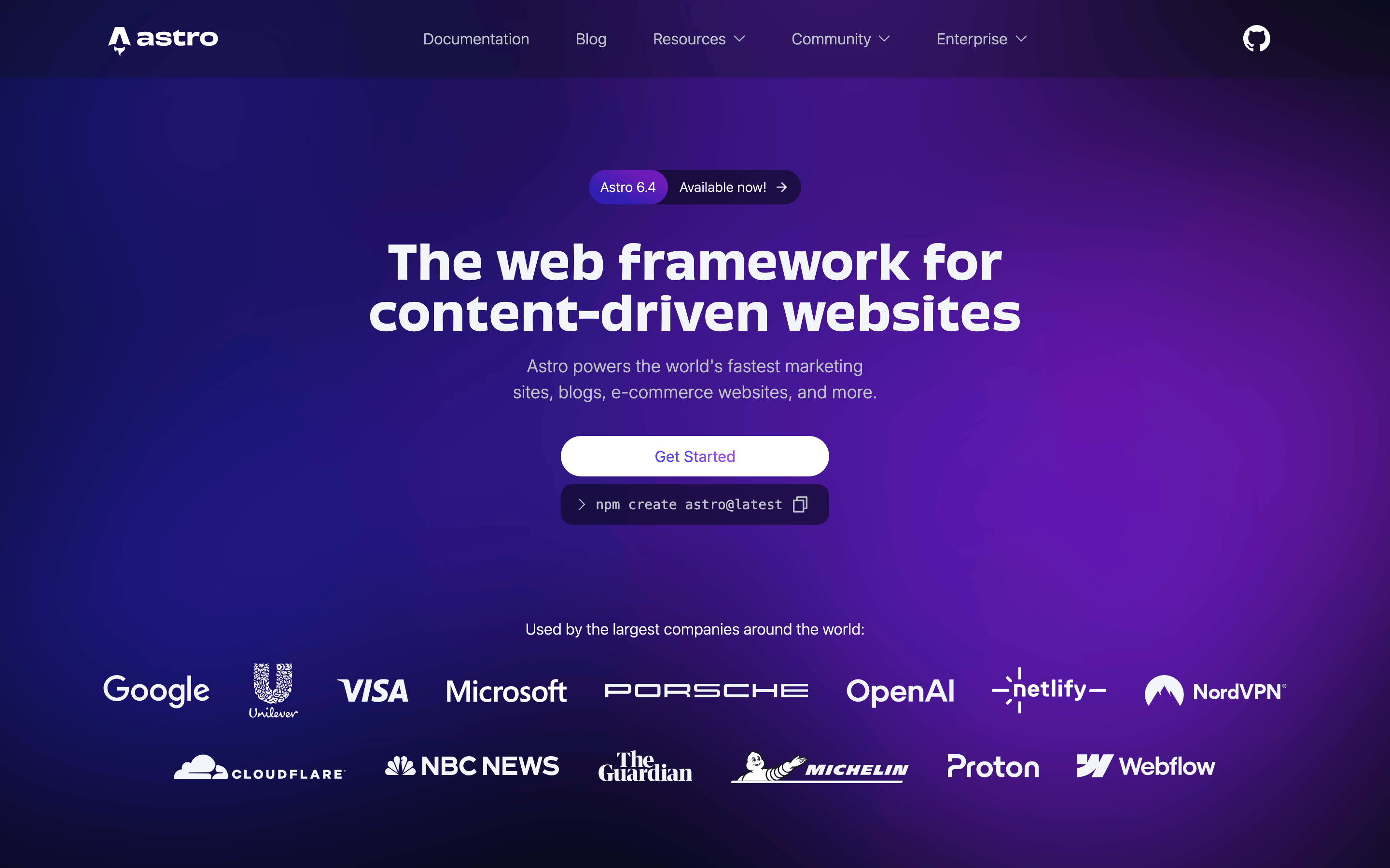
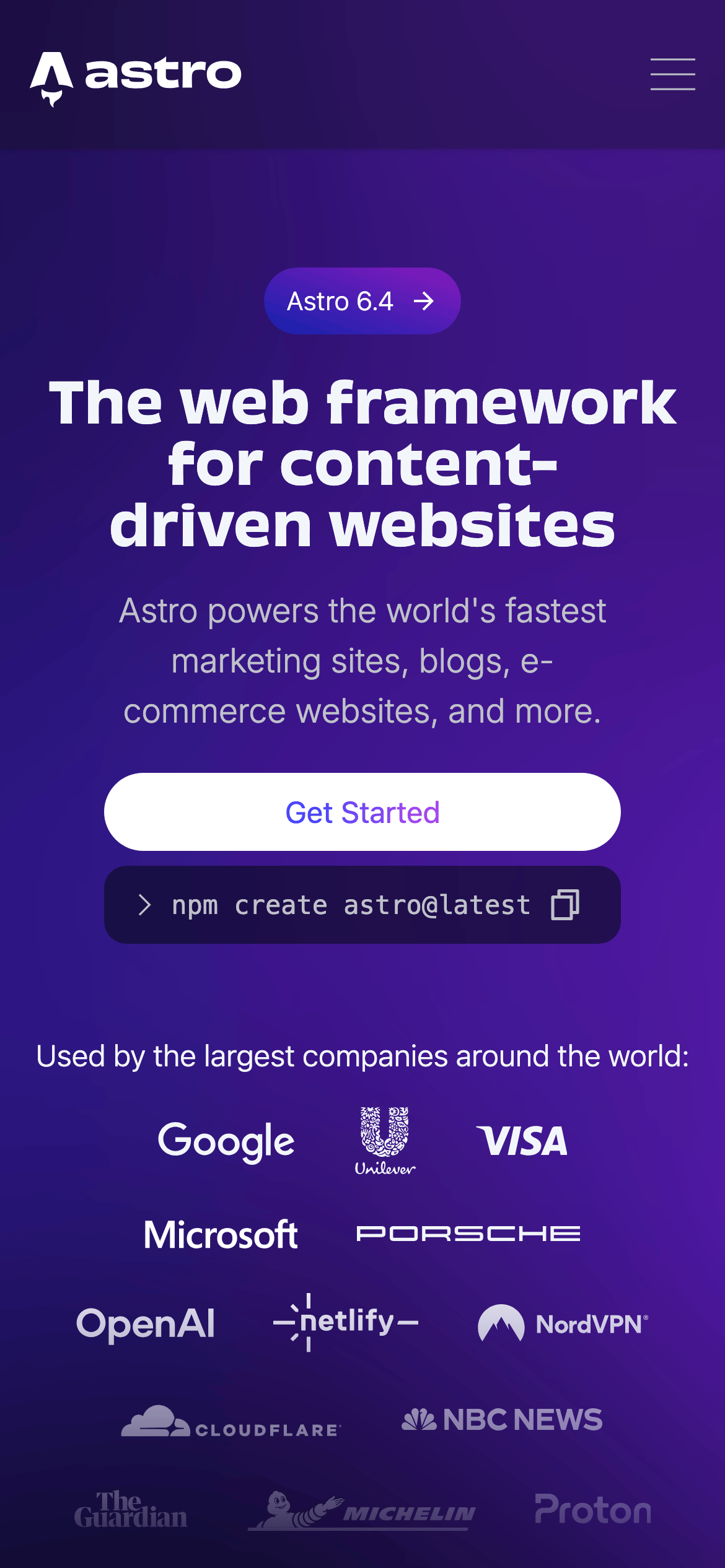
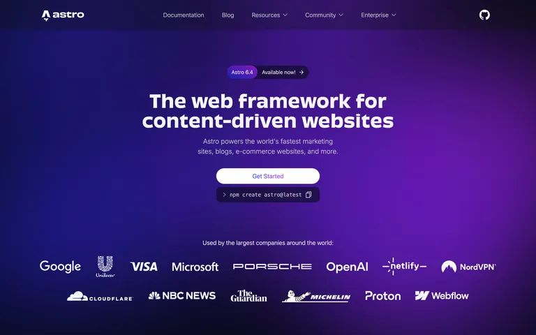
A high-performance sports car for building websites.
02
Color
#54B9FFAccent
#F2F6FAInk
#BFC1C9Ink soft
#0D0F14BG
#12151CBG soft
#858B98Muted
rgba(133, 139, 152, 0.2)Line
Deep, dark backgrounds create a premium, high-contrast canvas for vibrant gradients and crisp white typography.
03
Typography
grotesque-sans · monospace
display64px · 700
h230px · 600
body16px · 400
caption13px · 400
Use clean, geometric grotesque-sans for headlines and body text to maintain a technical, modern feel. · Deploy monospace fonts strictly for code snippets and CLI commands. · Maintain tight letter spacing on large display text for impact.
04
Spacing
4px
8px
12px
16px
24px
32px
48px
64px
96px
Based on a 4px grid, with generous padding (16px, 24px, 32px) defining section boundaries and component spacing.
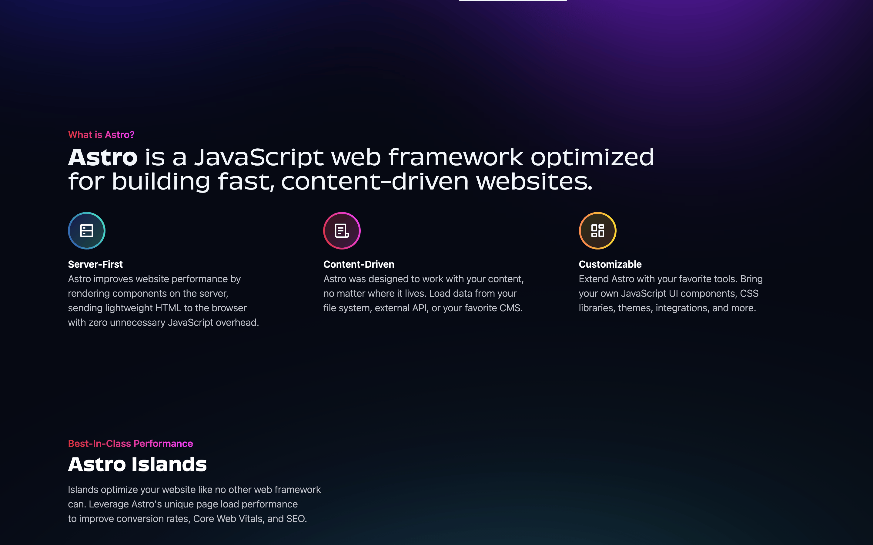
Centered, single-column hero with stacked content, transitioning into a multi-column grid for theme showcases.
07
Motion & Interaction
150msmicro
300mssmall
500msmedium
cubic-bezier(0.4, 0, 0.2, 1)easing
Smooth color and background-color transitions for interactive elements. · Subtle opacity and box-shadow transitions for hover states. · Transform transitions for interactive feedback.
Smooth color and background-color transitions with a standard easing curve. · Standard pointer cursor with no immediate, jarring visual shifts.
08
Components
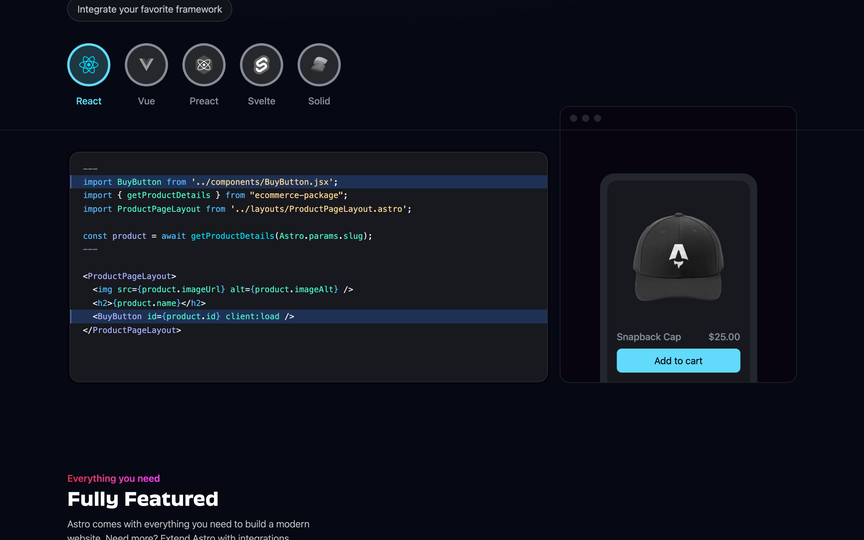
buttonPill-shaped with solid backgrounds (white or purple) and high contrast text.
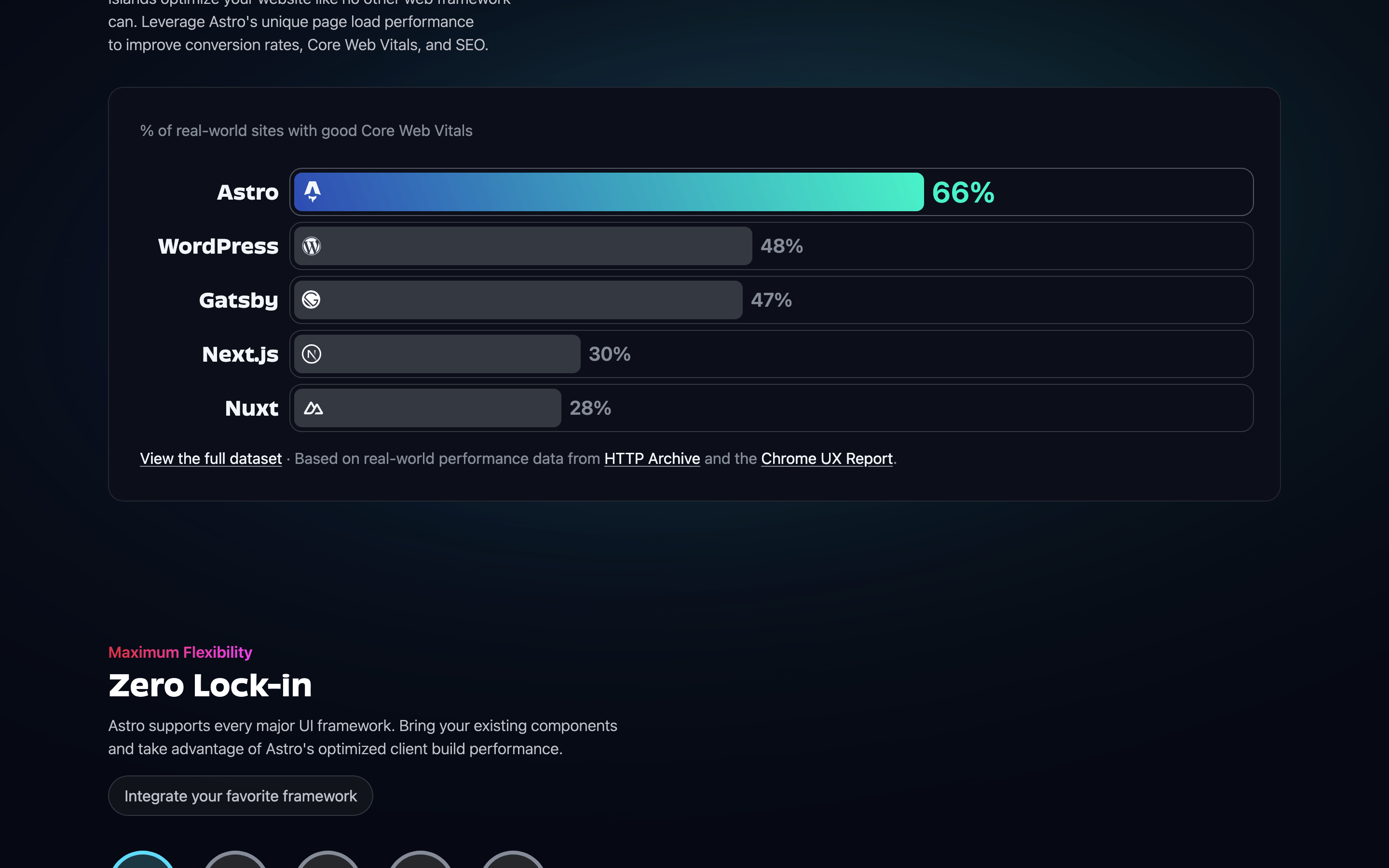
cardDark background with subtle borders and rounded corners, used to showcase themes.
chipPill-shaped category filters with subtle borders.
inputDark background code block with monospace font and a copy icon.
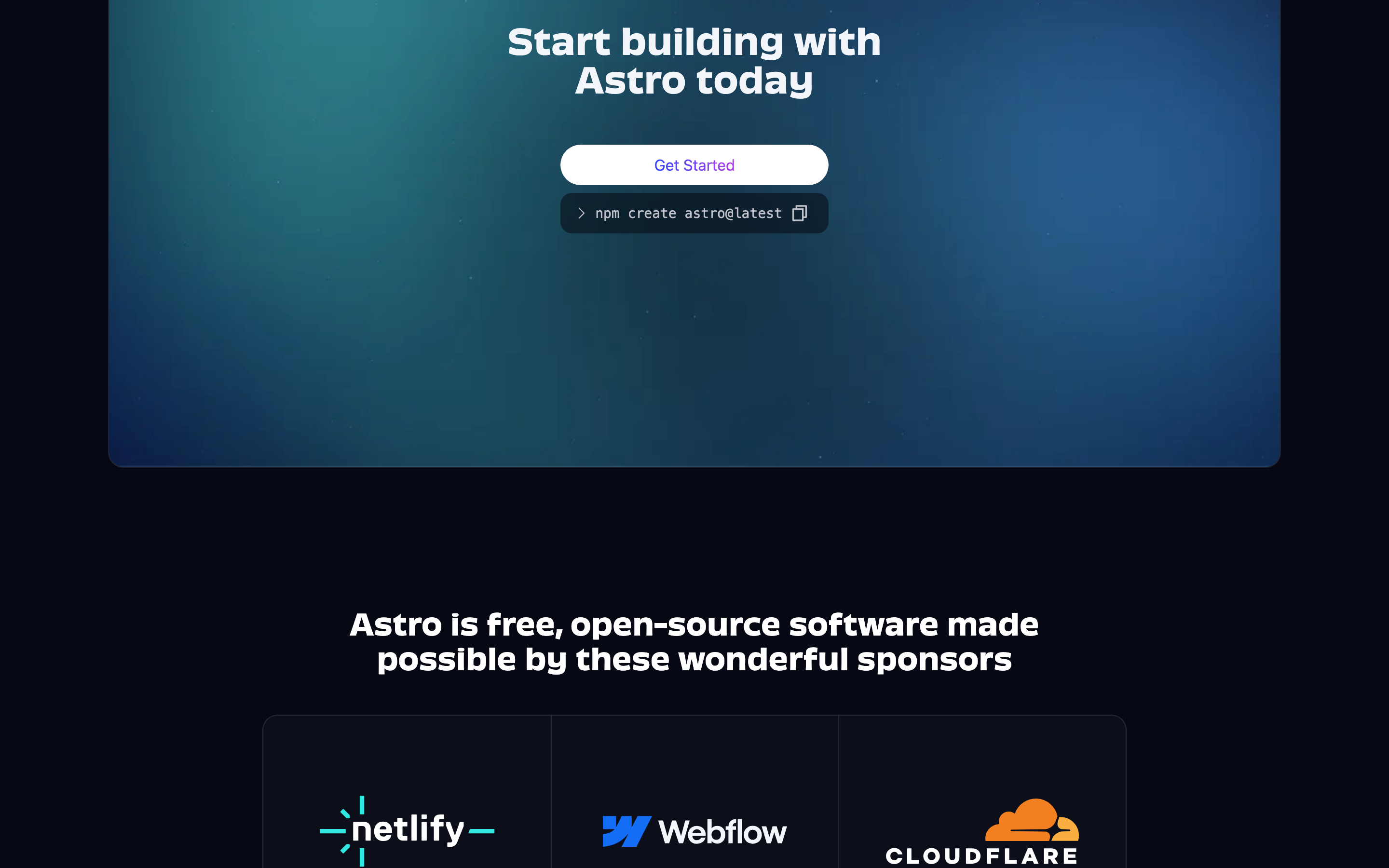
heroFull-width section with a striking linear gradient background and centered typography.
09
Voice & Don'ts
ToneConfident, developer-centric, and straightforward.
HeadlinesBold, direct, and value-oriented statements.
CTAsClear, action-oriented phrases like 'Get Started'.
Don't use bright, saturated backgrounds — screenshot shows deep, dark gradients.
Don't use decorative or serif fonts — screenshot shows clean, geometric sans-serifs.
Don't use sharp, rectangular buttons — screenshot shows pill-shaped buttons with full rounding.
Don't use thin, light text weights for headlines — screenshot shows bold (700) and semi-bold (600) weights.
Don't use a busy or cluttered layout — screenshot shows generous white space and a clear hierarchy.
Don't use a wide range of colors — screenshot shows a limited palette of dark blues, purples, and whites.
Captured from the live site · real computed styles
11
System prompt
Astro is a modern web framework designed for content-driven websites. The design is premium and developer-focused, utilizing a dark mode palette with a deep navy (#0D0F14) base, vibrant purple gradients, and crisp white (#F2F6FA) text. Typography is clean and modern, relying on humanist/grotesque sans-serif categories for a technical feel. Critical design rules include: 1. Always use dark, high-contrast backgrounds. 2. Use pill-shaped (border-radius: 9999px) buttons for primary actions. 3. Never use decorative serif fonts for headlines or body text.
Bring this taste to your agent
Hand your AI agent a machine-readable spec of this design — tokens, type, motion, the whole DNA.