← OpenDesign CURATED · OPEN · FREE
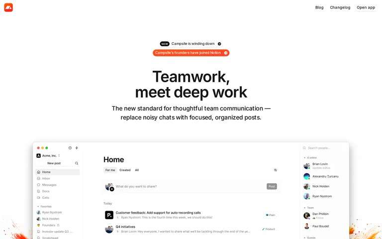
Campsite
A focused team communication tool that replaces noisy chats with organized posts.
SaaS Productivity Clean Calm Restraint
01
Identity DNA
thoughtful focused team communication
A quiet, well-organized library for team posts.
02
Color
#fb432cAccent
#171717Ink
#737373Ink soft
#ffffffBG
#f5f5f5BG soft
#f0f0f0BG quiet
#a3a3a3Muted
rgba(0, 0, 0, 0.1)Line
High-contrast minimalism: crisp white surfaces anchored by deep ink, with a vibrant orange-red accent for key actions.
03
Typography
humanist-sans · monospace
display 56px · 500h2 32px · 600body 16px · 400small 14px · 400Negative letter-spacing on large display text · Regular weight for body copy · Semi-bold for section headings
04
Spacing
4px
8px
12px
16px
24px
32px
48px
64px
96px
Consistent 4px base grid
05
Surfaces
sm · 4px
md · 8px
lg · 12px
pill · 9999px
1px solid rgba(0, 0, 0, 0.1)
0px 3px 6px -3px rgba(0, 0, 0, 0.05) · 0px 1px 2px 0px rgba(0, 0, 0, 0.05) · 0px 1px 0px -1px rgba(0, 0, 0, 0.05)
06
Layout
1280 container
12 columns
24px gutter
768 / 1024 breakpoints
Standard marketing site layout with centered content and generous whitespace.
07
Motion & Interaction
100ms micro
200ms small
400ms medium
cubic-bezier(0.4, 0, 0.2, 1) easing
Smooth color transitions on hover · Subtle box-shadow shifts on interaction
Subtle color or background shifts. · Immediate visual feedback.
08
Components
button Rounded pill shape, outlined or solid primary color. card Clean white containers with subtle borders and soft shadows. chip Small rounded labels with subtle backgrounds. input Standard text fields with light borders. hero Large centered headline with supportive subtext and product screenshot. 09
Voice & Don'ts
Tone Professional yet approachable. Headlines Concise, direct, and benefit-oriented. CTAs Simple, action-oriented text inside rounded buttons. Don't use deep or dark mode backgrounds — screenshot shows bright white surfaces (#ffffff). Don't use sharp, unrounded corners — screenshot shows pill shapes (9999px) and rounded cards (8px–12px). Don't use loud, complex gradients — screenshot shows a clean, flat background with a singular orange accent. Don't use overly decorative or script fonts — screenshot shows a clean, functional sans-serif. Don't crowd elements together — screenshot shows generous whitespace (base 4px grid). Don't use harsh drop shadows — screenshot shows very subtle, low-opacity box shadows. Avoid: Jargon-heavy language Avoid: Overly loud or aggressive marketing copy Avoid: Visual clutter 10
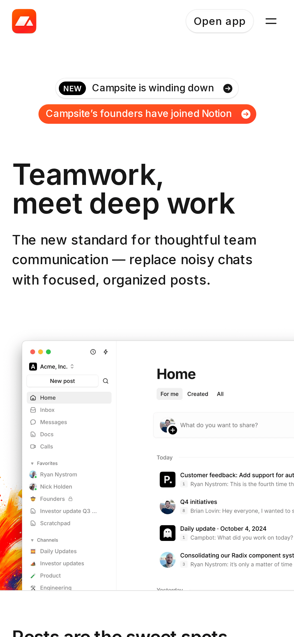
Inside the pack — real screenshots
桌面首屏(hero) 桌面滚动分段(90% viewport 步进,作为视觉证据) 桌面滚动分段(90% viewport 步进,作为视觉证据) 桌面滚动分段(90% viewport 步进,作为视觉证据) 桌面滚动分段(90% viewport 步进,作为视觉证据) 桌面滚动分段(90% viewport 步进,作为视觉证据) 桌面滚动分段(90% viewport 步进,作为视觉证据) 桌面滚动分段(90% viewport 步进,作为视觉证据) 桌面滚动分段(90% viewport 步进,作为视觉证据) 移动首屏 Captured from the live site · real computed styles
11
System prompt
Campsite is a focused team communication tool for remote teams. Its design DNA is built on a clean, high-contrast minimalist aesthetic: crisp white (#ffffff) surfaces, deep ink (#171717) for text, and a vibrant orange-red accent (#fb432c) for primary actions. Typography uses a humanist sans-serif category with negative letter-spacing on large display text. Critical design constraints: do not use dark mode or complex gradients, do not use sharp corners (always use rounded pills or soft radiuses), and do not crowd the layout (maintain generous whitespace).
More from the library en · zh-CN · zh-TW · ja · ko
OpenDesign · curated web aesthetics for AI-readable design DNA · opendesign.cc
Why we curated this: The site exemplifies a modern, restrained SaaS landing page design, using typography and whitespace as primary design tools.