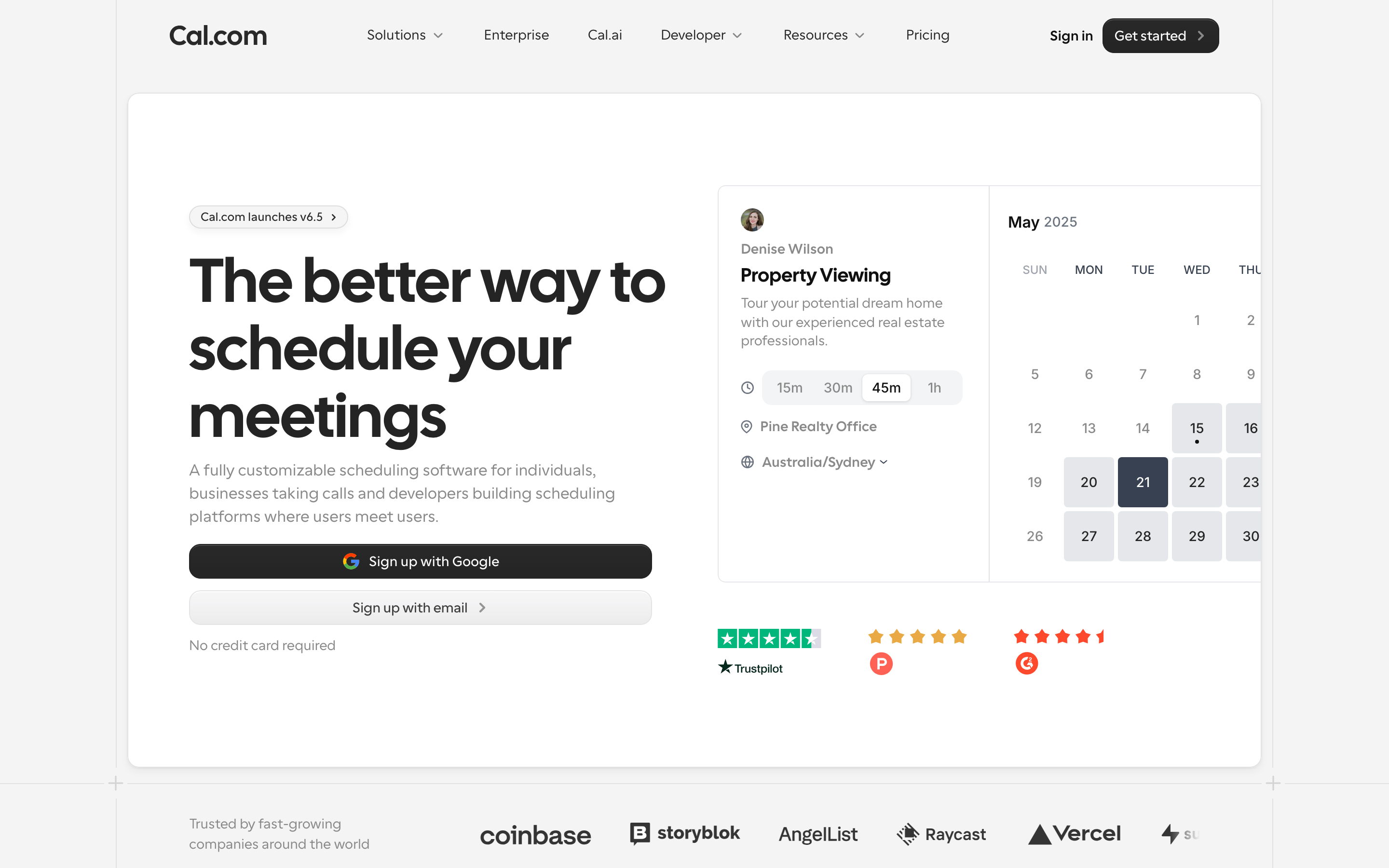
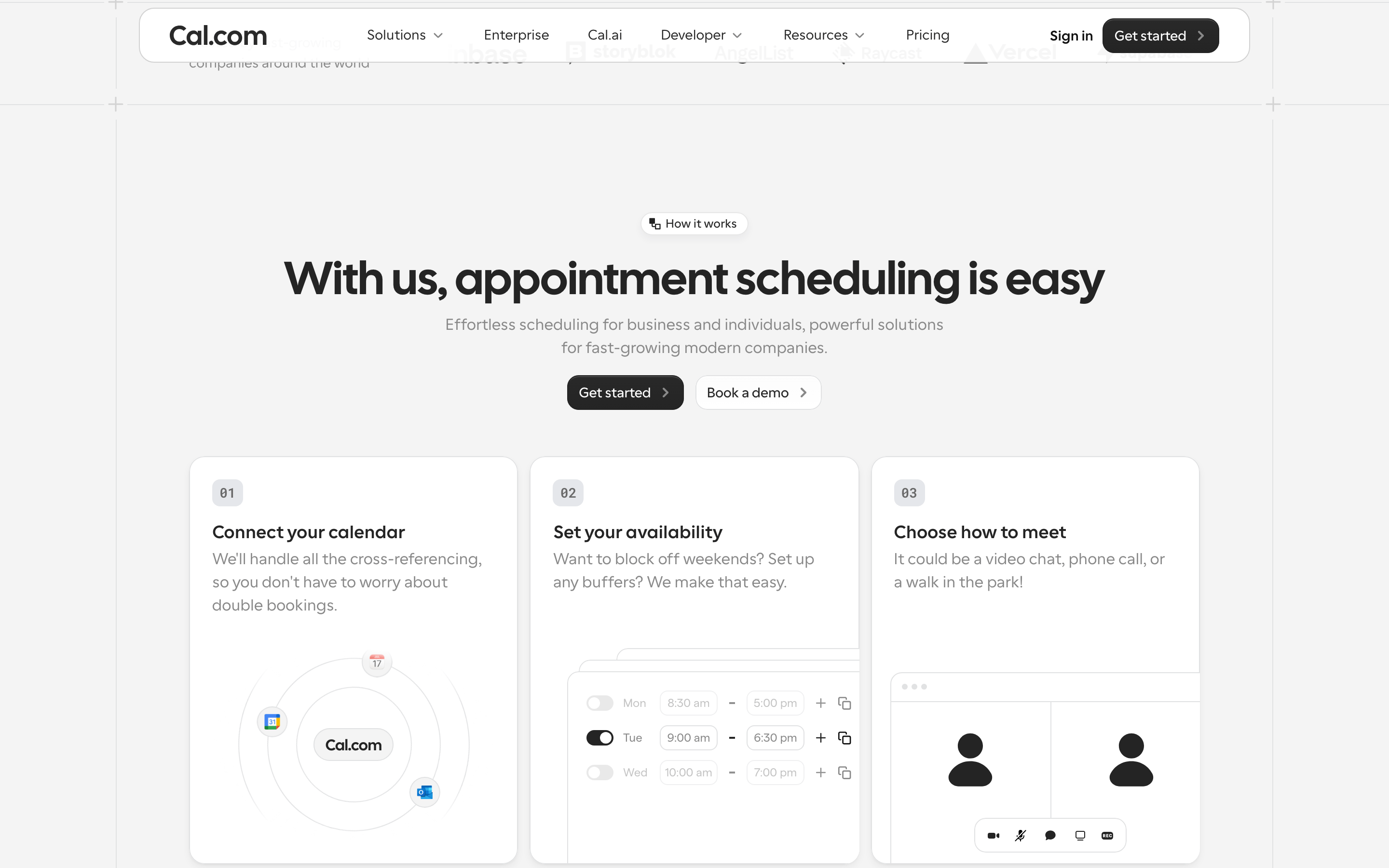
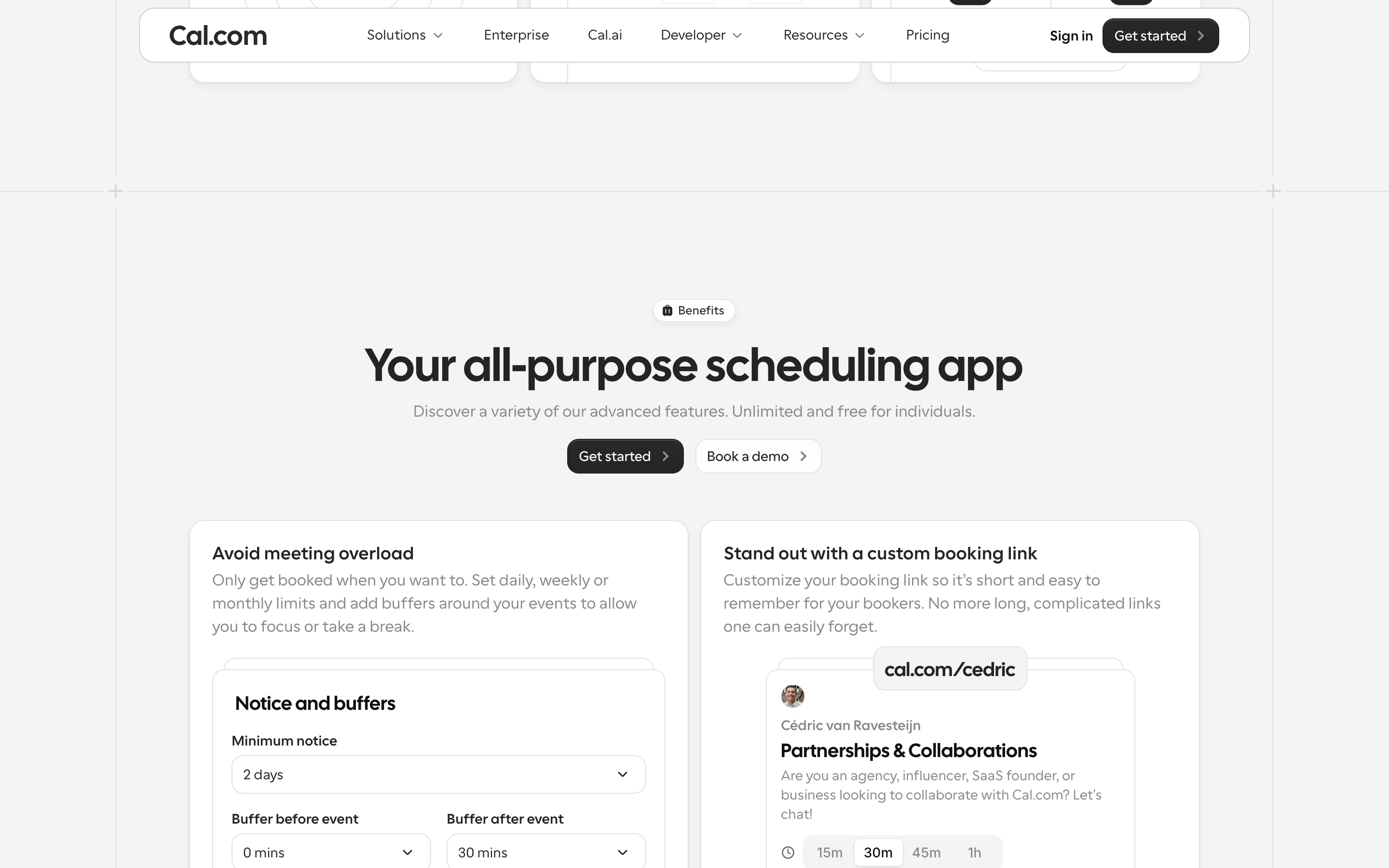
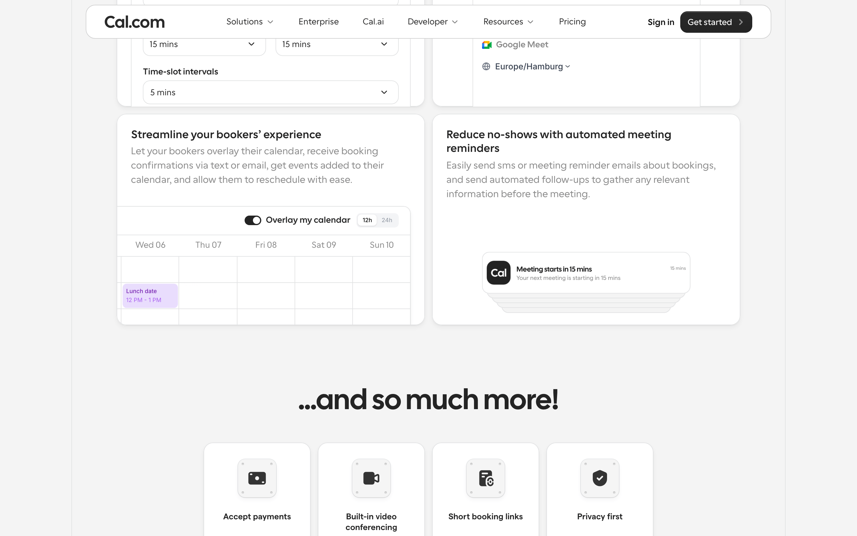
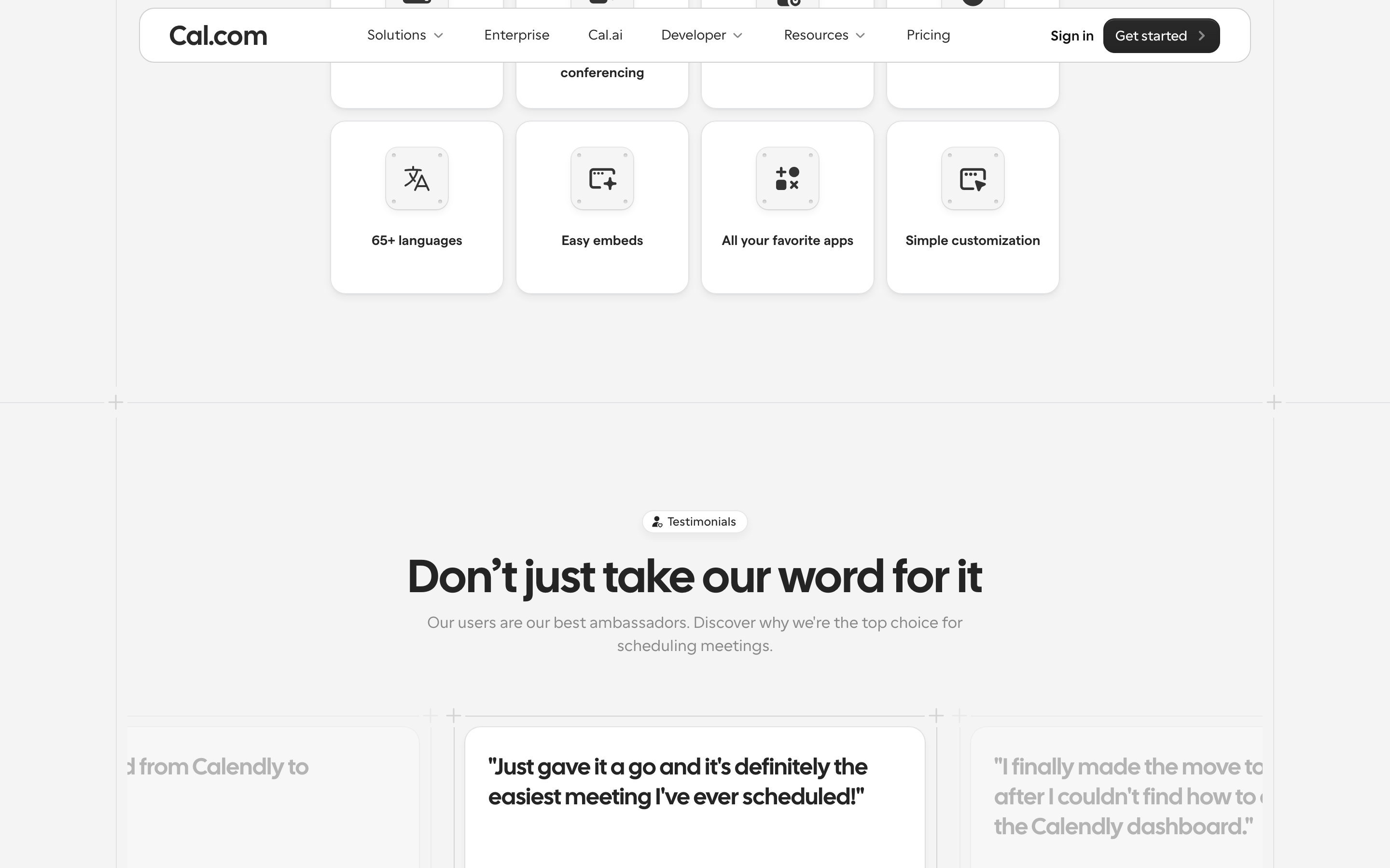
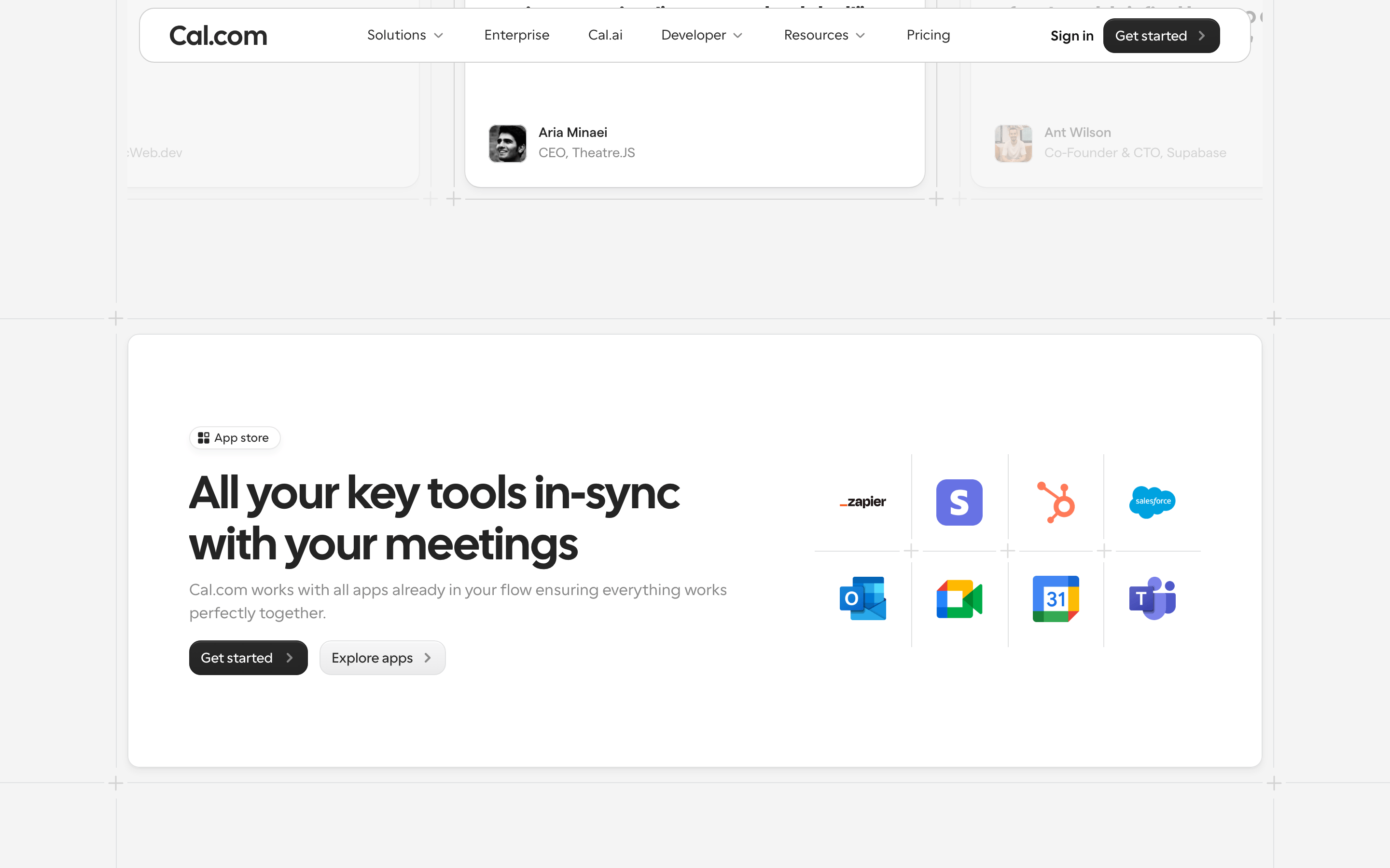
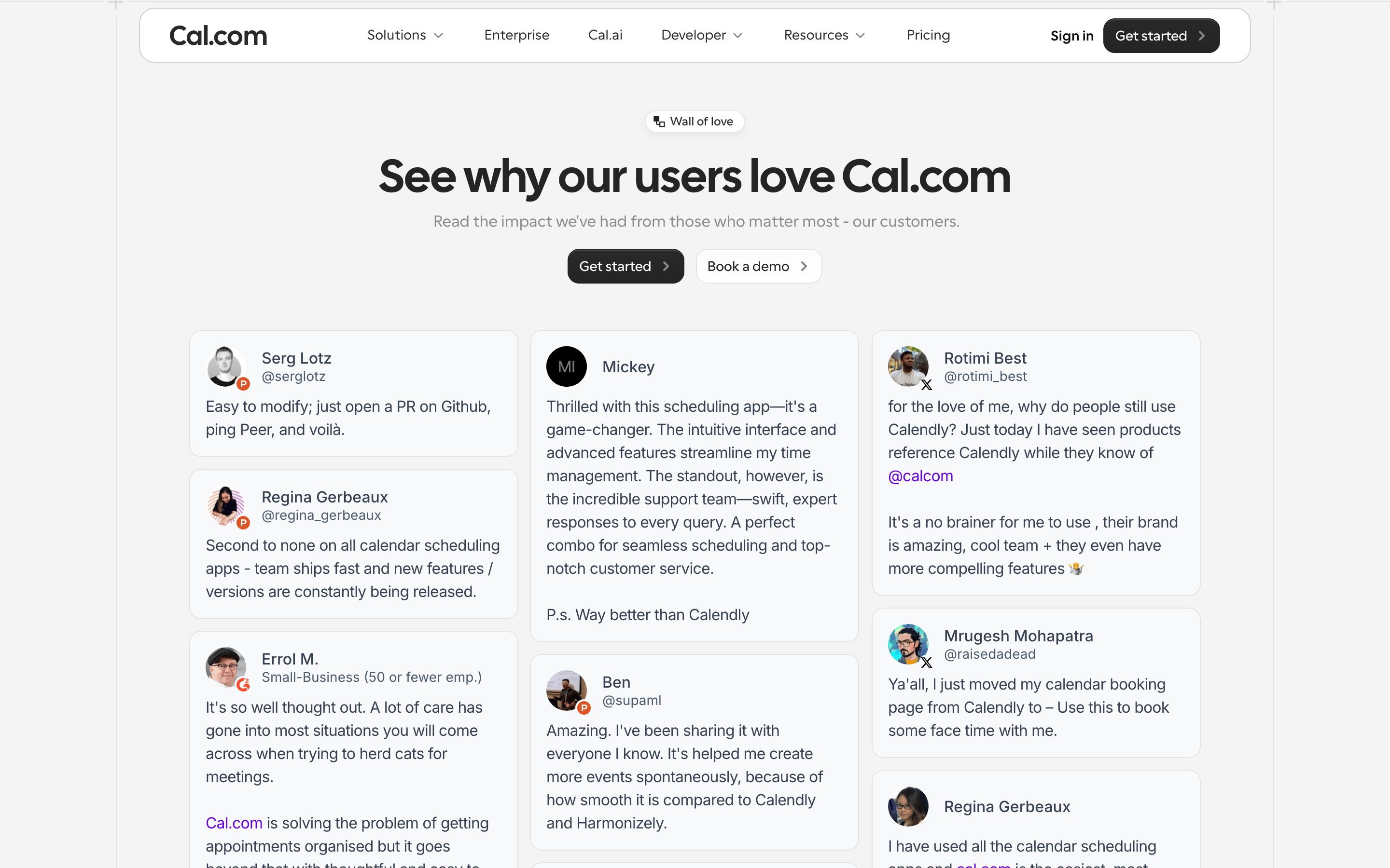
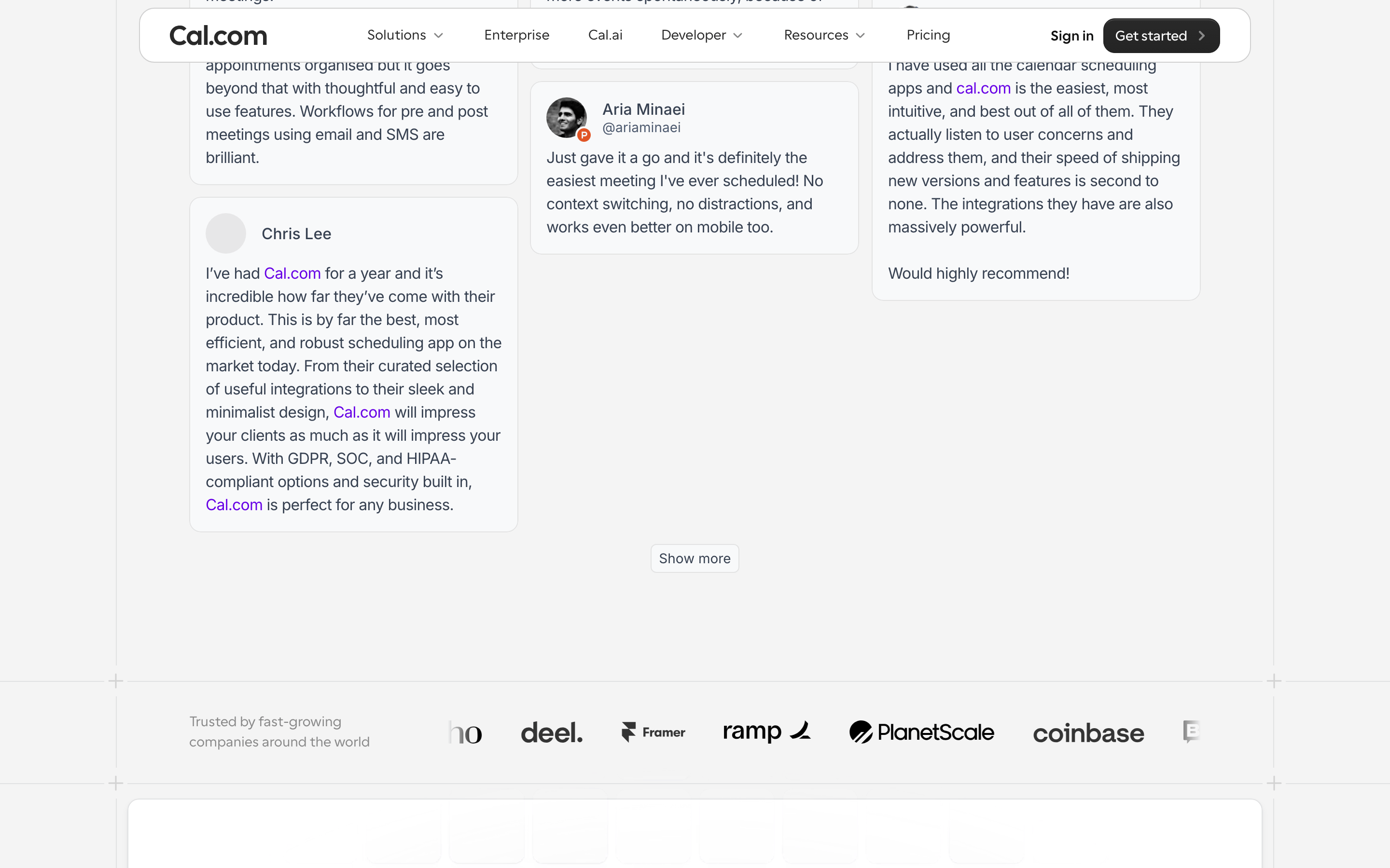
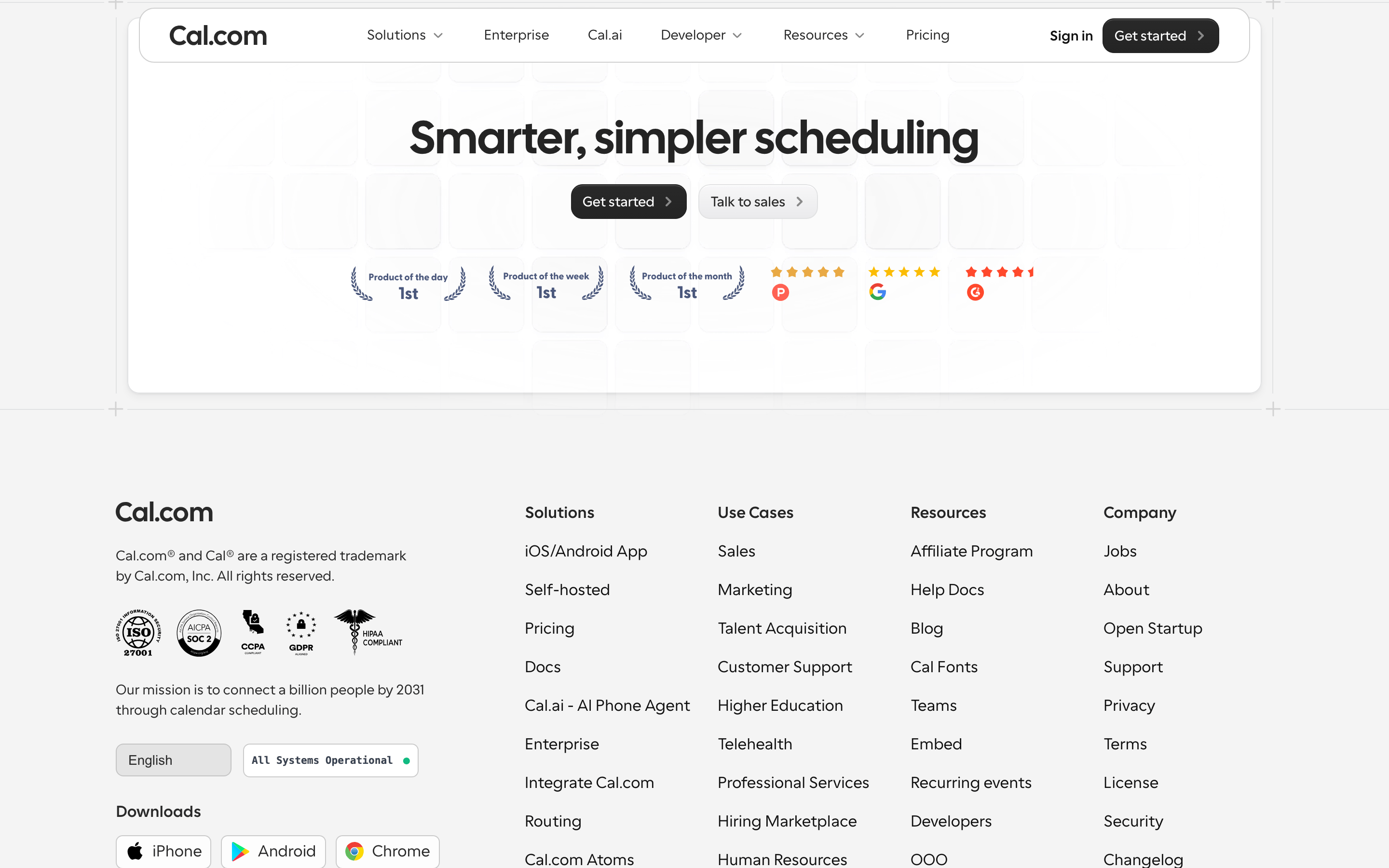
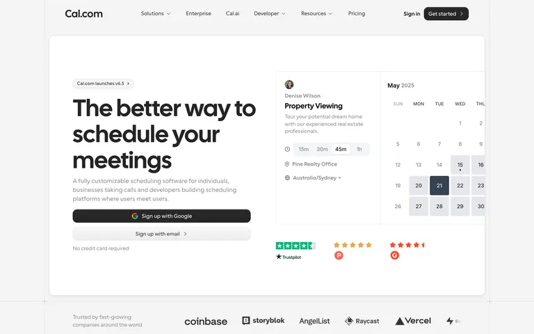
A clean, modern Swiss railway timetable translated into a digital scheduling platform.
02
Color
#000000Ink
#292929Ink soft
#FFFFFFBG
#F4F4F4BG soft
#E1E2E3BG quiet
#898989Muted
rgba(0,0,0,0.16)Line
Monochromatic with high contrast. Pure black on white with neutral grays for hierarchy and structure.
03
Typography
geometric-sans · humanist-sans · monospace
display48px · 500
h232px · 600
body16px · 400
caption12px · 400
Headlines use a tight letter-spacing of -0.2px · Body text uses a comfortable 1.5 line height · Buttons and navigation use 500 weight for emphasis · Calendar days and small labels use 400 weight
04
Spacing
4px
8px
16px
24px
32px
48px
64px
96px
A consistent 4px base grid ensures tight alignment in UI components and relaxed whitespace in content sections.
05
Surfaces
sm · 4px
md · 8px
lg · 12px
pill · 999px
Subtle 1px solid borders using rgba(0,0,0,0.16) or light grays for card edges.
Captured from the live site · real computed styles
11
System prompt
Cal.com is a high-end, customizable scheduling software platform. Its design DNA is built on a clean, monochromatic palette of black, white, and neutral grays, using geometric sans-serif fonts for display and humanist sans-serif for body text. The layout is spacious and structured, featuring a 12-column grid and a 4px base for spacing. Key components include pill-shaped buttons and subtle cards that showcase product functionality. Critical constraints: avoid any vibrant accent colors, do not use serif fonts, and maintain a high-contrast, professional aesthetic. Avoid cluttered layouts; prioritize clarity and whitespace. The overall feel is premium and developer-focused, emphasizing reliability and precision.
Bring this taste to your agent
Hand your AI agent a machine-readable spec of this design — tokens, type, motion, the whole DNA.