← OpenDesign CURATED · OPEN · FREE
Carrd
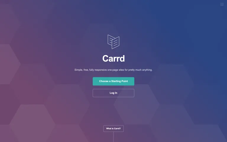
A minimal, gradient-based landing page for a one-page site builder.
nocode tool
01
Identity DNA
simplicity accessibility responsive
A calm, geometric welcome screen for a digital toolkit.
02
Color
#33ada9Accent
#ffffffInk
rgba(255,255,255,0.75)Ink soft
#24252dBG
rgba(255,255,255,0.4)Muted
rgba(255,255,255,0.075)Line
High-contrast white text over a dark, low-chroma gradient, with a single vibrant teal accent.
03
Typography
grotesque-sans
display 56px · 700heading 34px · 700body-lg 24px · 400body 16px · 400caption 12px · 40004
Spacing
4px
8px
16px
24px
32px
48px
64px
96px
Base 4px scale with generous padding (32-64px) for large sections.
05
Surfaces
sm · 4px
md · 6px
lg · 12px
pill · 999px
Subtle 1-2px white borders with varying opacity (0.4 to 0.75) or a solid white stroke.
rgba(0, 0, 0, 0.1) 0px 8px 16px 0px
06
Layout
1280 container
12 columns
24px gutter
768 / 1024 breakpoints
Centered single-column layout on hero, transitioning to a 2-column grid for features.
07
Motion & Interaction
200ms micro
250ms small
800ms medium
cubic-bezier(0.25, 0.1, 0.25, 1) easing
Color and opacity transitions on hover and focus · Fade-in for page sections
Color transitions and subtle opacity changes on interactive elements. · N/A
08
Components
button Rounded rectangles with solid teal fill for primary actions, and thin white borders for secondary actions. card Cards with images and subtle shadows, often used for template previews. chip N/A input N/A hero Full-width centered layout with a large logo, headline, sub-headline, and primary CTA button. 09
Voice & Don'ts
Tone Helpful, minimalist, and approachable. Headlines Bold, large, and clean, often using a single word like 'Responsive' or 'Free'. CTAs Direct and action-oriented, using phrases like 'Choose a Starting Point'. Don't use multiple competing accent colors — screenshot shows a single teal (#33ada9) as the only vibrant hue. Don't use complex, multi-layered gradients — screenshot shows a simple two-color linear gradient overlay. Don't use decorative or serif typefaces — screenshot shows a clean, standard grotesque-sans (Arial/Helvetica). Don't use heavy, solid black backgrounds — screenshot shows a dark charcoal (#24252d) as the primary background. Don't use square, sharp corners for buttons — screenshot shows consistent 6px rounded corners. Don't use wide, sprawling layouts — screenshot shows content constrained to a narrow, centered column. Avoid: Jargon-heavy technical language Avoid: Overly complex sentences Avoid: Aggressive or urgent tone 10
Inside the pack — real screenshots
桌面首屏(hero) 桌面滚动分段(90% viewport 步进,作为视觉证据) 桌面滚动分段(90% viewport 步进,作为视觉证据) 桌面滚动分段(90% viewport 步进,作为视觉证据) 桌面滚动分段(90% viewport 步进,作为视觉证据) 桌面滚动分段(90% viewport 步进,作为视觉证据) 桌面滚动分段(90% viewport 步进,作为视觉证据) 桌面滚动分段(90% viewport 步进,作为视觉证据) 移动首屏 Captured from the live site · real computed styles
11
System prompt
Carrd is a minimalist, user-friendly tool for creating simple one-page websites. The design utilizes a dark, desaturated palette centered around charcoal (#24252d) with a subtle purple-blue gradient overlay. Typography is strictly functional, relying on standard system grotesque-sans fonts (Arial/Helvetica) for all display and body text. The single vibrant accent is a muted teal (#33ada9), used exclusively for primary call-to-action buttons to provide clear visual guidance. Critical design constraints include avoiding complex color schemes, maintaining a strictly centered single-column or simple 2-column layout, and using only consistent 6px rounded corners for interactive elements. The overall tone is calm, restrained, and highly focused on clarity and ease of use.
More from the library en · zh-CN · zh-TW · ja · ko
OpenDesign · curated web aesthetics for AI-readable design DNA · opendesign.cc
Why we curated this: This site is a perfect example of how a highly restrained, minimalist design can still feel modern and professional through careful use of a dark mode palette and a single, well-chosen accent color.
浙ICP备2021038972号-5