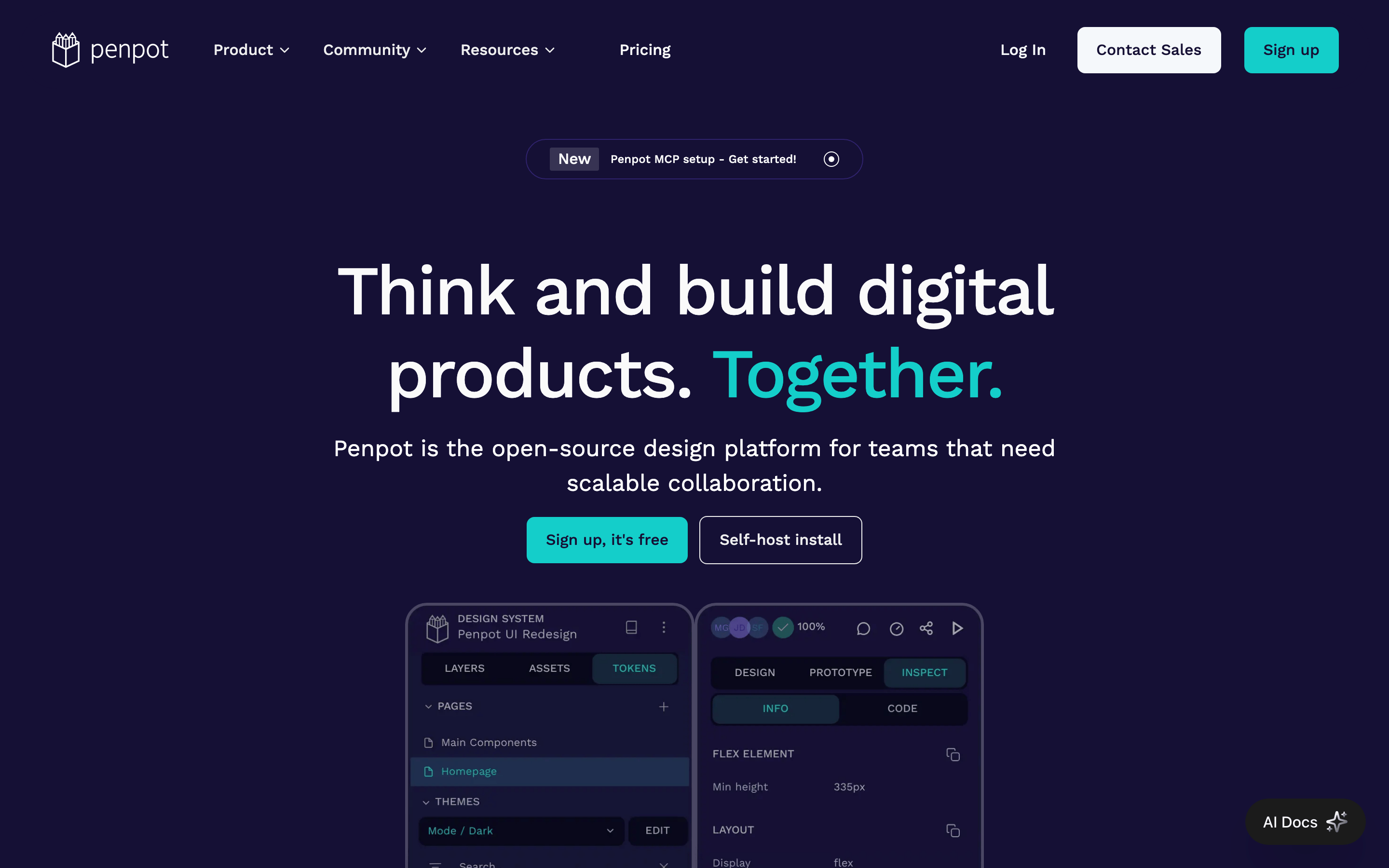
An open-source Figma alternative focused on team collaboration and scalable design systems.
02
Color
#14CECAAccent
#FAFAFAInk
#EEEEEEInk soft
#151035BG
#1C124BBG soft
rgba(255, 255, 255, 0.15)Line
High-contrast dark theme with a single vibrant teal accent for primary actions.
03
Typography
humanist-sans · monospace
display72px · 500
heading52px · 500
body18px · 400
small16px · 400
tiny12px · 500
04
Spacing
4px
8px
12px
16px
20px
24px
32px
48px
64px
96px
A consistent 4px grid system is used for all spacing, padding, and sizing.
05
Surfaces
sm · 4px
md · 8px
lg · 12px
pill · 100px
Subtle 1px borders in rgba(255, 255, 255, 0.15) or matching background colors are used for structural separation.
elevation-1: none · elevation-2: none
06
Layout
1280container
12columns
24pxgutter
768 / 1024breakpoints
A centered, single-column layout with a maximum width container for content.
07
Motion & Interaction
100msmicro
200mssmall
1000msmedium
ease-in-outeasing
Smooth transitions on background and transform properties. · Subtle opacity changes for interactive states.
Background colors shift slightly, and text colors may change to indicate interactivity. · Immediate visual feedback through color change or subtle transform.
08
Components
buttonPill-shaped buttons with high contrast (teal background with dark text, or dark background with white text/border).
cardDark containers with subtle borders, often featuring rounded corners and internal padding.
chipSmall, pill-shaped tags or badges used for status or categories.
inputDark-themed input fields with subtle borders and light text.
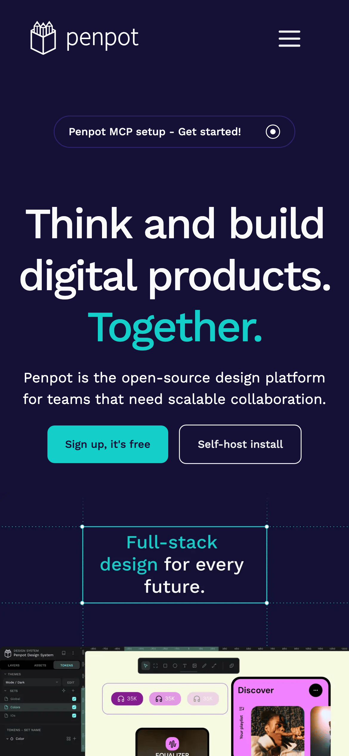
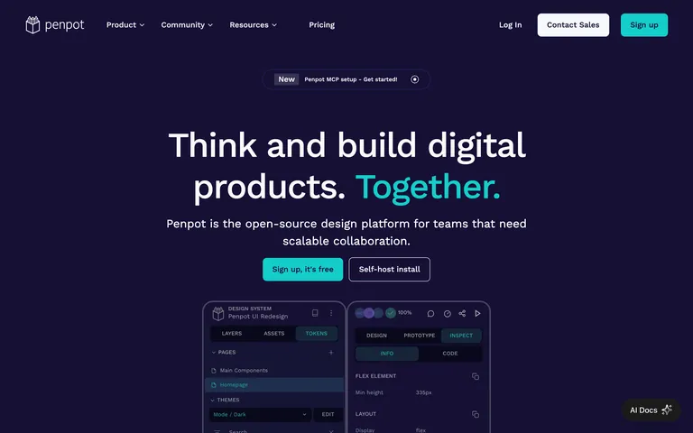
heroA full-width, dark-background section featuring a large, bold headline, descriptive text, and prominent call-to-action buttons.
09
Voice & Don'ts
ToneProfessional, confident, and collaborative.
HeadlinesBold, direct statements emphasizing empowerment and teamwork.
CTAsClear, action-oriented phrases like 'Sign up, it's free' or 'Self-host install'.
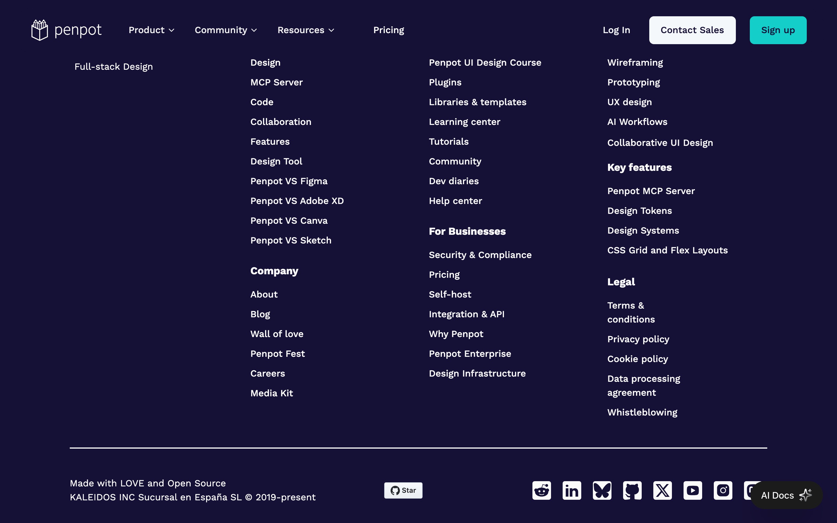
Don't use a light theme — the screenshot shows a consistent, deep dark background (#151035).
Don't use a serif font for headings — the screenshot shows a humanist sans-serif (Work Sans) throughout.
Don't use multiple competing accent colors — the screenshot shows a single, dominant teal (#14CECA) for emphasis.
Don't use sharp, rectangular corners on buttons or cards — the screenshot shows rounded corners (8px-12px) or pill shapes.
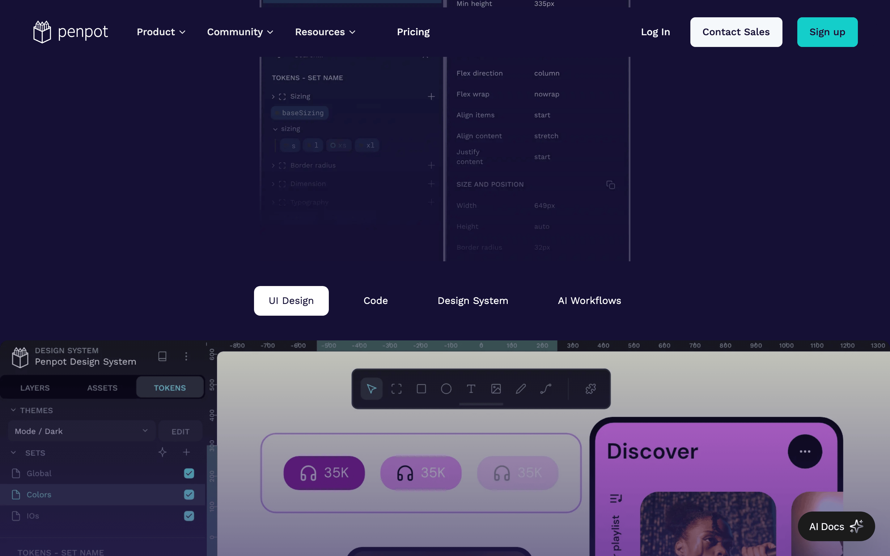
Don't use complex, multi-colored gradients for backgrounds — the screenshot shows a solid dark background with subtle gradients only in specific UI mockups.
Don't use heavy, decorative typography — the screenshot shows clean, highly legible humanist sans-serif fonts.
Avoid: Vague or overly technical jargon without context.
Captured from the live site · real computed styles
11
System prompt
This is the website for Penpot, an open-source design platform. It uses a dark mode theme with a deep indigo (#151035) background and white (#FAFAFA) text. A single, vibrant teal (#14CECA) is used as the primary accent color for calls-to-action. The typography is a clean, humanist sans-serif (Work Sans) across all scales. Layouts are centered and spacious. Do not use a light theme, multiple accent colors, or serif fonts. Avoid heavy gradients and sharp, rectangular corners on interactive elements.
Bring this taste to your agent
Hand your AI agent a machine-readable spec of this design — tokens, type, motion, the whole DNA.