← OpenDesign CURATED · OPEN · FREE
Evm Elektramontreal Ca
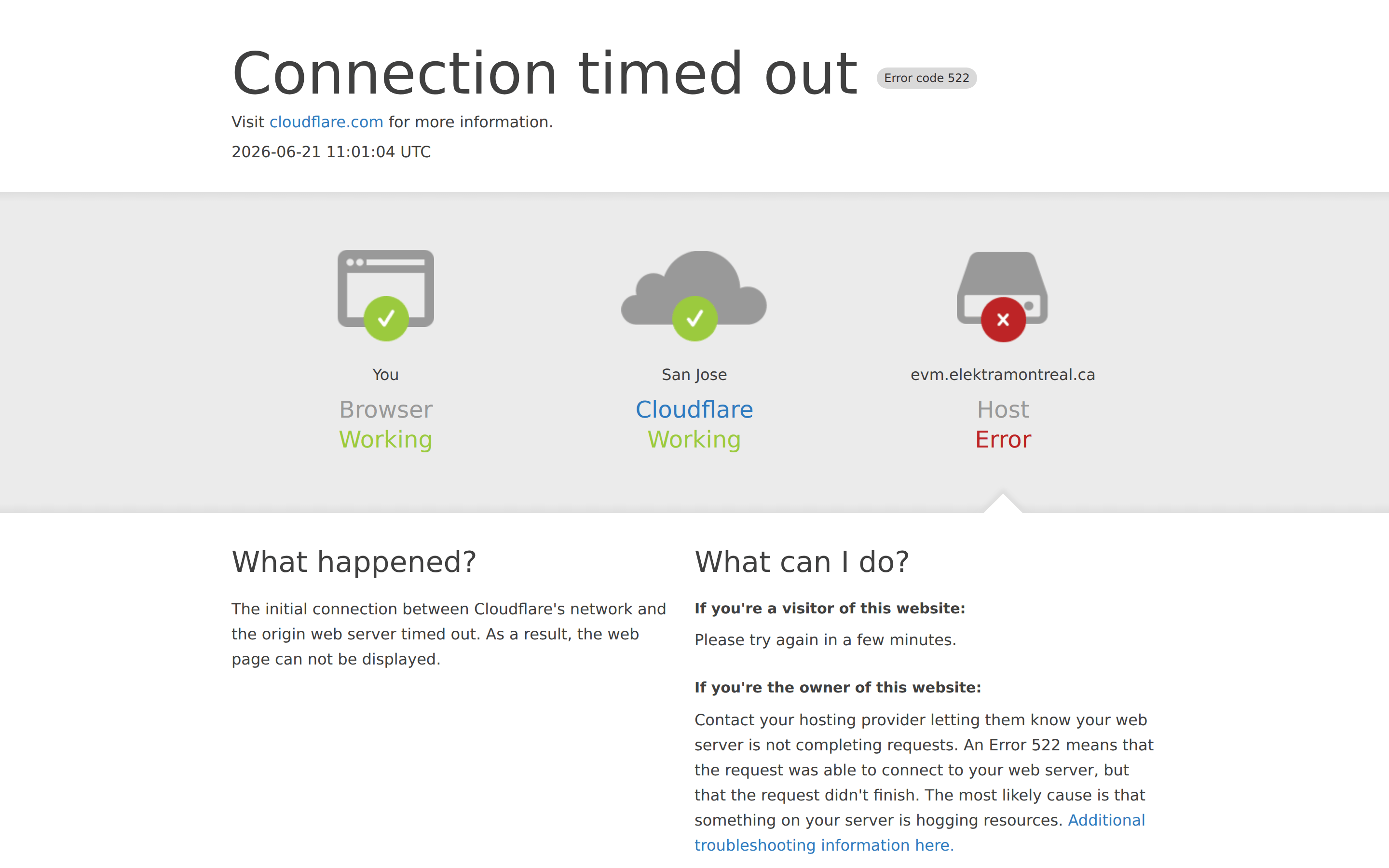
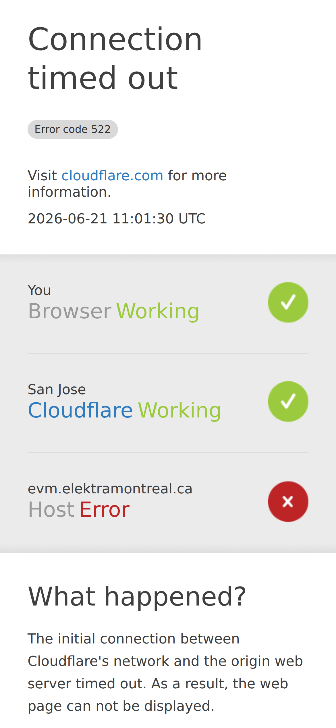
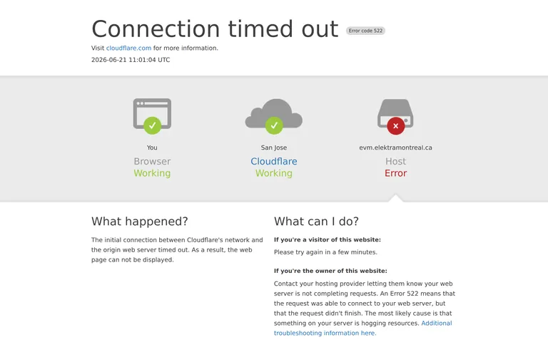
A utilitarian error page providing clear diagnostic information through visual icons and concise text.
SaaS Developer Tools Clean Reference Restraint
01
Identity DNA
error diagnostic informative utility clarity
A clear, utilitarian system status dashboard for a network error.
02
Color
#404040Ink
#FFFFFFBG
#999999Muted
rgba(64,64,64,0.1)Line
High-contrast neutral palette with semantic color accents for status.
03
Typography
system-sans · system-mono
display 60px · 300heading 30px · 300body 16px · 40004
Spacing
4px
8px
16px
24px
32px
48px
64px
96px
Standard 4px base grid with generous vertical spacing for clarity.
05
Surfaces
sm · 4px
md · 8px
lg · 12px
pill · 999px
Subtle light gray gradient background for the status diagram section.
06
Layout
1280 container
12 columns
24px gutter
768 / 1024 breakpoints
Three-column horizontal status diagram that collapses to a single-column vertical stack on mobile.
07
Motion & Interaction
150ms micro
0ms small
0ms medium
cubic-bezier(0, 0, 0.2, 1) easing
Standard CSS transitions for link hover states.
Subtle color change on links. · Standard link navigation.
08
Components
button No visible buttons, only links. card Three-column status diagram with icons and labels. chip Small, pill-shaped error code badge with a light gray background. input No form inputs visible. hero Large, light-weight headline with a subtext link and timestamp. 09
Voice & Don'ts
Tone Direct, informative, and technically precise. Headlines Large, light-weight, and declarative. CTAs Informational links rather than call-to-action buttons. Don't use decorative fonts — screenshot shows a highly legible system sans-serif stack. Don't add complex shadows or depth — screenshot shows a flat design with only a subtle gradient background. Don't use a dark color scheme — screenshot shows a bright white background with dark gray text. Don't hide the error code — screenshot shows it prominently in a small, distinct badge next to the headline. Don't use multiple accent colors — screenshot uses a limited palette where red and green are strictly for status icons. Don't create a cluttered layout — screenshot shows generous whitespace and a clear visual hierarchy with a large title. Avoid: Jargon without explanation Avoid: Playful or informal language Avoid: Dense, unbroken paragraphs of text Avoid: Vague instructions Avoid: Overuse of bold or strong emphasis 10
Inside the pack — real screenshots
桌面首屏(hero) 桌面滚动分段(90% viewport 步进,作为视觉证据) 桌面滚动分段(90% viewport 步进,作为视觉证据) 移动首屏 Captured from the live site · real computed styles
11
System prompt
This is a utilitarian error page design focused on clarity and information delivery. The palette is neutral, using #FFFFFF for background and #404040 for primary ink, with semantic green and red for status. Typography is a system sans-serif stack, with a very light 60px display weight for the main headline. The layout is a centered container that switches from a 3-column status diagram to a vertical stack on mobile. Critical donts: don't use decorative fonts, don't add complex shadows, and don't hide the specific error code. The design prioritizes immediate recognition of a system failure and provides clear, actionable instructions.
More from the library en · zh-CN · zh-TW · ja · ko
OpenDesign · curated web aesthetics for AI-readable design DNA · opendesign.cc
Why we curated this: This site is worth including as a prime example of a clear, accessible, and well-structured utility/error page design.