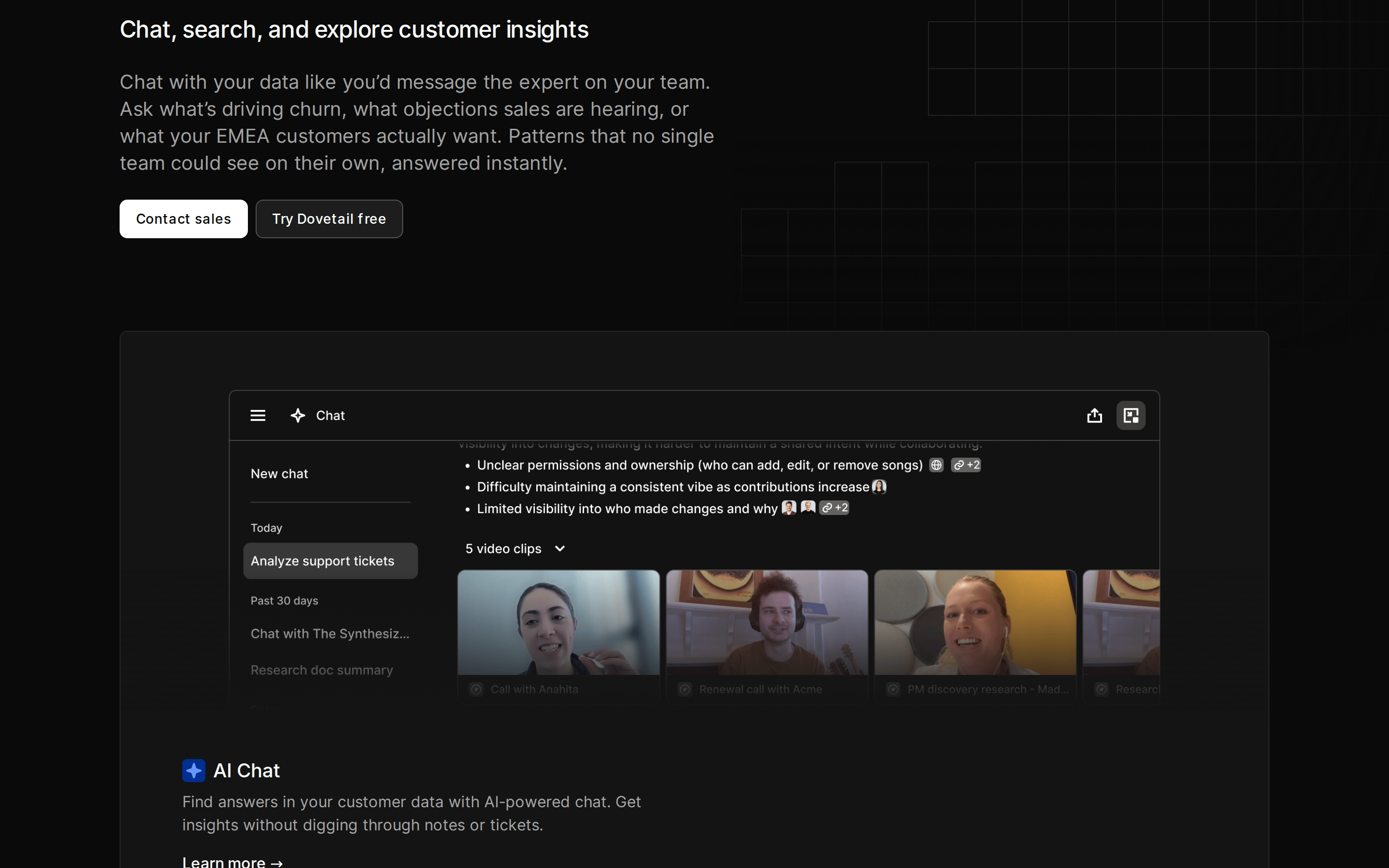
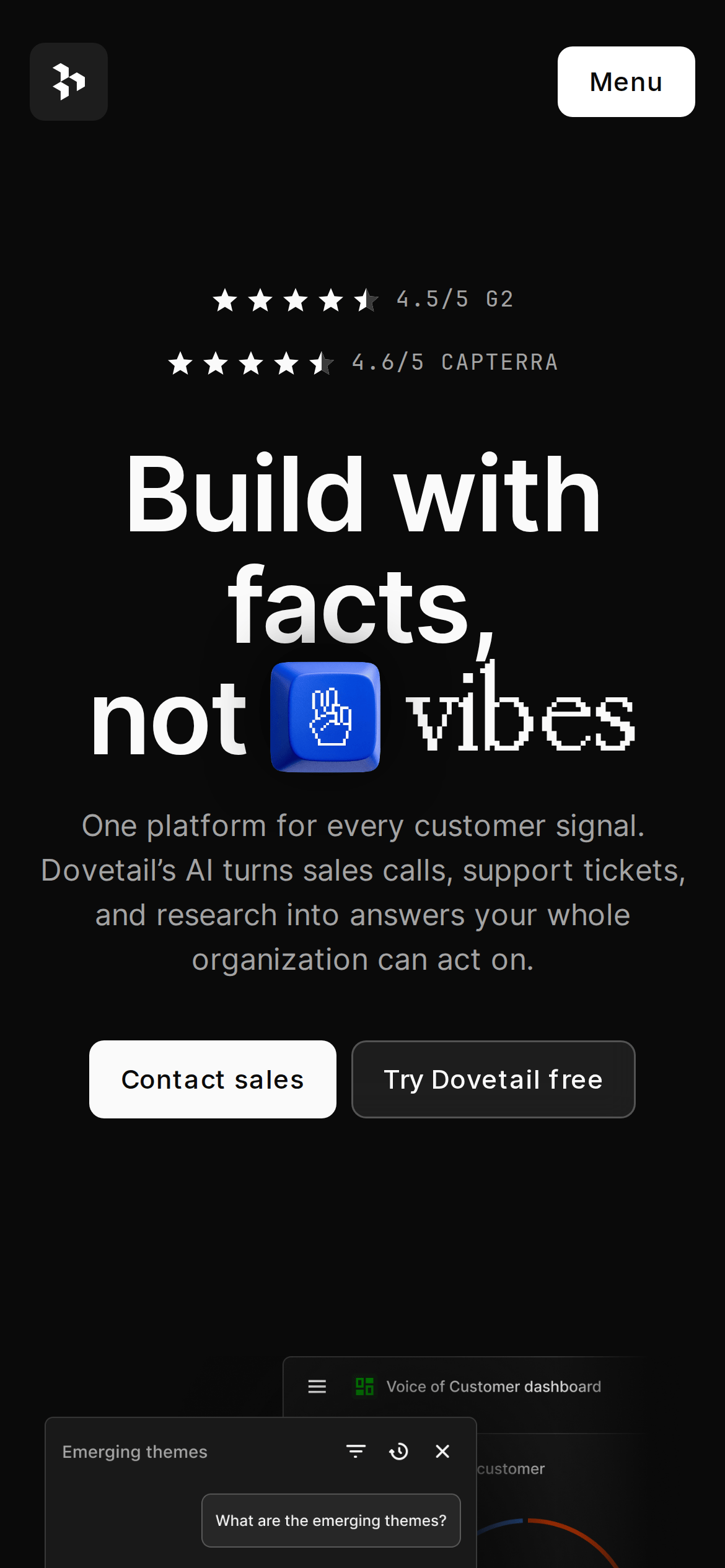
A modern, data-centric command center for customer feedback.
02
Color
#0044FFAccent
#FAFAFAInk
#A7A7A7Ink soft
#0A0A0ABG
#141414BG soft
#151515BG quiet
rgba(255, 255, 255, 0.08)Line
High-contrast monochrome base with a single electric blue accent to denote primary actions.
03
Typography
geometric-sans · humanist-sans · monospace
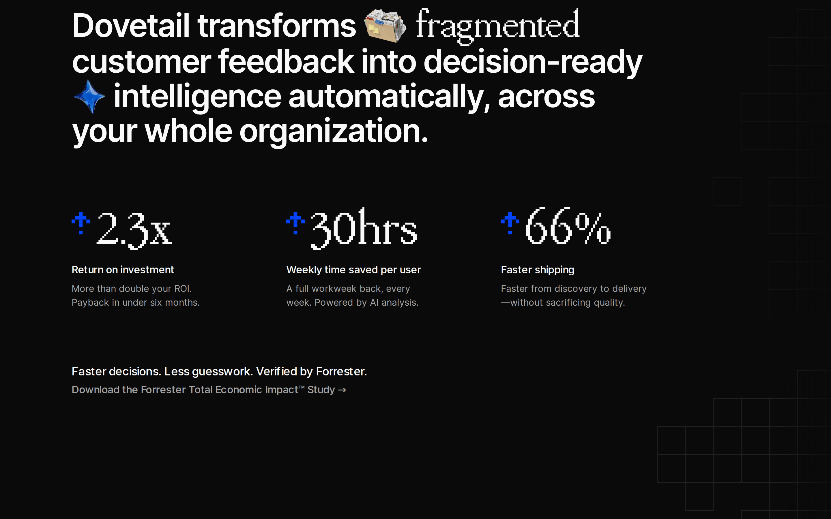
display112px · 500
heading24px · 600
body20px · 400
caption14px · 500
Use geometric sans for large, impactful headlines to establish a modern tech feel. · Keep body text at a comfortable reading size with ample line height for readability. · Monospace is reserved strictly for code snippets or technical data representations. · PP Mondwest is used specifically for the 'vibes' decorative element in the hero.
04
Spacing
4px
8px
16px
24px
32px
48px
64px
96px
124px
Generous vertical rhythm with 124px padding creating clear section separation.
05
Surfaces
sm · 4px
md · 8px
lg · 12px
pill · 999px
Subtle 1px borders using rgba(255, 255, 255, 0.08) for cards and input fields.
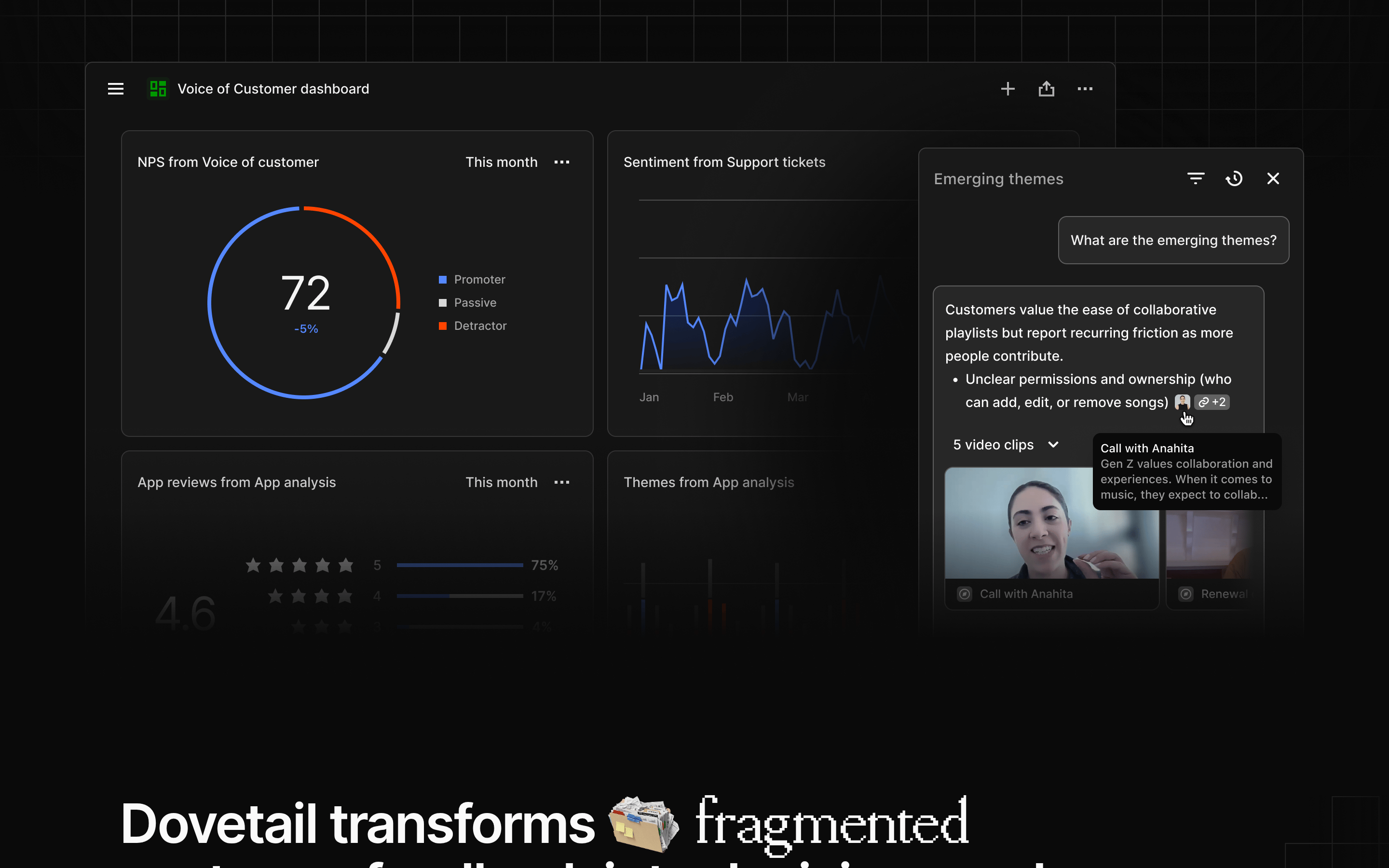
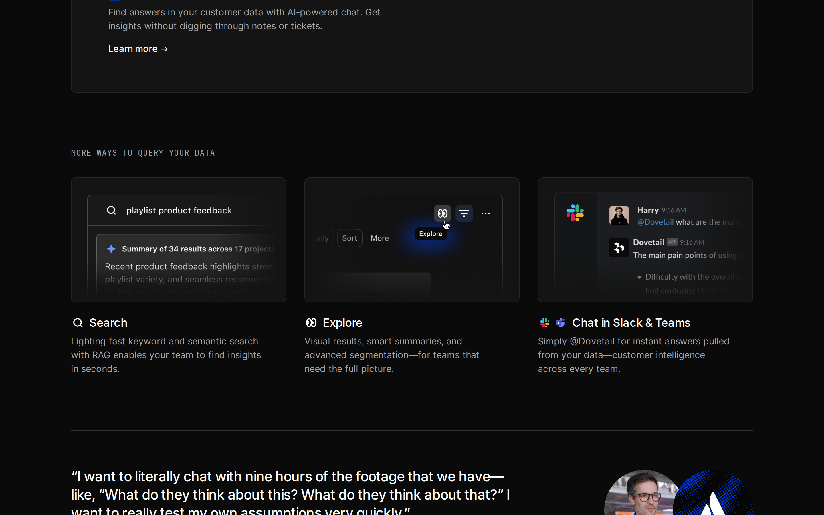
Centered, single-column hero followed by wide multi-column feature grids.
07
Motion & Interaction
220msmicro
400mssmall
800msmedium
cubic-bezier(0.25, 0.1, 0.25, 1.0)easing
Smooth opacity and color transitions on hover states (0.2s-0.3s). · Subtle entrance animations for content blocks. · Interactive elements change color smoothly without jarring jumps.
Subtle background color shifts and opacity changes on buttons and links. · Immediate visual feedback through color inversion or slight scaling.
08
Components
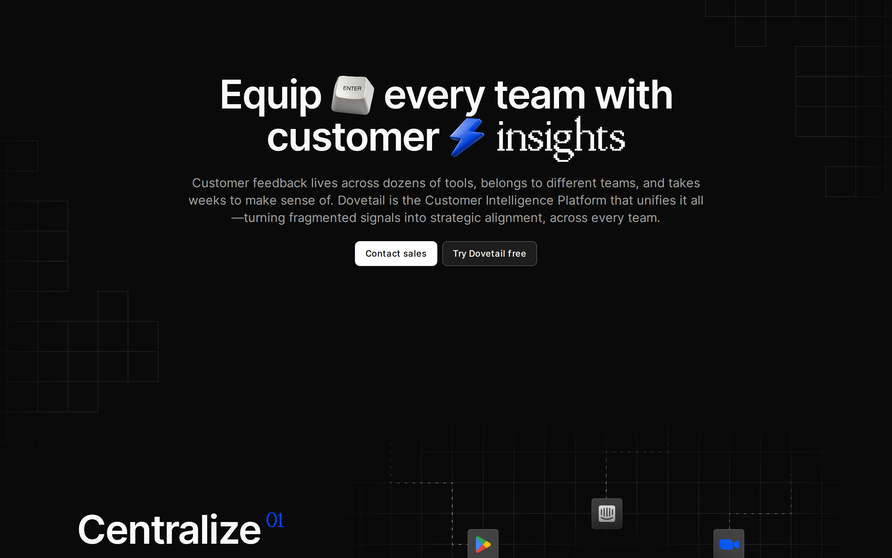
buttonRounded pill buttons; primary is solid white with black text, secondary is outlined with white text.
cardDark cards with subtle borders and slight background elevation (#141414).
chipSmall rounded tags for metadata, often with subtle borders.
inputClean, dark input fields with subtle borders.
heroFull-width, centered text layout with massive typography and a playful 3D icon.
09
Voice & Don'ts
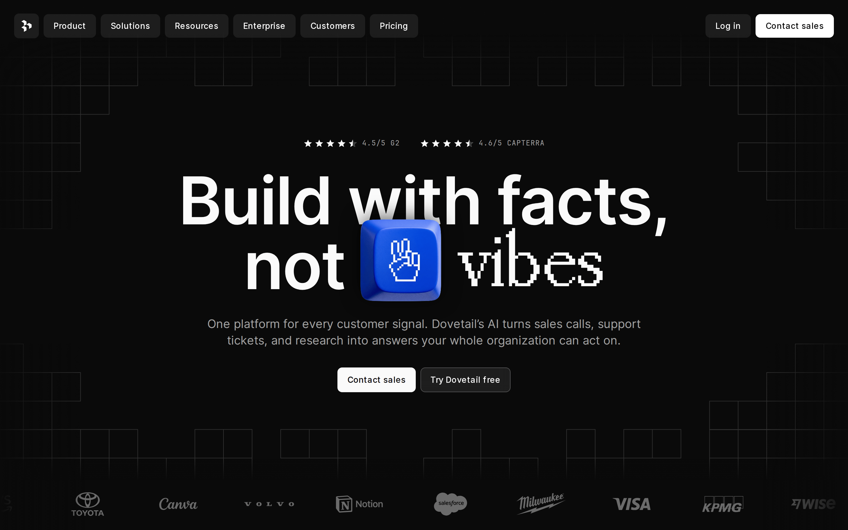
ToneProfessional, direct, and slightly irreverent ('Build with facts, not vibes').
HeadlinesBold, declarative statements that emphasize data and clarity.
CTAsAction-oriented and clear ('Contact sales', 'Try Dovetail free').
Don't use a white background — screenshot shows a deep near-black (#0A0A0A) base.
Don't use rounded corners on all elements — screenshot shows sharp or subtly rounded edges.
Don't use multiple accent colors — screenshot shows a strict monochrome palette with only one blue (#0044FF).
Don't use decorative serif fonts for body text — screenshot shows clean sans-serif for readability.
Don't use thin borders — screenshot shows either no borders or very subtle 0.08 opacity white borders.
Don't use small, cramped spacing — screenshot shows generous padding and wide margins.
Avoid: Avoid overly technical jargon that alienates non-technical stakeholders.
Avoid: Avoid excessive use of the blue accent color outside of primary actions.
Avoid: Avoid dense text blocks without clear visual hierarchy.
Avoid: Avoid playful illustrations that contradict the 'facts not vibes' positioning.
Captured from the live site · real computed styles
11
System prompt
Dovetailapp is a B2B SaaS platform focused on customer insights and research. The design DNA is defined by a dark mode aesthetic with a deep black background (#0A0A0A) and high-contrast white text (#FAFAFA). The primary accent color is a vibrant electric blue (#0044FF), used sparingly for key interactive elements. Typography is centered around a clean, modern geometric sans-serif for display text (112px hero) and a humanist sans for body copy, ensuring excellent readability. Critical design rules include: never use a white background; maintain a strict monochrome-plus-one-color palette; ensure generous spacing (124px padding between sections); and keep borders subtle using rgba(255, 255, 255, 0.08). The overall feel is premium, data-driven, and authoritative, yet accessible.
Bring this taste to your agent
Hand your AI agent a machine-readable spec of this design — tokens, type, motion, the whole DNA.