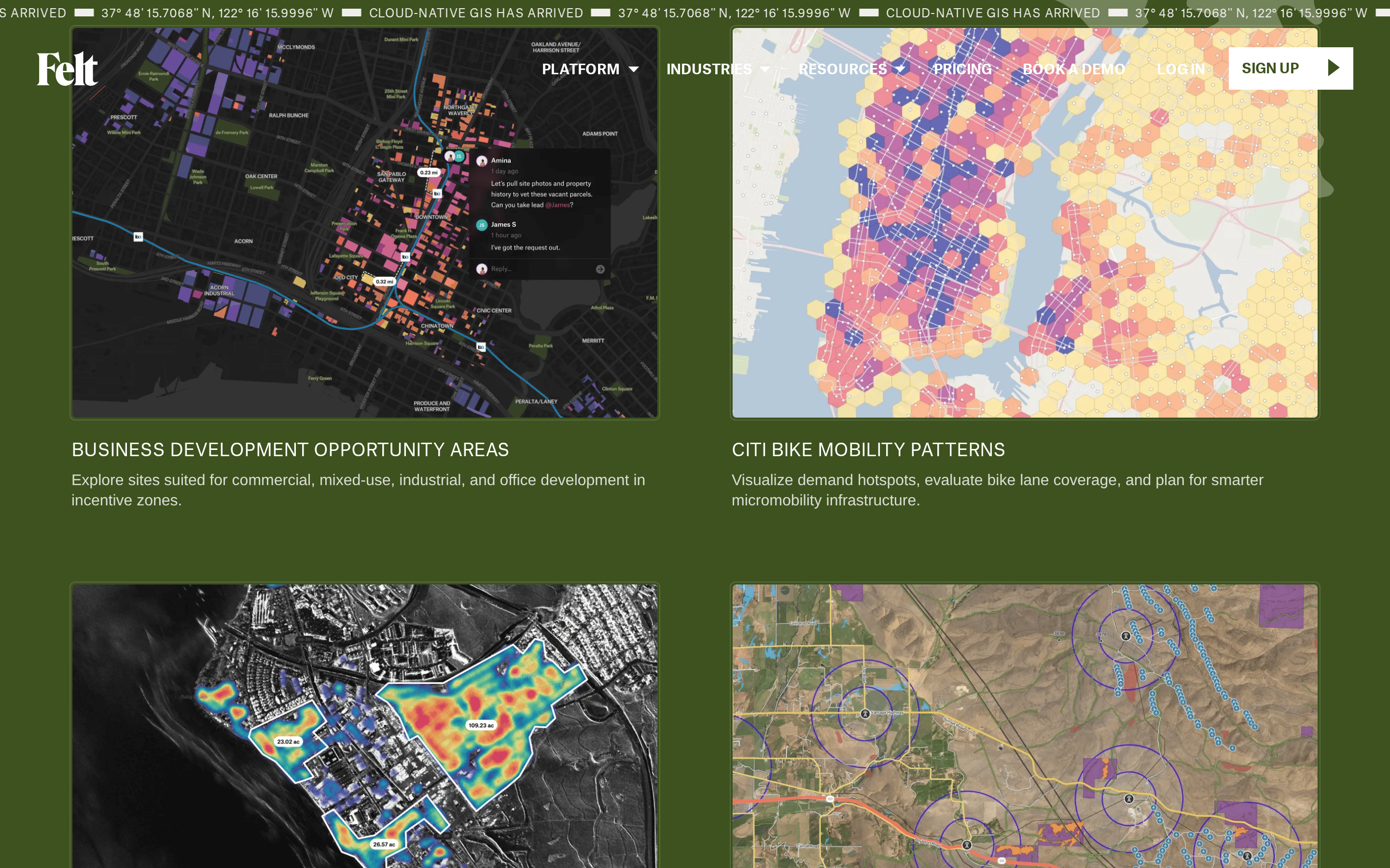
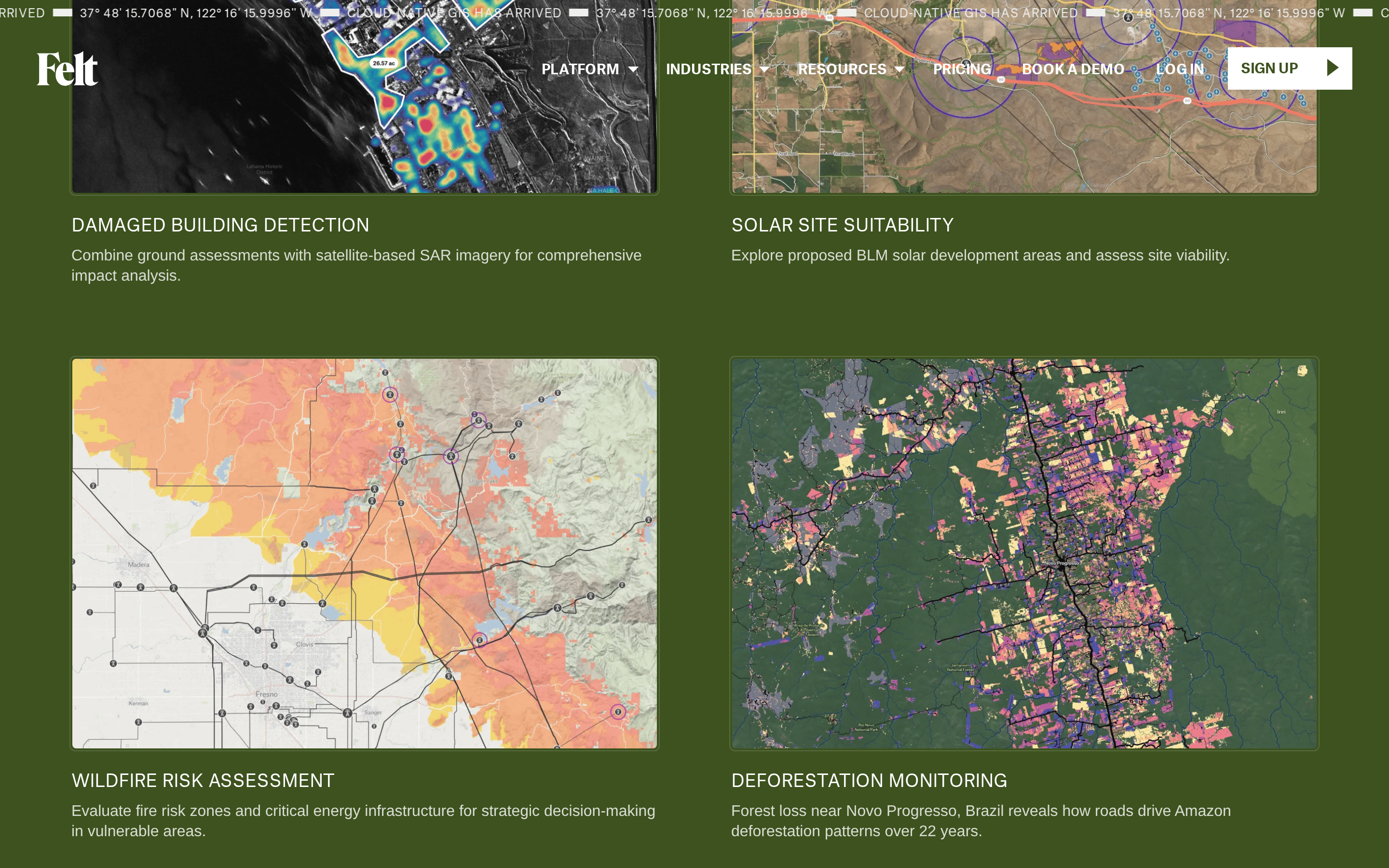
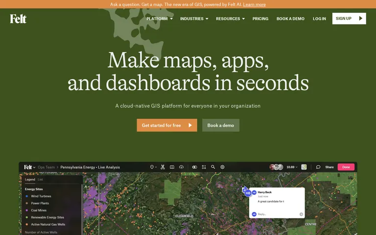
High-contrast earthy tones mixed with a warm action color to balance utility and approachability.
03
Typography
transitional-serif · grotesque-sans · monospace
display101px · 300
body16px · 400
Headlines use a light-weight transitional serif with tight letter-spacing · UI elements use a clean grotesque sans-serif · Monospace elements are used for technical labels
04
Spacing
4px
8px
16px
24px
32px
48px
64px
96px
8px baseline grid
05
Surfaces
sm · 4px
md · 8px
lg · 12px
pill · 999px
1px solid #333333
0px 2px 5px 0px rgba(0,0,0,0.2)
06
Layout
1280container
12columns
24pxgutter
768 / 1024breakpoints
Centered content columns with generous whitespace
07
Motion & Interaction
75msmicro
200mssmall
400msmedium
cubic-bezier(0.25, 0.1, 0.25, 1)easing
Background color transitions on hover · Text color transitions on focus
Background color change · Subtle background darkening
08
Components
buttonRounded rectangle with accent background or bordered style
cardClean bordered containers for interface screenshots
chipUsed for tag or status labels
inputStandard text input fields with subtle borders
heroLarge scale typography over a solid color block with product showcase
09
Voice & Don'ts
ToneProfessional yet accessible and modern
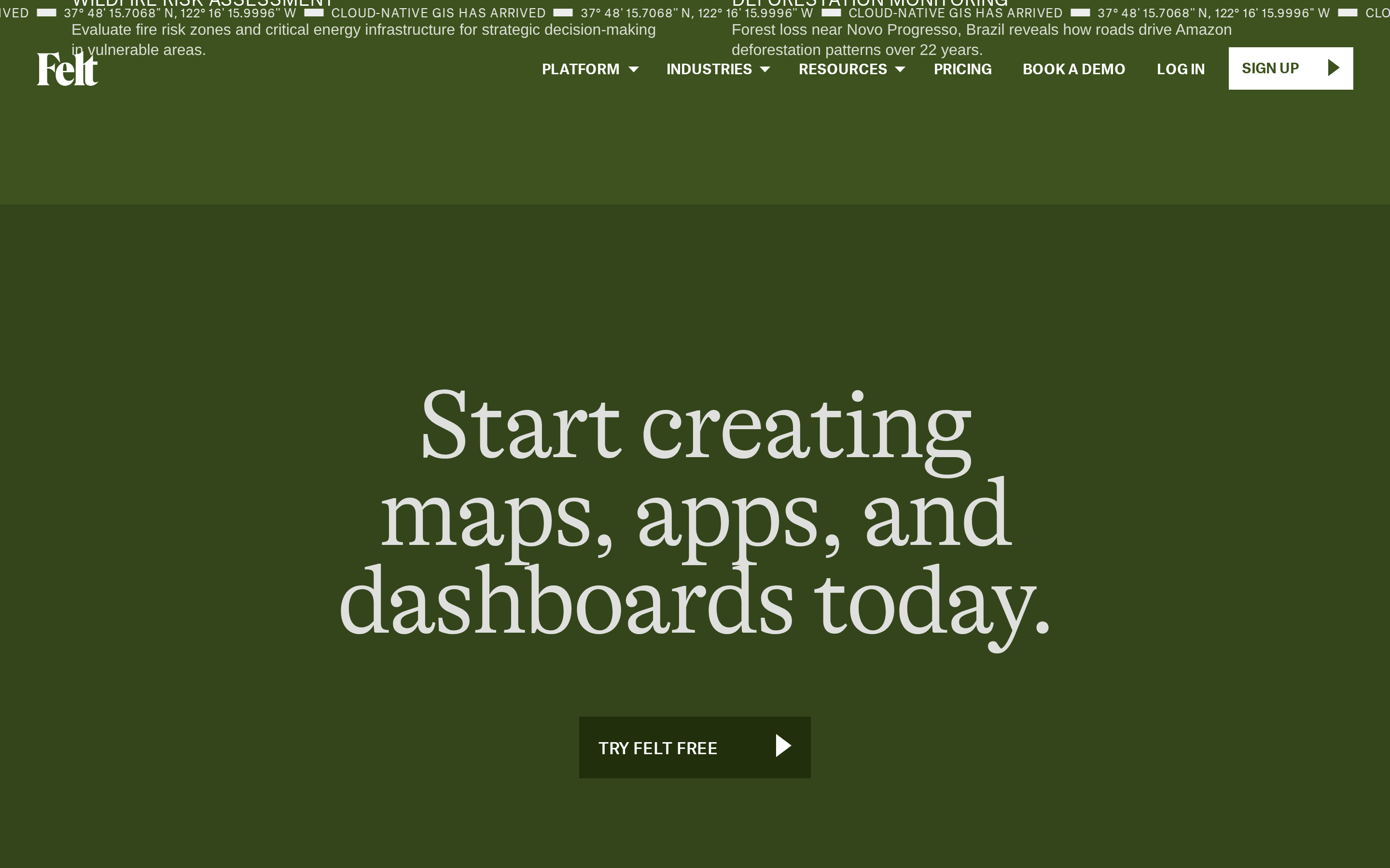
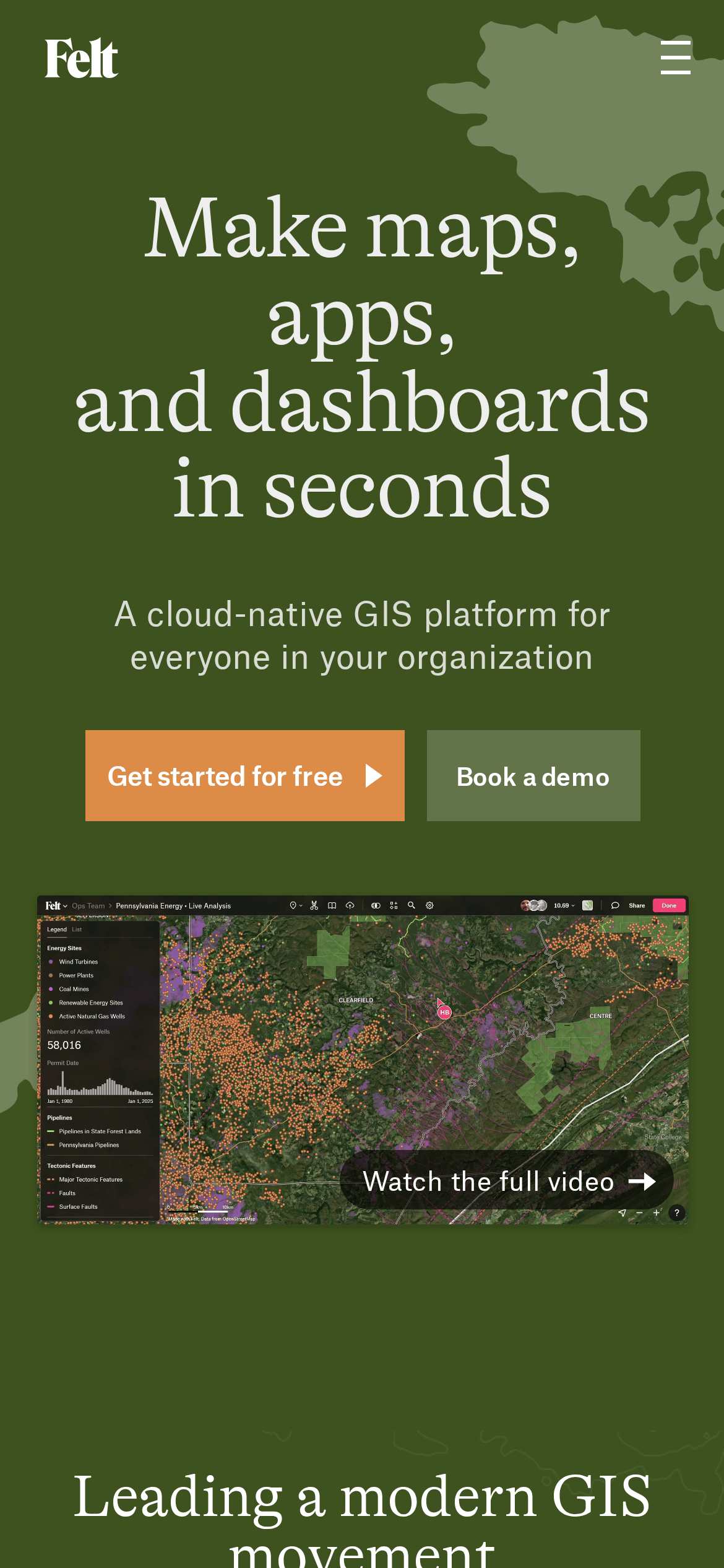
HeadlinesLarge, impactful serif typography
CTAsDirect and action-oriented (e.g., 'Get started for free')
Don't use neon or highly saturated synthetic colors — screenshot shows a grounded, earthy palette.
Don't use thick decorative borders — screenshot shows clean, 1px borders or borderless layouts.
Don't use tight, dense layouts — screenshot shows generous whitespace around elements.
Don't use all-lowercase for UI labels — screenshot shows uppercase for navigation and specific labels.
Don't use heavy drop shadows — screenshot shows very subtle or no shadows on most elements.
Don't use a playful sans-serif for headlines — screenshot shows a transitional serif for impact.
Captured from the live site · real computed styles
11
System prompt
This is a modern SaaS landing page for a cloud-native GIS platform. It positions itself as an easy-to-use, collaborative mapping tool. The primary colors are a deep forest green (#3D521E) and a warm accent orange (#DC8C46), with off-white (#EEE) for contrast. Typography pairs a transitional serif for display with a grotesque sans for body text. Critical donts: avoid neon colors, avoid dense layouts, avoid decorative borders, avoid lowercase UI labels, avoid heavy shadows, and avoid sans-serif display type.
Bring this taste to your agent
Hand your AI agent a machine-readable spec of this design — tokens, type, motion, the whole DNA.