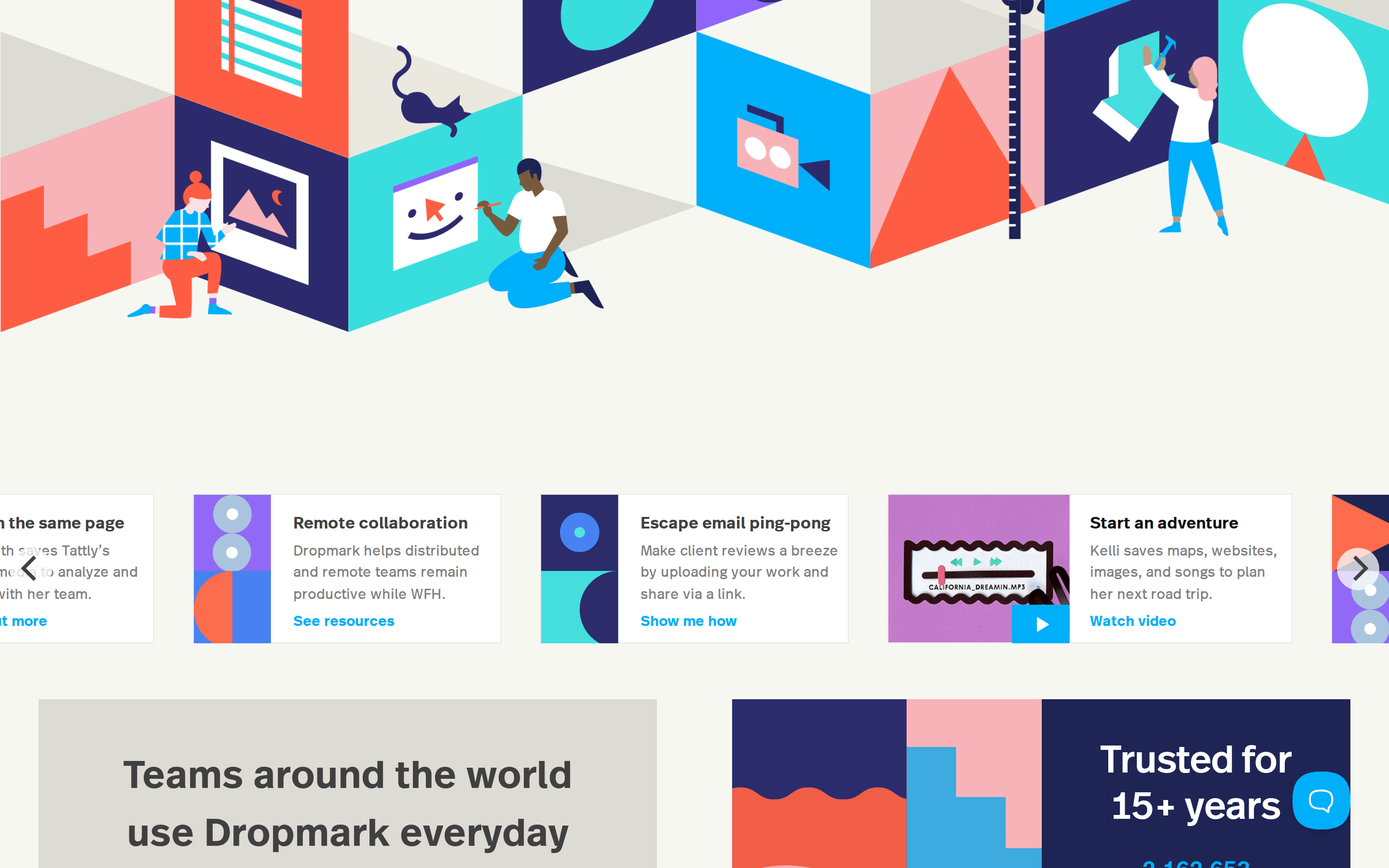
Bright white canvas with soft warm greys and a vibrant cyan accent.
03
Typography
humanist-sans
display56px · 600
Primary typeface is a custom humanist sans-serif (DropmarkRealHead/Text) · Headings use semi-bold weight (600) for approachable prominence · Body text maintains standard readability at 400 weight
04
Spacing
4px
8px
16px
24px
32px
48px
64px
96px
Generous vertical spacing creates an airy, breathable layout.
Captured from the live site · real computed styles
11
System prompt
Dropmark is a friendly, approachable SaaS tool for visual organization and team collaboration. It uses a bright white (#FFFFFF) background with a soft warm off-white (#F7F7F1) for subtle section breaks. The primary text is a soft dark grey (#404040), and the key accent color is a vibrant cyan (#00AFFA). Typography relies on humanist-sans-serif categories for both headings and body, maintaining a semi-bold weight for display text and regular weight for readability. Critical constraints: avoid dark mode or high-contrast dark backgrounds, avoid sharp square corners on buttons, and avoid heavy, aggressive fonts. The layout is centered, airy, and uses generous whitespace to keep the interface calm and focused.
Bring this taste to your agent
Hand your AI agent a machine-readable spec of this design — tokens, type, motion, the whole DNA.