A sophisticated digital magazine showcasing the creative output of a corporate design team.
02
Color
#171717Ink
#FFFFFFBG
#FCD2BABG quiet
rgba(23,23,23,0.2)Line
Warm neutral base with stark dark text, relying on colorful imagery rather than interface accents for visual interest.
03
Typography
transitional-serif · geometric-sans
display64px · 700
display-sm32px · 700
body18px · 400
caption12px · 400
Display text uses a high-contrast transitional serif (Millik) for strong visual impact. · Body and UI text use a clean geometric sans-serif (Moderat) for excellent readability. · Large display text should tightly track negative values (-0.8px to -1px) for a compact, editorial feel.
04
Spacing
4px
8px
16px
24px
32px
48px
64px
96px
generous
05
Surfaces
sm · 4px
md · 8px
lg · 12px
pill · 999px
minimal
06
Layout
1280container
12columns
24pxgutter
768 / 1024breakpoints
centered column for text, horizontal scrolling carousels for visual content
07
Motion & Interaction
220msmicro
400mssmall
800msmedium
cubic-bezier(0.16, 1, 0.3, 1)easing
horizontal scroll · smooth transitions
pointer cursor on interactive elements · grab cursor for draggable carousels
08
Components
buttonrounded outline buttons with minimal weight
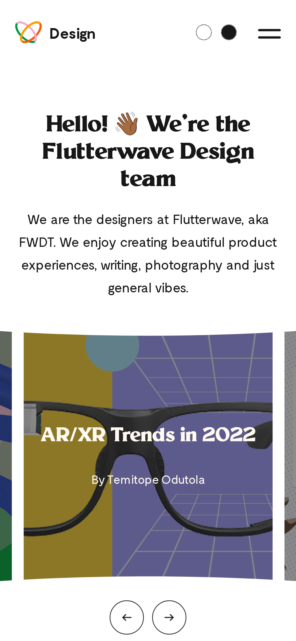
cardlarge, image-forward cards with overlay text
herolarge centered headline with subtext
09
Voice & Don'ts
Tonefriendly
Headlinesbold, direct, slightly playful
CTAsuppercase, minimal, text-based
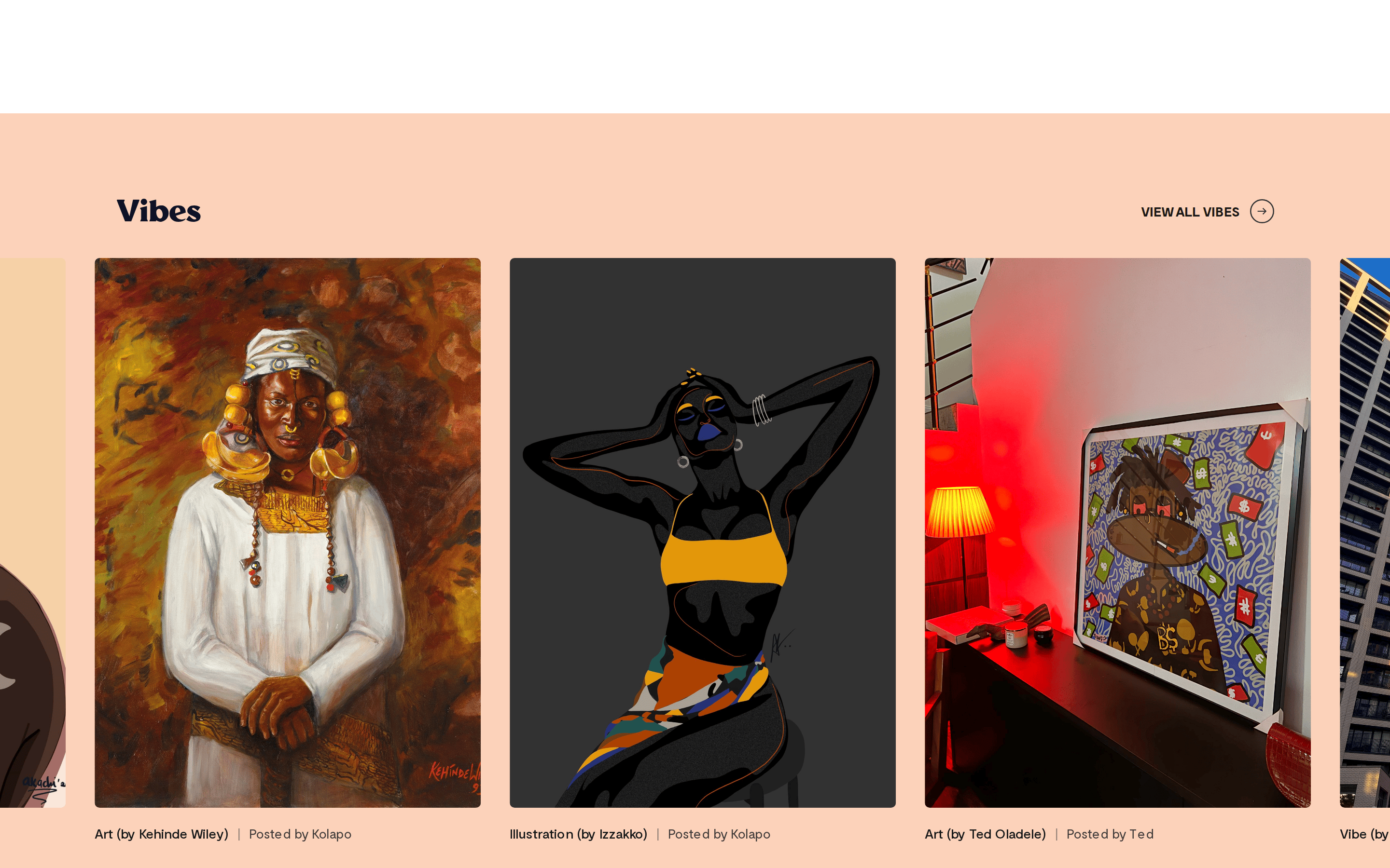
don't use a sterile, all-grey corporate palette — screenshot shows warm peach (#FCD2BA) and vibrant imagery.
don't use thin, light typefaces for headlines — screenshot shows bold, high-contrast serif display font.
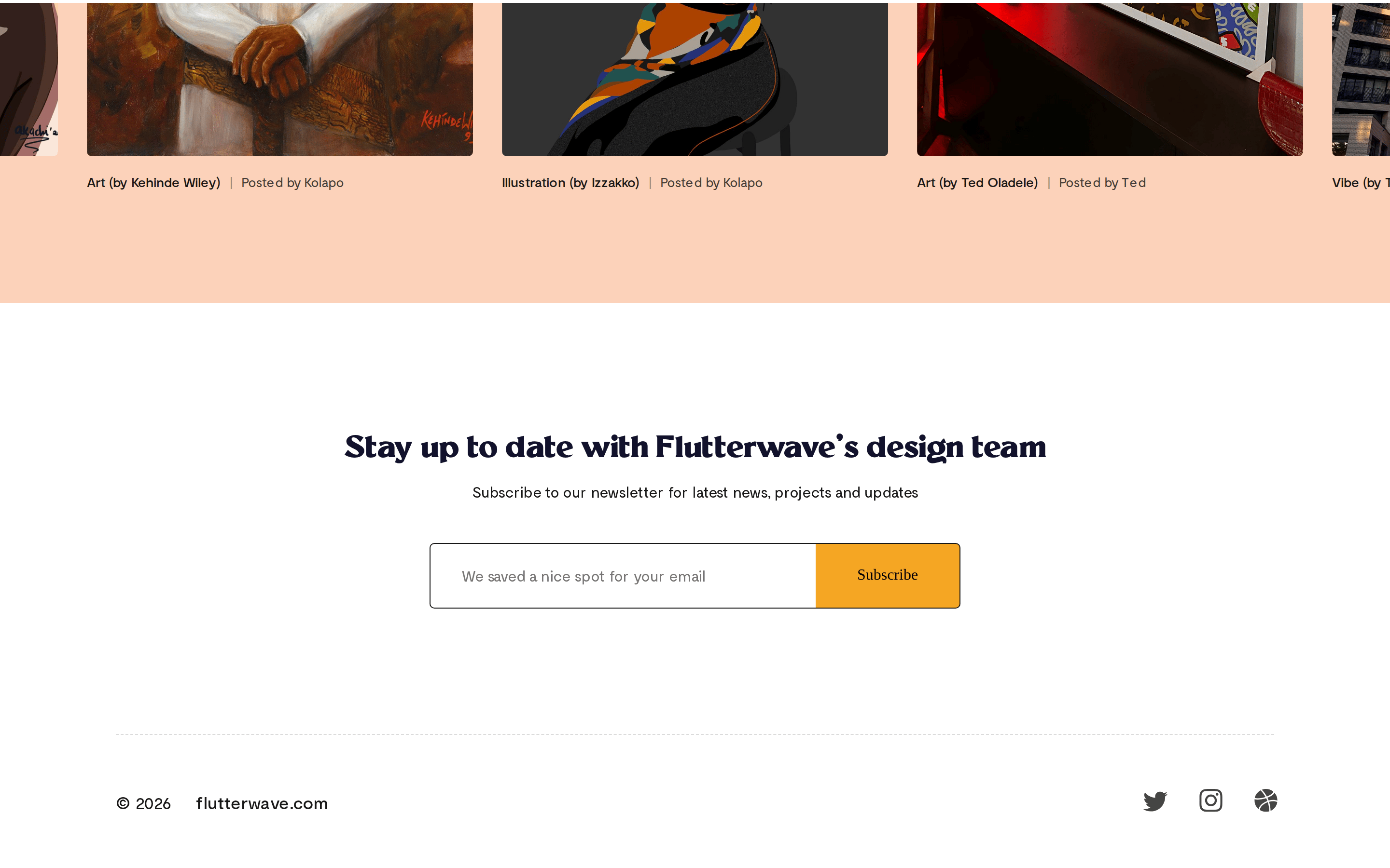
don't apply tight padding and dense layouts — screenshot shows generous whitespace around elements.
don't rely solely on UI color for emotion — screenshot shows the mood is driven by curated photography and illustration.
don't use sharp, square corners for interactive elements — screenshot shows 5px rounded borders.
don't flatten the visual hierarchy — screenshot maintains a clear distinction between large display type and body text.
Captured from the live site · real computed styles
11
System prompt
Design a friendly, editorial-style website for a creative studio or design team. The layout should feel like a curated digital magazine, using a stark white background and a secondary warm peach tone (#FCD2BA) for section differentiation. Rely on a bold transitional serif (like Millik) for display headlines and a clean geometric sans-serif (like Moderat) for body text, using tight negative letter-spacing on large type. The core interaction model should feature horizontal scrolling carousels for showcasing visual work, using a 'grab' cursor. Strictly avoid: heavy shadows, dense/claustrophobic layouts, sterile corporate palettes, or using a single accent color to drive the UI—the visual interest must come from the rich, colorful imagery of the portfolio pieces.
Bring this taste to your agent
Hand your AI agent a machine-readable spec of this design — tokens, type, motion, the whole DNA.