← OpenDesign CURATED · OPEN · FREE
Oker
A minimalist design studio portfolio characterized by a monochrome palette, refined typography, and generous whitespace.
Studio Editorial Portfolio Clean Refined
01
Identity DNA
design studio minimal creative portfolio editorial
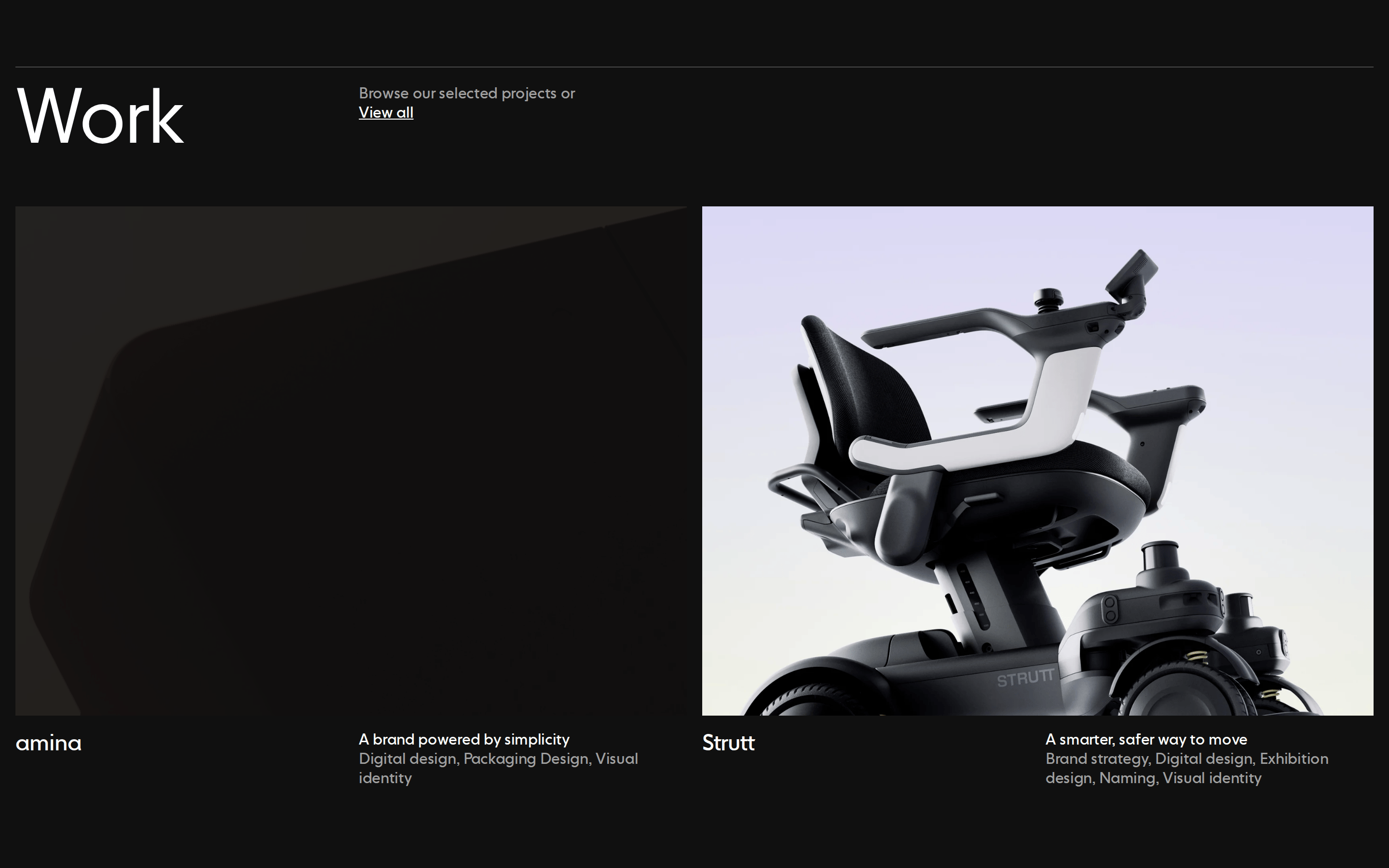
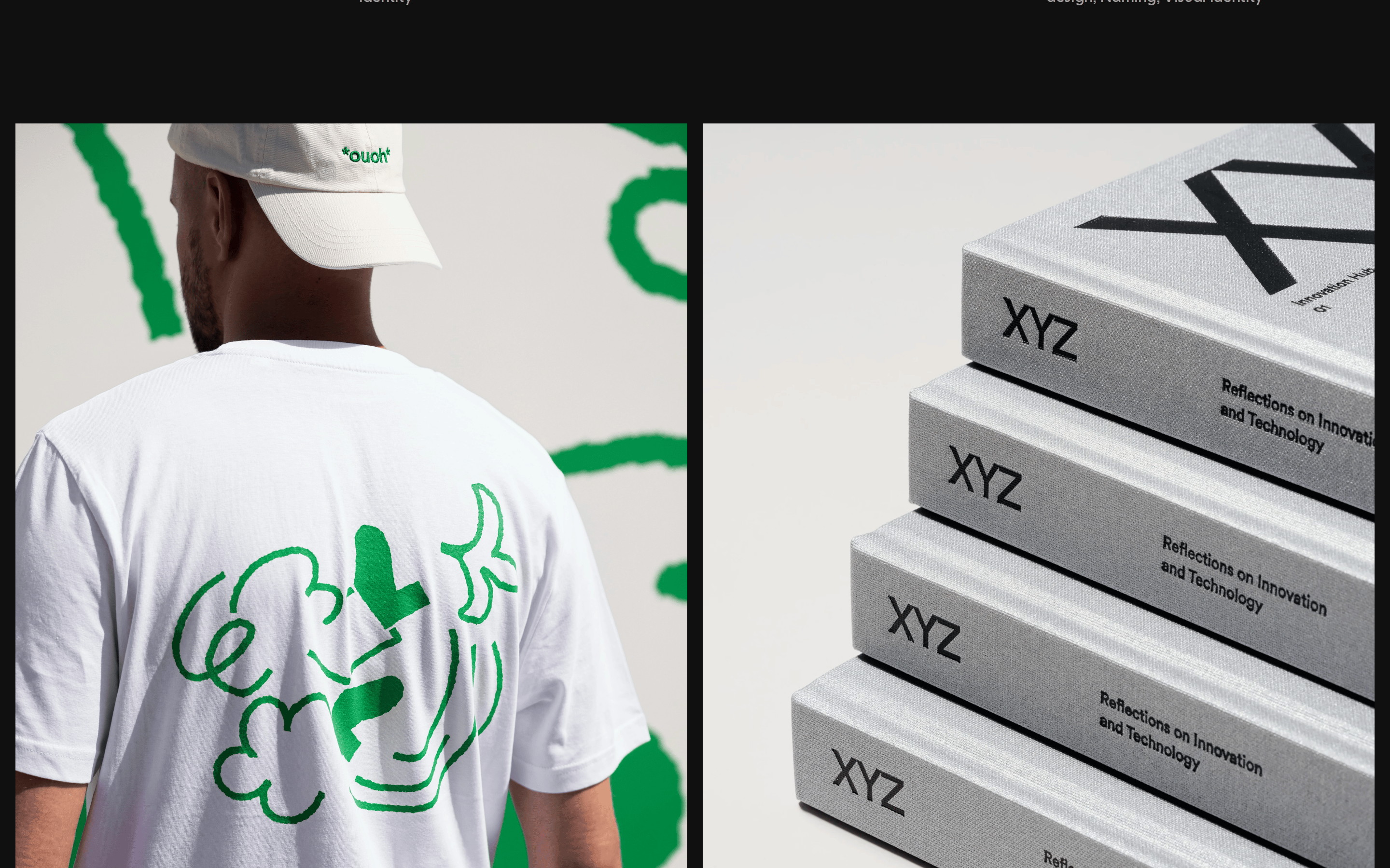
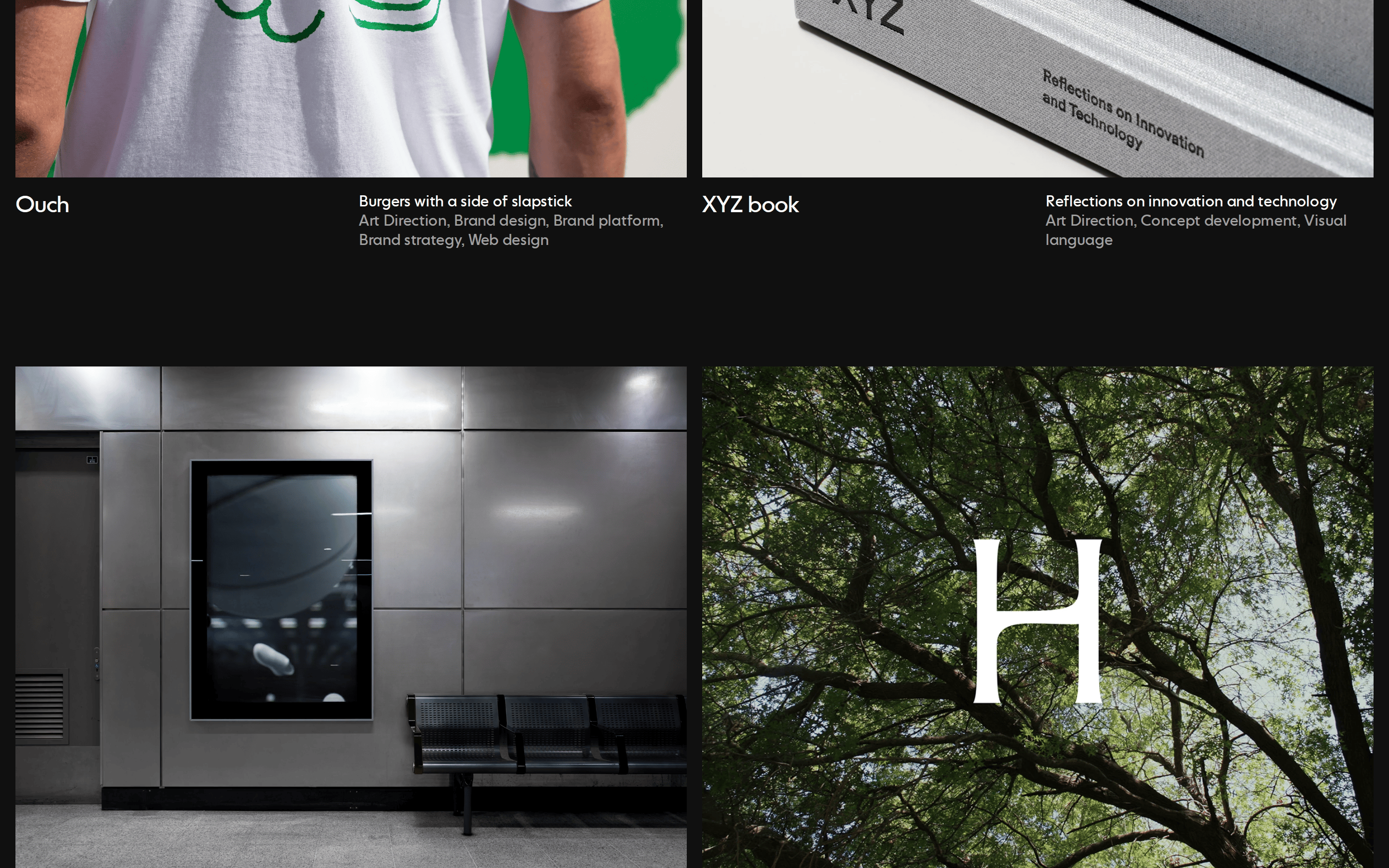
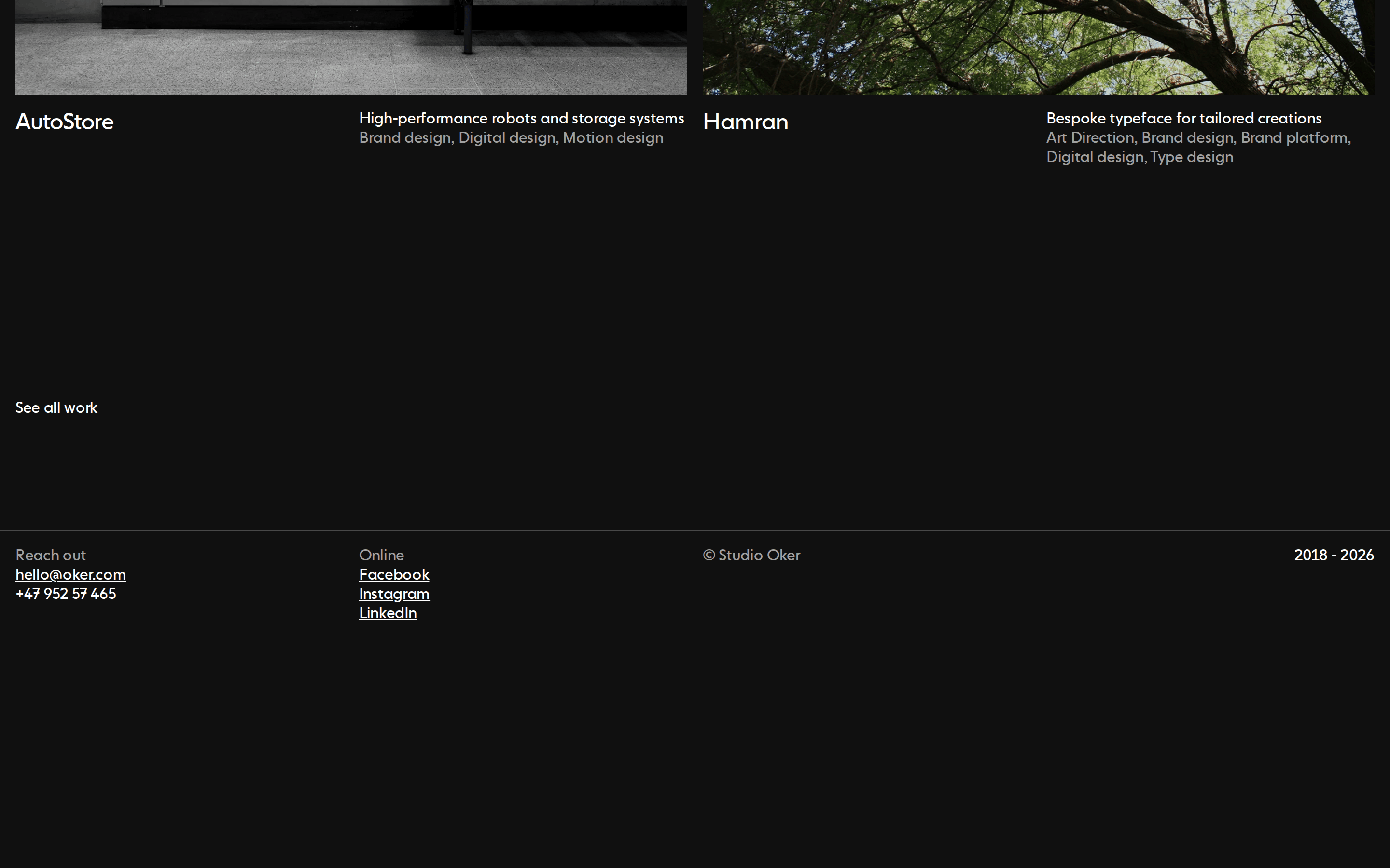
A quiet, refined gallery of creative work with a focus on typography and large imagery.
02
Color
#FFFFFFInk
#A0A0A0Ink soft
#000000BG
#101010BG soft
#F5F5F5BG quiet
#808080Muted
rgba(160, 160, 160, 1.0)Line
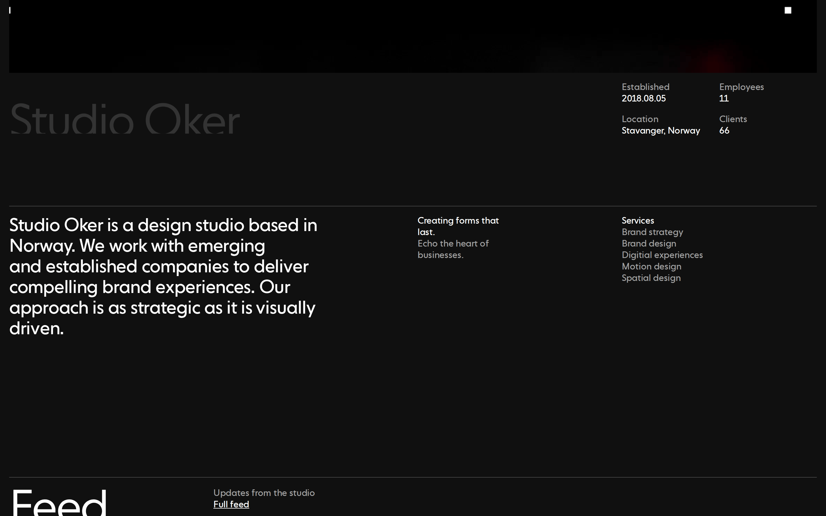
Strict monochrome foundation with stark high-contrast modes (black/white) for focus.
03
Typography
transitional-serif
display 80px · 400title 32px · 400body 16px · 400caption 16px · 30004
Spacing
4px
8px
16px
24px
32px
48px
64px
96px
Consistent use of 8px and 16px increments for padding and alignment.
05
Surfaces
sm · 0px
md · 0px
lg · 0px
pill · 999px
1px solid rgb(160, 160, 160) for subtle horizontal dividers.
06
Layout
1280 container
12 columns
16px gutter
768 / 1024 breakpoints
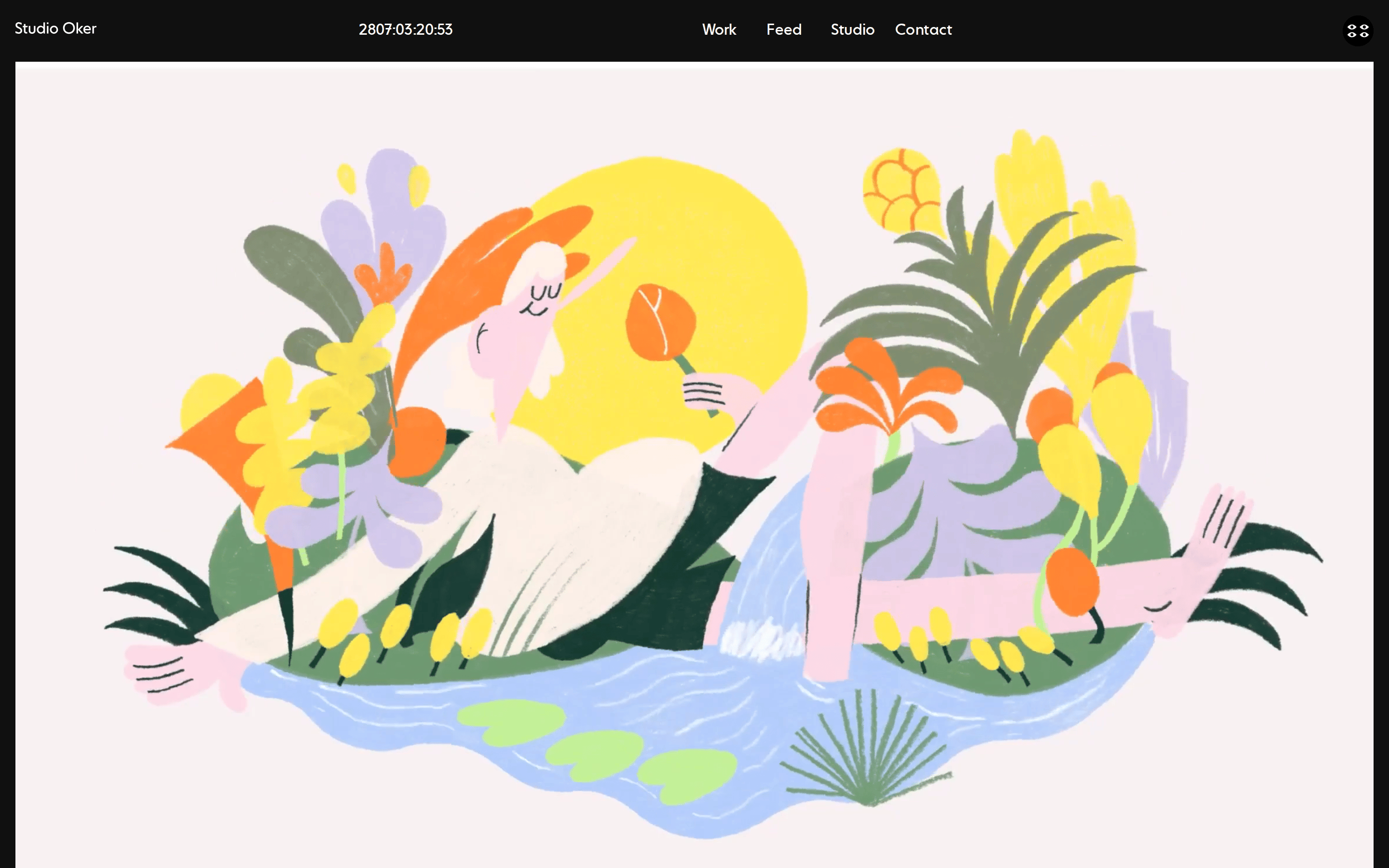
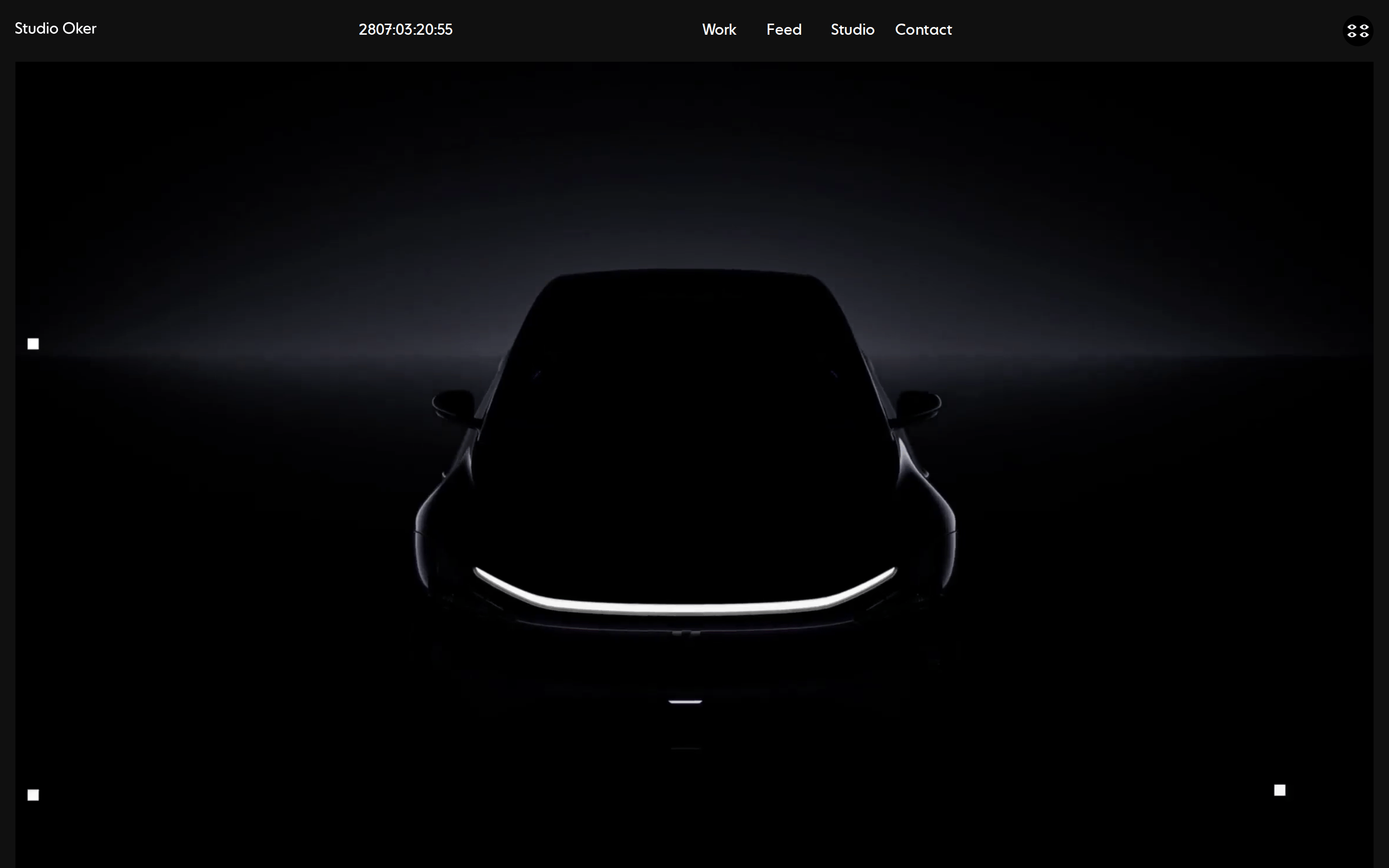
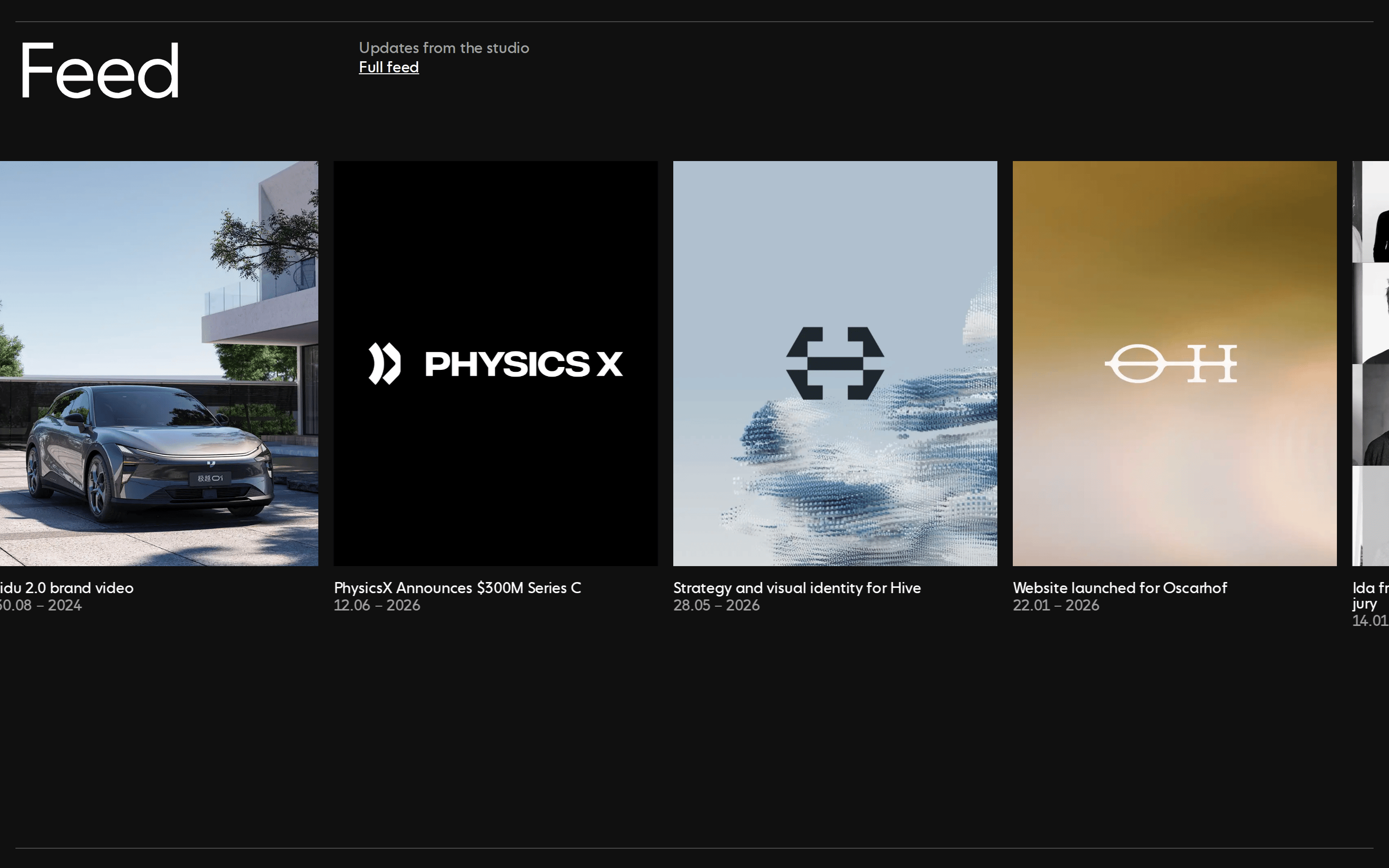
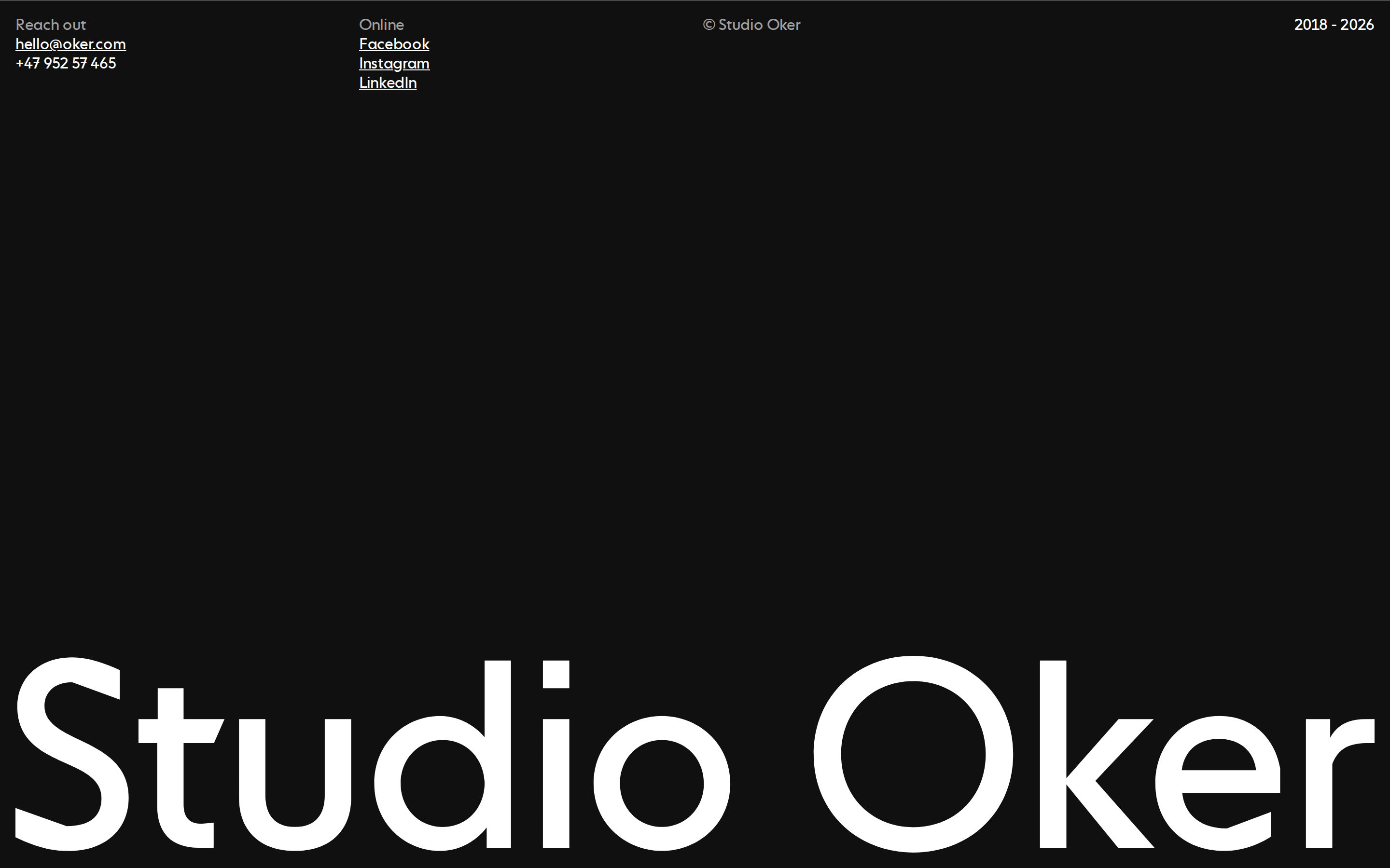
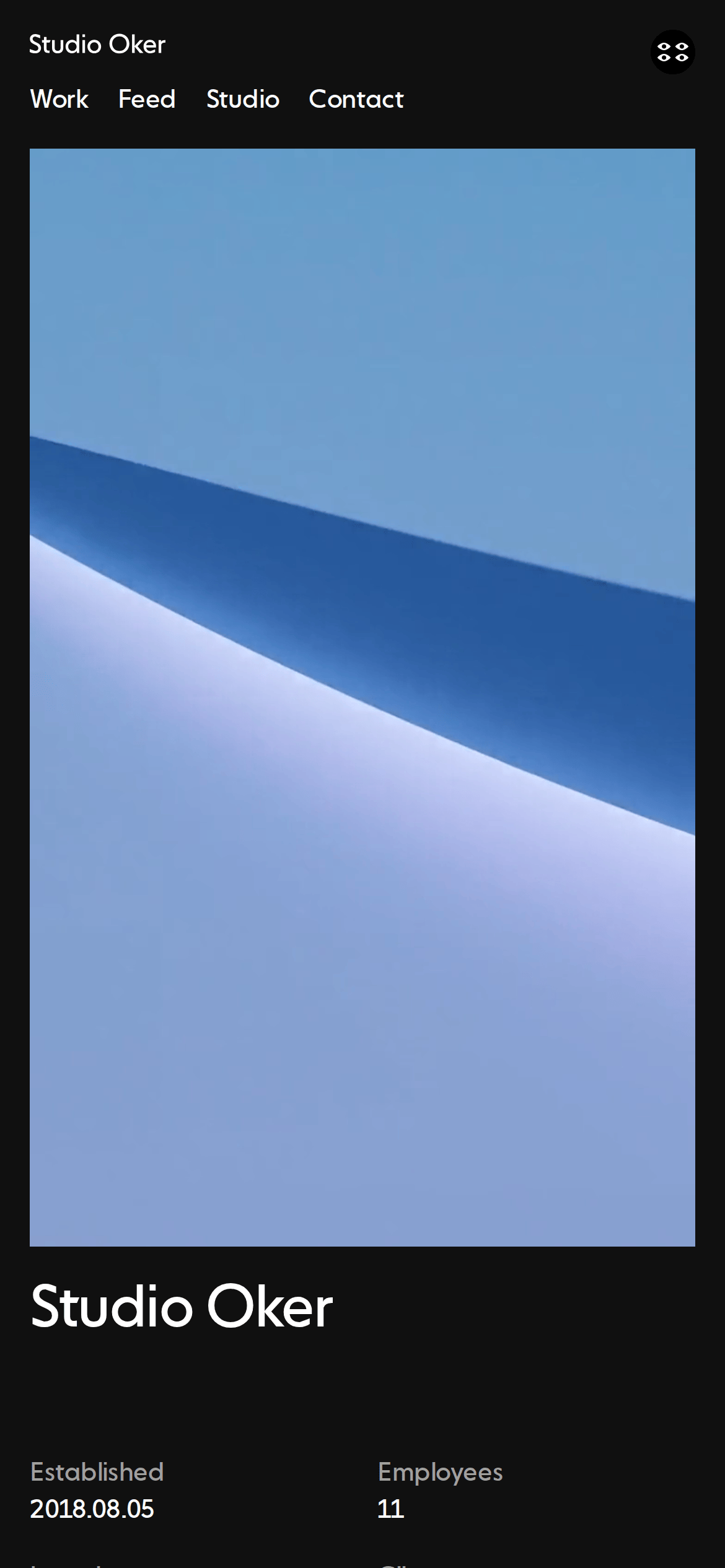
Large full-bleed imagery separated by generous black or white padding.
07
Motion & Interaction
200ms micro
300ms small
600ms medium
cubic-bezier(0.645, 0.045, 0.355, 1) easing
Smooth fade-in and color transitions on hover · Transform and opacity transitions for image reveals
Color transitions on text links and subtle cursor changes. · Standard pointer interactions.
08
Components
button Simple text links with color transitions, no visible button shapes. card No traditional cards; content presented as large standalone images with typography. chip No chips observed. input No form inputs observed. hero Full-viewport large-scale illustration or photography, often edge-to-edge. 09
Voice & Don'ts
Tone Minimalist, professional, and quiet. Headlines Large-scale, low-weight transitional serif, often centered or left-aligned. CTAs Simple text links without button styling. Don't use sans-serif display fonts — screenshot shows transitional-serif for all headings. Don't use rounded buttons — screenshot shows text-only links with no button containers. Don't use colorful accent palettes — screenshot shows a strict monochrome foundation. Don't use heavy drop shadows — screenshot shows completely flat imagery and typography. Don't use complex multi-column grids for text — screenshot shows generous single-column whitespace. Don't use busy decorative patterns — screenshot shows large, clean photographic or illustrative areas. Avoid: Bright neon colors Avoid: Heavy drop shadows Avoid: Busy decorative backgrounds Avoid: Rounded UI elements Avoid: Sans-serif display fonts Avoid: Complex gradients 10
Inside the pack — real screenshots
桌面首屏(hero) 桌面滚动分段(90% viewport 步进,作为视觉证据) 桌面滚动分段(90% viewport 步进,作为视觉证据) 桌面滚动分段(90% viewport 步进,作为视觉证据) 桌面滚动分段(90% viewport 步进,作为视觉证据) 桌面滚动分段(90% viewport 步进,作为视觉证据) 桌面滚动分段(90% viewport 步进,作为视觉证据) 桌面滚动分段(90% viewport 步进,作为视觉证据) 桌面滚动分段(90% viewport 步进,作为视觉证据) 移动首屏 Captured from the live site · real computed styles
11
System prompt
Studio Oker is a minimalist design studio portfolio with a refined, editorial aesthetic. The design relies on a strict monochrome palette, primarily using #000000 and #FFFFFF, complemented by #A0A0A0 and #808080 for secondary text and borders. The typography uses transitional-serif font categories with tight letter-spacing (-1.6px for display). The layout features large, full-bleed imagery separated by generous black or white padding. Key constraints include: strictly monochrome colors only, avoid rounded UI elements or heavy shadows, and maintain generous whitespace around large typography and imagery. The interaction style is subtle, using smooth opacity and color transitions with a custom cubic-bezier easing.
More from the library en · zh-CN · zh-TW · ja · ko
OpenDesign · curated web aesthetics for AI-readable design DNA · opendesign.cc
Why we curated this: This site is a great example of minimalist editorial design, effectively using scale and whitespace to create a premium, gallery-like feel.