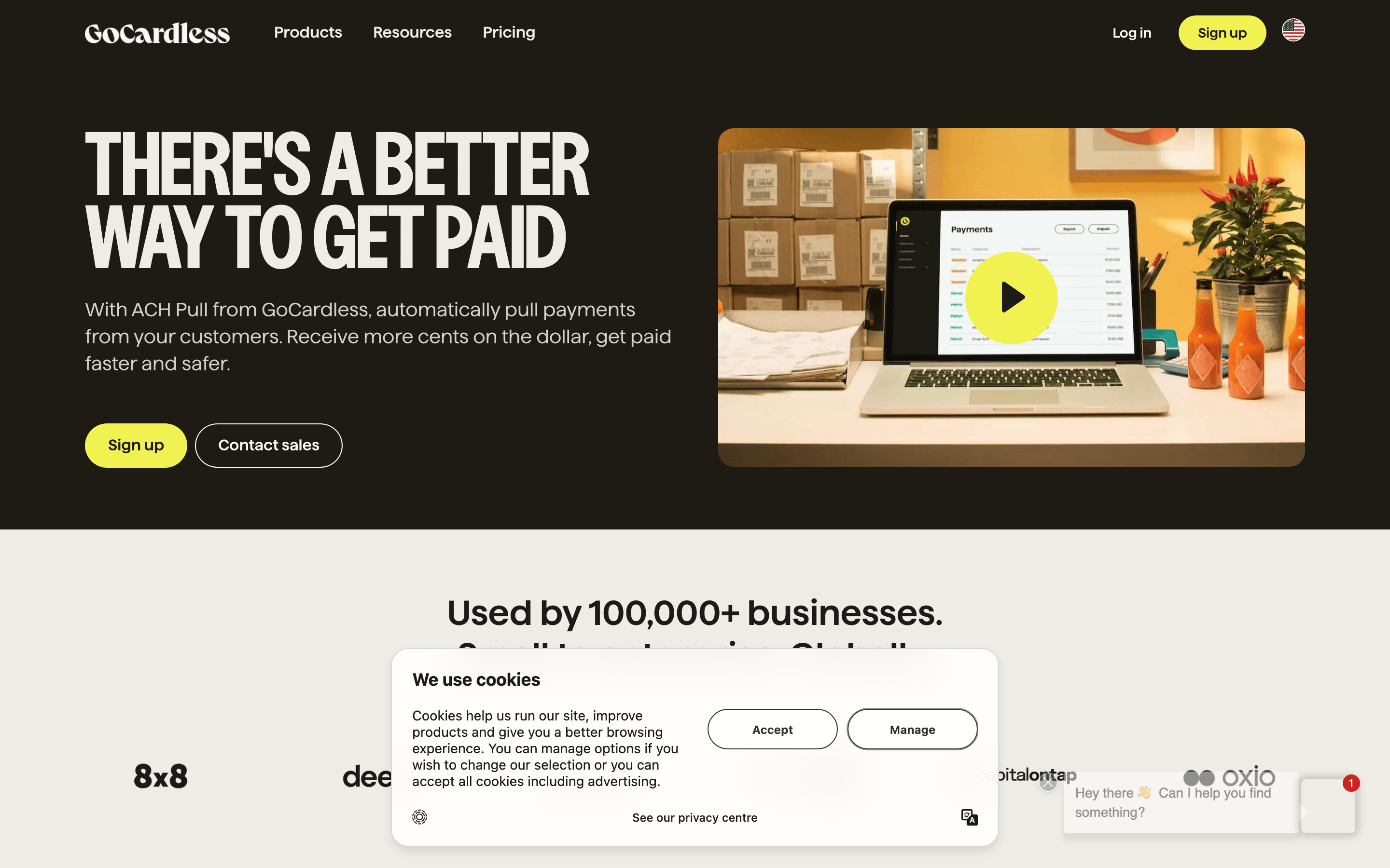
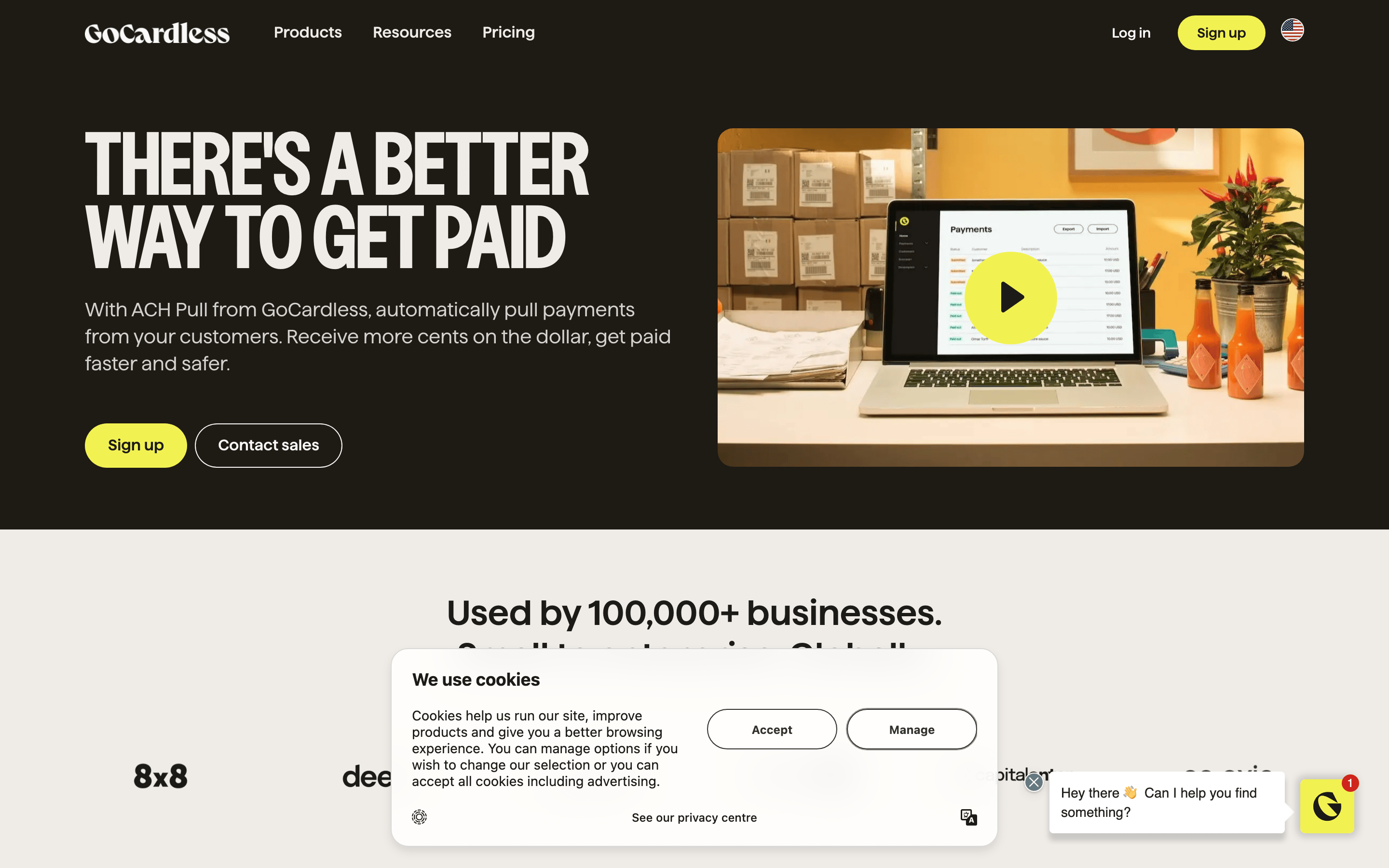
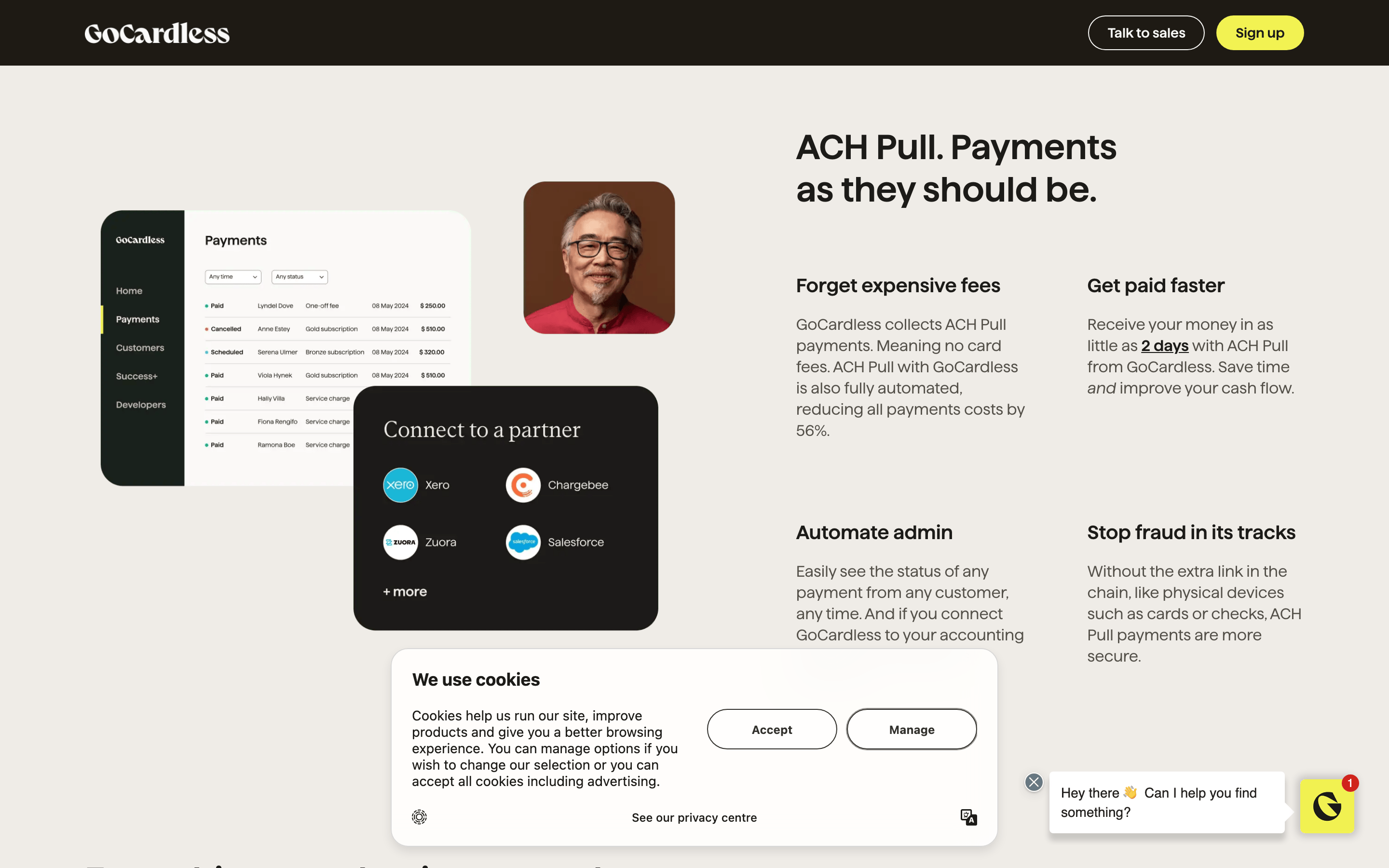
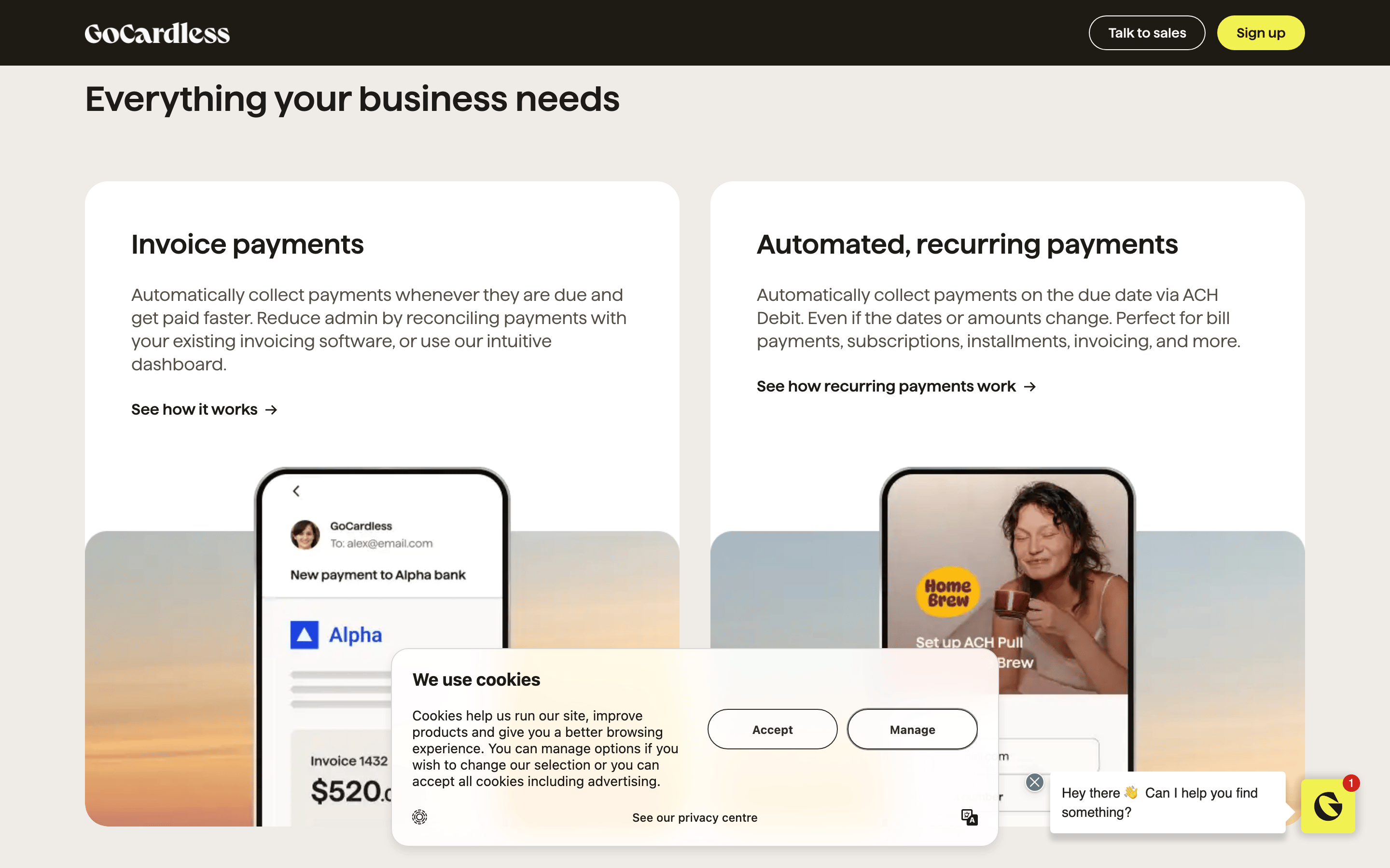
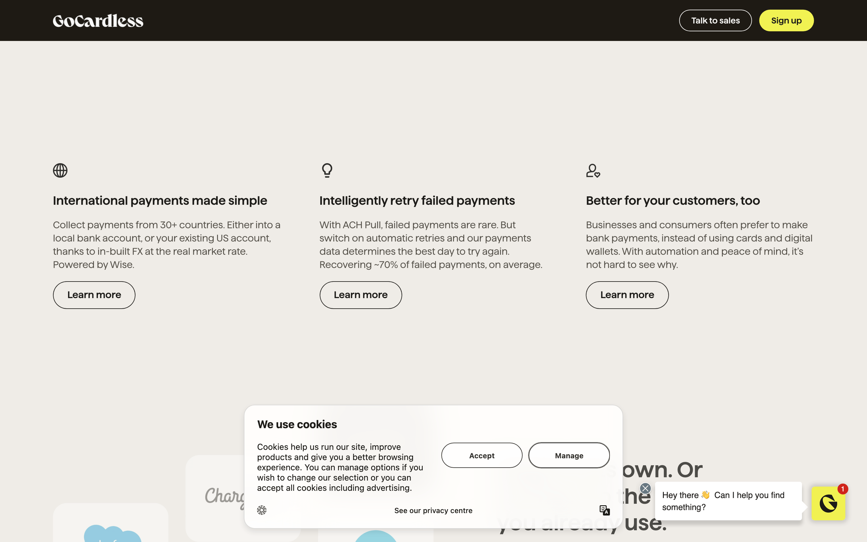
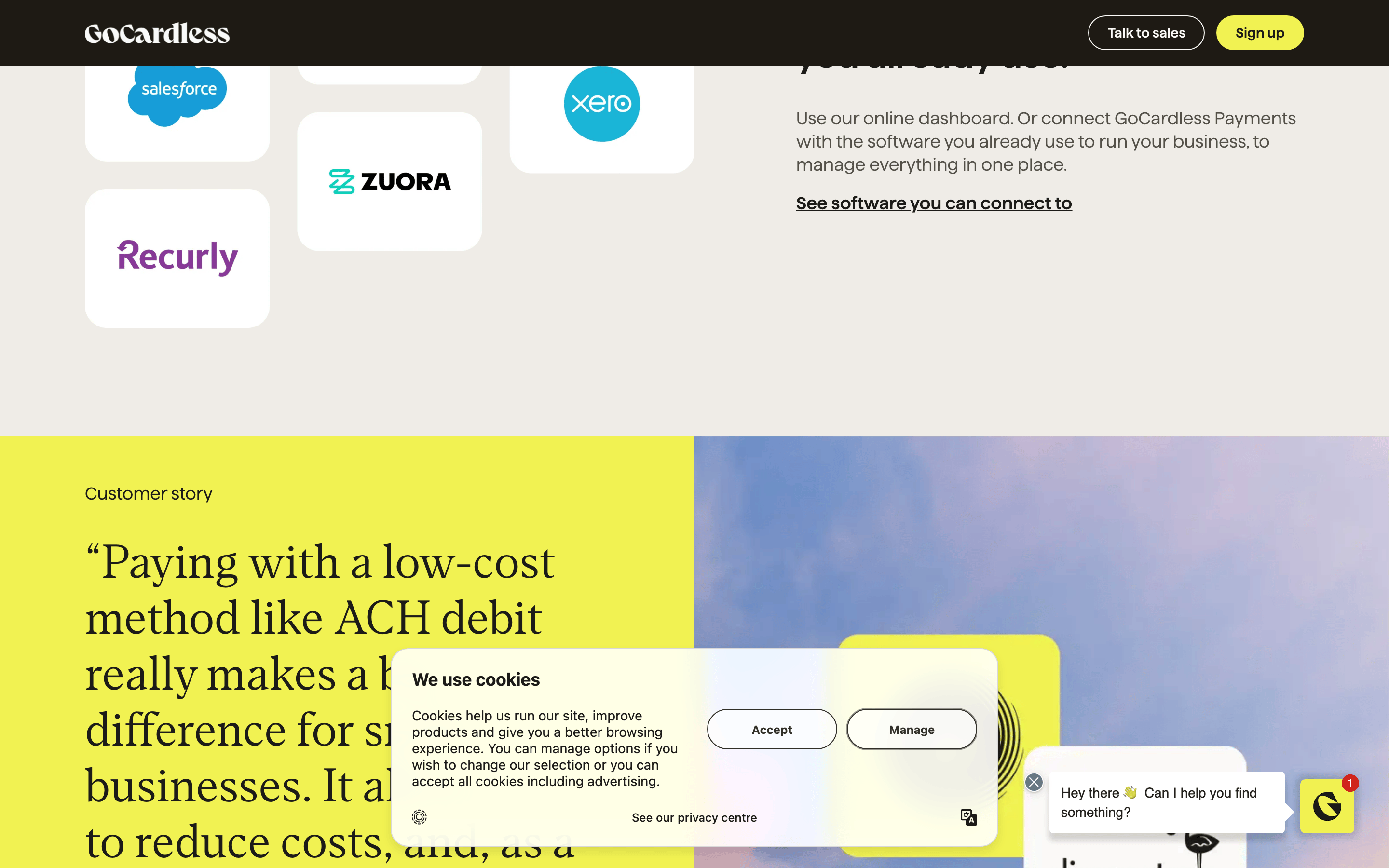
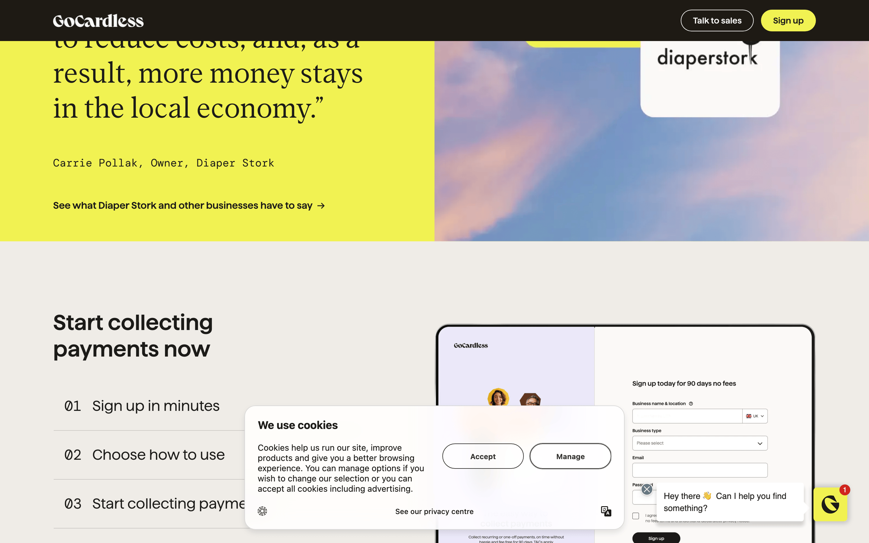
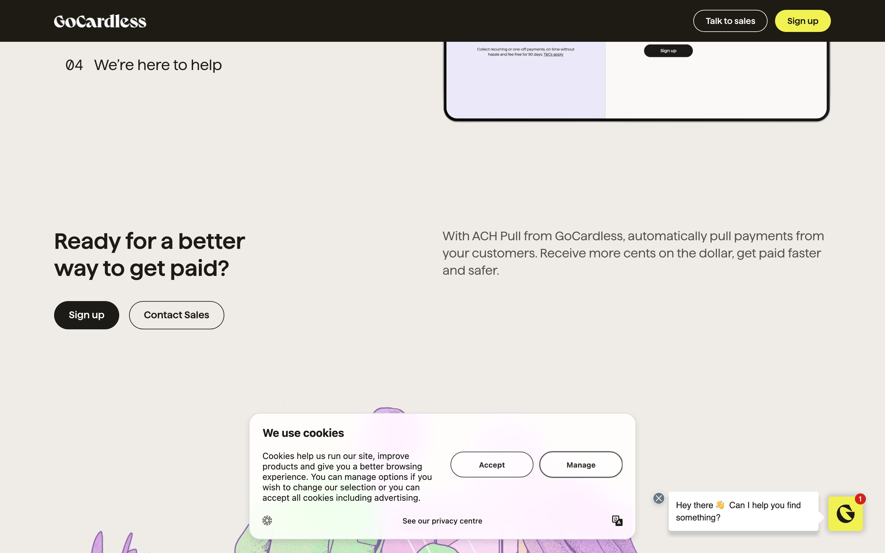
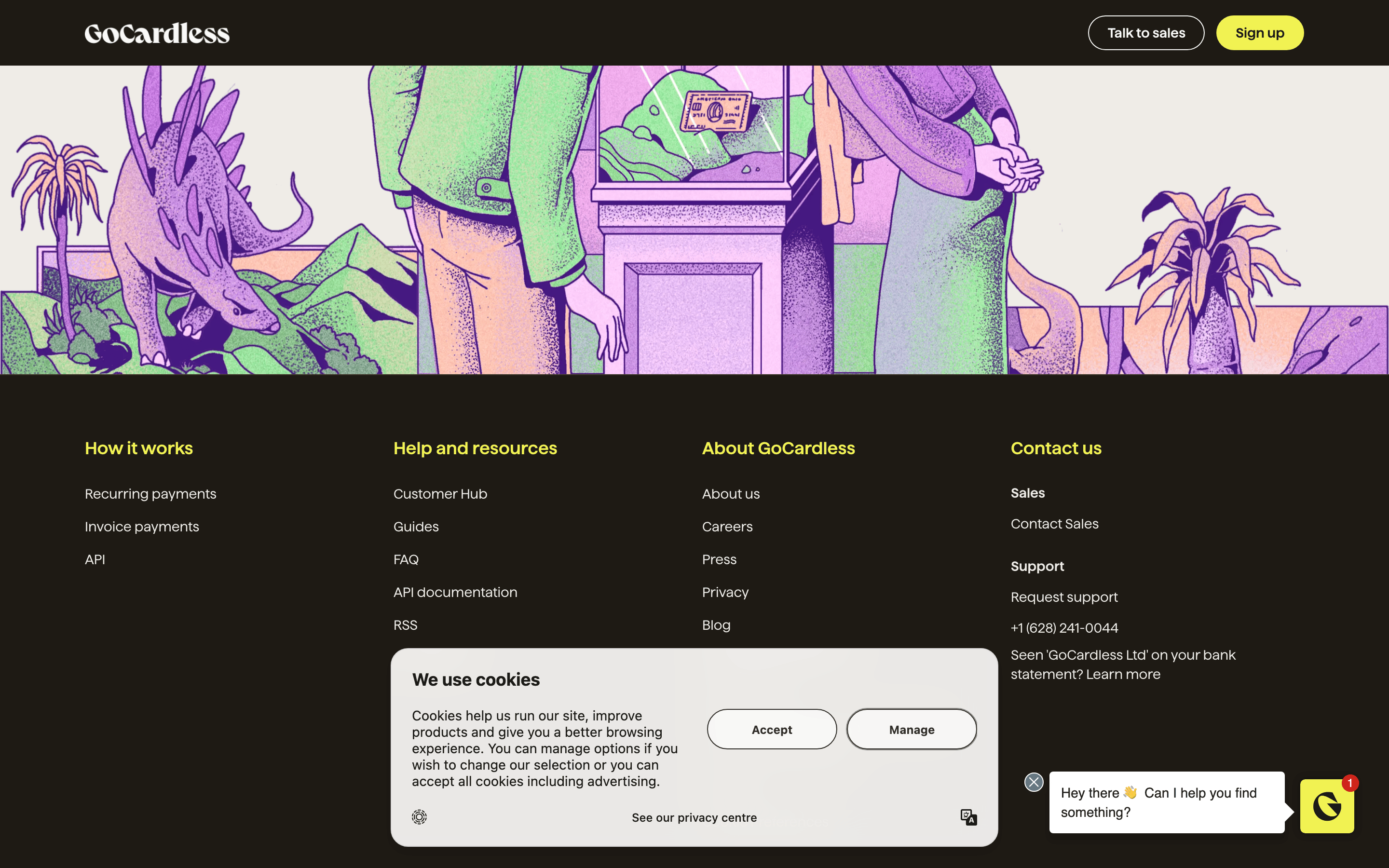
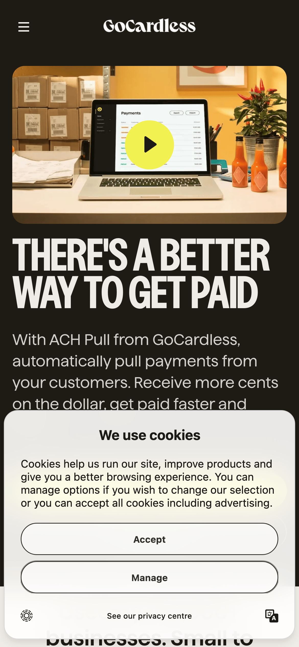
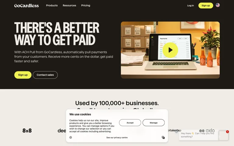
A professional, trust-focused fintech platform designed to streamline B2B payment collection.
02
Color
#F1F252Accent
#1C1B18Ink
#545048Ink soft
#EFECE7BG
#FAF9F7BG soft
#D4D1CDMuted
rgba(212, 209, 205, 1)Line
A restrained palette of warm off-whites and dark charcoals, punctuated by a single high-chroma electric yellow accent.
03
Typography
geometric-sans · humanist-sans · monospace
display56px · 700
h236px · 600
body18px · 400
small14px · 400
Headlines use a bold, geometric sans-serif for a strong, modern presence. · Body text uses a highly legible humanist sans-serif for comfortable reading. · Monospaced fonts are reserved for specific technical or data-related contexts.
04
Spacing
4px
8px
12px
16px
24px
32px
48px
64px
96px
Consistent 4px base grid with generous vertical rhythm (48px/64px) between major page sections.
Captured from the live site · real computed styles
11
System prompt
GoCardless is a premium B2B fintech platform for automated payments. The design DNA features a warm off-white background (#EFECE7) with deep charcoal ink (#1C1B18), punctuated by a high-chroma electric yellow accent (#F1F252). Typography relies heavily on a bold, geometric sans-serif (Haffer) for display, paired with a highly legible humanist sans-serif for body copy. Key critical constraints: 1) Never use a dark mode or purely black backgrounds for content sections. 2) Always use a heavy font-weight (700) for major headlines to maintain the brand's bold presence. 3) Strictly avoid using more than one high-chroma color; the electric yellow must be used sparingly for primary CTAs only.
Bring this taste to your agent
Hand your AI agent a machine-readable spec of this design — tokens, type, motion, the whole DNA.