← OpenDesign CURATED · OPEN · FREE
Increase
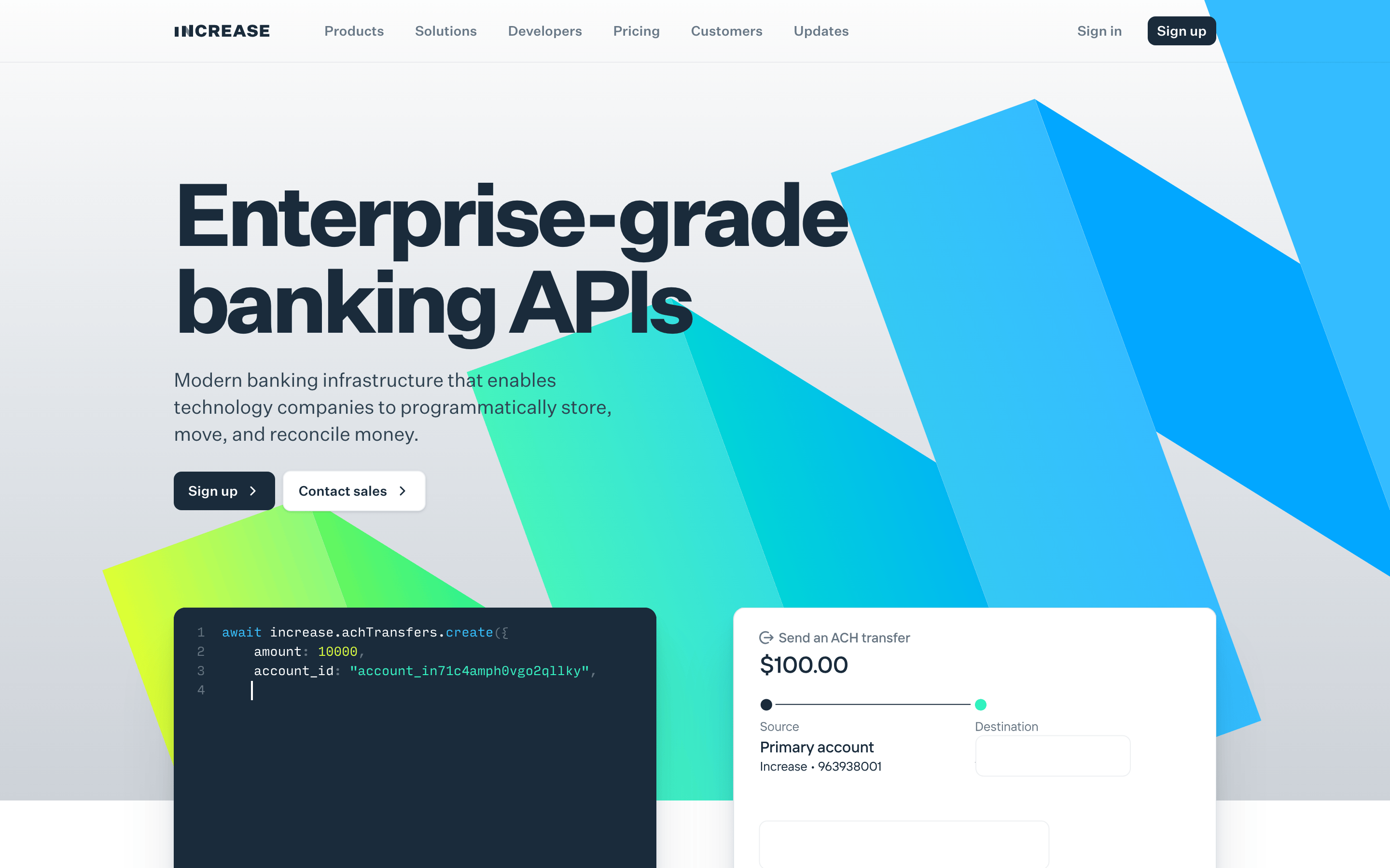
Enterprise-grade banking APIs for technology companies.
fintech api
01
Identity DNA
Enterprise Banking APIs Infrastructure Developer
A precision-engineered dashboard for financial infrastructure.
02
Color
#31F2CCAccent
#1A2B3BInk
#687887Ink soft
#FFFFFFBG
#F5F6F7BG soft
#E4E5E9BG quiet
#314352Muted
rgba(26, 43, 59, 0.1)Line
A clean, professional palette anchored in deep navy for trust, balanced by vibrant teal and lime gradients for modern tech appeal.
03
Typography
grotesque-sans · monospace
display 72px · 700h2 40px · 700body 16px · 400caption 14px · 40004
Spacing
4px
8px
16px
24px
32px
48px
64px
96px
A consistent 4px grid system driving clear visual hierarchy.
05
Surfaces
sm · 4px
md · 8px
lg · 12px
pill · 999px
1px solid rgba(26, 43, 59, 0.1)
rgba(12, 25, 39, 0.05) 0px 6px 8px 0px · rgba(12, 25, 39, 0.06) 0px 16px 20px 0px · rgba(12, 25, 39, 0.1) 0px 50px 60px 0px
06
Layout
1280 container
12 columns
24px gutter
768 / 1024 breakpoints
Max-width container with a 12-column grid, centering main content.
07
Motion & Interaction
150ms micro
300ms small
500ms medium
cubic-bezier(0.4, 0, 0.2, 1) easing
Smooth transitions for hover states on interactive elements · Subtle color and shadow shifts on interaction
Subtle color transitions or slight shadow elevation. · Immediate visual response, often through color or scale shifts.
08
Components
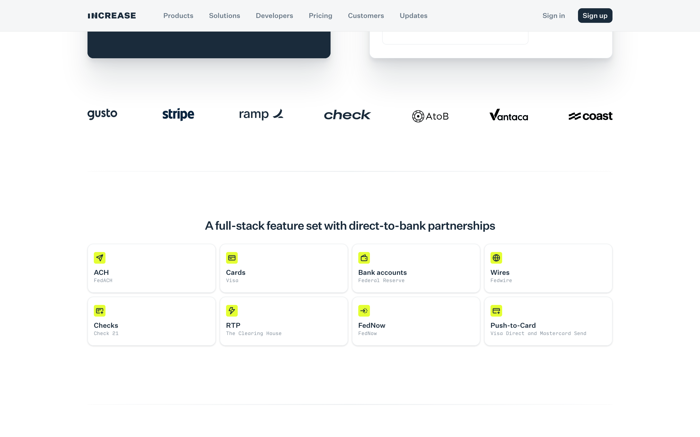
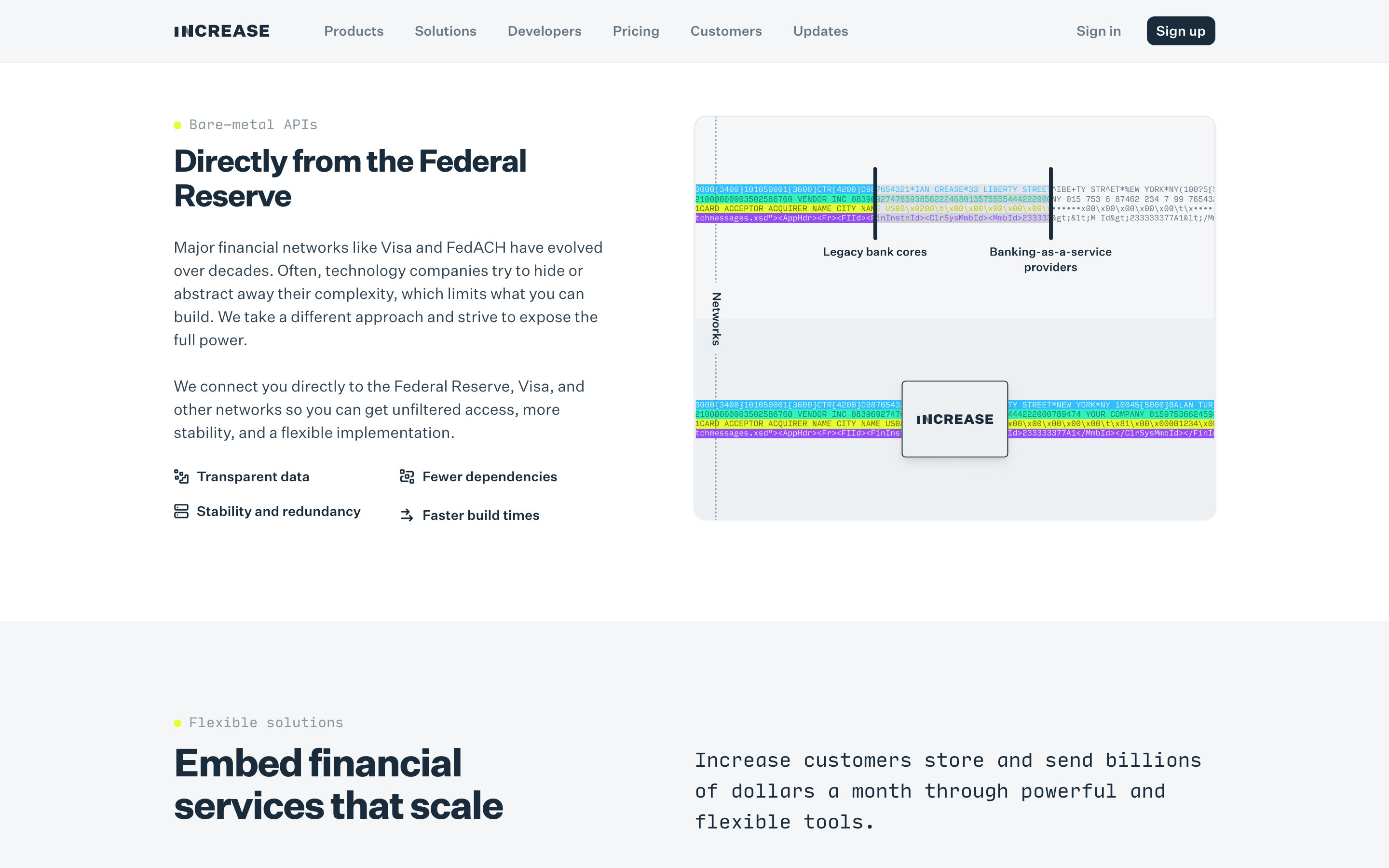
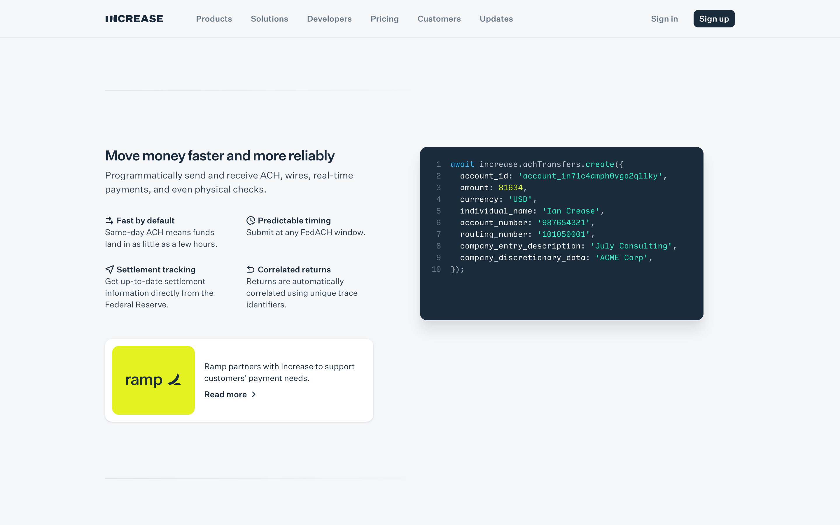
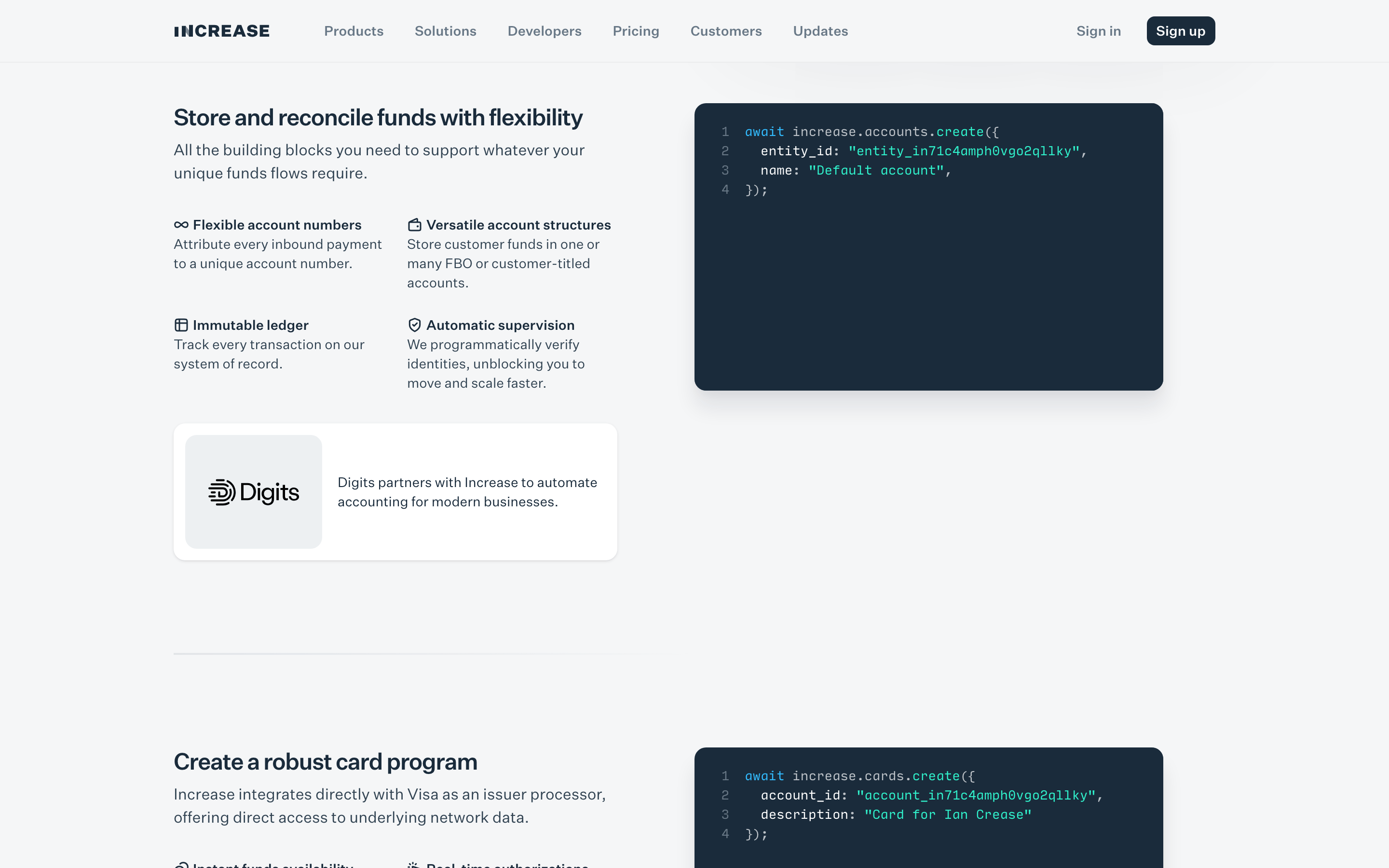
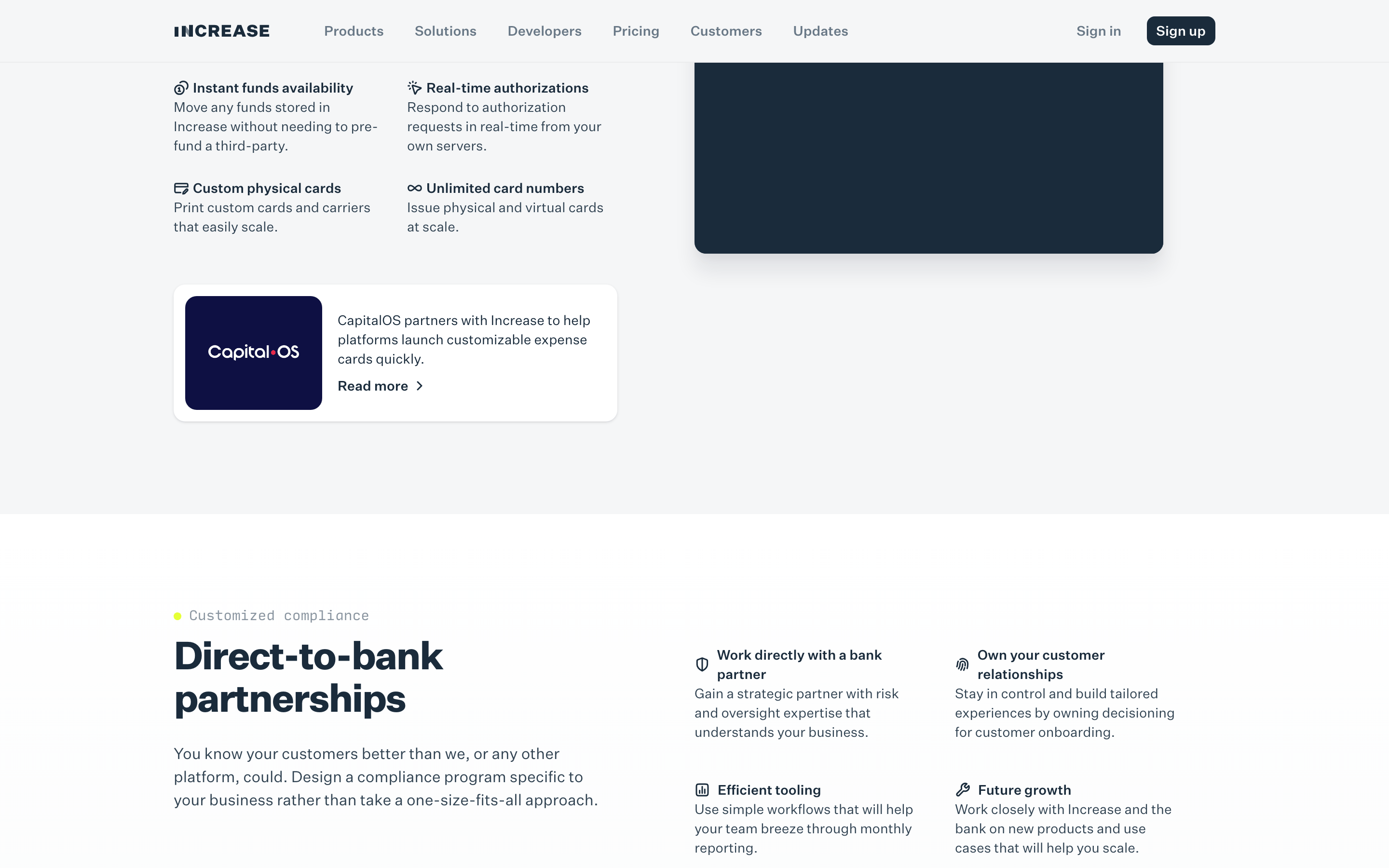
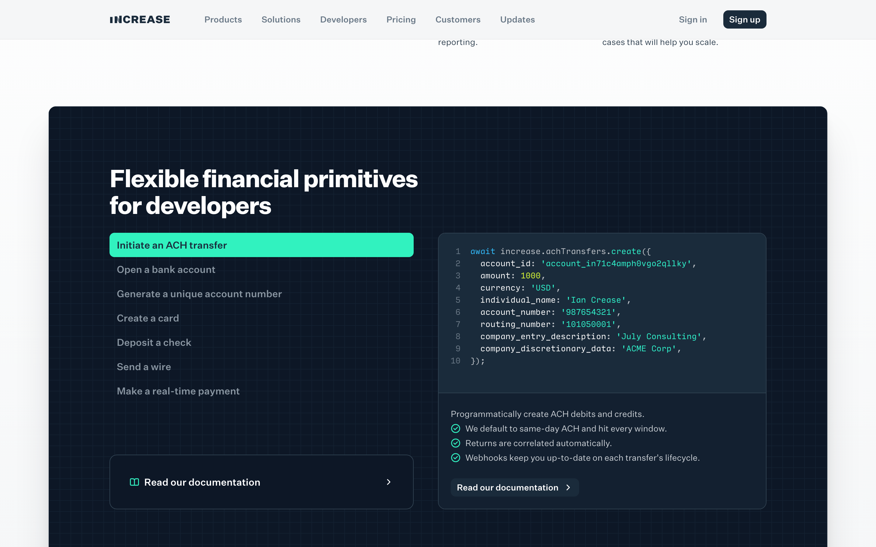
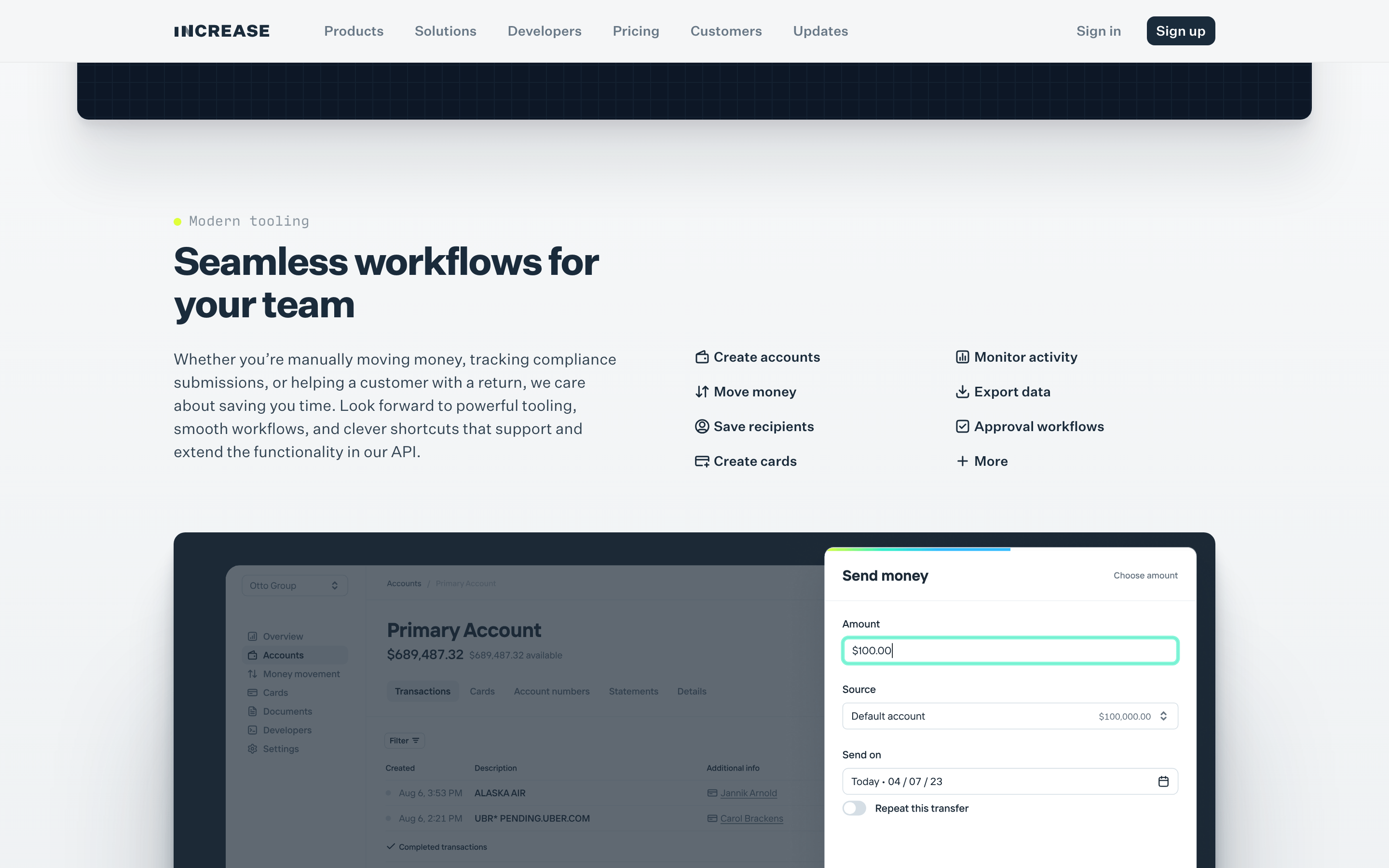
button Dark pill-shaped primary buttons with white text; white secondary buttons with dark borders and icons. card Clean white cards with subtle drop shadows and 12px border-radius. chip Small, rounded pill-shaped labels. input Clean text fields with subtle borders and rounded corners. hero Large, impactful typography paired with dynamic, overlapping geometric gradients. 09
Voice & Don'ts
Tone Professional, authoritative, and developer-focused. Headlines Direct, powerful statements emphasizing enterprise-grade reliability. CTAs Action-oriented with clear directional arrows. Don't use serif fonts — screenshot shows grotesque-sans for display and body text Don't use complex, organic illustrations — screenshot shows bold, flat geometric gradients Don't use a wide, airy layout without clear hierarchy — screenshot shows tight, structured grids Don't use bright, neon colors as primary UI elements — screenshot uses a deep navy base with vibrant accents Don't use heavy drop shadows on every element — screenshot uses subtle shadows only on cards and buttons Don't use a cluttered navigation bar — screenshot shows a clean, minimal top navigation Avoid: Overly casual slang Avoid: Flowery adjectives Avoid: Vague marketing speak 10
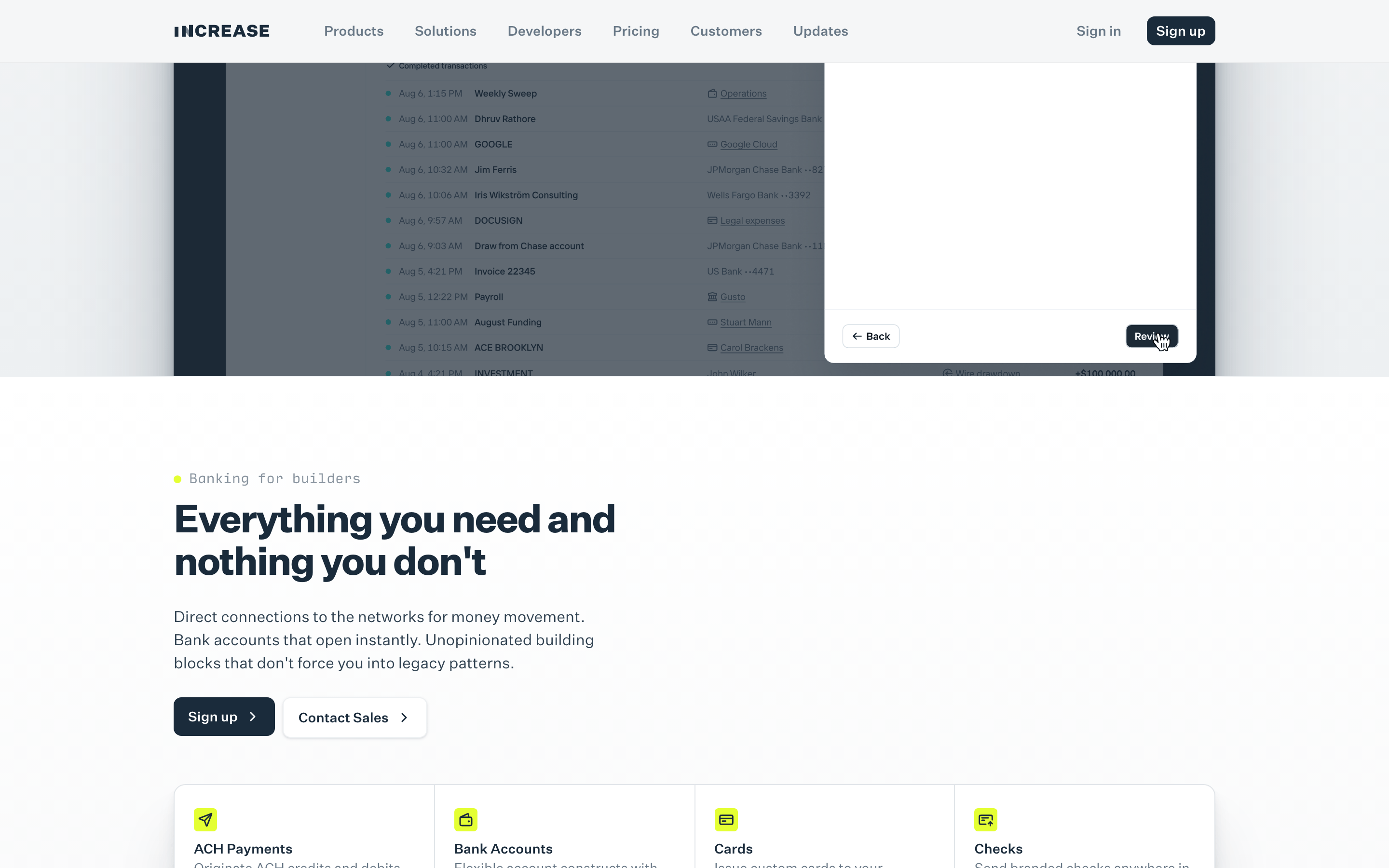
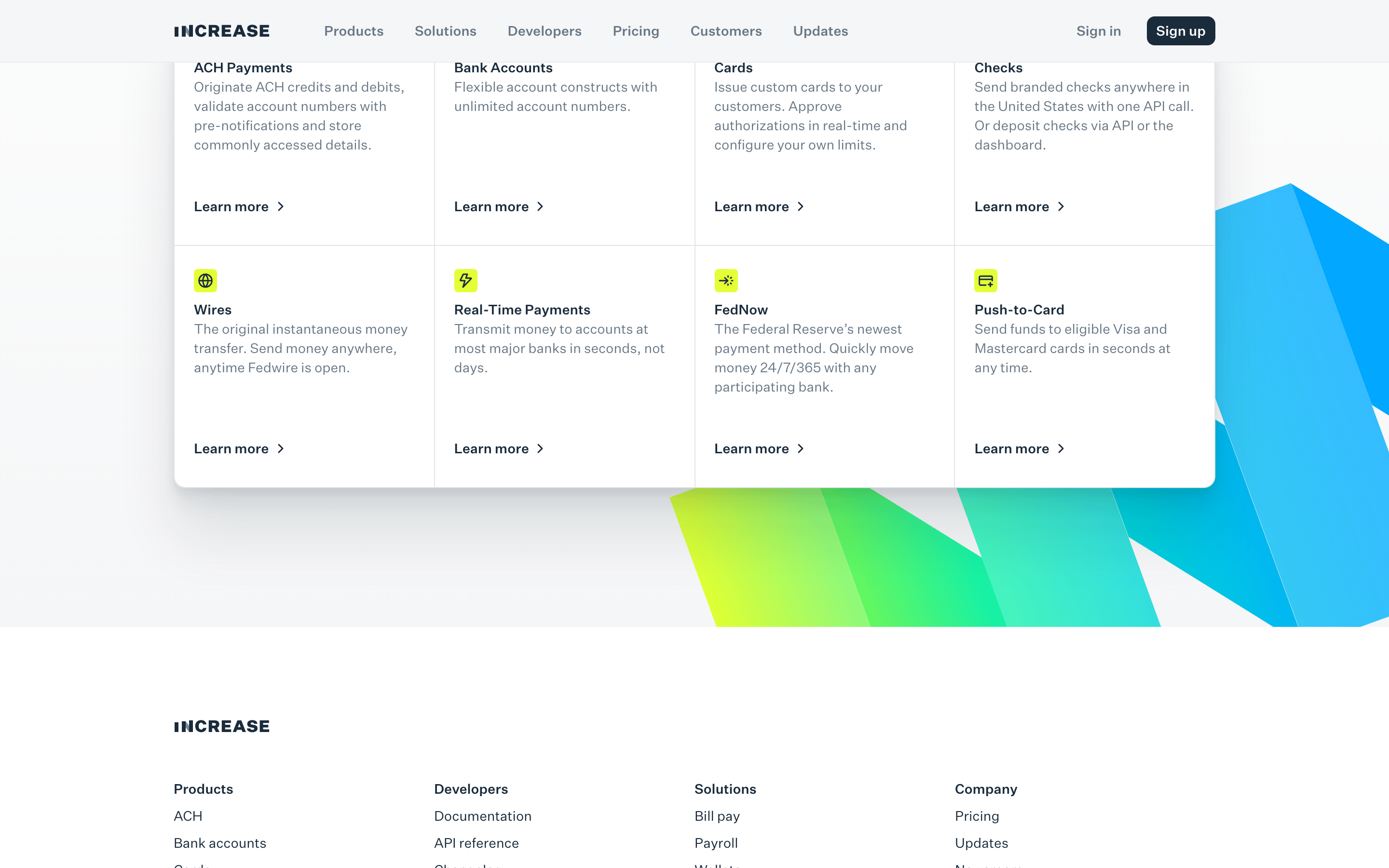
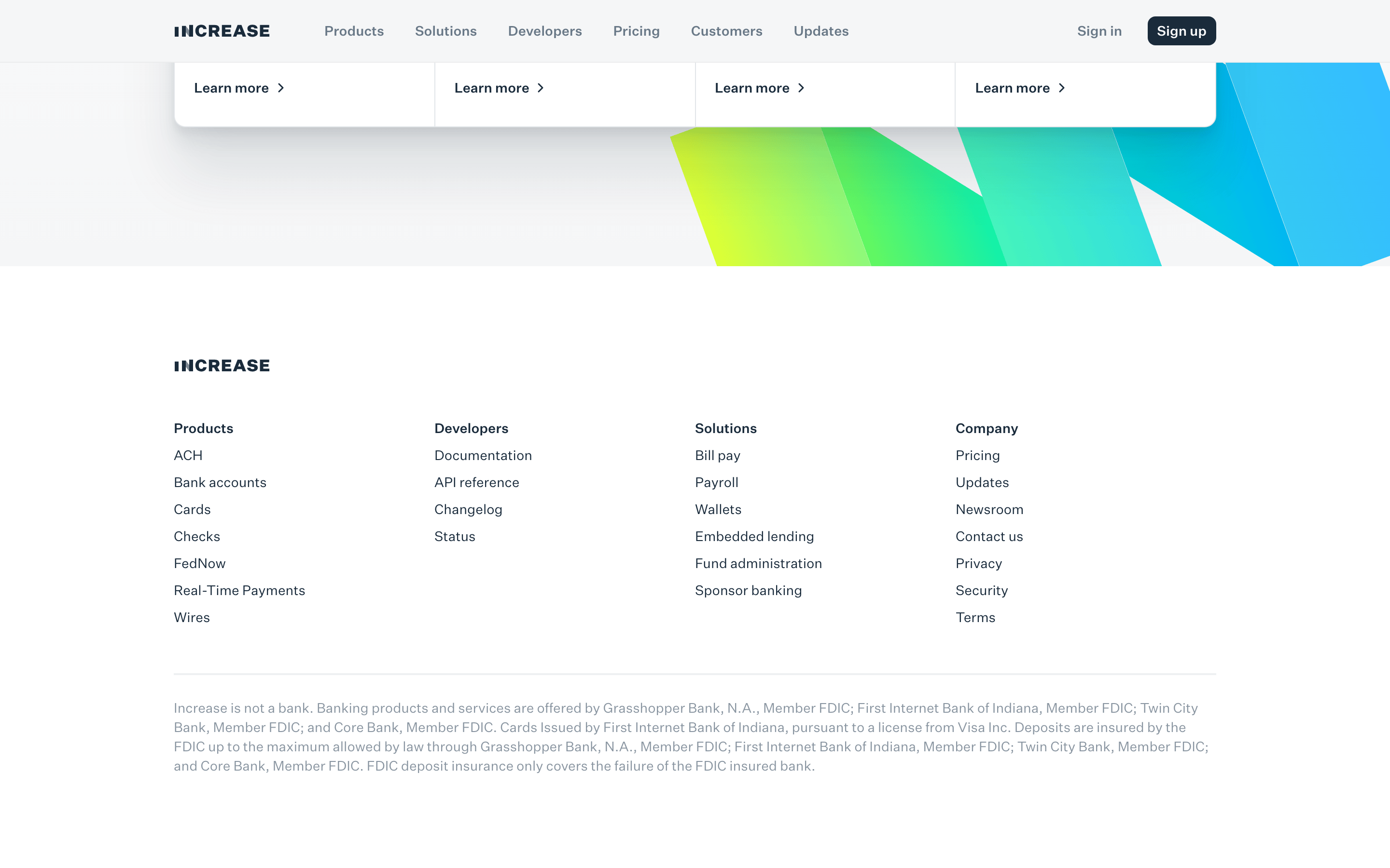
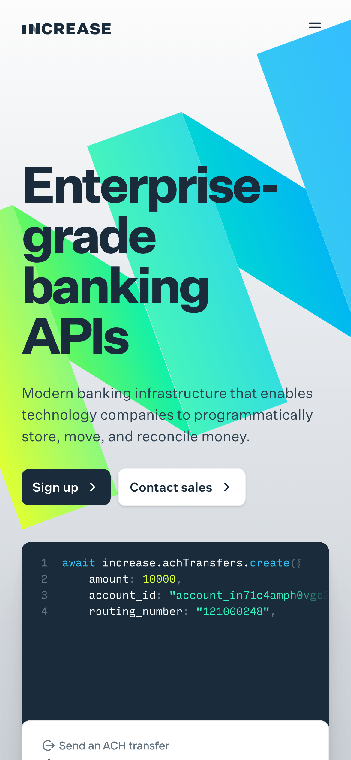
Inside the pack — real screenshots
桌面首屏(hero) 桌面滚动分段(90% viewport 步进,作为视觉证据) 桌面滚动分段(90% viewport 步进,作为视觉证据) 桌面滚动分段(90% viewport 步进,作为视觉证据) 桌面滚动分段(90% viewport 步进,作为视觉证据) 桌面滚动分段(90% viewport 步进,作为视觉证据) 桌面滚动分段(90% viewport 步进,作为视觉证据) 桌面滚动分段(90% viewport 步进,作为视觉证据) 桌面滚动分段(90% viewport 步进,作为视觉证据) 桌面滚动分段(90% viewport 步进,作为视觉证据) 桌面滚动分段(90% viewport 步进,作为视觉证据) 桌面滚动分段(90% viewport 步进,作为视觉证据) 移动首屏 Captured from the live site · real computed styles
11
System prompt
This is a professional Fintech SaaS product designed for enterprise developers. The palette is anchored by a deep navy (#1A2B3B) for trust, contrasted with vibrant teal (#31F2CC) and lime-green gradients for modern energy. Typography uses grotesque-sans for display and body, with monospace for code snippets. Layouts are grid-based, spacious, and highly legible. Critical constraints: Don't use serif fonts, avoid cluttered UI, and never use overly playful or organic visual elements. Ensure the deep navy is used for primary buttons and text to maintain authority.
More from the library en · zh-CN · zh-TW · ja · ko
OpenDesign · curated web aesthetics for AI-readable design DNA · opendesign.cc
Why we curated this: A prime example of a modern, developer-focused Fintech interface that balances professional authority with high-tech visual appeal through bold typography and geometric abstraction.