Use transitional-serif for elegant, high-contrast headlines. · Use a clean grotesque-sans for body text and primary interface elements. · Use a bold, wide grotesque-sans for brand logos and strong call-to-actions. · Apply uppercase and wide letter-spacing to labels and buttons.
04
Spacing
4px
8px
16px
24px
32px
48px
64px
96px
Generous padding and whitespace create a premium, breathable layout.
05
Surfaces
sm · 2px
md · 4px
lg · 8px
pill · 999px
Minimal, using thin 1px solid black or magenta lines for separation and highlights.
rgba(0,0,0,0.25) 0px 5.78px 5.78px 0px
06
Layout
1440container
12columns
24pxgutter
768 / 1024breakpoints
Full-width hero sections with centered content, transitioning into structured multi-column product grids.
07
Motion & Interaction
220msmicro
400mssmall
800msmedium
cubic-bezier(0.39, 0.575, 0.565, 1)easing
Smooth fade-in transitions for content loading. · Opacity-based hover states for interactive elements.
Subtle opacity reduction or color change on buttons and links. · Immediate visual feedback through color change or subtle scale.
08
Components
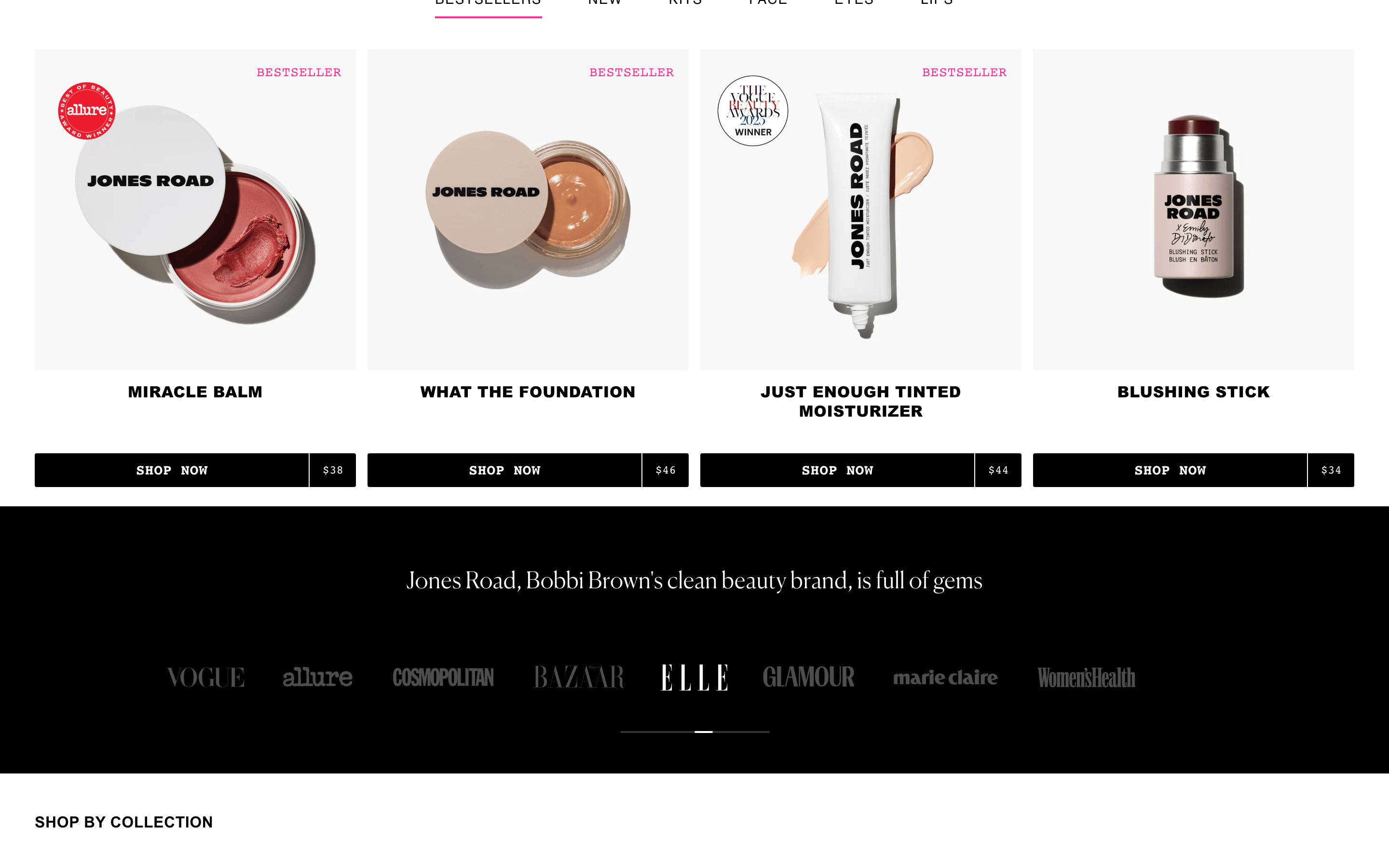
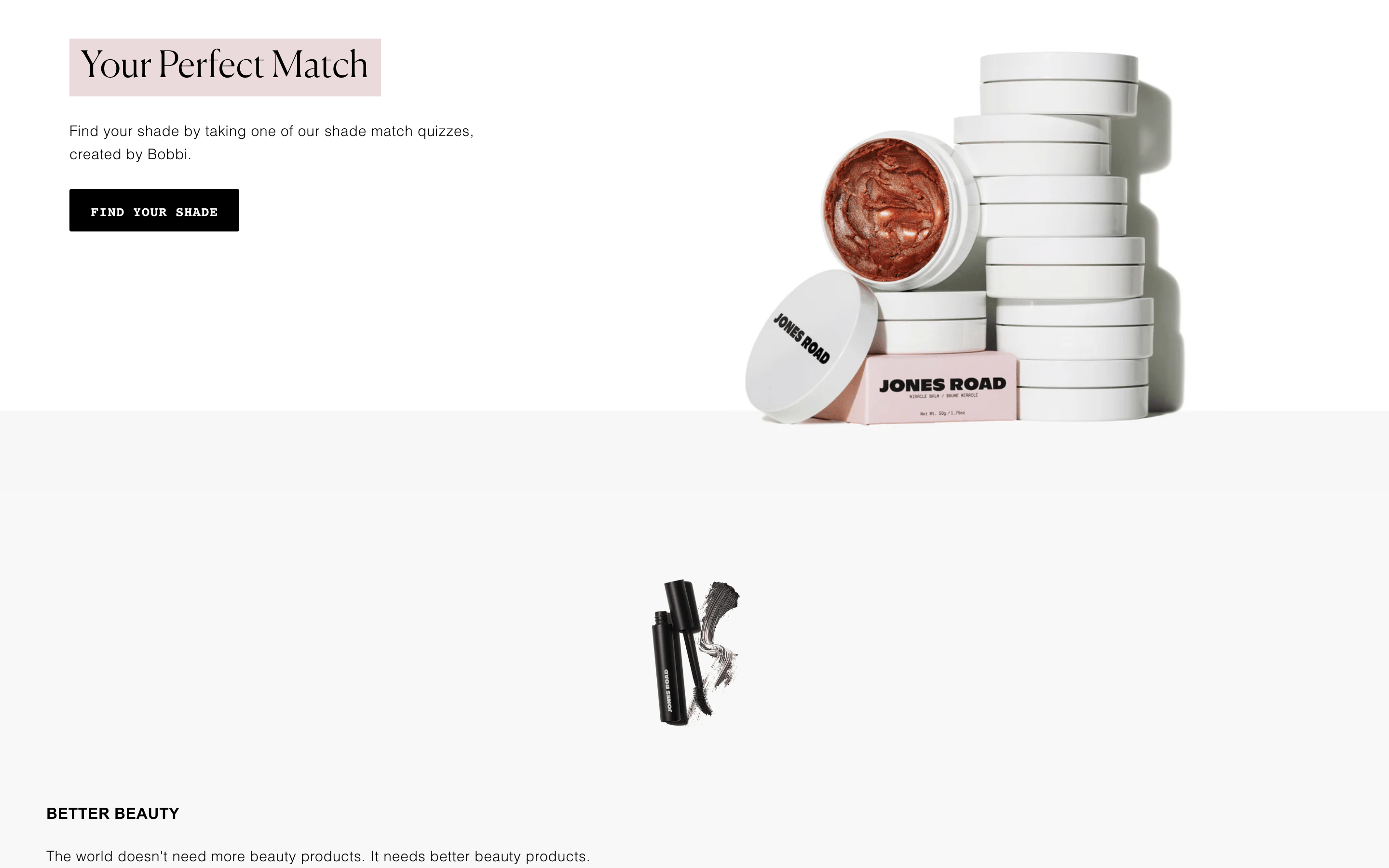
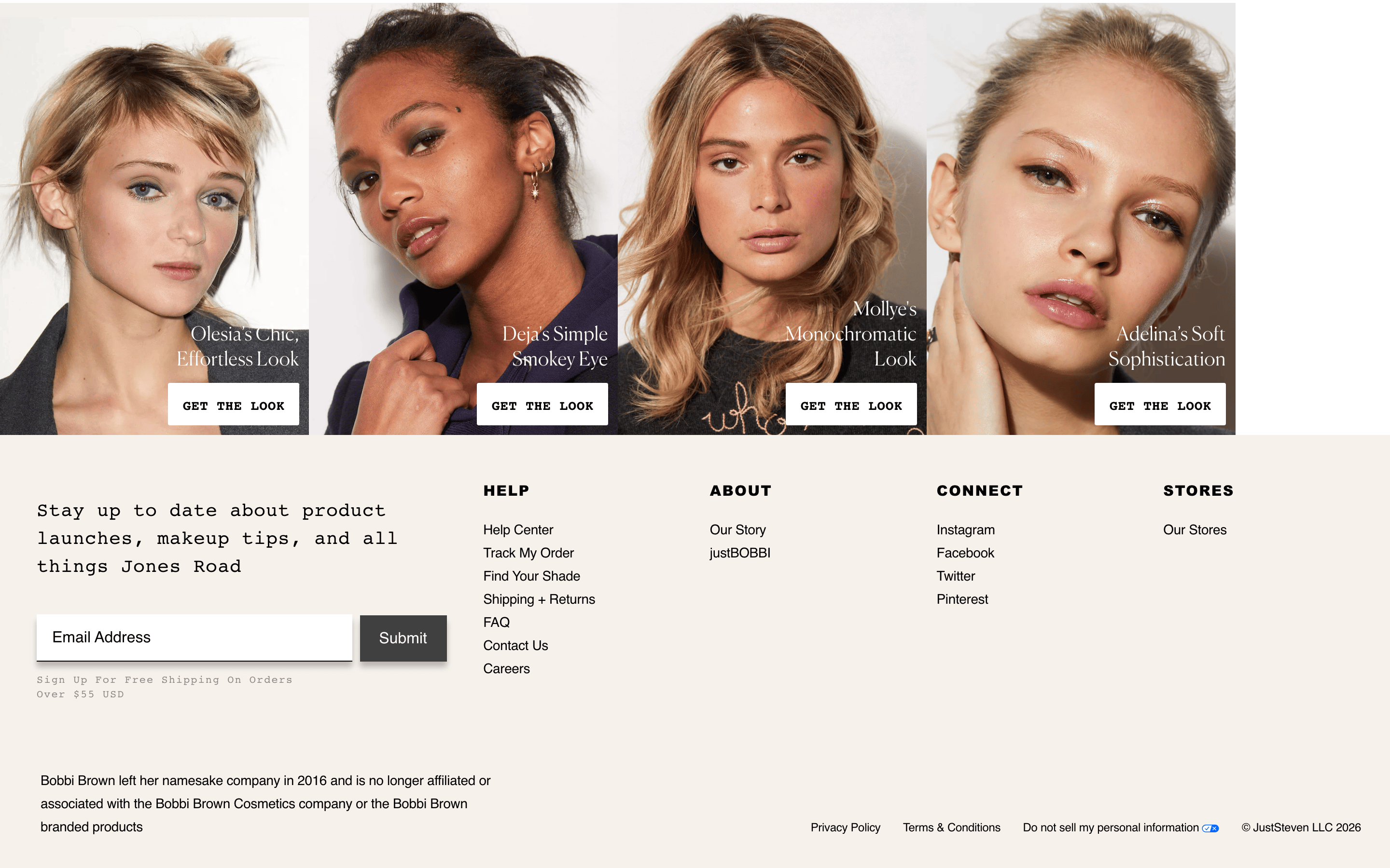
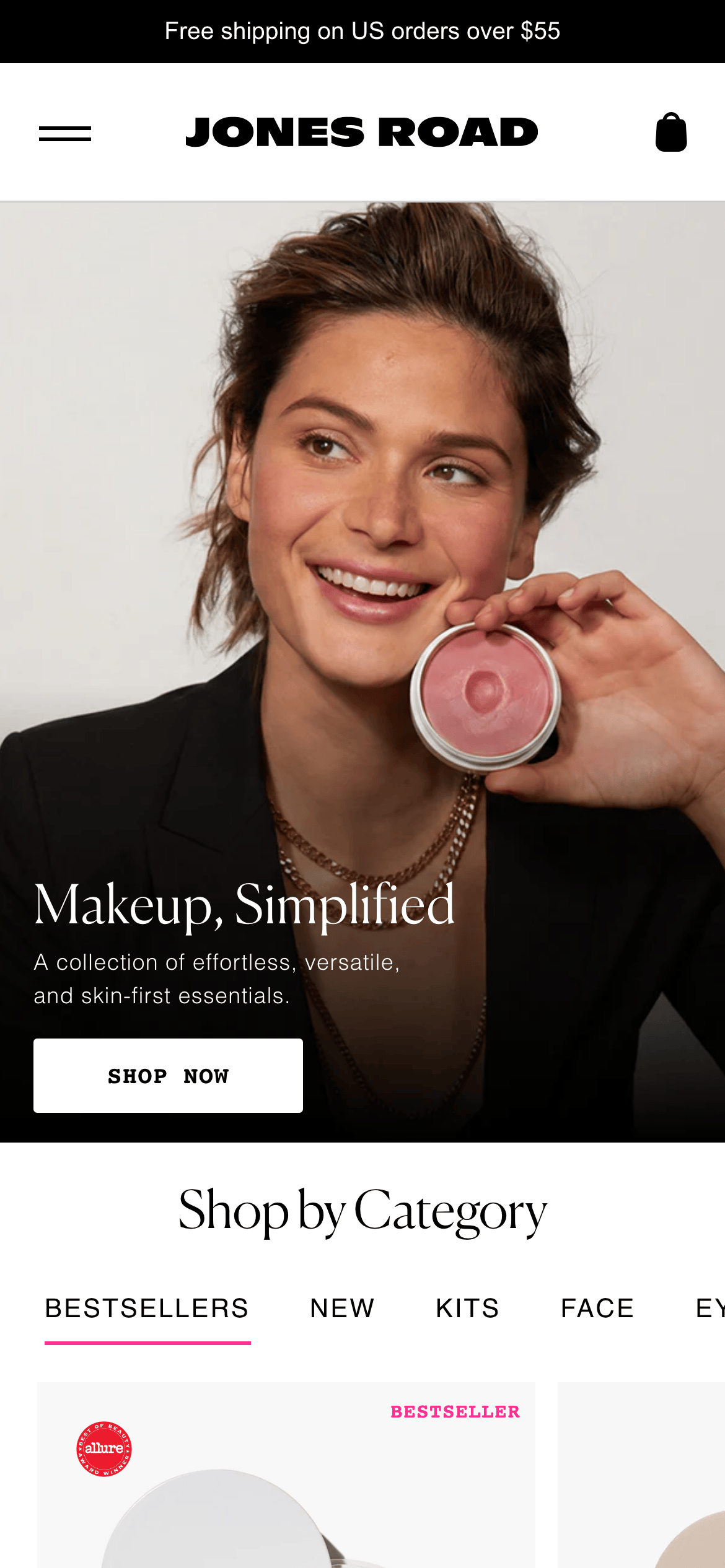
buttonBlack background with white uppercase text, sharp corners, and wide letter-spacing. Magenta variant for secondary actions.
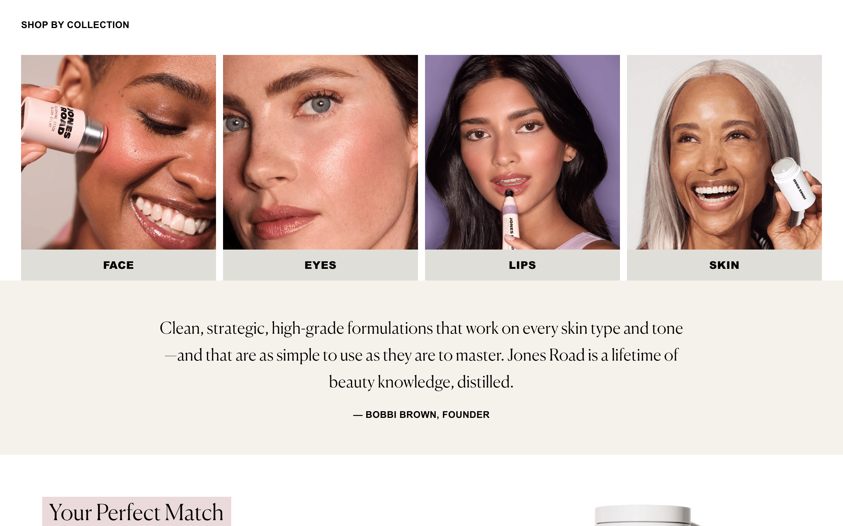
cardClean white backgrounds with minimal borders, focusing on high-quality product photography.
chipUppercase text labels with a thin bottom border, switching to magenta for the active state.
inputSimple line-style inputs with black borders, maintaining the minimal aesthetic.
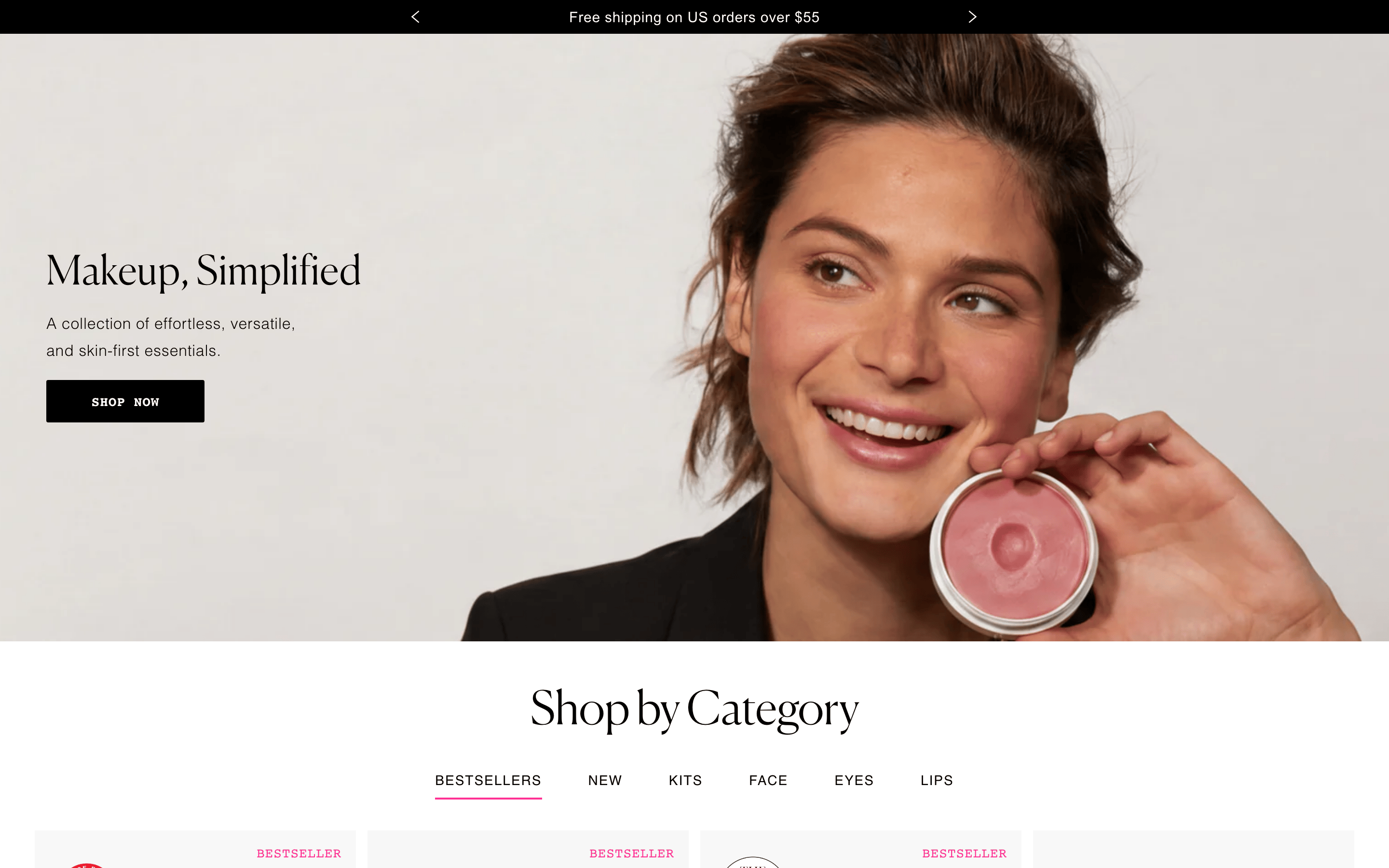
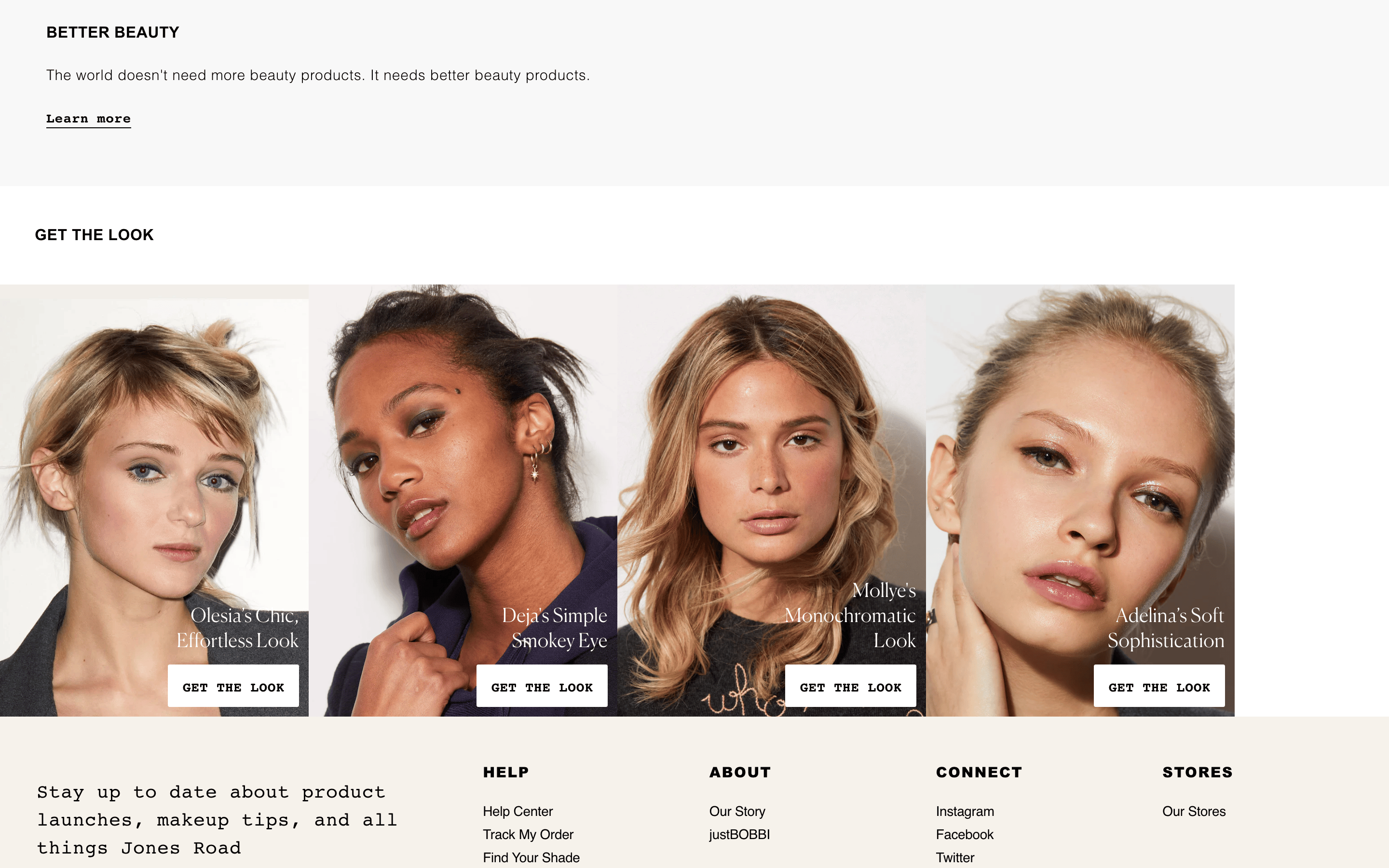
heroLarge-scale photographic hero with serif headline, sans-serif description, and a prominent black CTA button.
09
Voice & Don'ts
ToneConfident, sophisticated, and direct.
HeadlinesElegant serif headlines that emphasize simplicity and quality.
CTAsBold, uppercase, and action-oriented with wide letter-spacing.
don't use rounded corners on primary buttons — screenshot shows sharp, rectangular button shapes.
don't add drop shadows to product cards — screenshot shows flat, borderless cards.
don't use multiple accent colors — screenshot shows only a single magenta accent.
don't use script or handwritten fonts — screenshot shows only serif and sans-serif categories.
don't use heavy background patterns — screenshot shows clean white or off-white backgrounds.
don't use small, cramped spacing — screenshot shows generous padding and whitespace.
Captured from the live site · real computed styles
11
System prompt
This design is for a premium, minimalist beauty brand positioned as 'effortless, versatile, and skin-first'. The palette is strictly monochrome (black #000000 on white #FFFFFF) with a single vibrant magenta (#FF2E92) accent. Typography pairs an elegant transitional-serif for headlines with clean grotesque-sans for body text. Avoid adding rounded corners to buttons, using multiple accent colors, or adding drop shadows to product cards. The layout prioritizes generous whitespace and high-quality photography over complex decorative elements. Use uppercase, wide-spaced labels for navigation and interactive elements to maintain the sophisticated, editorial feel.
Bring this taste to your agent
Hand your AI agent a machine-readable spec of this design — tokens, type, motion, the whole DNA.