← OpenDesign CURATED · OPEN · FREE
Le Labo
A premium fragrance brand presenting a raw, editorial aesthetic through moody photography and stark typography.
beauty fragrance
01
Identity DNA
artisanal raw apothecary luxury fragrance
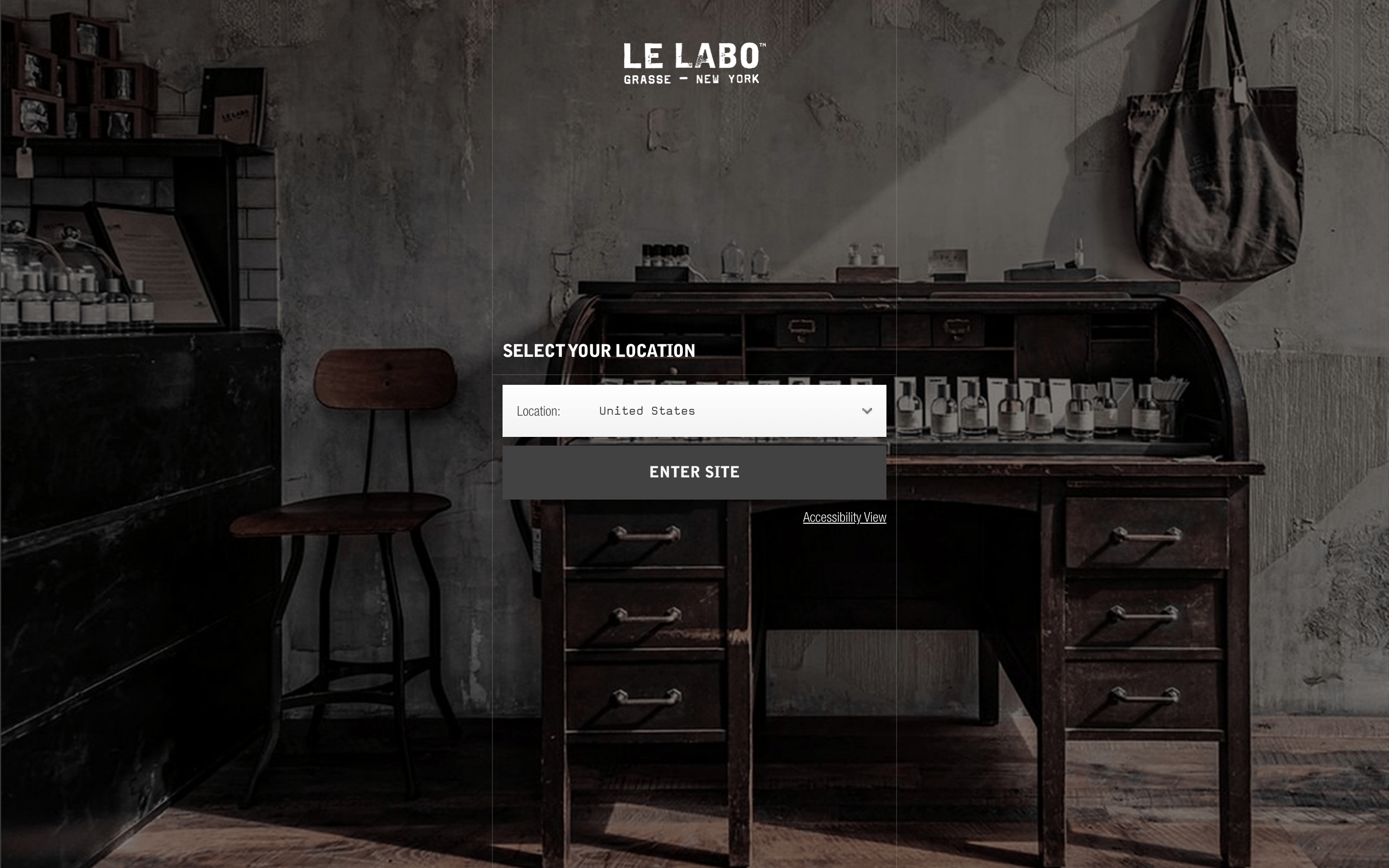
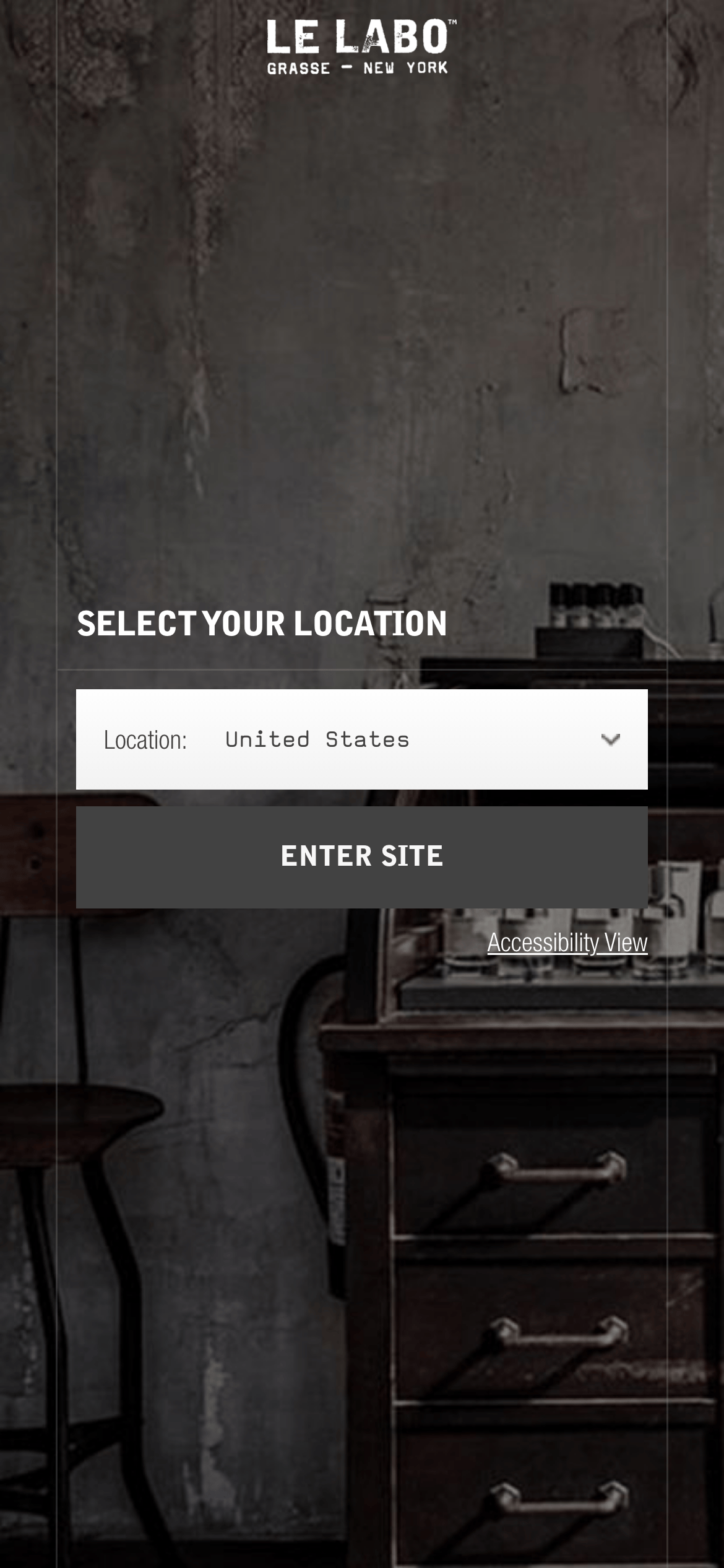
A refined, dark apothecary laboratory where raw materials meet modern minimalism.
02
Color
#FFFFFFInk
#333333Ink soft
#000000BG
#595959Muted
rgba(51, 51, 51, 1.0)Line
High-contrast monochrome palette relying on white text over dark, textured photography.
03
Typography
grotesque-sans
display 30px · 900heading 18px · 700body 14px · 400Heavy use of uppercase for headings and labels. · Wide letter-spacing applied to smaller uppercase text.
04
Spacing
4px
8px
16px
24px
32px
48px
64px
96px
Moderate rhythm with generous padding in primary containers.
05
Surfaces
sm · 0px
md · 0px
lg · 0px
pill · 999px
1px solid rgba(51, 51, 51, 1.0)
0 2px 4px rgba(0,0,0,0.1)
06
Layout
1200 container
12 columns
24px gutter
768 / 1024 breakpoints
Centered column layout with heavy use of full-width background imagery.
07
Motion & Interaction
100ms micro
300ms small
0ms medium
cubic-bezier(0.25, 0.1, 0.25, 1.0) easing
Fast opacity transitions on hover. · No complex entry animations observed.
Opacity change on interactive elements. · Immediate state change with no complex feedback.
08
Components
button Full-width, dark rectangular block with white uppercase text. card Image-based cards with minimal borders, relying on photography. chip None observed in this view. input White background dropdown with black text and subtle border. hero Full-screen, moody photographic background with centered overlay text. 09
Voice & Don'ts
Tone Direct, authoritative, and understated. Headlines Short, punchy uppercase statements. CTAs All-caps, high-contrast buttons that command attention. Don't use vibrant accent colors — screenshot shows a strictly monochrome palette. Don't use rounded corners on primary buttons — screenshot shows sharp, rectangular edges. Don't use serif fonts for primary headings — screenshot shows a bold, geometric grotesque-sans. Don't clutter the interface with many small icons — screenshot shows a minimalist approach. Don't use light, airy backgrounds — screenshot features dark, moody, and textured photography. Don't use lowercase for primary call-to-action buttons — screenshot shows all-caps text. Avoid: Playful language Avoid: Bright colors Avoid: Decorative elements 10
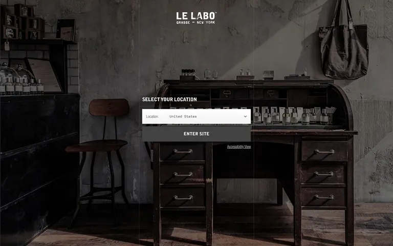
Inside the pack — real screenshots
桌面首屏(hero) 桌面滚动分段(90% viewport 步进,作为视觉证据) 桌面滚动分段(90% viewport 步进,作为视觉证据) 移动首屏 Captured from the live site · real computed styles
11
System prompt
This is a premium fragrance brand site with a dark, editorial aesthetic. It uses a high-contrast monochrome palette (Black #000000, White #FFFFFF, Muted #333333) over full-bleed, moody photography. Typography is exclusively bold, uppercase grotesque-sans (like the declared Bell Gothic Std). Key hex colors are #000, #FFF, and #333. Critical donts: Do not use vibrant accents, do not use rounded corners on buttons, and do not use lowercase for CTAs. The design is minimalist, focusing on the texture of the imagery and the starkness of the typography to convey artisanal luxury.
More from the library en · zh-CN · zh-TW · ja · ko
OpenDesign · curated web aesthetics for AI-readable design DNA · opendesign.cc
Why we curated this: This site is a masterclass in using photography and typography to establish a premium, artisanal brand identity without relying on a wide color palette.