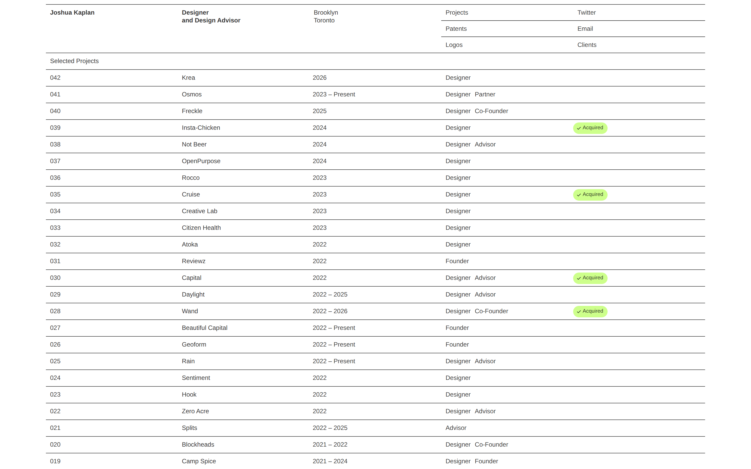
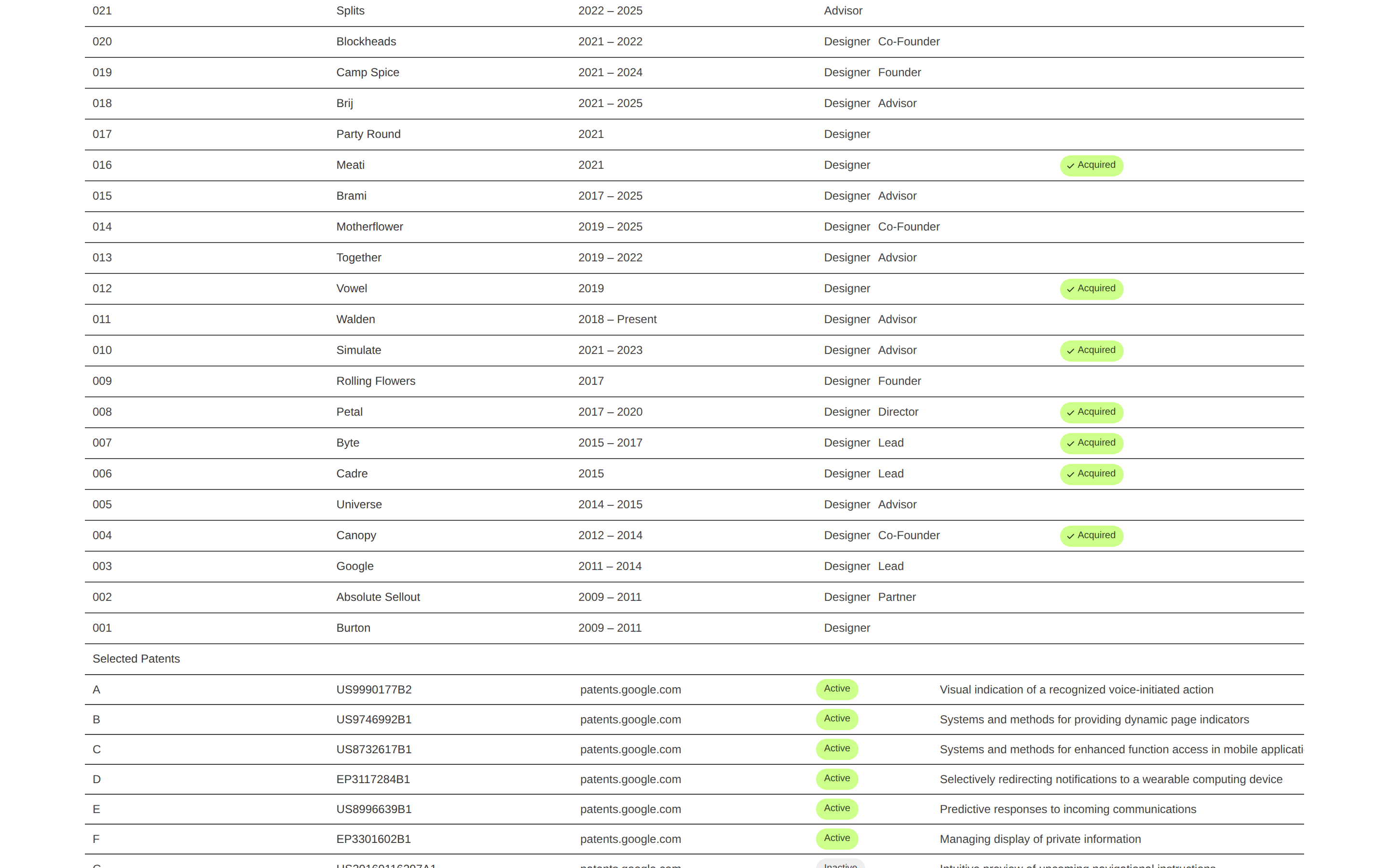
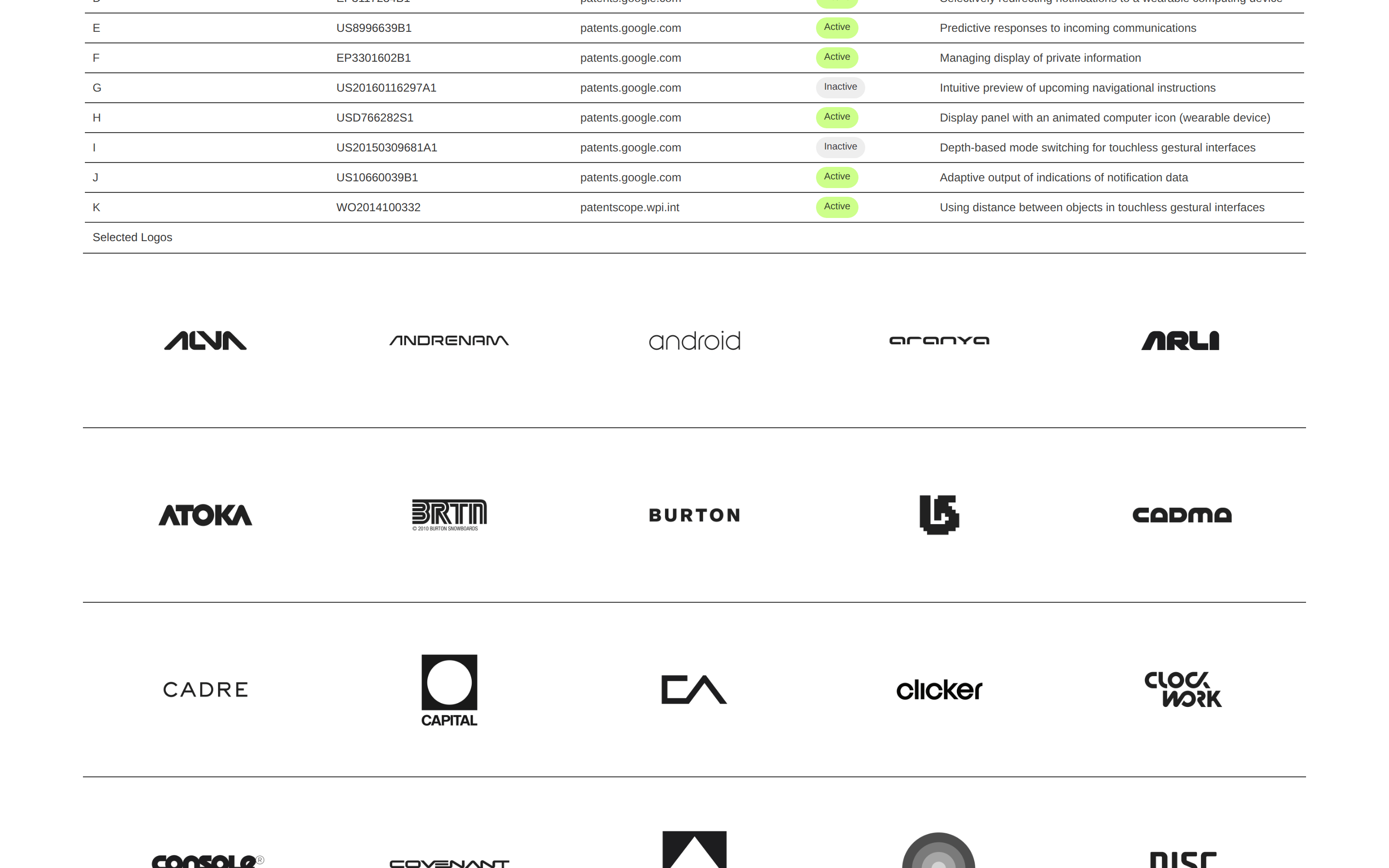
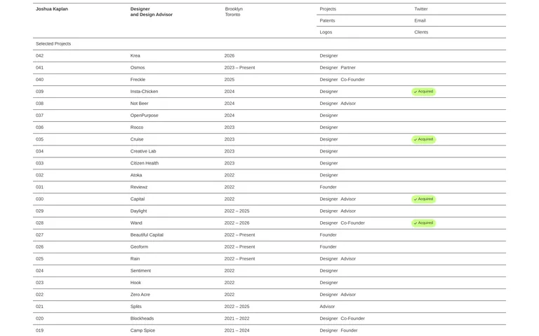
A meticulously organized design portfolio, functioning like a structured index or ledger.
02
Color
#CDFF8BAccent
#000000Ink
rgba(0,0,0,0.75)Ink soft
#FFFFFFBG
rgba(0,0,0,0.5)Muted
A stark, high-contrast palette of black and white, using a single bright lime green accent for status indicators.
03
Typography
sans-serif
display16px · 500
body12px · 500
All text uses a medium weight (500) sans-serif font. · Line height is very tight, often around 1.0 to 1.2. · Font size is consistently small, with 16px and 12px being the primary sizes.
04
Spacing
4px
8px
16px
24px
32px
48px
64px
96px
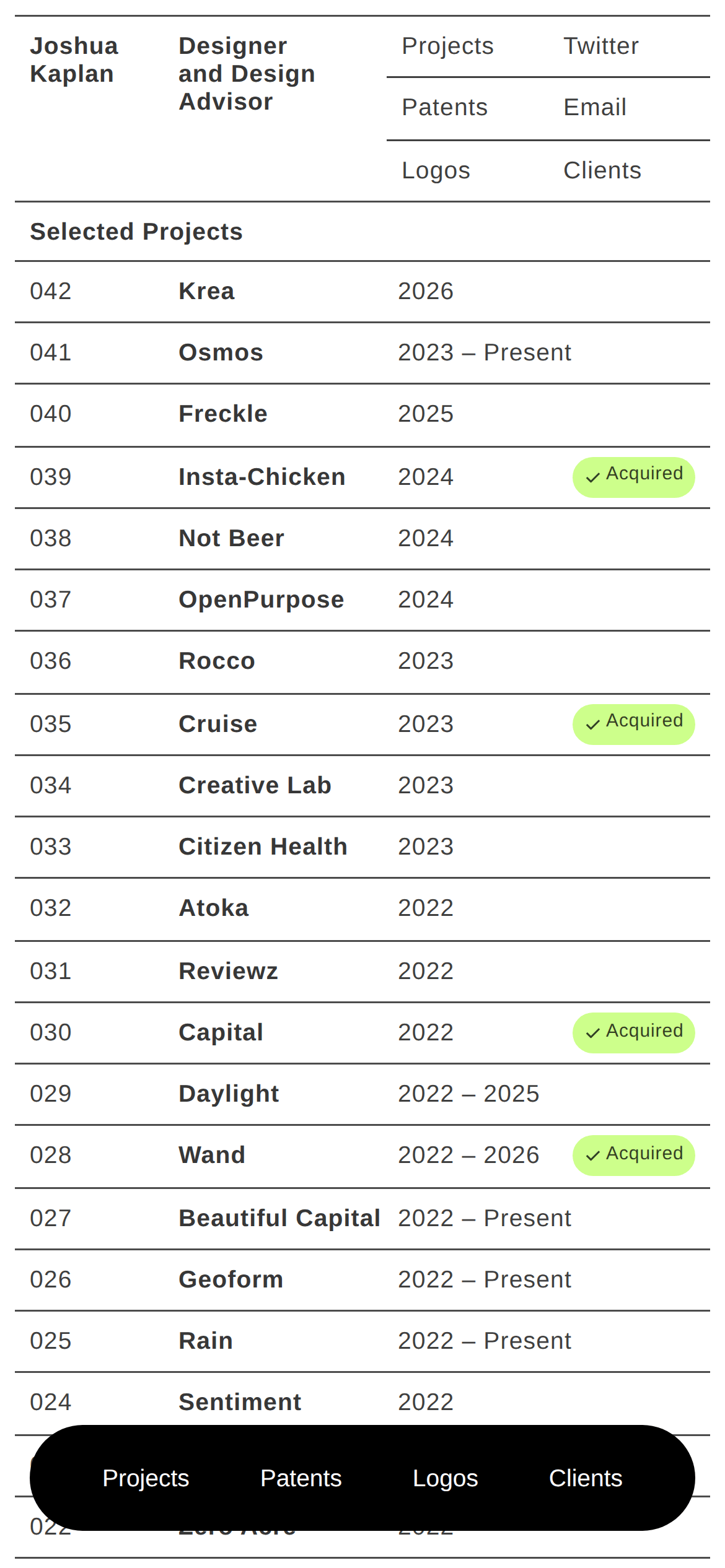
Tight, consistent 8px padding is used within grid cells, with horizontal rules defining major sections.
05
Surfaces
sm · 0px
md · 0px
lg · 0px
pill · 20px
1px solid rgba(0,0,0,0.75) horizontal rules are used extensively to separate rows and sections.
06
Layout
1200container
4columns
768 / 1024breakpoints
A single-column vertical stack of rows, with rows divided into 4 columns of varying widths.
07
Motion & Interaction
220msmicro
400mssmall
800msmedium
cubic-bezier(0.25, 0.1, 0.25, 1)easing
Transitions on all interactive elements.
Text links change color to blue on hover. · Standard pointer cursor on clickable elements.
08
Components
buttonText links with no visual button styling, functioning as navigation.
cardRows act as data cards, with content organized into aligned columns.
chipPill-shaped status indicators (e.g., '✓ Acquired') with a bright lime green background.
heroA text-only header introducing the designer and providing navigation links.
09
Voice & Don'ts
ToneProfessional, concise, and systematic.
HeadlinesDirect and informational, stating roles and locations.
CTAsSimple, unadorned text links for navigation.
Don't use rounded corners on containers — the screenshot shows sharp 90-degree corners on all rows and sections.
Don't use drop shadows or elevation — the screenshot shows a completely flat design with no shadows.
Don't use multiple accent colors — the screenshot shows a monochrome palette with only one lime green accent for status pills.
Don't use large, varied typography — the screenshot shows a very tight typographic scale with minimal size variation.
Don't use heavy borders or boxes — the screenshot shows only thin, single-pixel horizontal rules for separation.
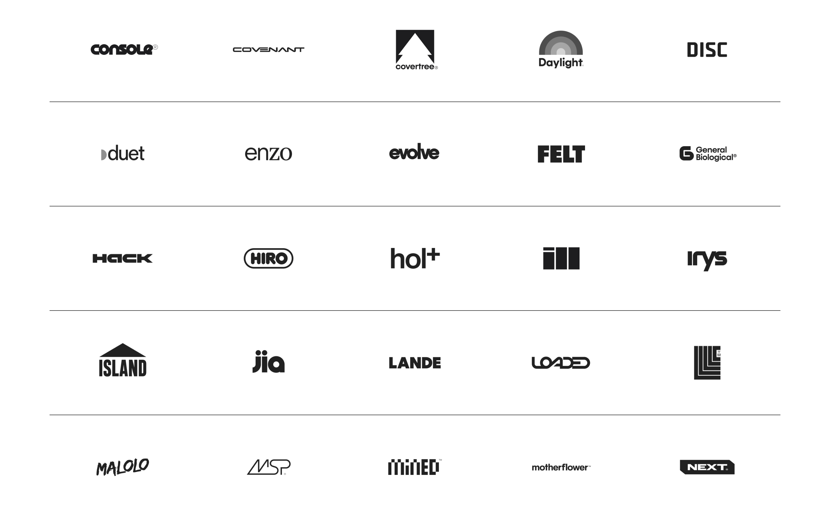
Don't use decorative imagery or background patterns — the screenshot shows a plain white background with no imagery except for logos.
Captured from the live site · real computed styles
11
System prompt
This is a highly structured, minimalist designer portfolio. It uses a stark, high-contrast black-and-white palette with a single lime green accent (#CDFF8B) for status indicators. Typography is exclusively a medium-weight sans-serif, used in a very tight scale (16px and 12px) with a line height of around 1.0 to 1.2. The layout is a systematic, single-column grid of rows divided into four aligned columns, defined by thin horizontal rules. Key critical donts: Do not use rounded corners on main containers. Do not add drop shadows or elevation effects. Do not introduce multiple accent colors or decorative imagery. The design is purely typographic and structural.
Bring this taste to your agent
Hand your AI agent a machine-readable spec of this design — tokens, type, motion, the whole DNA.