A curated gallery of high-end lifestyle photography.
02
Color
#000000Ink
#F0F0F0BG
#808080Muted
rgba(0,0,0,0.8)Line
Minimalist monochrome palette with strict geometric borders to prioritize photography.
03
Typography
didone-serif · humanist-sans
display56px · 400
heading32px · 400
body16px · 400
small10px · 400
Headlines use elegant didone serifs with high stroke contrast. · Navigation and metadata use clean, uppercase sans-serif with generous letter-spacing. · Body text maintains a consistent 400 weight for a refined, low-contrast look.
04
Spacing
4px
8px
12px
16px
18px
24px
32px
48px
60px
Generous internal padding for cards and structured vertical spacing for the grid.
05
Surfaces
sm · 0px
md · 0px
lg · 0px
pill · 0px
Thin 1px borders using rgba(0, 0, 0, 0.8) to create a strict grid structure.
1px 0px 0px 0px rgba(240, 240, 240, 1)
06
Layout
1440container
12columns
768 / 1024breakpoints
Strict rectangular grid with visible border lines acting as structural dividers.
07
Motion & Interaction
220msmicro
250mssmall
400msmedium
cubic-bezier(0.4, 0, 0.2, 1)easing
Smooth opacity transitions on hover (0.25s linear 0.2s delay). · General 0.3s transitions on interactive elements.
Subtle opacity changes on text links and images. · Standard pointer cursor interactions.
08
Components
buttonText-only uppercase links with no background fill.
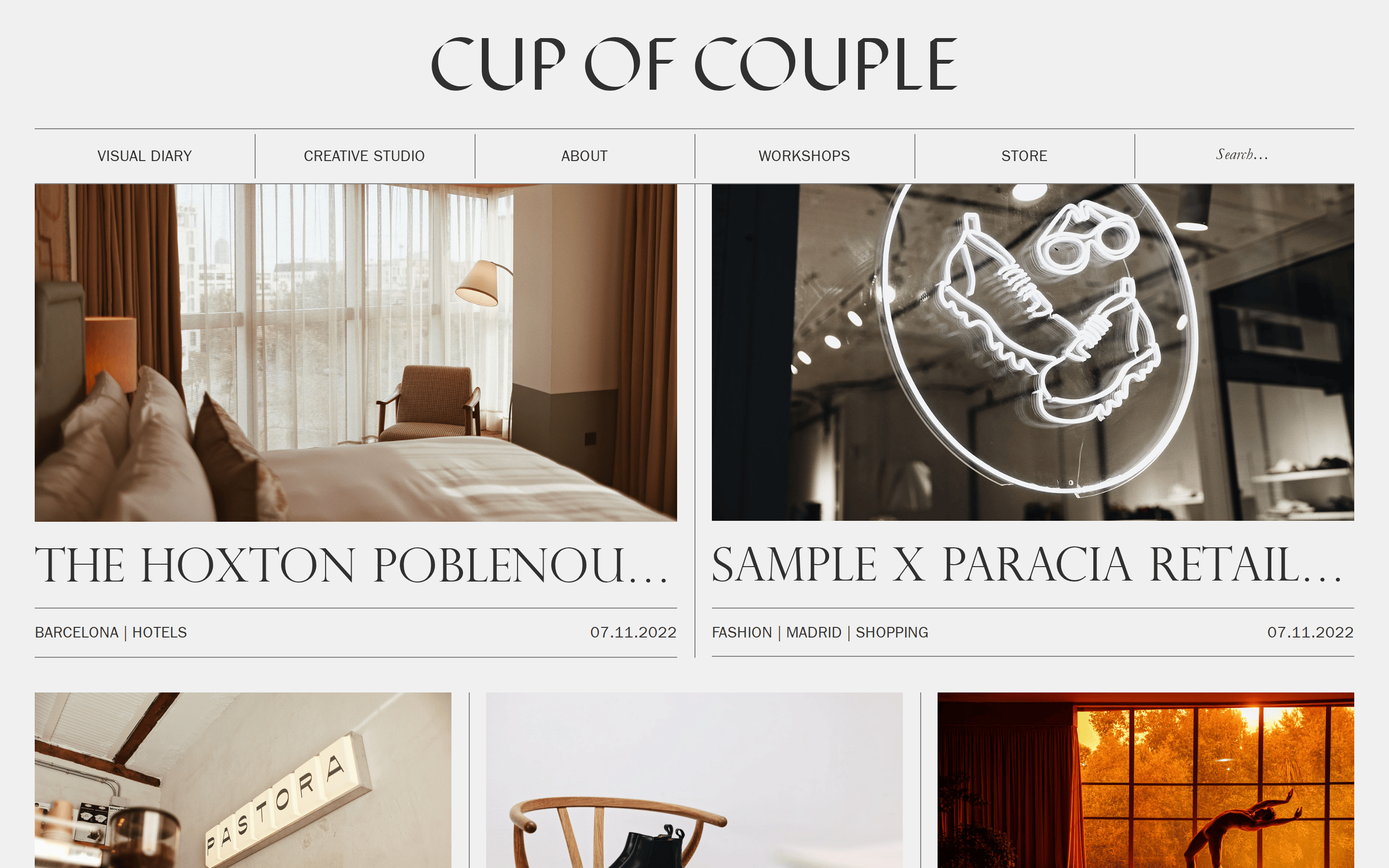
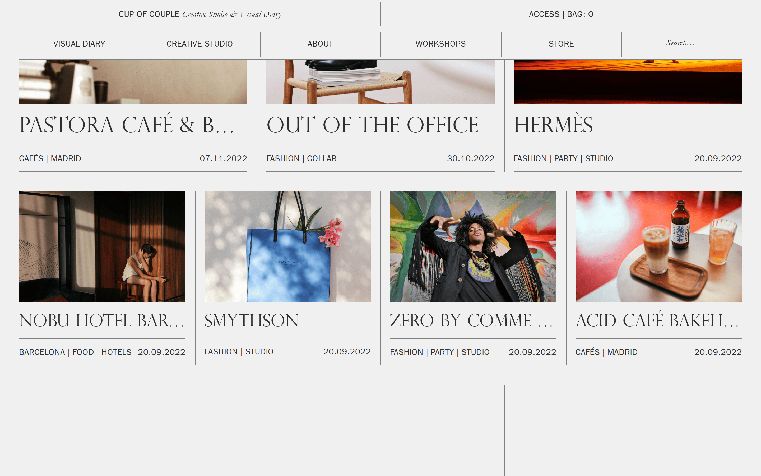
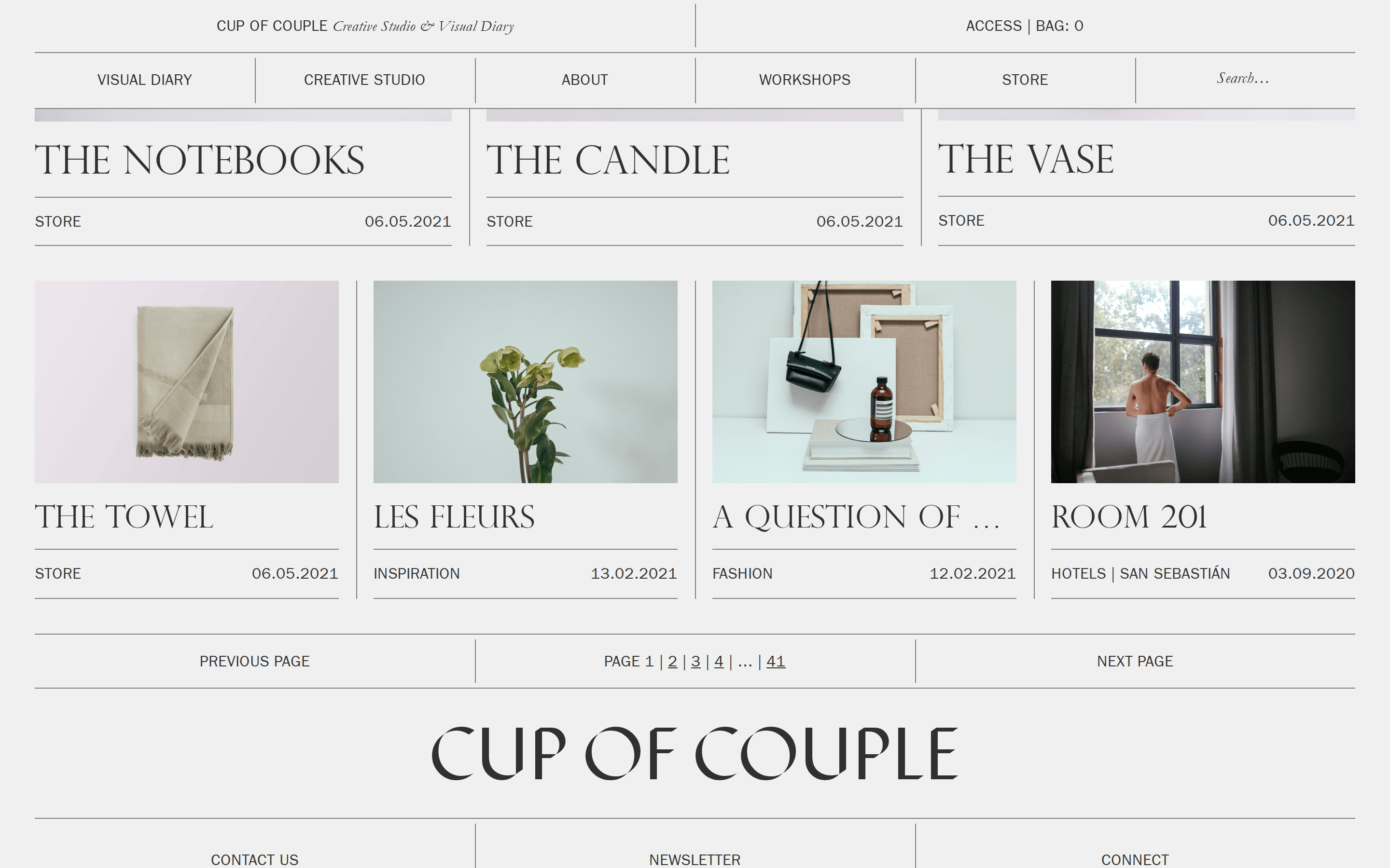
cardImage-heavy cards with thin internal borders, separated by hairline grid lines.
chipMinimal text tags separated by vertical pipes (|).
inputSimple text field with no visible border or background, labeled 'Search...'.
heroA massive, centered display serif logo acting as a focal point.
09
Voice & Don'ts
ToneSophisticated, minimal, and curated.
HeadlinesElegant serif typography in all caps for high-impact visual weight.
CTAsUnderstated, text-based navigation without prominent buttons.
Don't use vibrant accent colors — screenshot shows a strict monochrome palette.
Don't use rounded corners — screenshot shows sharp, zero-radius edges.
Don't use drop shadows for depth — screenshot uses thin borders for structure.
Don't use bold font weights — screenshot shows uniform 400 weight across all text.
Don't use sans-serif for headlines — screenshot shows serif typography for all titles.
Don't use cluttered layouts — screenshot uses a spacious, grid-based structure with hairline dividers.
Captured from the live site · real computed styles
11
System prompt
A refined editorial portfolio and visual diary for a creative studio. The design uses a monochrome palette of light gray backgrounds and dark gray/black typography, with no accent colors. It features a strict, zero-radius grid structure where thin borders define sections. Typography contrasts elegant didone serifs for headlines with humanist sans-serifs for navigation. Never use rounded corners, drop shadows, or vibrant accent colors; instead, maintain the minimalist, structured aesthetic. Key colors: Background #F0F0F0, Ink #000000, Line rgba(0,0,0,0.8).
Bring this taste to your agent
Hand your AI agent a machine-readable spec of this design — tokens, type, motion, the whole DNA.