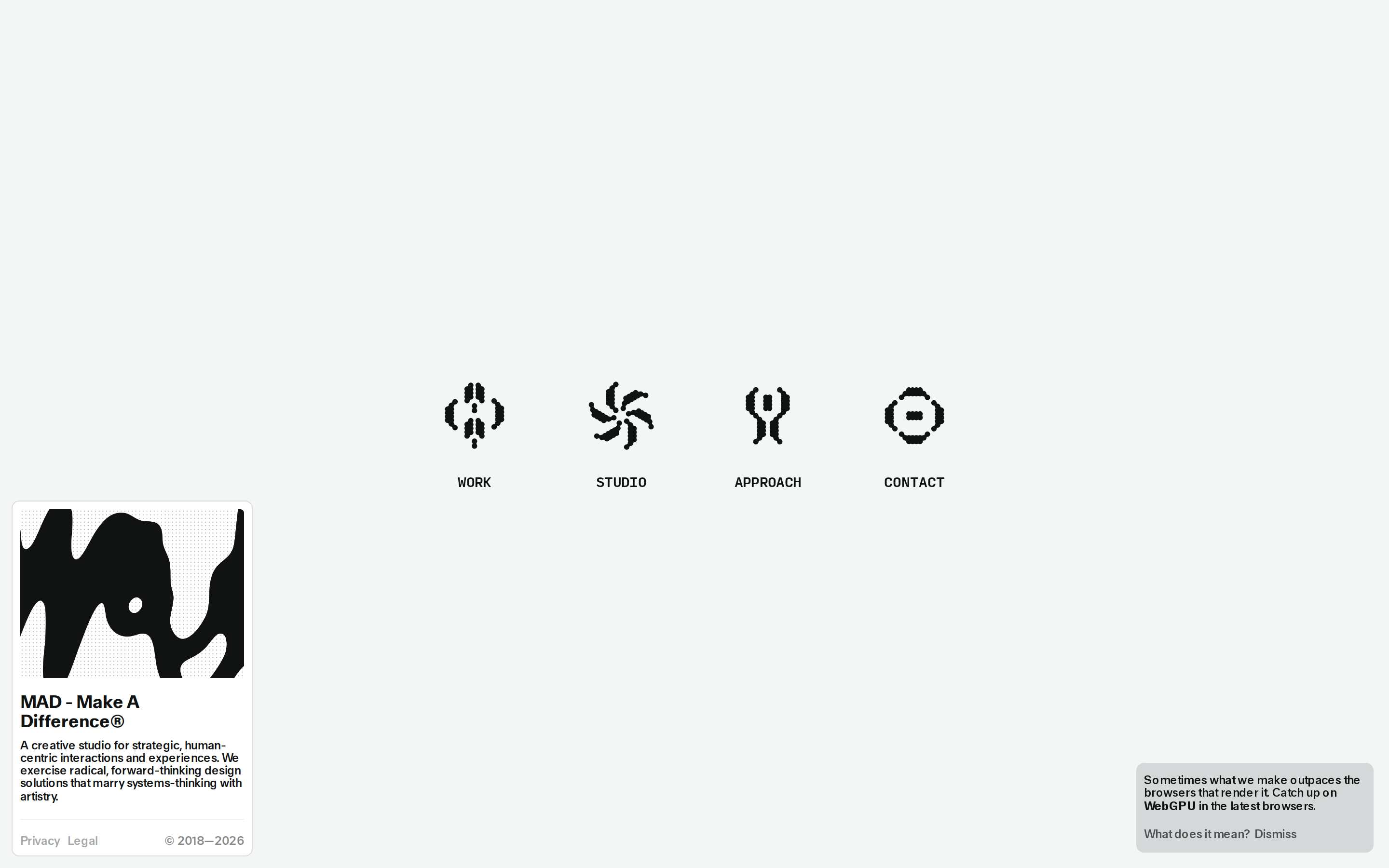
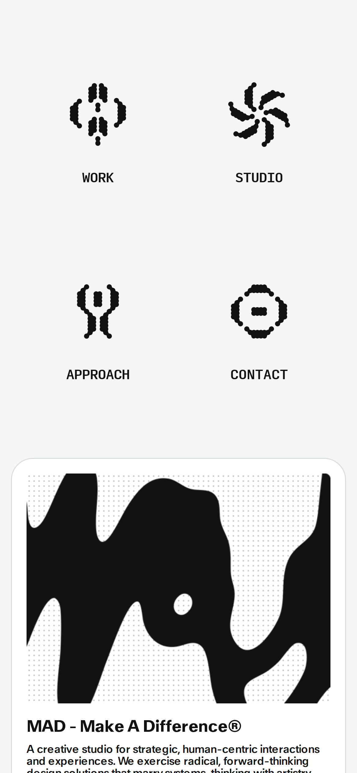
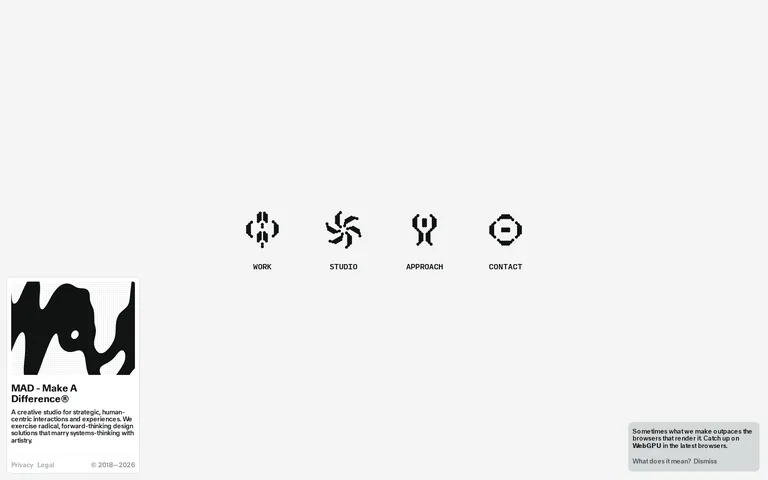
An avant-garde design studio that merges bold artistic expression with structured systems thinking.
02
Color
#111313Ink
#4B5353Ink soft
#F4F5F5BG
#D8DCDCMuted
rgba(17, 19, 19, 0.1)Line
A highly restrained, achromatic palette that relies entirely on high-contrast ink and negative space to direct focus.
03
Typography
humanist-sans · monospaced
display56px · 560
headline32px · 500
body14px · 500
Use tight tracking (-0.32px) for body and navigation text · Maintain a uniform weight of 500 for primary text hierarchy · Ensure generous vertical spacing to balance the dense typographic weight
04
Spacing
4px
8px
16px
24px
32px
48px
64px
96px
A loose, spacious rhythm that allows large graphic elements to breathe while maintaining tight internal padding on cards.
05
Surfaces
sm · 4px
md · 8px
lg · 12px
pill · 999px
1px solid rgba(17, 19, 19, 0.1)
06
Layout
1280container
12columns
24pxgutter
768 / 1024breakpoints
A minimalist, center-aligned layout for the primary navigation, transitioning to a stacked card-based system for content.
07
Motion & Interaction
150msmicro
300mssmall
800msmedium
cubic-bezier(0.25, 0.1, 0.25, 1.0)easing
Subtle color and opacity transitions for interactive elements · Clip-path transitions for expressive graphical reveals · Smooth backdrop-filter changes for overlaying elements
Subtle opacity or color shifts, typically a 0.15s transition. · Immediate response with minimal visual feedback.
08
Components
buttonMinimal text links, often uppercase, with subtle hover state changes.
cardHigh-contrast containers with a light border, padding of 16px, and a small border radius of 8px.
chipSmall, uppercase text tags with a subtle background or border.
inputMinimalist text inputs with a clean border and no heavy background.
heroA massive, expressive graphic element paired with bold, tightly tracked typography.
09
Voice & Don'ts
ToneConfident, forward-thinking, and slightly provocative.
HeadlinesBold, direct, and highly expressive, often using all-caps for navigation.
CTAsSubtle and integrated into the typography, avoiding heavy button styles.
Don't use a multi-colored palette — screenshot shows a strict black-and-white achromatic scheme.
Don't use heavy drop shadows — screenshot shows elements defined by clean borders and negative space.
Don't use thin, delicate typography — screenshot shows a bold, heavy humanist-sans with tight tracking.
Don't use generic icons — screenshot features highly expressive, custom-drawn organic shapes.
Captured from the live site · real computed styles
11
System prompt
This site represents a radical creative studio identity, defined by a high-contrast, achromatic palette (ink #111313 on background #F4F5F5) and bold, tightly tracked humanist-sans typography. The design relies on large expressive graphics and generous negative space rather than color or decoration. Key constraints include maintaining a strict black-and-white scheme, using heavy weights (500+) for all text, and avoiding generic icons or heavy shadows. Always prioritize bold typography and custom, organic iconography over standard UI patterns. Do not introduce color accents, as the design relies entirely on high-contrast form.
Bring this taste to your agent
Hand your AI agent a machine-readable spec of this design — tokens, type, motion, the whole DNA.