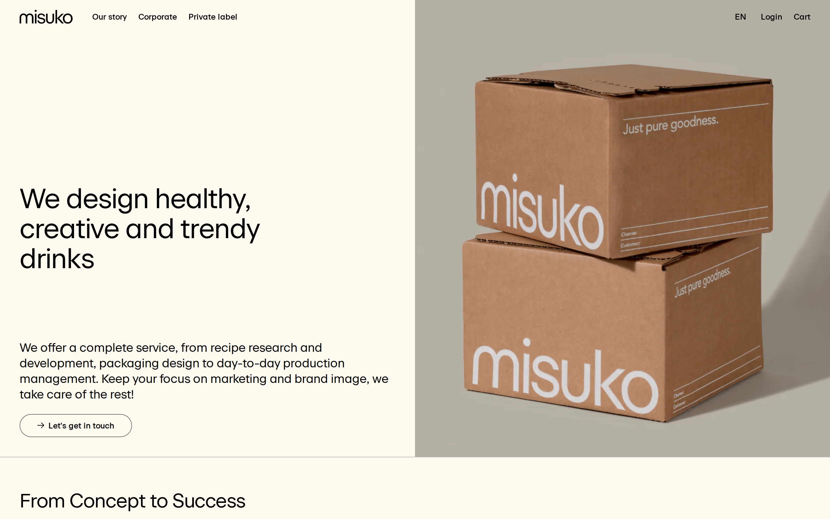
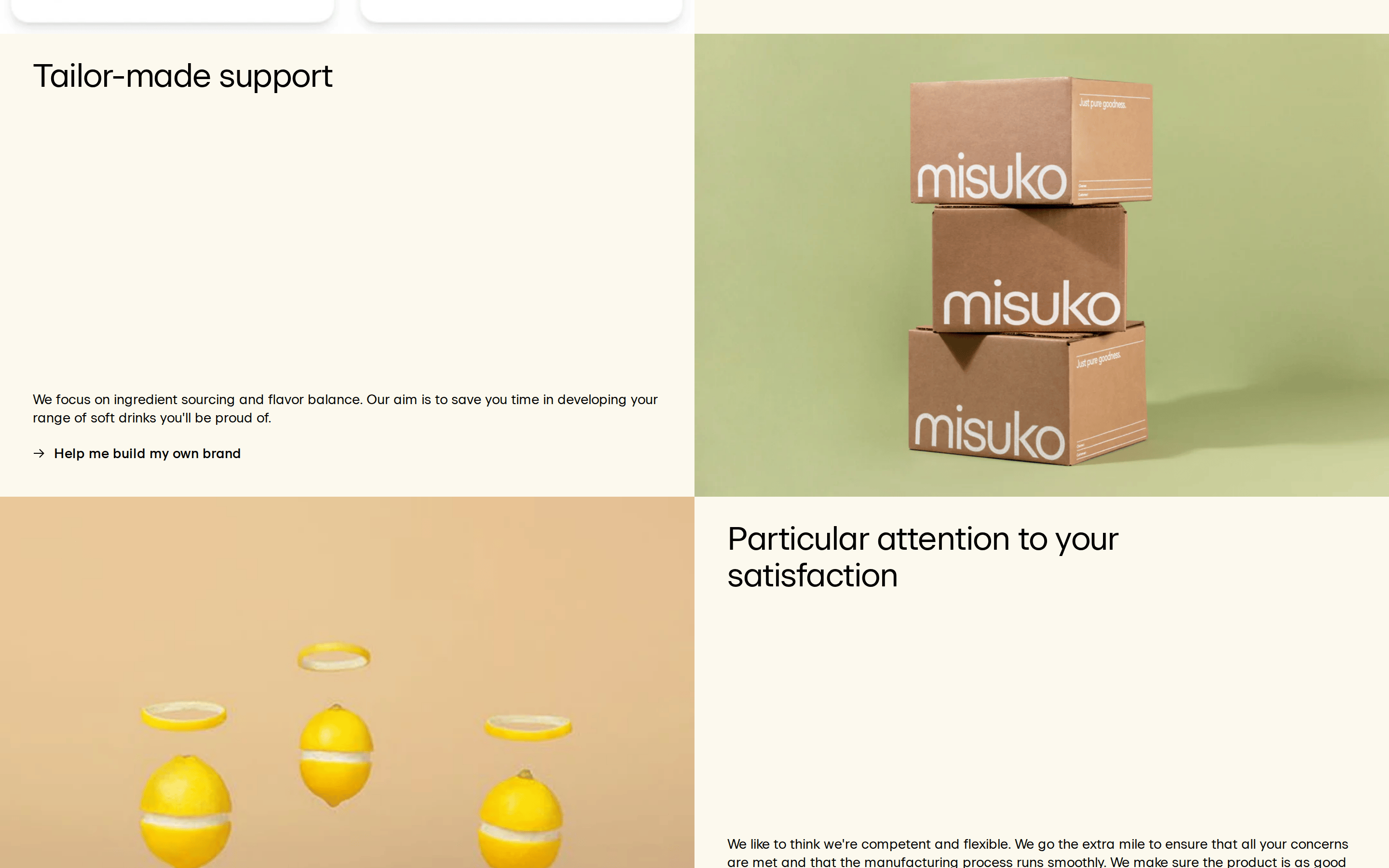
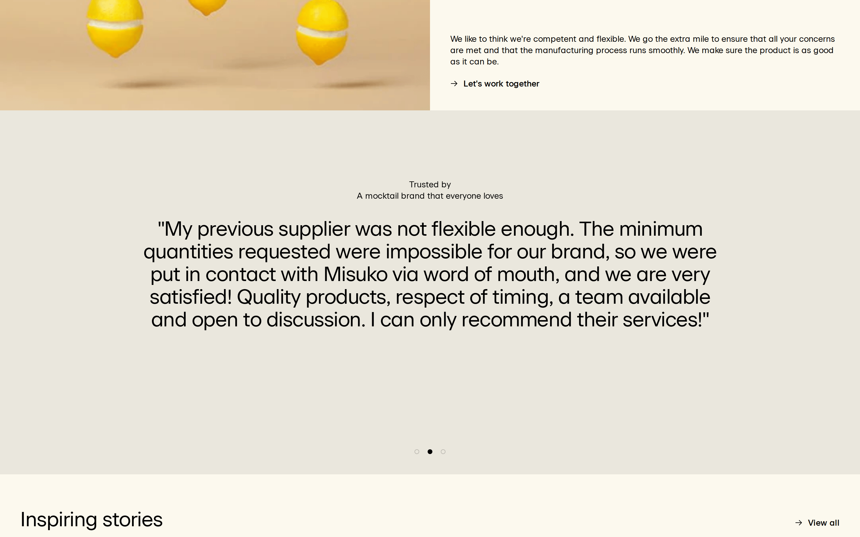
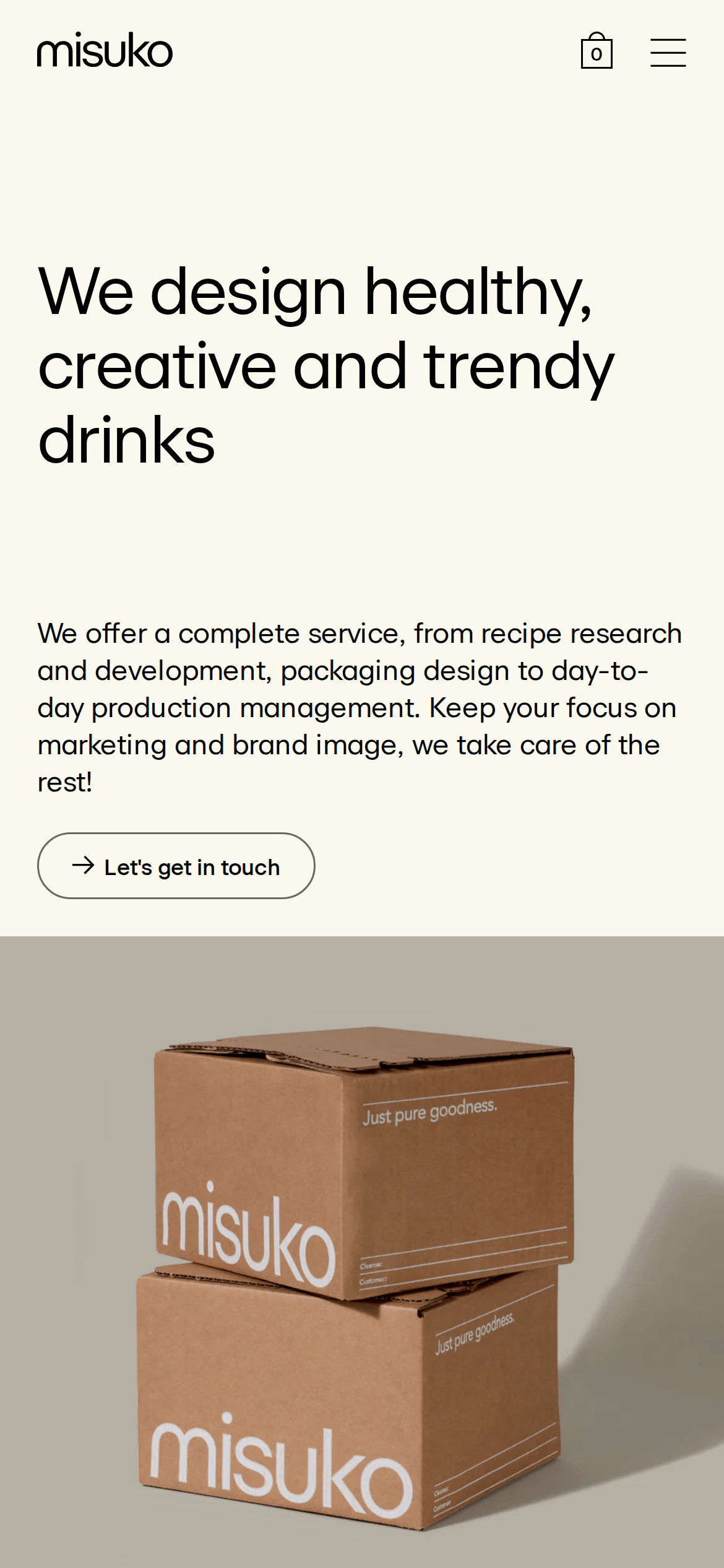
A clean, professional packaging studio for beverage brands
02
Color
#000000Ink
#6A6965Ink soft
#F2EFE3BG
#FCF9EEBG soft
#BCBEB2Muted
rgba(188,186,178,1)Line
Earthy, muted background palette with sharp black typography for high contrast.
03
Typography
grotesque-sans
display48px · 500
heading34px · 400
body14px · 400
Headlines use tight negative letter-spacing · Body text maintains a comfortable 1.36 line-height · Nav links and body copy share the same base font size
Captured from the live site · real computed styles
11
System prompt
This is a B2B service website for a beverage production and packaging studio. The design is clean, professional, and grounded in an earthy palette of beige (#F2EFE3), black (#000000), and muted gray (#6A6965). The typography is a clean grotesque-sans with tight negative letter-spacing on headlines, creating a modern and structured feel. The layout utilizes large, split-screen sections that pair bold text with high-quality product photography. Critical constraints: Do not introduce bright accent colors or gradients; maintain the warm, neutral aesthetic. Do not use centered text layouts; stick to strong left alignment. Avoid cluttered, multi-column grids in favor of spacious, breathable split-screen arrangements.
Bring this taste to your agent
Hand your AI agent a machine-readable spec of this design — tokens, type, motion, the whole DNA.