← OpenDesign CURATED · OPEN · FREE
Microwaver59
A monochrome, typographically driven, and highly interactive portfolio interface.
Dark Mode Monochrome Experimental Typography Refined
01
Identity DNA
minimal brutalist experimental monochrome typographic
A stark, experimental design studio landing page.
02
Color
#FCFCFAInk
#000000BG
rgba(252, 252, 250, 0.2)Line
High-contrast monochrome, utilizing only black, white, and a single subtle gray.
03
Typography
monospace
All text is uppercase · Monospaced typeface used throughout for a technical, uniform aesthetic · Generous letter spacing applied to all text elements
04
Spacing
4px
8px
16px
24px
32px
48px
64px
96px
Strictly aligned to a 4px base grid with tight, consistent internal padding.
05
Surfaces
sm · 0px
md · 0px
lg · 0px
pill · 999px
1px solid borders used for interactive elements and structural divisions.
0 0 0 1px rgba(252, 252, 250, 1)
06
Layout
1440 container
1 columns
24px gutter
768 / 1024 breakpoints
Full-bleed, single-column layout with heavily padded sections.
07
Motion & Interaction
240ms micro
370ms small
620ms medium
cubic-bezier(0.68, -0.6, 0.32, 1.6) easing
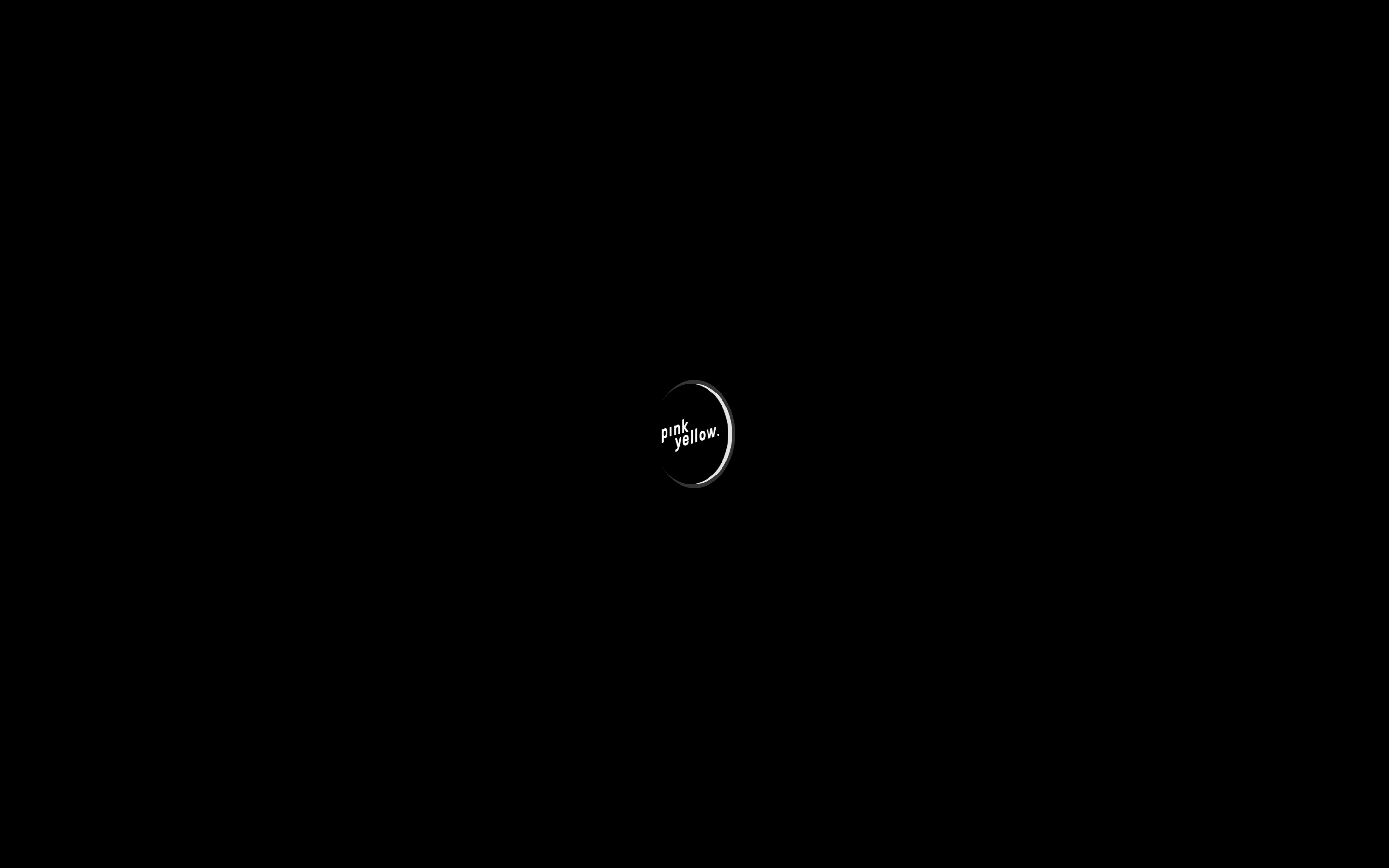
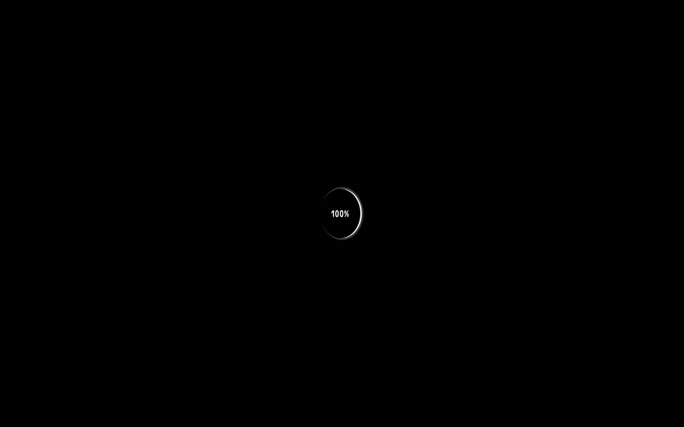
Morphing logo animation into a progress spinner · Smooth, slightly springy cubic-bezier transitions on hover states · Opacity fades for loading states
Subtle opacity or underline shifts on interactive elements. · Cursor changes to pointer on interactive elements.
08
Components
button Stark, rectangular buttons with uppercase monospace text and a default underline on hover. card Cards are defined primarily by typography and subtle hover states rather than heavy containers. chip Not visibly present in the provided screenshots. input Not visibly present in the provided screenshots. hero A dynamic, centered typographic logo animation that morphs into a progress indicator. 09
Voice & Don'ts
Tone Technical, direct, and highly restrained. Headlines All-caps, monospaced, and heavily tracked. CTAs Direct, uppercase, and minimal. Don't use colorful gradients — screenshot shows a strict monochrome black and white palette. Don't use rounded corners on main elements — screenshot shows sharp, rectangular edges. Don't use varied font weights — screenshot shows a uniform heavy weight for almost all text. Don't use left-aligned text — screenshot shows a centered, symmetrical layout. Don't use standard sentence casing — screenshot shows everything in uppercase. Don't use wide letter spacing — screenshot shows tightly packed, condensed text. Avoid: Rounded shapes Avoid: Soft gradients Avoid: Decorative imagery Avoid: Multiple colors 10
Inside the pack — real screenshots
桌面首屏(hero) 桌面滚动分段(90% viewport 步进,作为视觉证据) 桌面滚动分段(90% viewport 步进,作为视觉证据) 移动首屏 Captured from the live site · real computed styles
11
System prompt
This is a stark, experimental portfolio interface characterized by a strict monochrome palette (black #000000 and off-white #FCFCFA). The typography is exclusively monospaced, heavy-weight, uppercase, and tightly tracked, creating a technical and brutalist aesthetic. The layout is centered and minimalist, focusing heavily on interactive animations like the morphing logo and progress indicator. Critical donts include avoiding rounded corners on containers, using colorful gradients, applying standard sentence casing, or employing varied font weights. The design relies on extreme contrast and subtle, springy transitions rather than decorative elements or multiple colors.
More from the library en · zh-CN · zh-TW · ja · ko
OpenDesign · curated web aesthetics for AI-readable design DNA · opendesign.cc
Why we curated this: This site is a masterclass in restrained, brutalist web design, proving that a limited palette and strong typography can create a deeply memorable and premium experience.