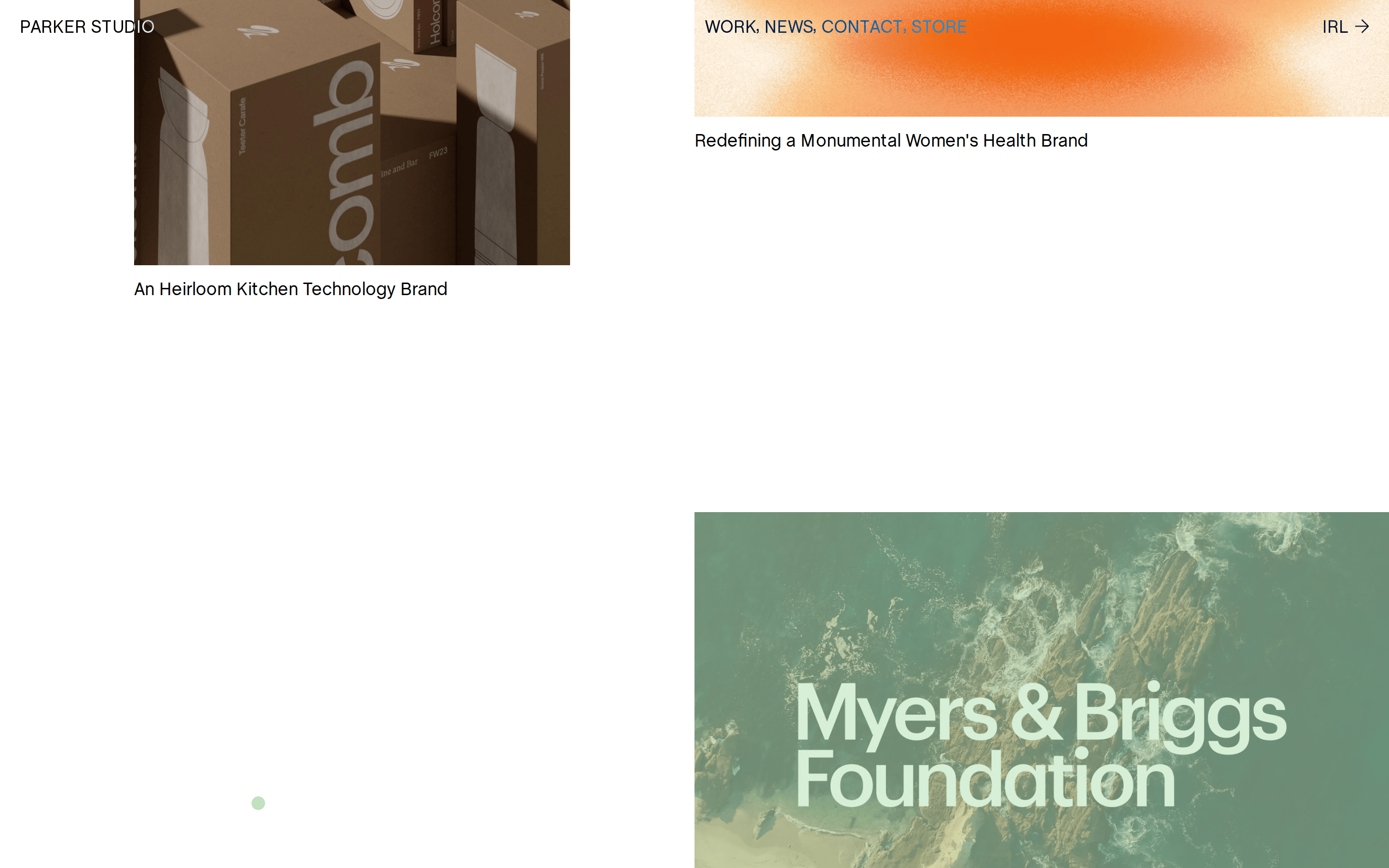
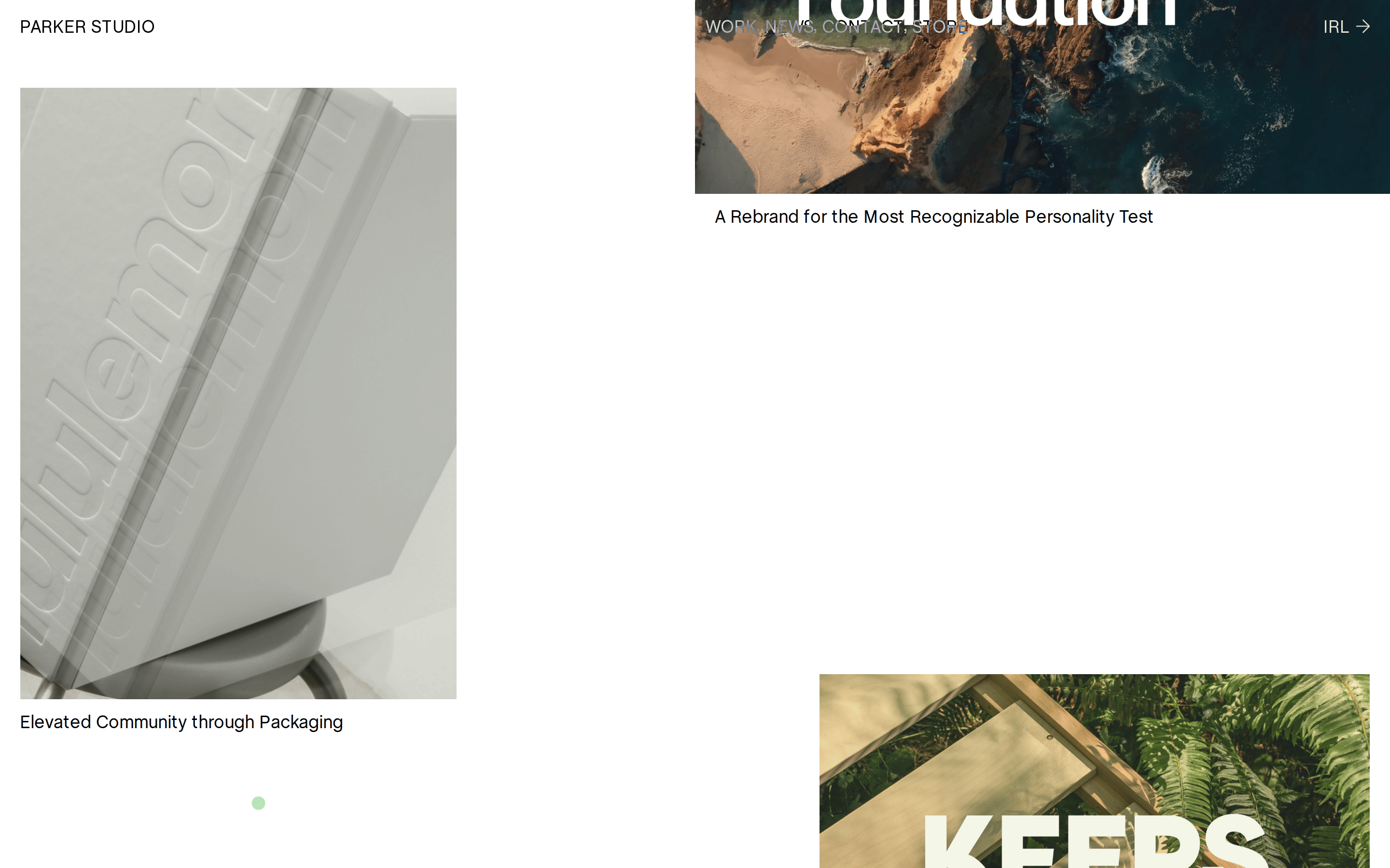
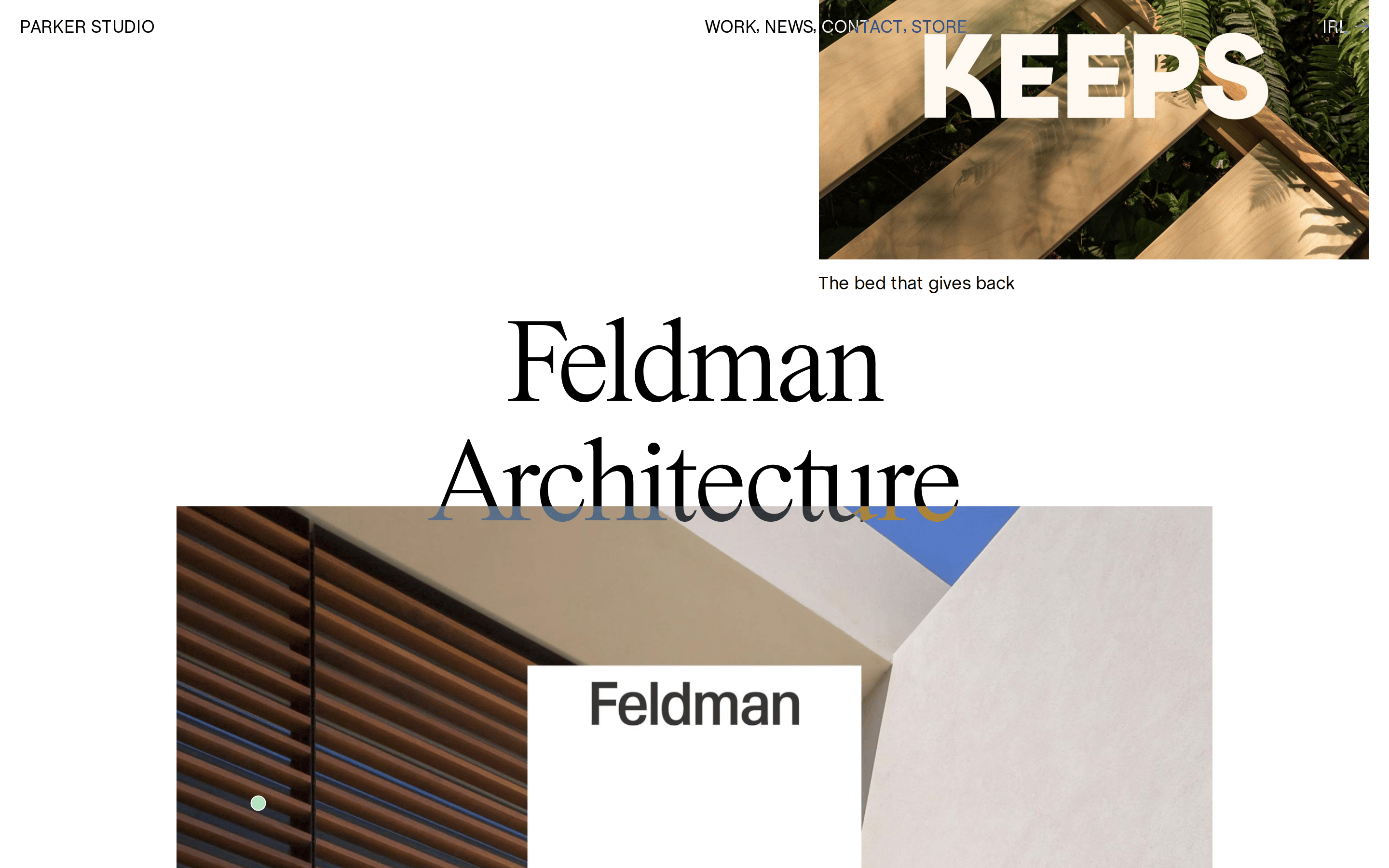
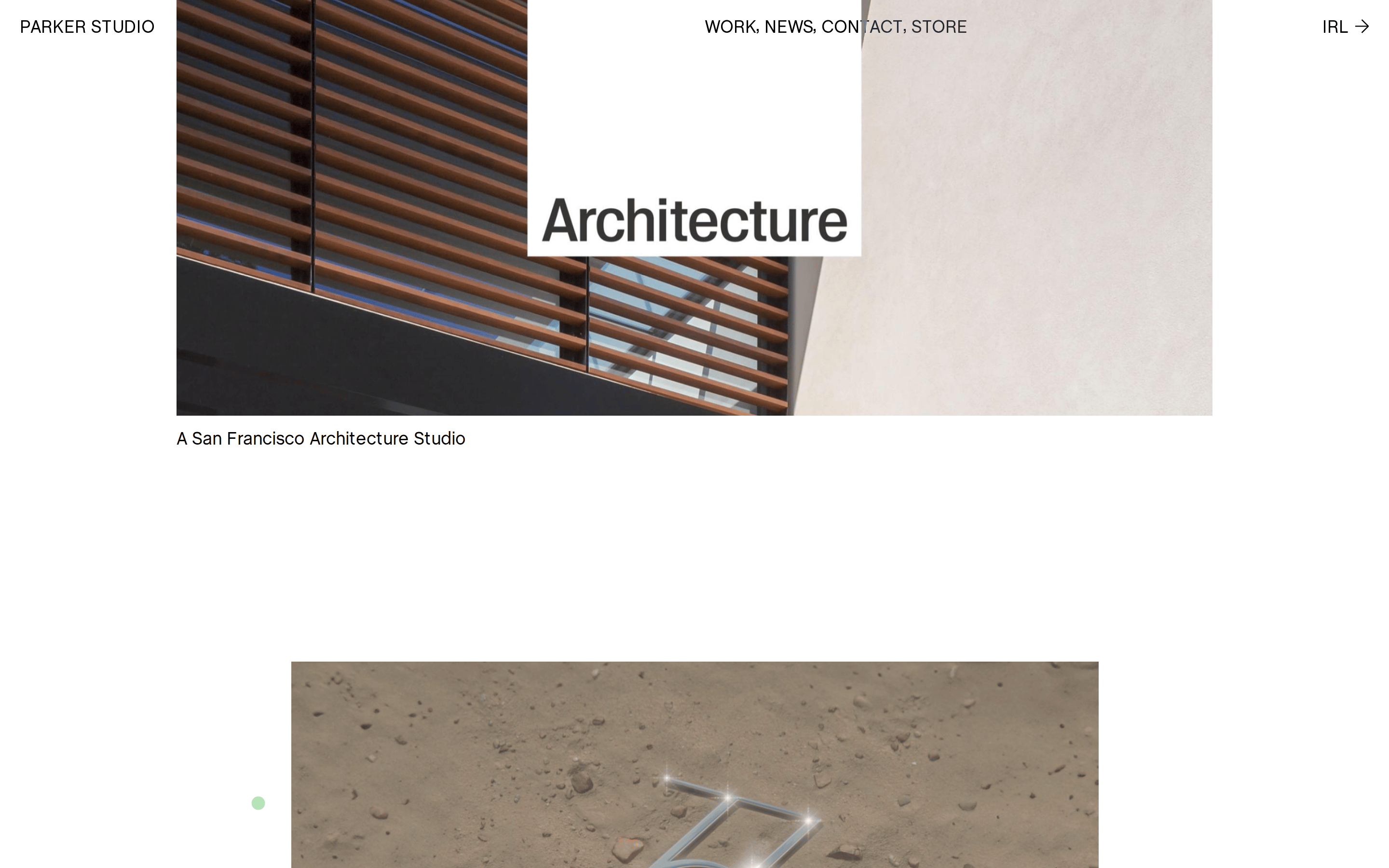
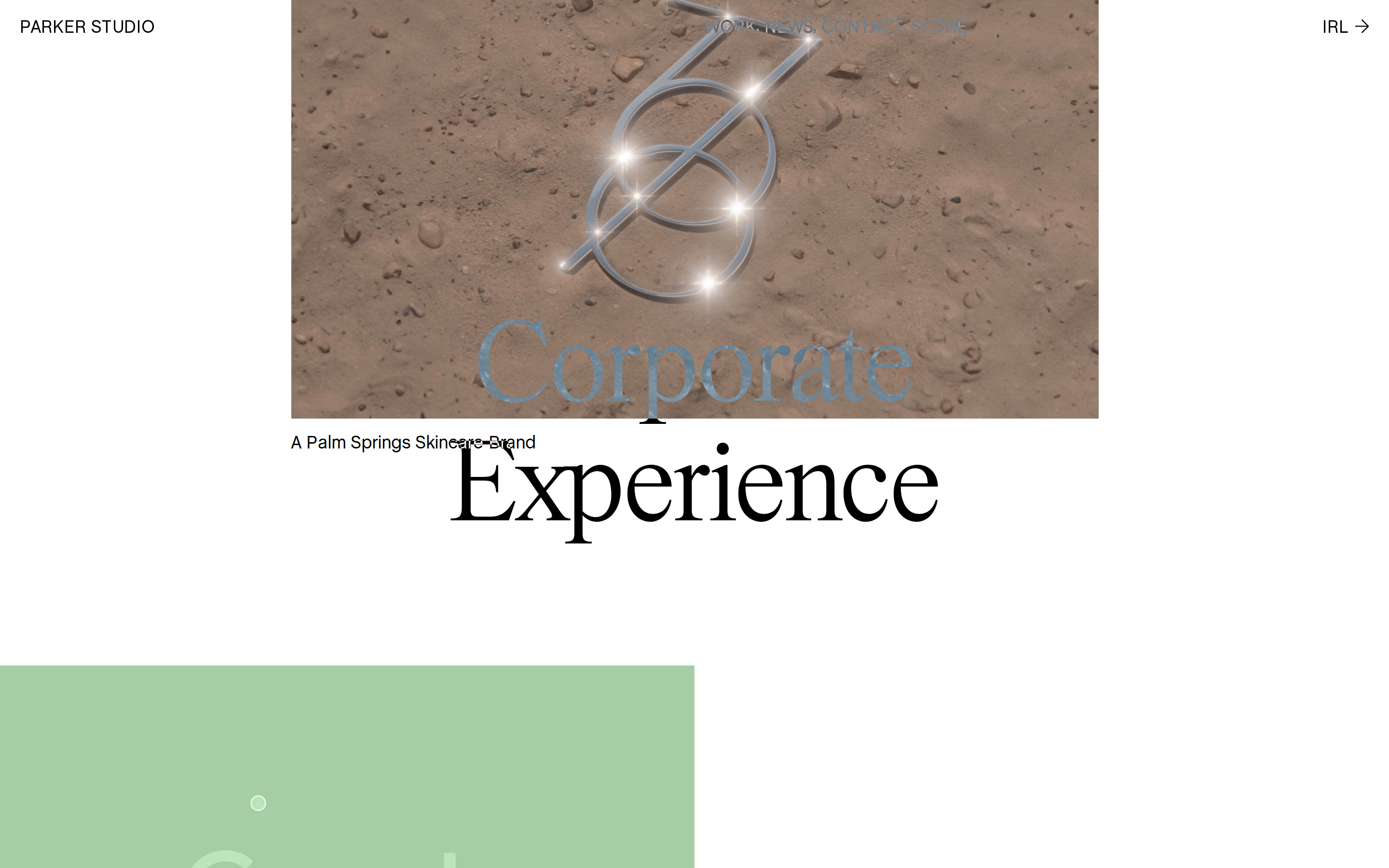
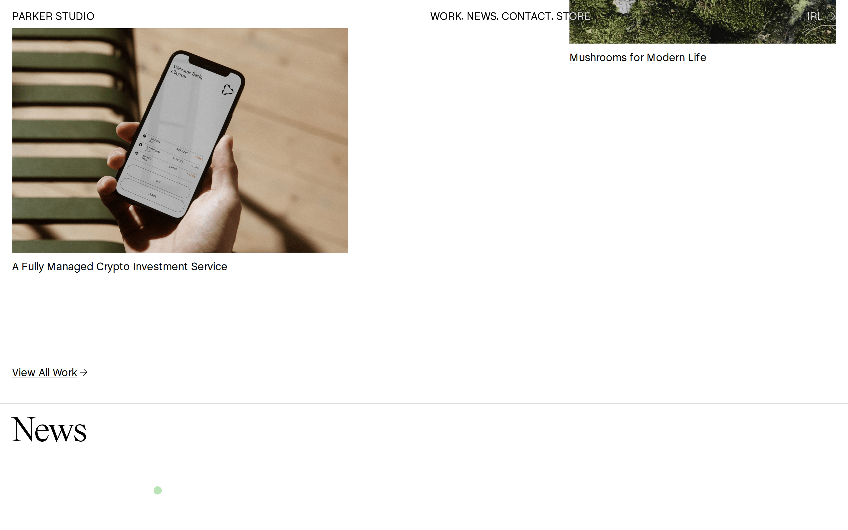
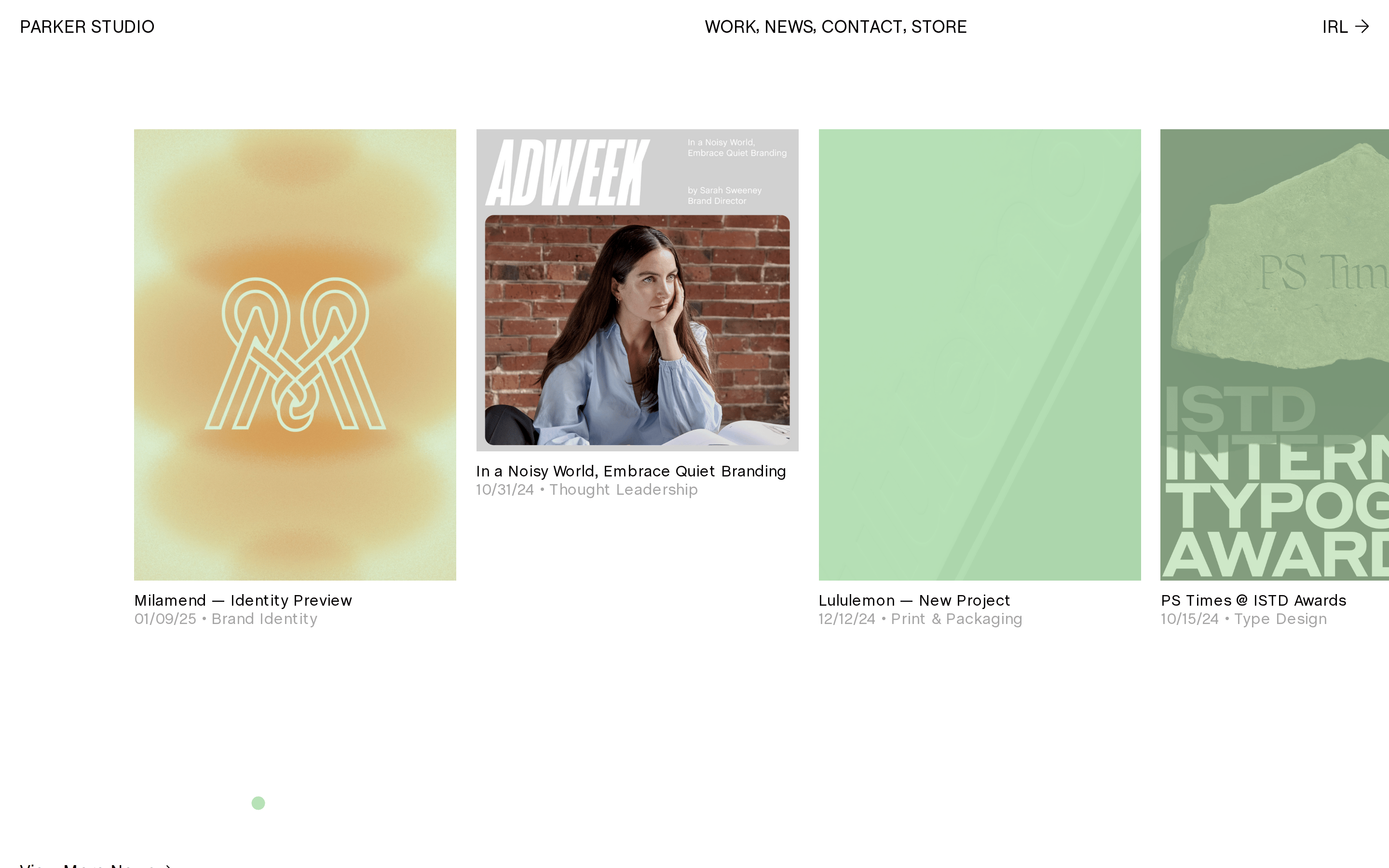
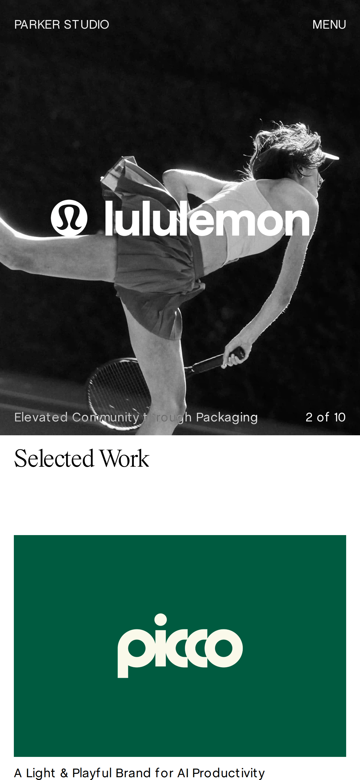
A modern gallery space showcasing diverse creative projects with distinct visual identities.
02
Color
#000000Ink
#A5A5A5Ink soft
#B7E3B6BG
#FFFFFFBG soft
rgba(0,0,0,1)Line
High-contrast palette with soft mint and pure white backgrounds, using black ink for maximum legibility.
03
Typography
transitional-serif · grotesque-sans
display43px · 400
body16px · 400
Mix transitional-serif for project headings with a clean grotesque-sans for navigation. · Maintain tight line heights for large display text. · Use uppercase transforms for consistent navigation styling.
04
Spacing
4px
8px
16px
20px
24px
32px
48px
64px
96px
Generous vertical spacing creates a sense of openness and highlights the visual work.
05
Surfaces
sm · 4px
md · 8px
lg · 12px
pill · 999px
1px solid rgba(0,0,0,1)
0px 4px 4px rgba(0, 0, 0, 0.25)
06
Layout
1280container
12columns
24pxgutter
768 / 1024breakpoints
Asymmetric, editorial layout with large, immersive imagery and generous whitespace.
07
Motion & Interaction
220msmicro
400mssmall
500msmedium
cubic-bezier(0.25, 0.1, 0.25, 1)easing
Smooth opacity and transform transitions on hover states.
Subtle color or position shifts, primarily on text links. · Direct navigation or modal triggers.
08
Components
buttonMinimal, text-based navigation with simple transitions.
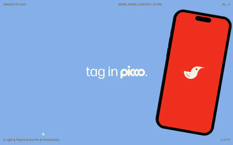
cardLarge, immersive project cards that often span the full width.
heroFull-bleed, image-driven hero sections that set a distinct visual tone for each project.
09
Voice & Don'ts
ToneConfident, professional, and slightly playful.
HeadlinesShort, punchy project titles often set in large serif type.
CTAsUnderstated, functional text links for navigation.
Don't use multiple competing background colors — screenshot shows a clean, focused use of soft mint, white, or black per section.
Don't apply heavy drop shadows to all elements — screenshot shows them used sparingly, mainly for depth on specific objects.
Don't center all text content — screenshot shows left-aligned navigation and headings to create a clear visual hierarchy.
Don't use a sans-serif for all headings — screenshot distinctly uses a transitional serif for project titles like 'Architecture'.
Don't use low-contrast text for navigation — screenshot shows high-contrast black or white text against its background.
Don't use rounded corners universally — screenshot shows primarily sharp edges on images and layout containers.
Avoid: Overly decorative elements that distract from the work.
Avoid: Cluttered layouts or excessive UI components.
Captured from the live site · real computed styles
11
System prompt
Parker Studio is a refined design agency portfolio showcasing diverse, high-quality projects. The design relies on a clean palette of soft mint, pure white, and solid black, creating high contrast and readability. Typography mixes transitional-serif for expressive headings with a clean grotesque-sans for navigation and UI elements. Key hex values include #B7E3B6, #FFFFFF, and #000000. Critical design principles include generous whitespace, high-contrast text, and immersive, image-driven layouts. Important constraints: do not use multiple competing background colors, do not apply heavy drop shadows universally, and do not center all text content. The overall feel is architectural yet playful, emphasizing the quality of the showcased work.
Bring this taste to your agent
Hand your AI agent a machine-readable spec of this design — tokens, type, motion, the whole DNA.