← OpenDesign CURATED · OPEN · FREE
Dyotanya
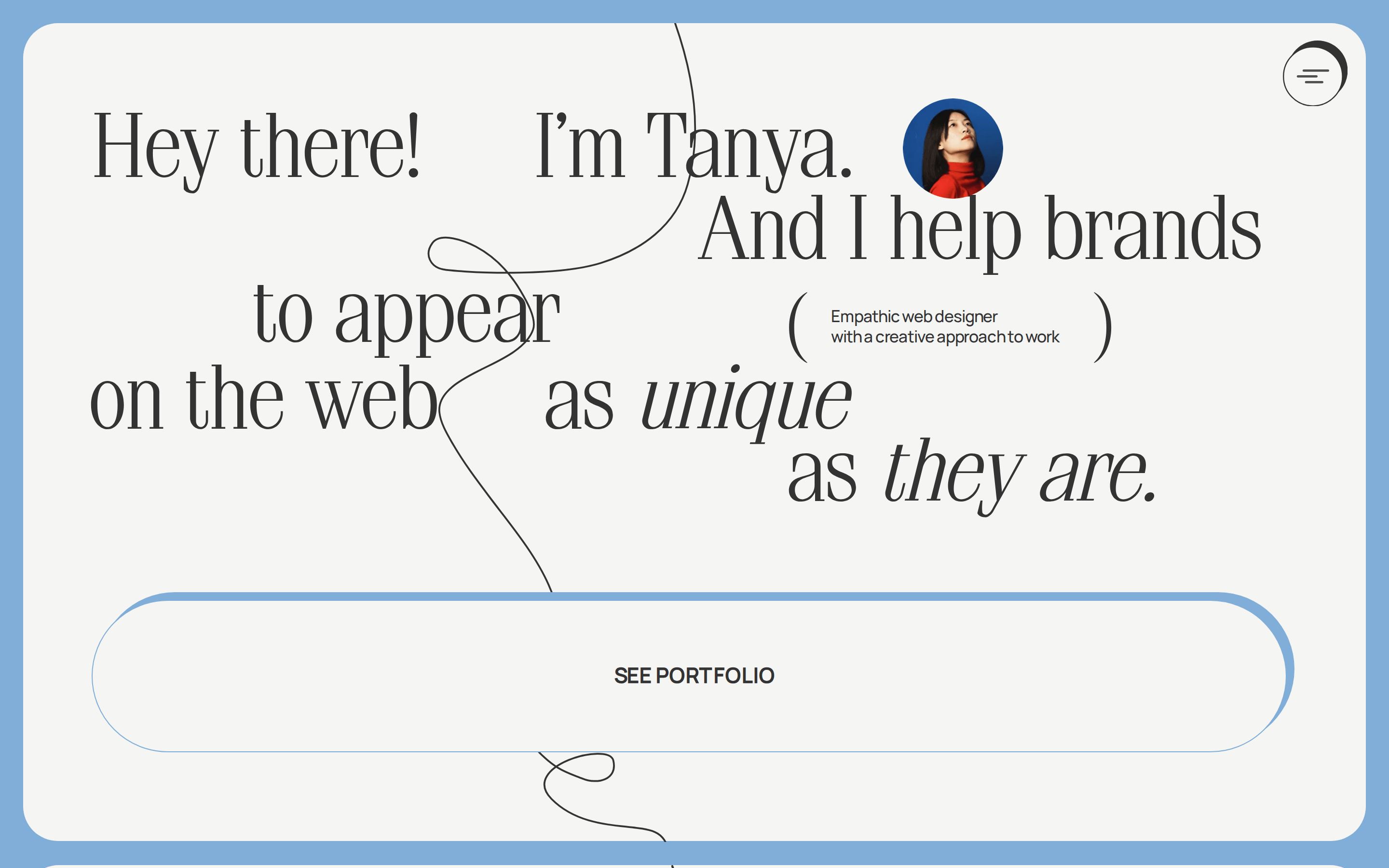
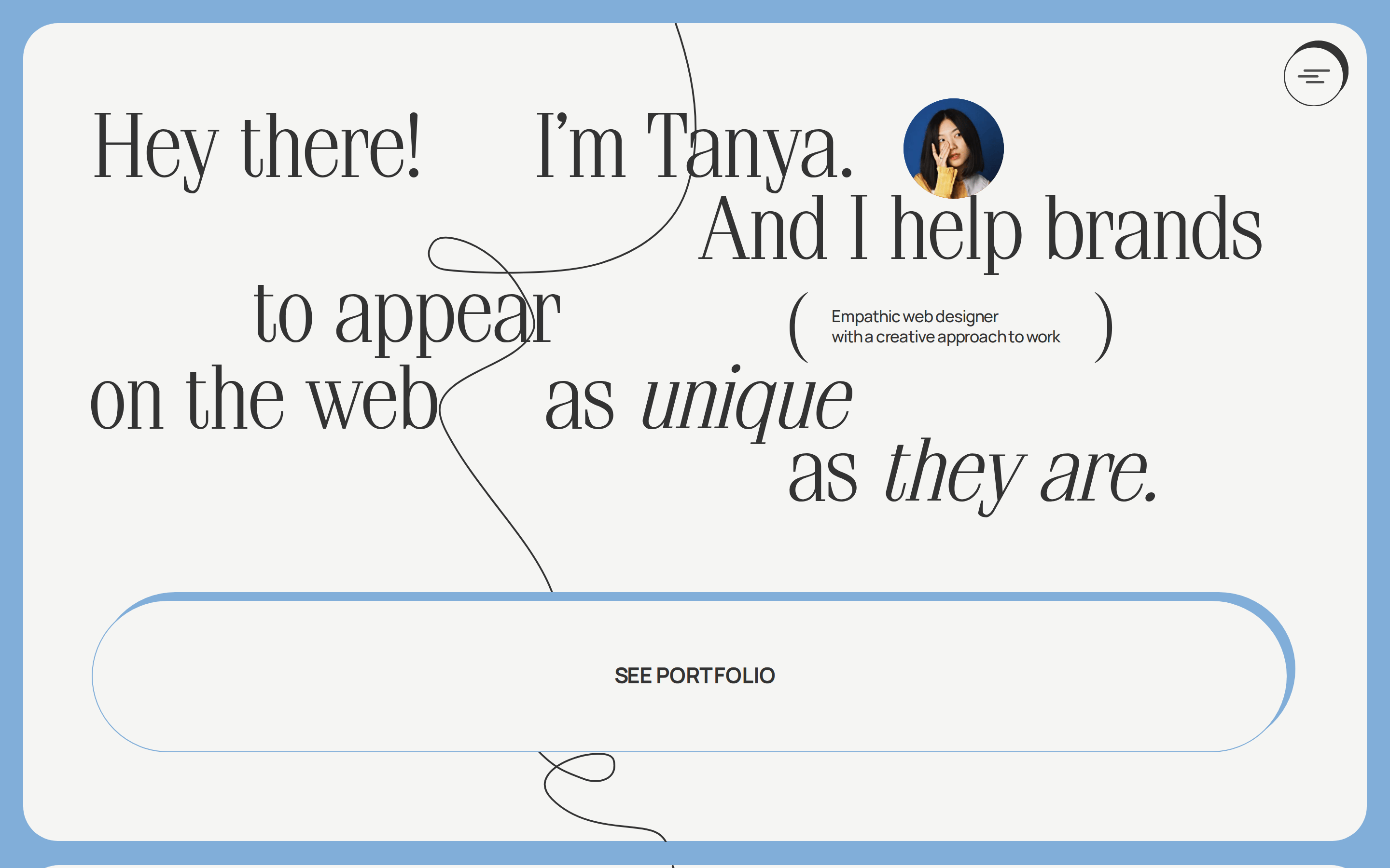
A personal portfolio for an empathic web designer that uses expressive serif typography and fluid layouts to communicate creativity.
Portfolio Studio Refined Typography Warm
01
Identity DNA
Creative Empathic Unique Personal Artistic
An expressive creative portfolio that blends refined typography with artistic flourishes.
02
Color
#81aed9Accent
#000000Ink
#333333Ink soft
#f5f5f3BG
#4f4f4fMuted
rgba(0, 0, 0, 0.1)Line
A restrained palette of off-white and black creates a sophisticated canvas, allowing the blue accent and expressive typography to take center stage.
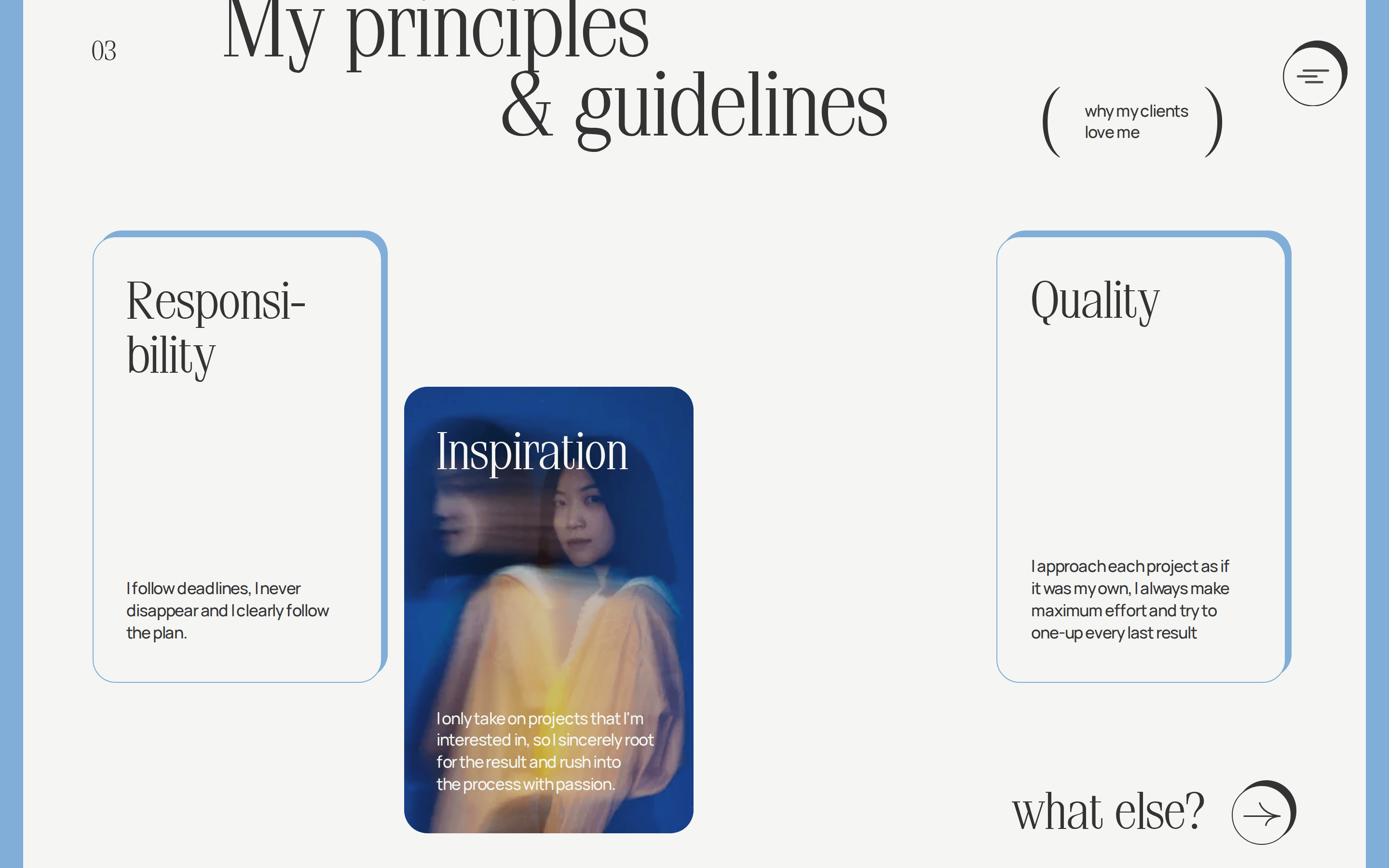
03
Typography
didone-serif · humanist-sans
display 80px · 400heading 46px · 400body 16px · 40004
Spacing
4px
8px
16px
24px
32px
48px
64px
96px
A relaxed 4px base grid provides generous spacing, supporting the breathable, editorial layout.
05
Surfaces
sm · 1px
md · 20px
lg · 30px
pill · 999px
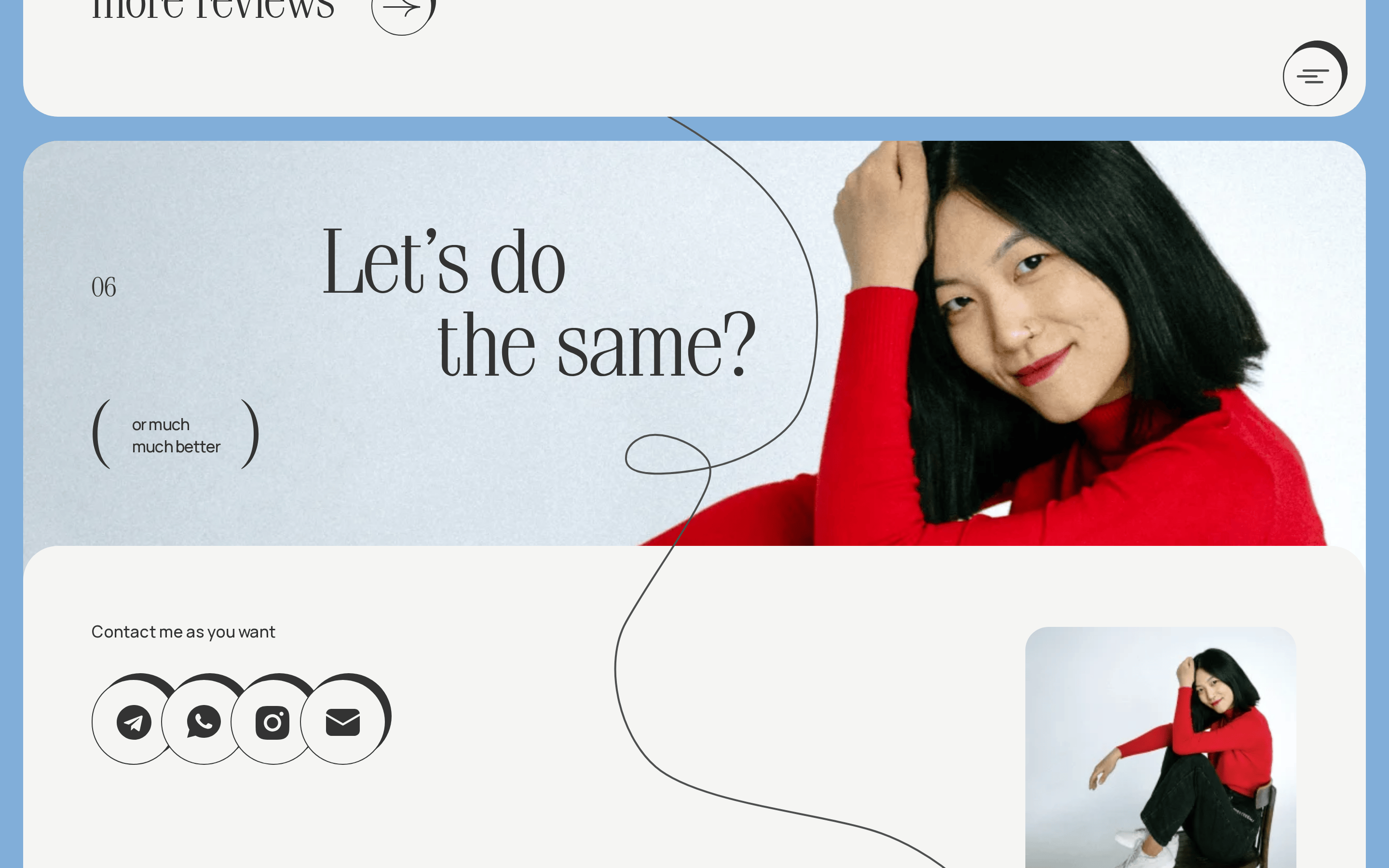
Thin, subtle borders or crisp solid box-shadows are used to elevate elements like buttons.
5px -5px 0px 0px #333333 · 4px -4px 0px 0px #333333
06
Layout
1280 container
12 columns
24px gutter
768 / 1024 breakpoints
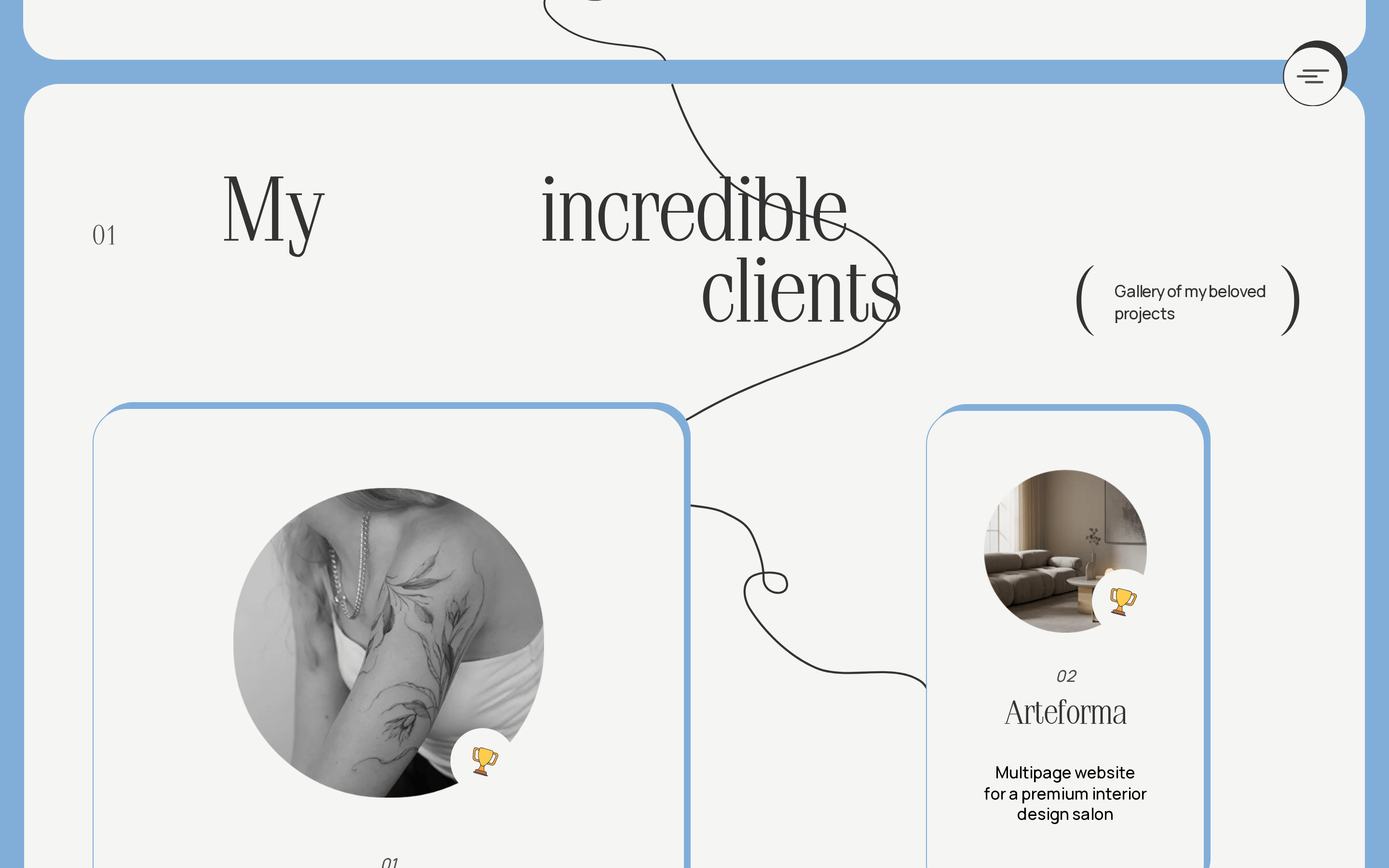
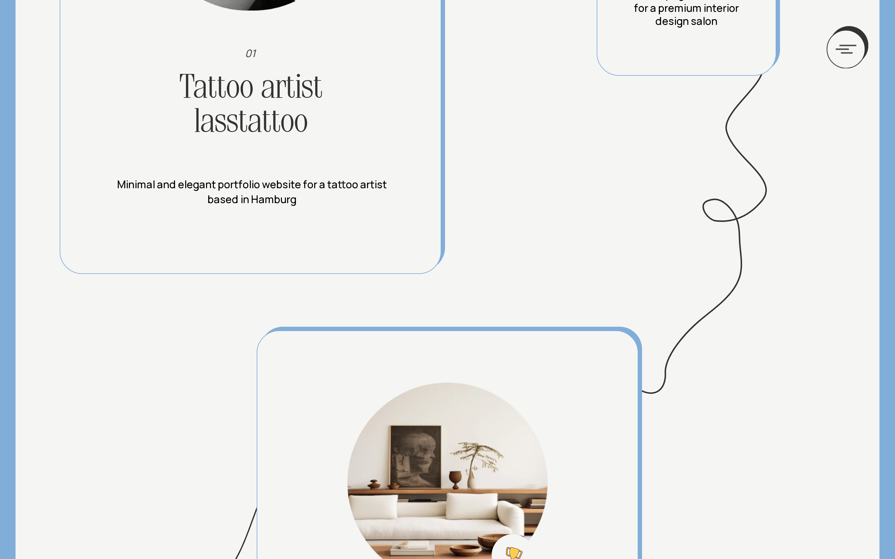
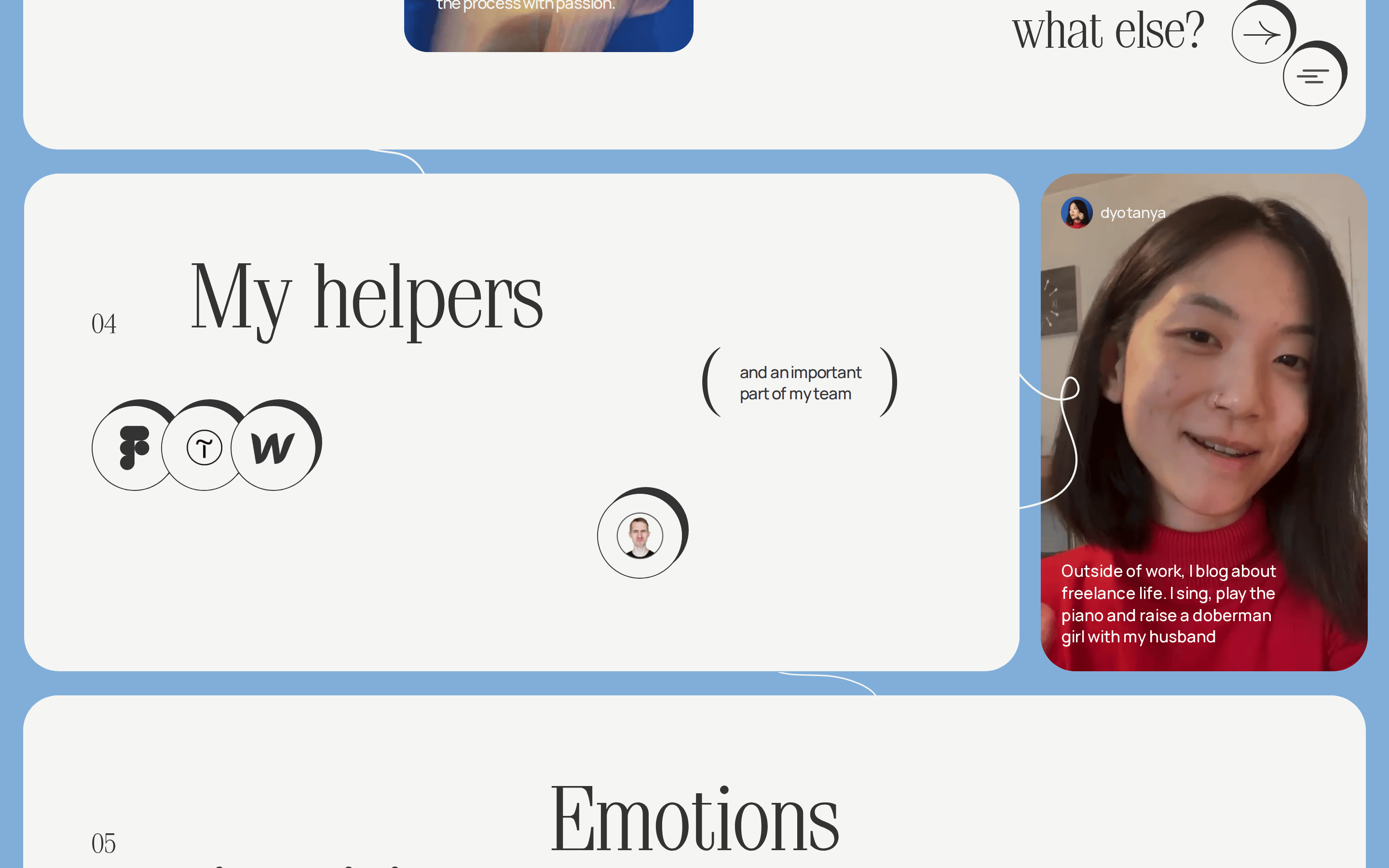
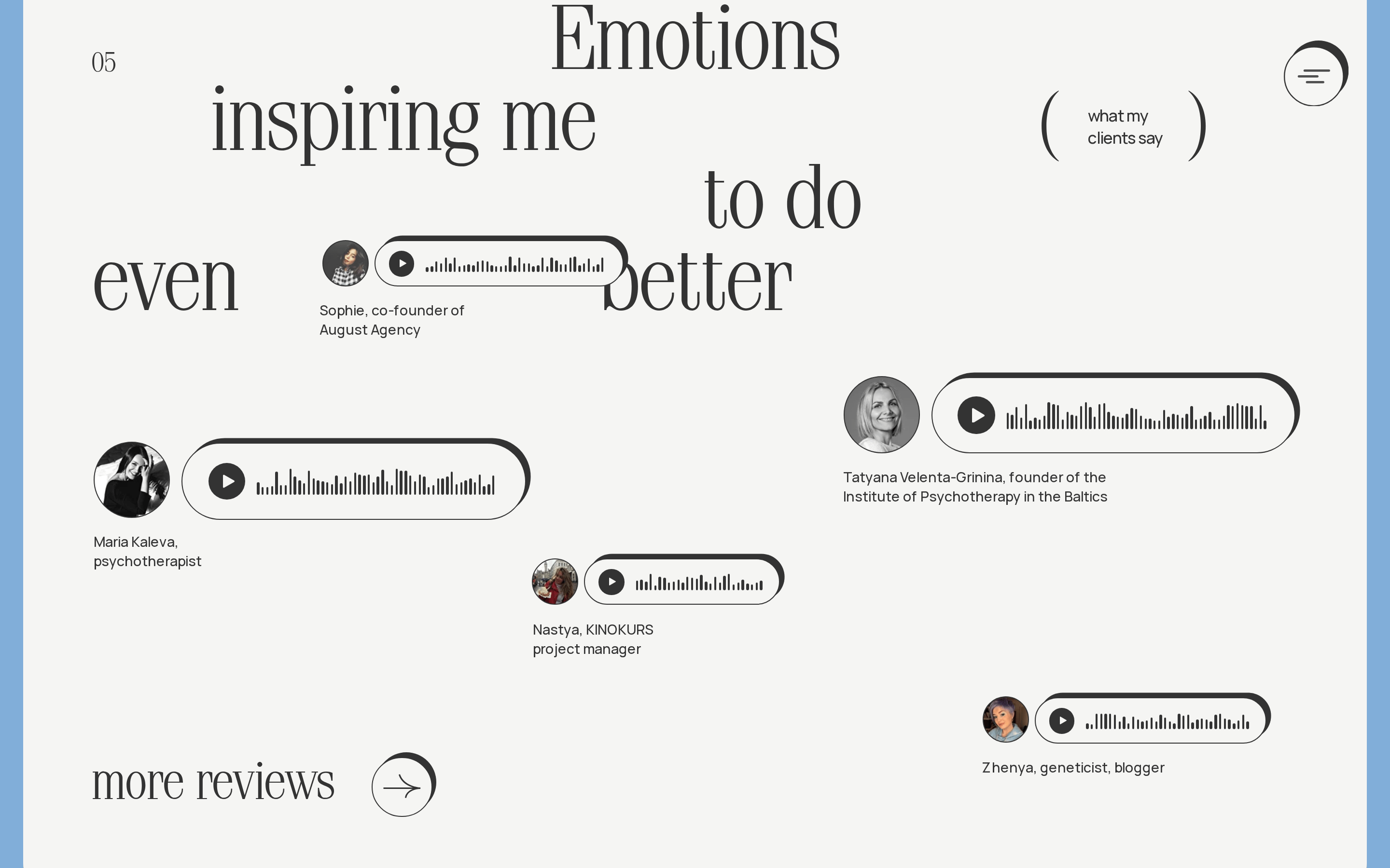
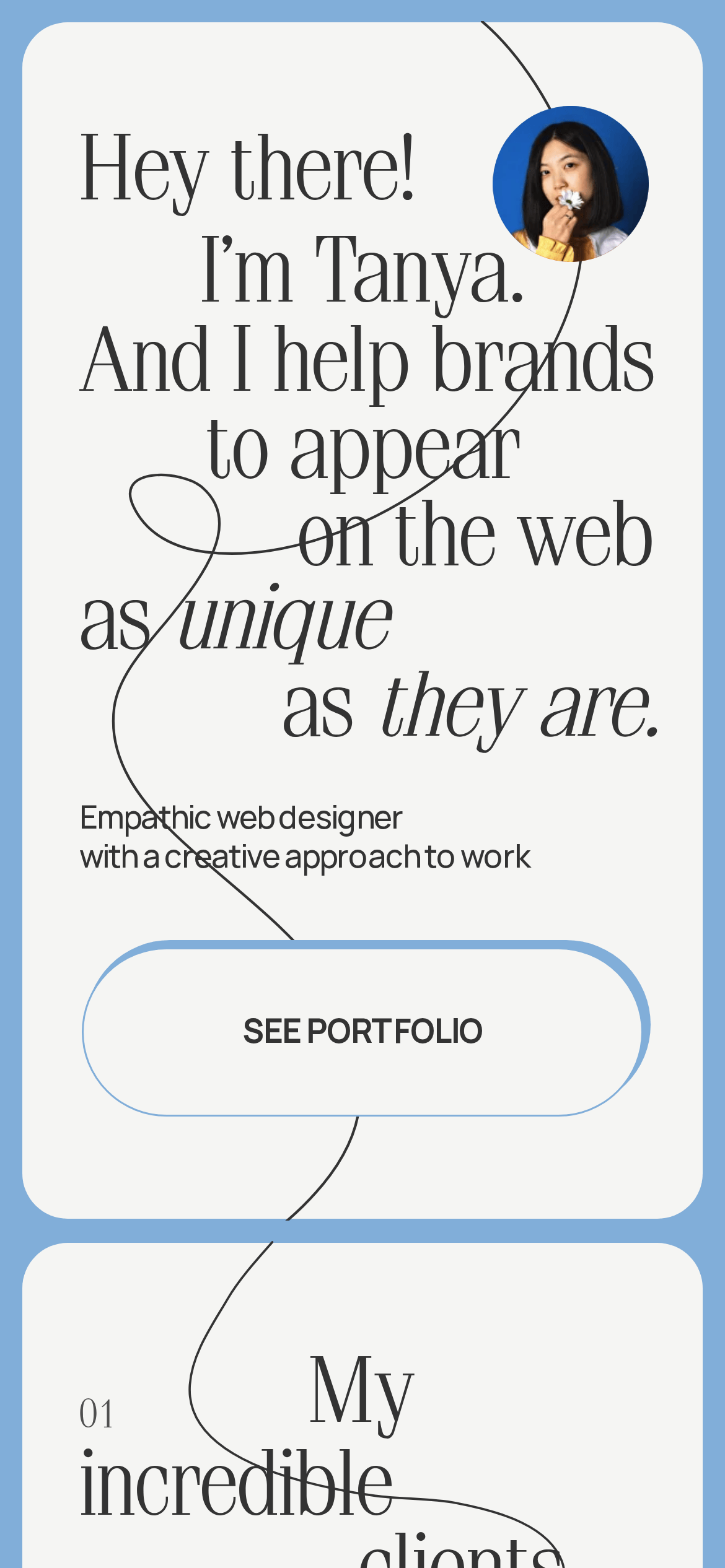
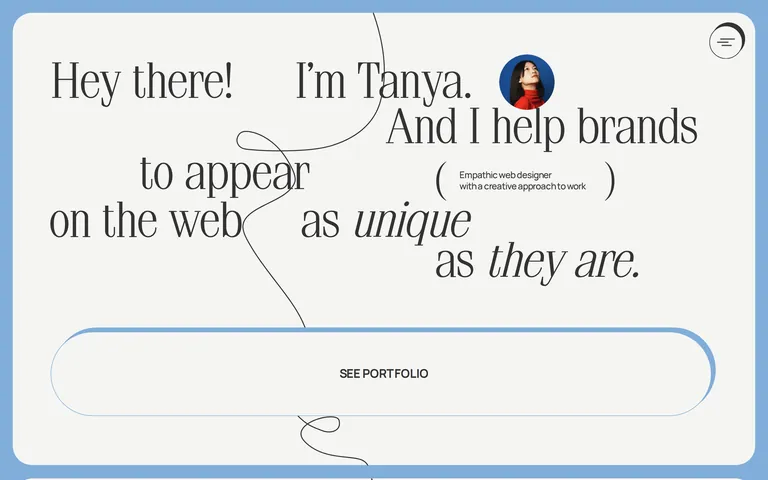
An asymmetric, free-flowing layout that uses large type blocks and asymmetric grids to guide the eye.
07
Motion & Interaction
100ms micro
250ms small
400ms medium
cubic-bezier(0.25, 0.1, 0.25, 1) easing
Subtle transitions on interactive elements like background-color and box-shadow. · Smooth letter-spacing animations for focused text elements.
Subtle background-color and box-shadow transitions on interactive elements. · A slight tactile reduction or color shift on press.
08
Components
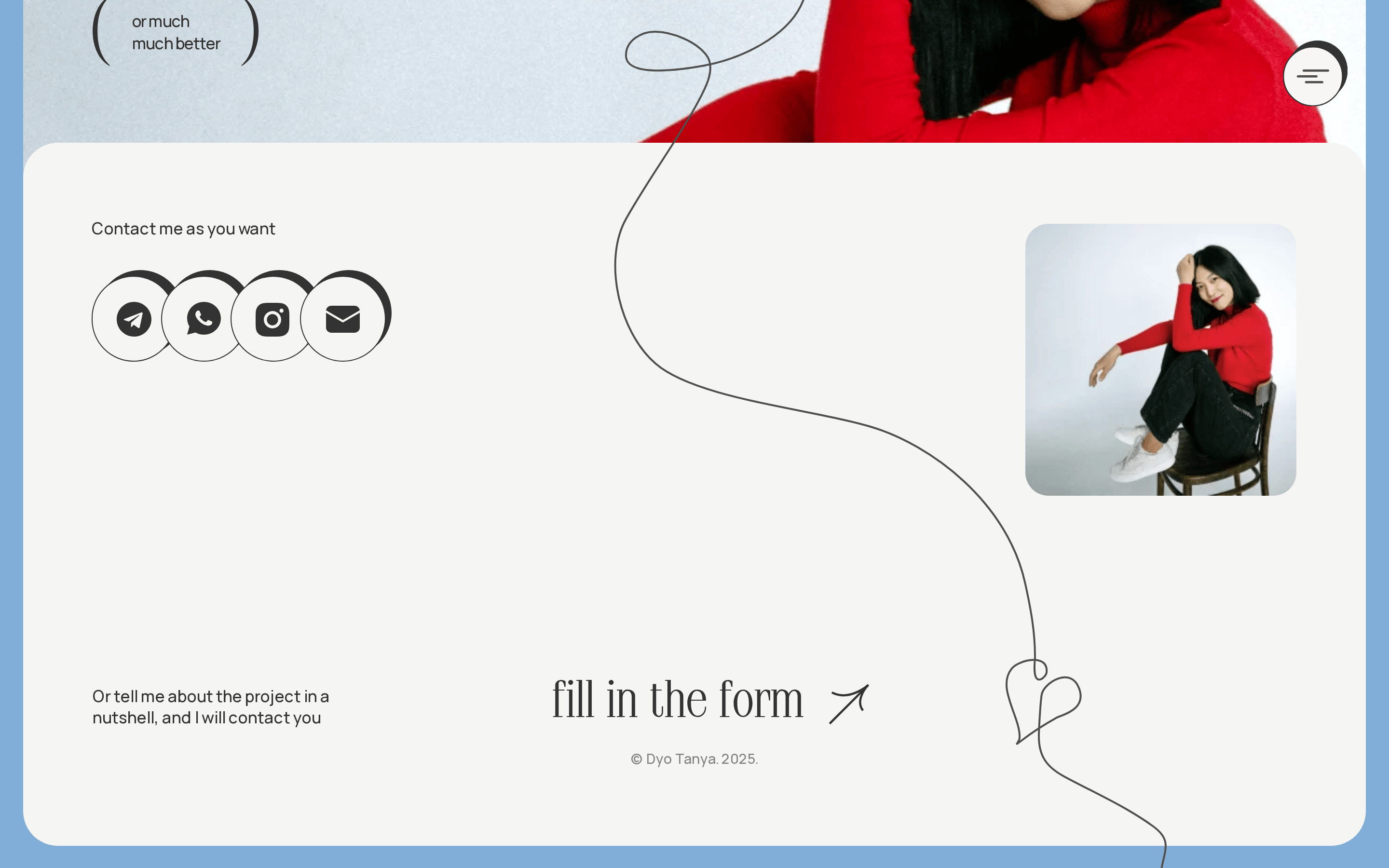
button Pill-shaped buttons with solid blue offset shadows for a tactile feel. card Asymmetric containers with large imagery and generous whitespace. chip Simple uppercase labels or tags with minimal styling. input Minimal text inputs with subtle bottom borders. hero A massive, expressive typography-driven introduction with a fluid line motif and integrated portrait. 09
Voice & Don'ts
Tone Warm, personal, and confident. Headlines Expressive and slightly poetic, using large serif fonts to create an emotional connection. CTAs Direct and encouraging, often presented in uppercase sans-serif within a prominent pill-shaped button. Don't use a grid-locked, symmetrical layout — screenshot shows an expressive, fluid, and asymmetric layout. Don't rely on bright, high-chroma primary colors everywhere — screenshot shows a predominantly neutral palette with a single blue accent. Don't use strictly geometric or grotesque fonts for headings — screenshot shows elegant, high-contrast serif typography. Don't hide navigation in complex mega-menus — screenshot shows a simple, discreet hamburger icon. Don't use harsh, solid black backgrounds — screenshot shows a light off-white background (#f5f5f3) as the primary surface. Don't use standard, flat rectangular buttons — screenshot shows pill-shaped buttons with distinct offset shadows. Avoid: Overly corporate jargon Avoid: Cold, robotic language Avoid: Dense blocks of text without breathing room 10
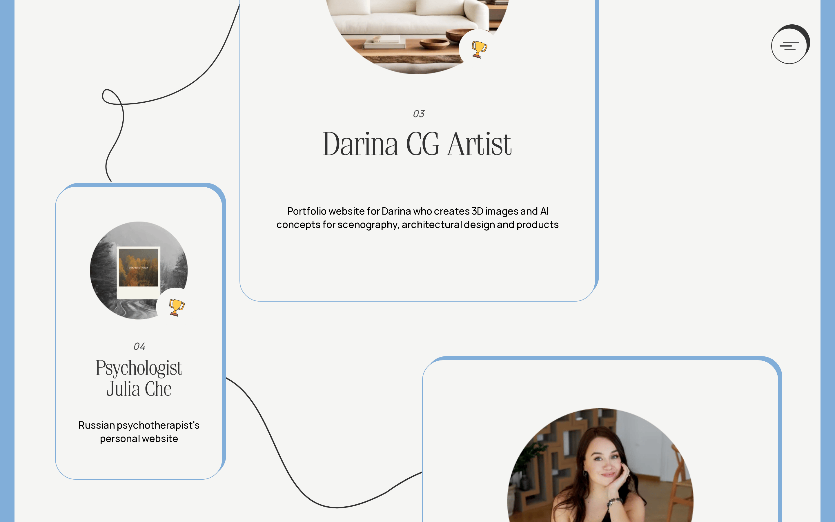
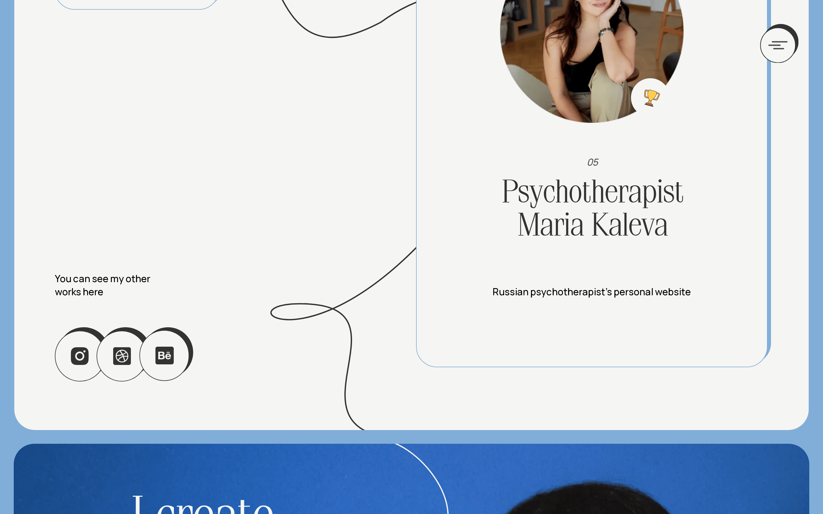
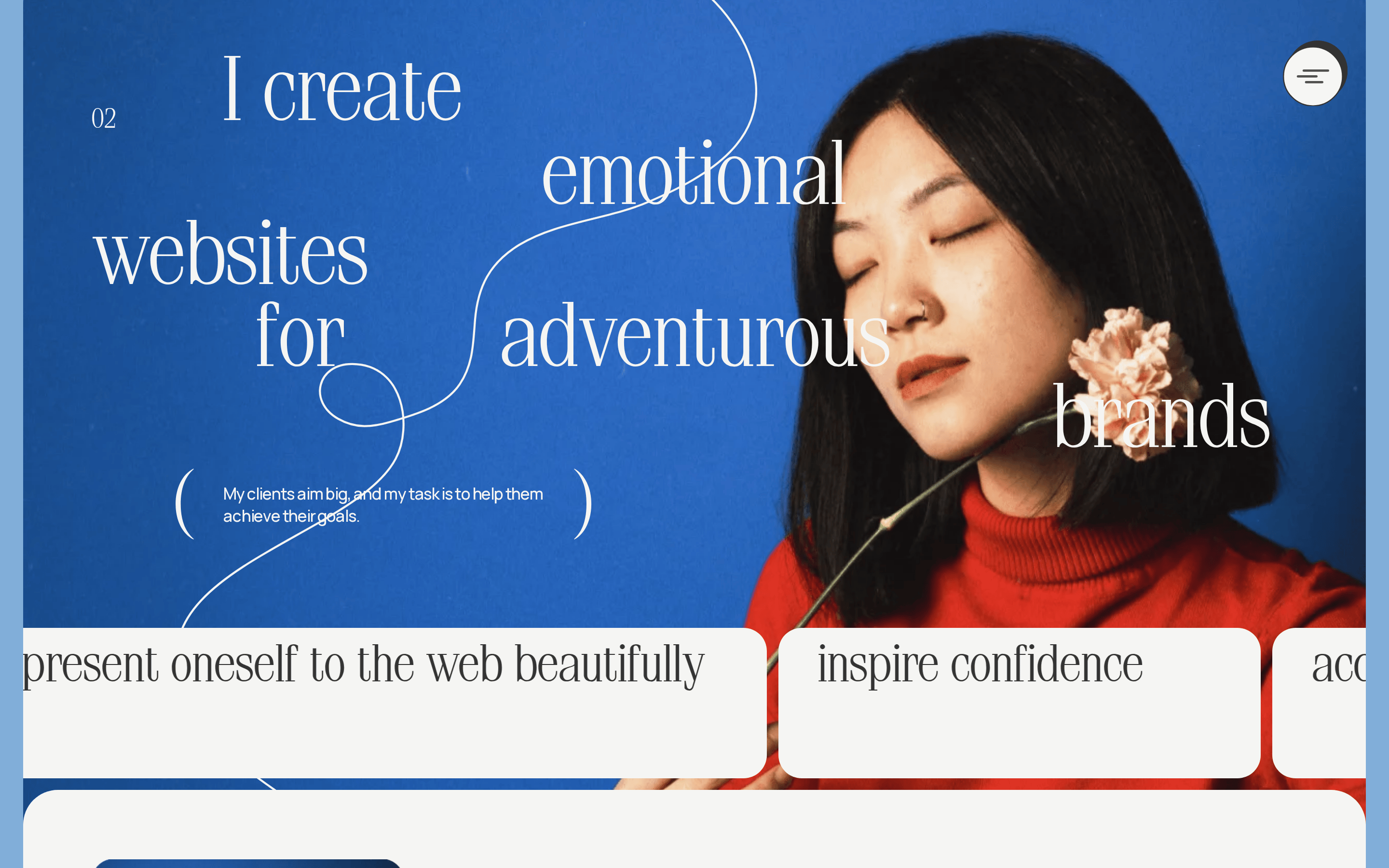
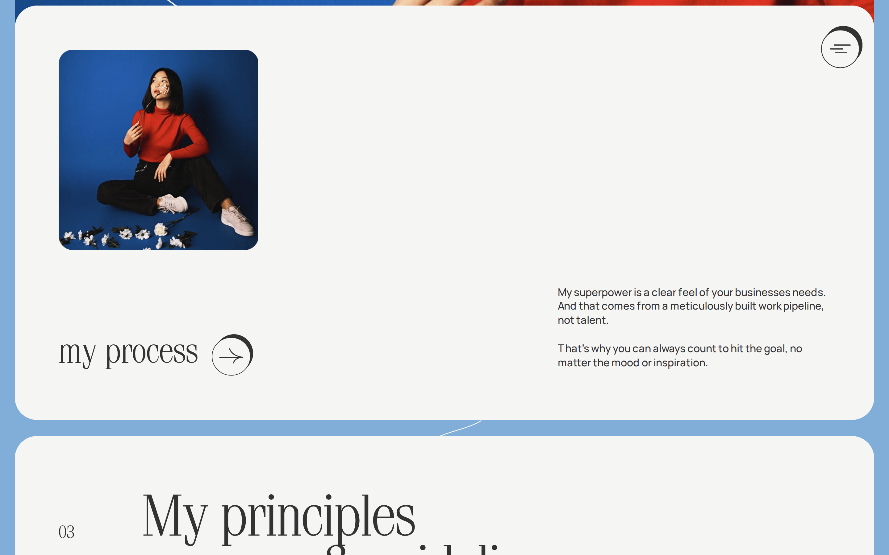
Inside the pack — real screenshots
桌面首屏(hero) 桌面滚动分段(90% viewport 步进,作为视觉证据) 桌面滚动分段(90% viewport 步进,作为视觉证据) 桌面滚动分段(90% viewport 步进,作为视觉证据) 桌面滚动分段(90% viewport 步进,作为视觉证据) 桌面滚动分段(90% viewport 步进,作为视觉证据) 桌面滚动分段(90% viewport 步进,作为视觉证据) 桌面滚动分段(90% viewport 步进,作为视觉证据) 桌面滚动分段(90% viewport 步进,作为视觉证据) 桌面滚动分段(90% viewport 步进,作为视觉证据) 桌面滚动分段(90% viewport 步进,作为视觉证据) 桌面滚动分段(90% viewport 步进,作为视觉证据) 桌面滚动分段(90% viewport 步进,作为视觉证据) 移动首屏 Captured from the live site · real computed styles
11
System prompt
This is a personal portfolio for an empathic web designer, positioned as artistic, refined, and warm. Key hex colors include an off-white background (#f5f5f3), near-black ink (#000000, #333333), and a light blue accent (#81aed9). The typography pairs an elegant didone-serif for display text with a clean humanist-sans for body copy, creating a strong contrast between expressive headlines and readable details. The layout is asymmetric and fluid, using large typography blocks and generous whitespace. Critical donts: Do not use a rigid grid layout, do not overuse bright colors, do not use geometric sans-serifs for headings, do not use standard flat buttons, do not use solid black backgrounds, and do not clutter the interface with unnecessary elements.
More from the library en · zh-CN · zh-TW · ja · ko
OpenDesign · curated web aesthetics for AI-readable design DNA · opendesign.cc
Why we curated this: This site is an excellent example of a personal portfolio that uses typography as a primary design element, blending classic serif elegance with a modern, fluid layout.