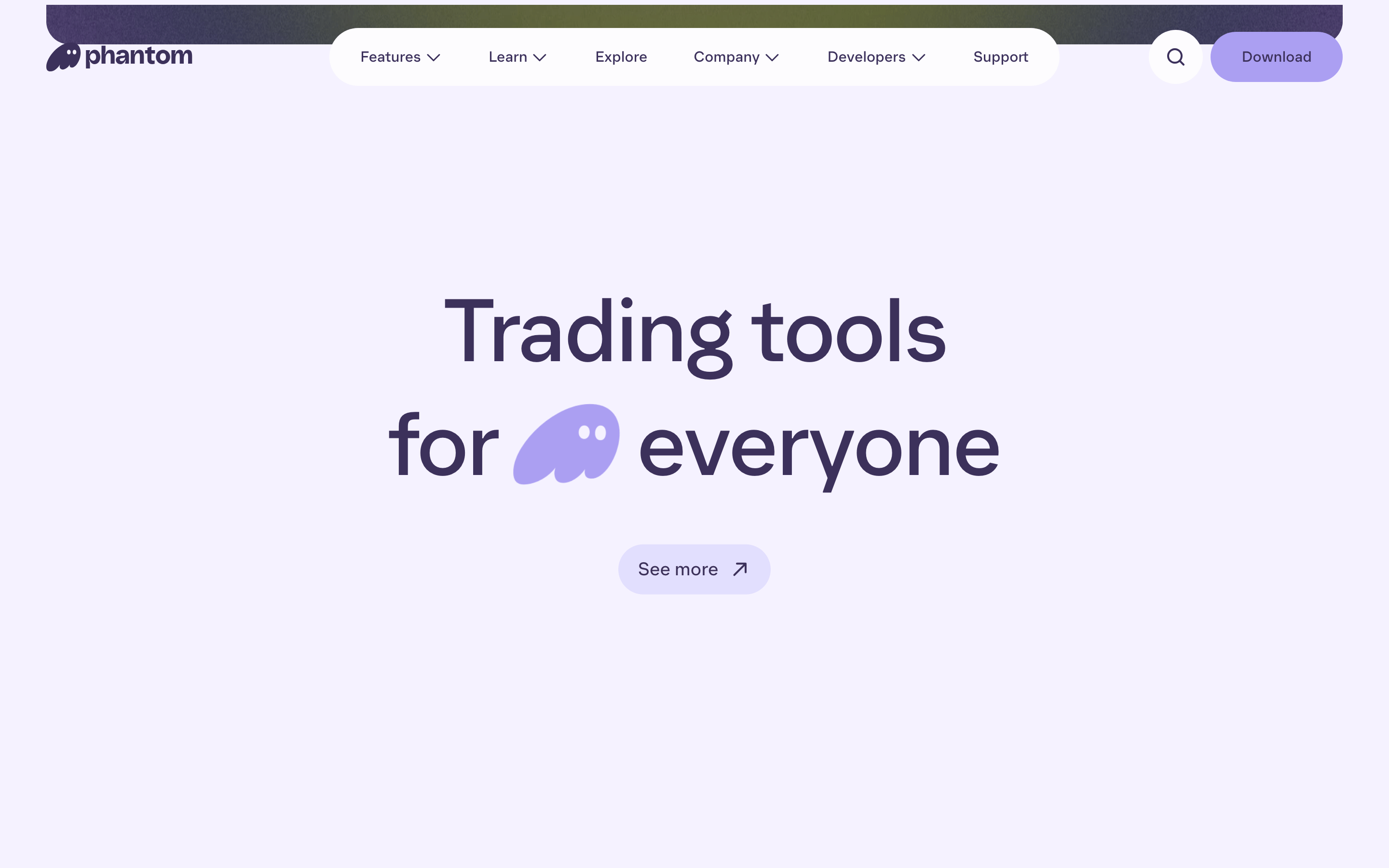
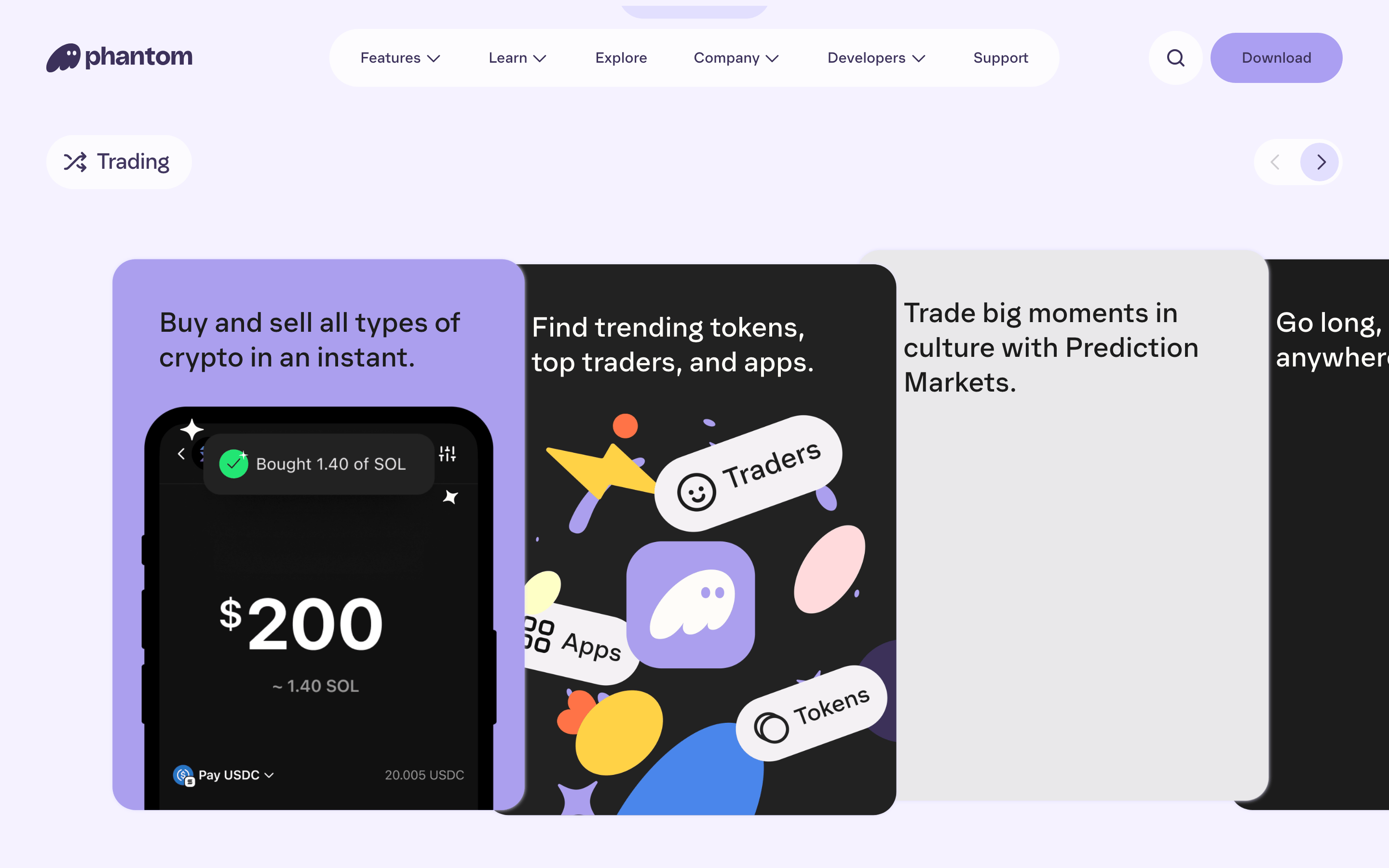
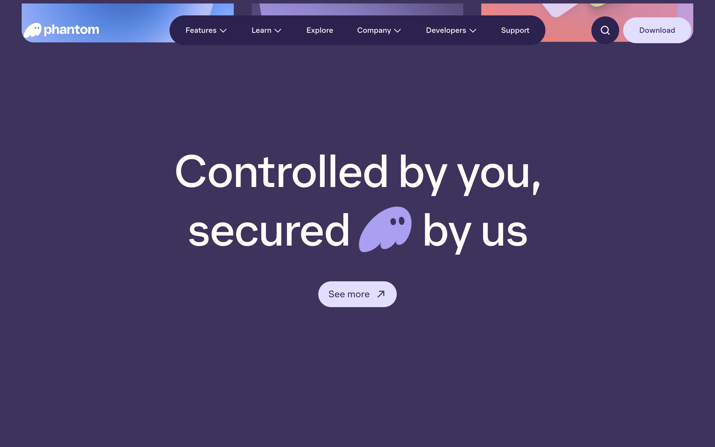
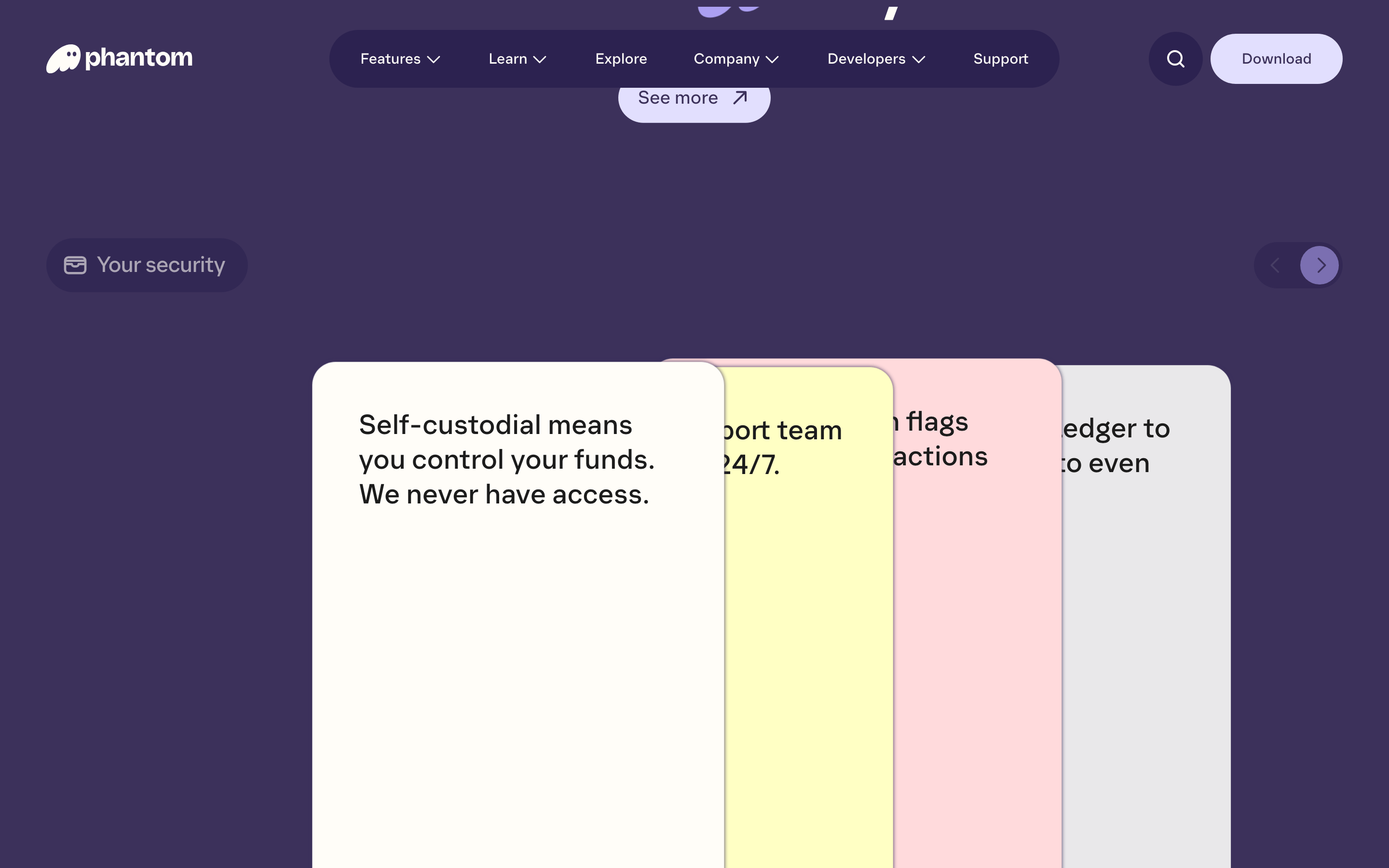
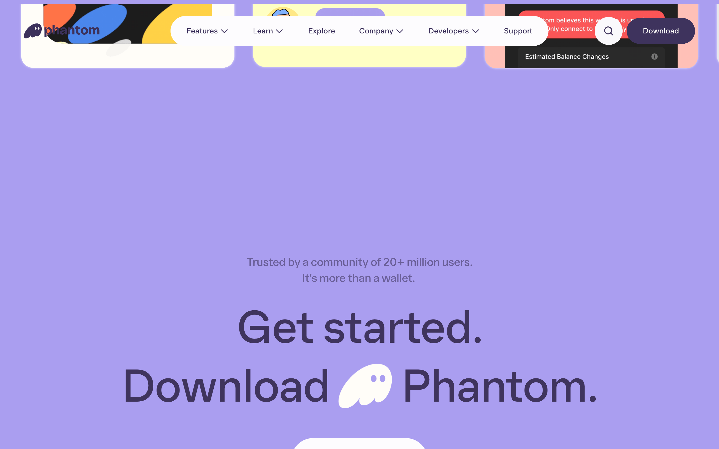
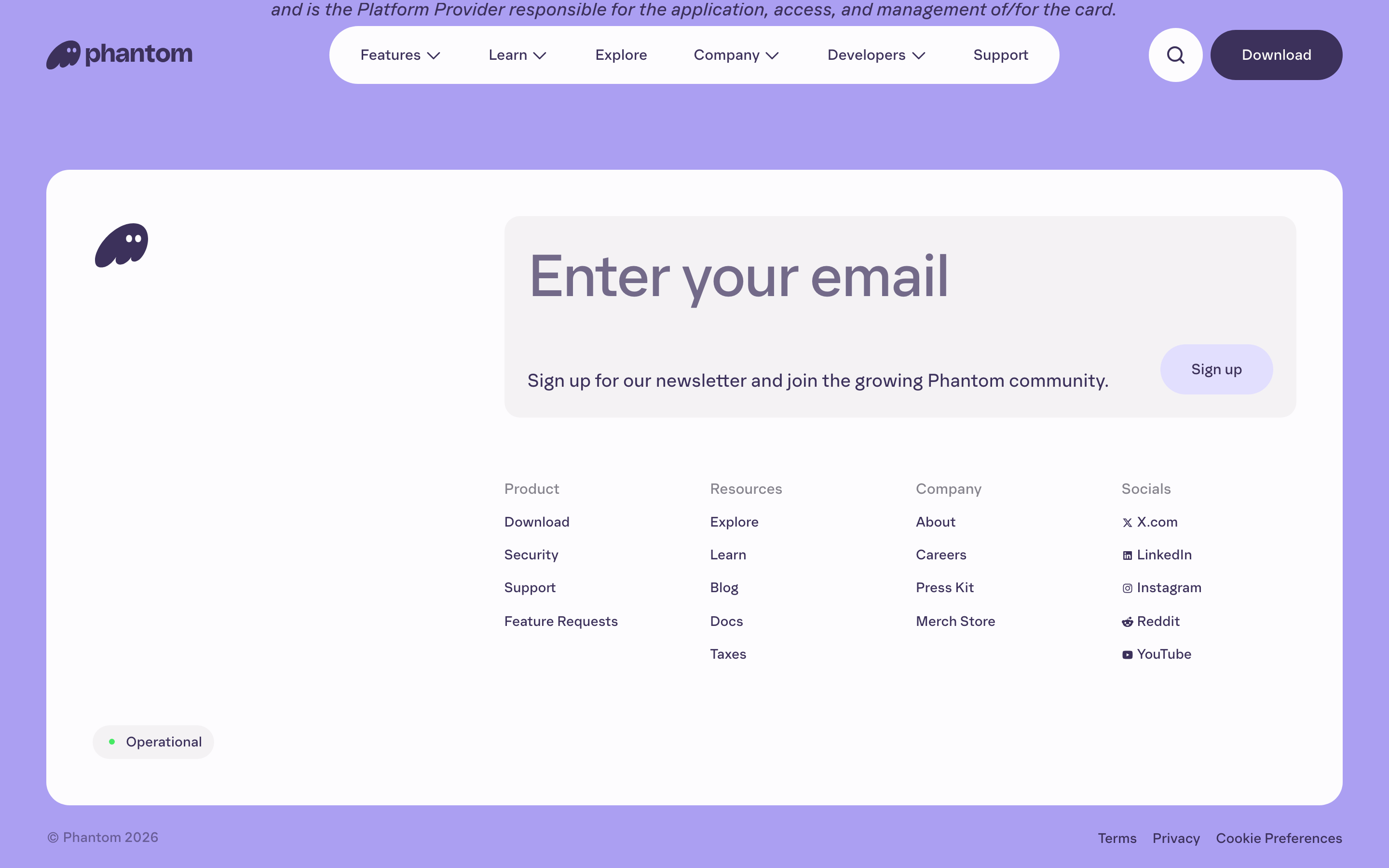
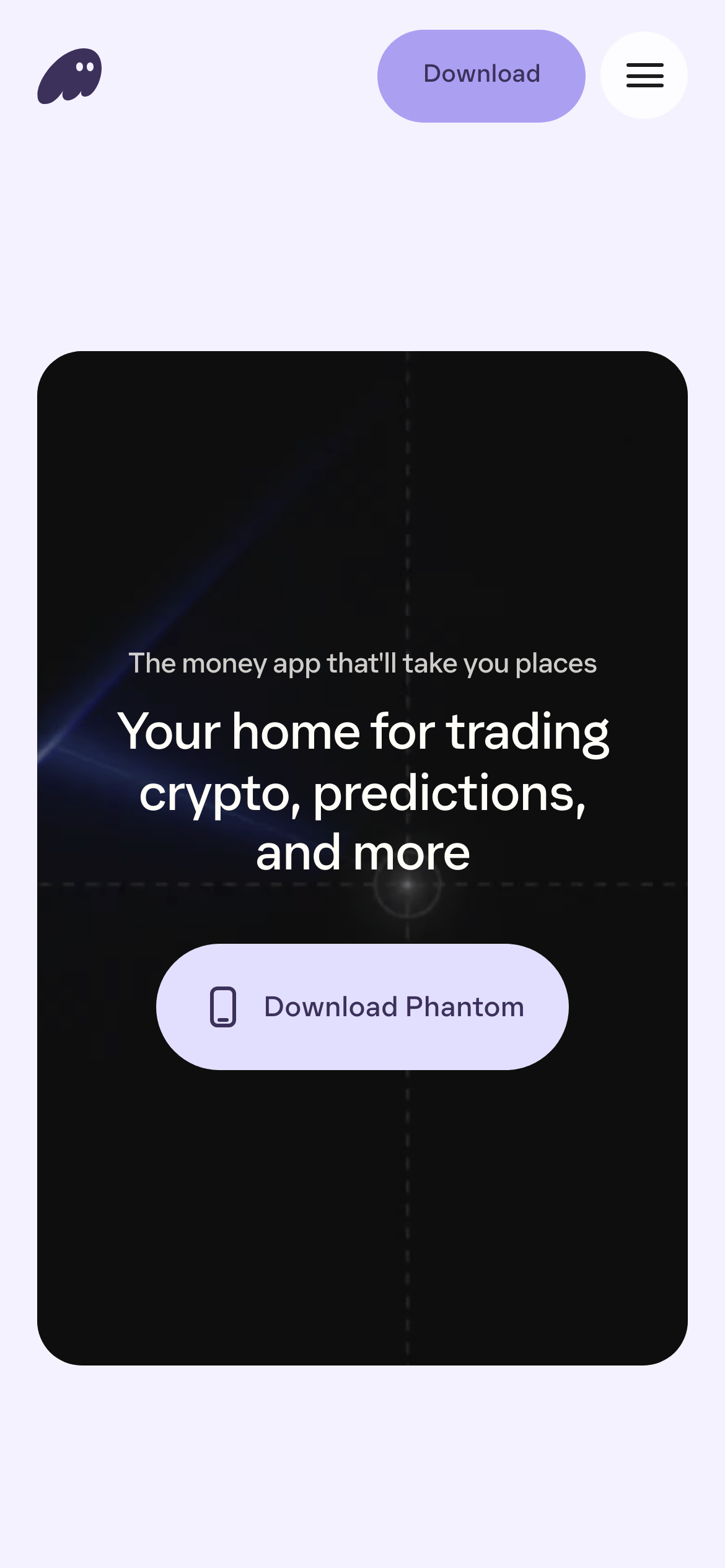
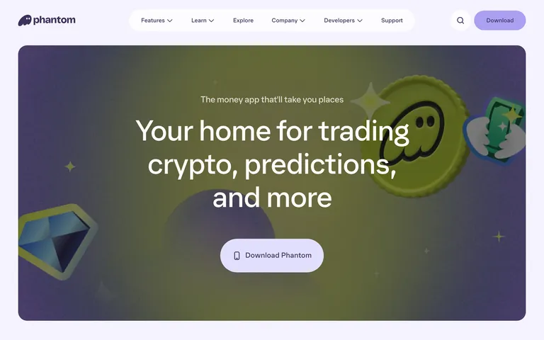
A high-contrast purple-based palette with a light neutral background and a vibrant, friendly accent color.
03
Typography
humanist-sans
display96px · 400
body16px · 400
Use the Phantom custom font for all text. · Headlines use a tight letter-spacing of -2.4px at large sizes. · Maintain a clean, rounded aesthetic in typography to match the brand.
04
Spacing
4px
8px
16px
24px
32px
48px
64px
96px
A consistent 4px base unit grid with generous padding for content blocks.
05
Surfaces
sm · 4px
md · 8px
lg · 16px
pill · 999px
1px solid border color matching the ink color
0px 0px 4px 0px rgba(226,223,254,1)
06
Layout
1280container
12columns
24pxgutter
768 / 1024breakpoints
A centered, single-column layout with large, immersive hero sections and generous whitespace.
07
Motion & Interaction
300msmicro
400mssmall
800msmedium
cubic-bezier(0.22, 1, 0.36, 1)easing
Smooth transitions for hover and click states on buttons. · Subtle color and background-color transitions.
Subtle background color changes with smooth transitions. · Immediate feedback with visual state change.
08
Components
buttonRounded pill-shaped buttons with soft background colors and smooth transitions.
cardClean, simple cards with subtle shadows or borders.
chipPill-shaped navigation or filter elements.
inputStandard text inputs with rounded corners.
heroLarge, immersive hero sections with bold typography and playful 3D graphics.
09
Voice & Don'ts
ToneFriendly, playful, and trustworthy.
HeadlinesBold, clear, and slightly whimsical.
CTAsDirect, action-oriented, and inviting.
Don't use sharp, hard edges for buttons or cards — screenshot shows rounded corners.
Don't use a purely black and white color scheme — screenshot shows a purple-dominant palette.
Don't use a serif or monospaced font for body text — screenshot shows a humanist-sans font.
Don't make the hero section feel cramped — screenshot shows generous spacing and large text.
Don't use overly complex or cluttered navigation — screenshot shows a clean, simple top bar.
Captured from the live site · real computed styles
11
System prompt
Phantom is a friendly and secure crypto wallet app. The design uses a deep purple (#3C315B) as the primary ink color on a light, slightly purple-tinted white (#FDFCFE) background, with a vibrant light purple accent (#AB8FF8). The typography is a custom, rounded humanist-sans that gives a playful yet trustworthy feel. Critical donts: 1) Don't use sharp, square corners for UI elements, 2) Don't use a cold, purely corporate color palette, 3) Don't use a generic sans-serif font, 4) Don't create dense, information-heavy layouts without whitespace, 5) Don't use abrupt, linear transitions.
Bring this taste to your agent
Hand your AI agent a machine-readable spec of this design — tokens, type, motion, the whole DNA.