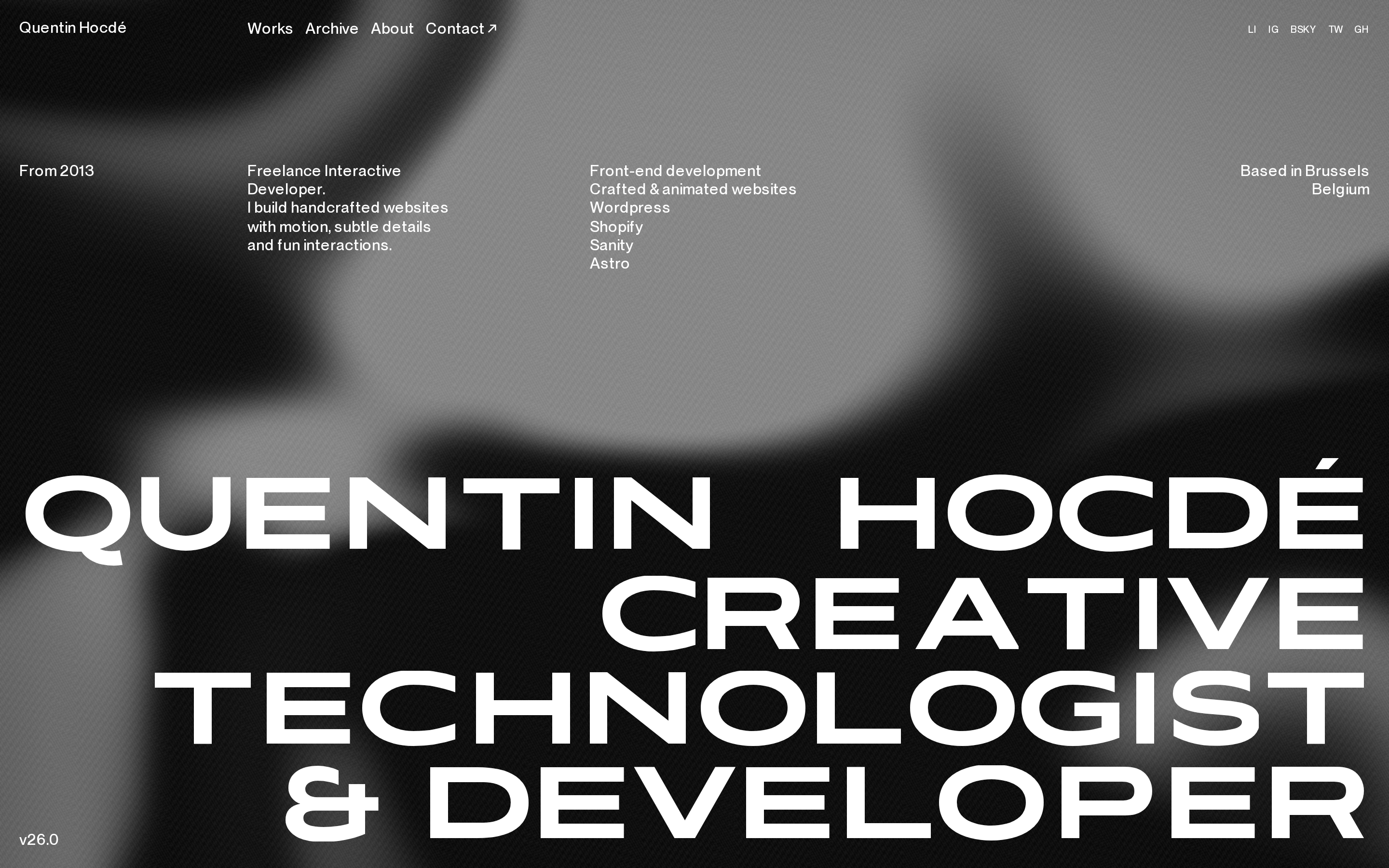
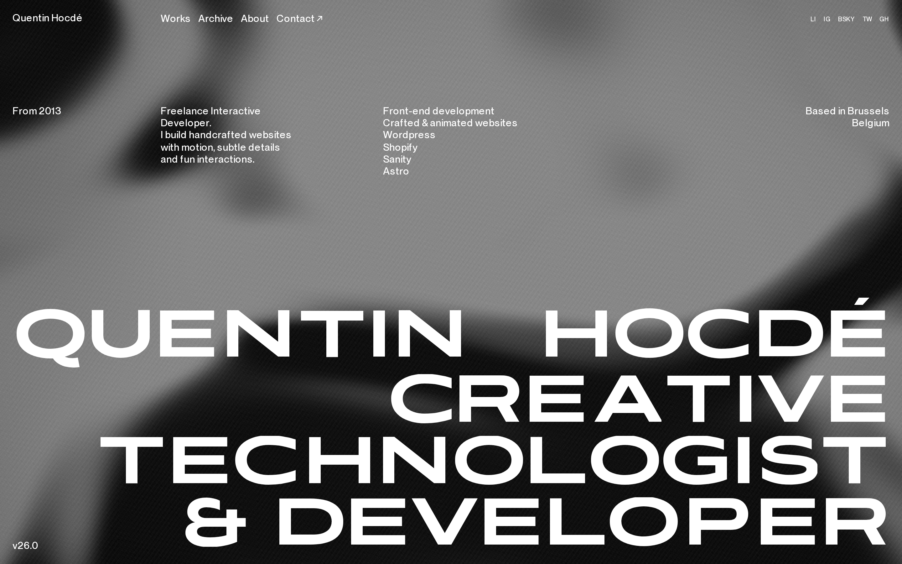
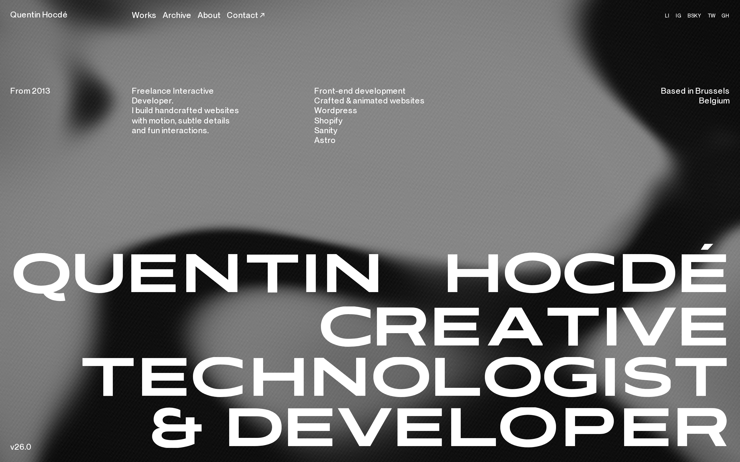
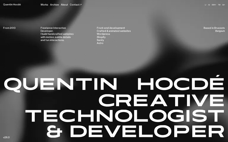
A digital portfolio that acts as a modern, brutalist poster for a creative technologist.
02
Color
#FFFFFFInk
#000000BG
rgba(255,255,255,1.0)Line
Strict monochrome with no accent colors, relying entirely on typography scale and weight for hierarchy.
03
Typography
geometric-sans · grotesque-sans
display-xl144px · 700
display-lg97px · 700
body16px · 400
caption10px · 400
Use tight, negative letter-spacing for large display text to create a compact, impactful look. · Uppercase is used extensively for display text and navigation links to maintain a structured, brutalist feel. · Body text should remain at a standard 16px for legibility against the complex background.
04
Spacing
4px
8px
12px
16px
20px
24px
32px
48px
64px
A 4px base scale is used for all spacing, with 12px and 20px acting as primary gutters for internal component padding.
05
Surfaces
sm · 0px
md · 0px
lg · 0px
pill · 999px
No visible borders; separation is achieved through spatial positioning and typography.
06
Layout
4columns
20pxgutter
768 / 1024breakpoints
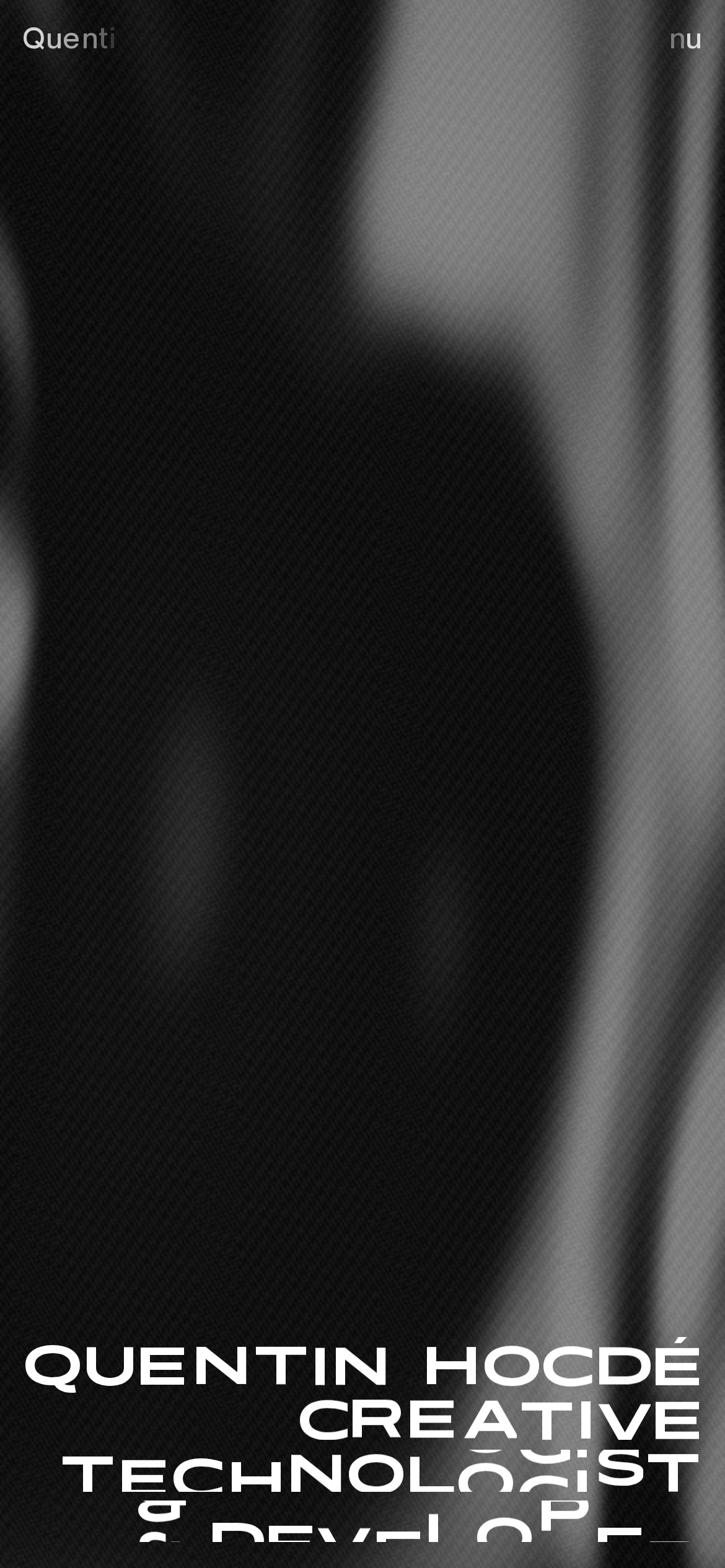
A full-bleed immersive layout with a complex background, featuring a fixed top navigation bar and content distributed across a flexible grid.
07
Motion & Interaction
0msmicro
300mssmall
800msmedium
cubic-bezier(0.645, 0.045, 0.355, 1)easing
Transform and background-size transitions with slight delays are applied to interactive elements and background components. · Subtle, continuous motion is implied by the shifting nature of the background texture across different states.
Interactive elements use 'cursor: pointer' to indicate clickability, with transform transitions providing subtle feedback. · Standard pointer events with immediate visual state changes via CSS transitions.
08
Components
buttonText-based links with pointer cursors and uppercase styling, lacking traditional button borders or backgrounds.
cardNo traditional cards; information is presented as floating text blocks directly over the background.
chipNo chips or tags are visible.
inputNo form inputs are visible on the landing page.
heroA full-viewport immersive section dominated by a massive, multi-line typographic statement overlapping a complex, textured background.
09
Voice & Don'ts
ToneProfessional, direct, and confident, focusing on craft and technical skill.
HeadlinesLarge, uppercase, heavily weighted typographic statements that serve as the primary focal point.
CTAsSimple, unadorned text links, often using external link icons to denote navigation away from the current page.
Don't introduce a third color for accents — screenshot shows a strictly monochrome white-on-black palette.
Don't use wide letter-spacing on large text — screenshot shows tight, negative letter-spacing for a dense, brutalist look.
Don't use a serif or script typeface for display text — screenshot shows a geometric sans-serif for all major headings.
Don't apply borders, shadows, or background colors to interactive elements — screenshot shows plain text links.
Don't use traditional button components — screenshot shows uppercase text links with pointer cursors instead.
Don't use a multi-column grid for the main hero statement — screenshot shows a massive, single-column typographic block.
Avoid: Avoid using colored accents or gradients.
Avoid: Avoid using decorative or script typefaces.
Avoid: Avoid traditional card-based UI components with borders or shadows.
Avoid: Avoid using large amounts of padding or whitespace that breaks the immersive feel.
Avoid: Avoid using standard button components with background fills.
Avoid: Avoid using small, understated typography for primary statements.
Captured from the live site · real computed styles
11
System prompt
A portfolio site for an interactive developer using a strict monochrome palette (#000000 background, #FFFFFF text) and bold, brutalist typography. The design relies on a massive, uppercase display font (categorized as geometric-sans) paired with a clean grotesque-sans for body text. The layout is immersive and full-bleed, avoiding traditional UI components like cards or colored buttons. Interaction feedback is provided through smooth 0.3s cubic-bezier transitions. Critical constraints: never use accent colors, never use wide letter-spacing on large text, and never use traditional bordered buttons.
Bring this taste to your agent
Hand your AI agent a machine-readable spec of this design — tokens, type, motion, the whole DNA.